MARKETING
21 Brand Style Guide Examples for Visual Inspiration

When it comes to building a memorable brand, it’s all about consistency. Like when you’re shopping for your favorite cereal or coffee at the grocery store, you want to be able to spot it from a mile away.
The best brands stick in our brains because their presence is defined by the repetition of the same logo, fonts, colors, and images. Once we see them enough, they become instantly recognizable, bringing us a clear sense of reliability and security.
Developing a consistent brand starts with creating a brand style guide. These branding rule books help graphic designers, marketers, web developers, community managers, and even product packaging departments all stay on the same page, and present a unified vision of the brand to the public.
In this article, we’ll go over what brand guidelines are, elements of a style guide, and some amazing examples of them in action to use as inspiration for your next branding project or website redesign.
What are brand guidelines?
Brand guidelines, also known as a brand style guide, govern the composition, design, and general look-and-feel of a company’s branding. Brand guidelines can dictate the content of a logo, blog, website, advertisement, and similar marketing collateral.
Picture the most recognizable brands you can think of. Chances are, you’ve learned to recognize them because of the consistency across the messaging — written or visual — these brands broadcast. The same brand colors are reflected across them. The language sounds familiar. It’s all very organized and, while not rigid, it’s cohesive.
Here are a few types of guidelines you’d find in a brand style guide and which parts of a brand they can influence.
Download our free resource on how to create your own style guide with brand guidelines templates to follow. Creating a consistent style guide isn’t easy, but with these tools you can build an unforgettable one with ease.
The Elements of a Brand Style Guide
A brand style guide encompasses much more than just a logo. It visually encompasses everything your brand is about — down to your business’ purpose. Here are some key elements that make or break a brand style guide.
- Mission Statement: Your mission statement is the compass of your brand style guide. It ensures that all your content is working toward the same goal. This statement can guide your blog and paid content, ad copy, visual media and slogan.
- Buyer Persona: A buyer persona is the fictional representation of your ideal customer. It includes details on your customer’s job title, age, gender and professional challenges — therefore stipulating for whom your brand publishes content. Your buyer persona guides you blog content, ad copy, and visual media.
- Color Palette: Your color palette is a group of colors your company uses to design its brand, guiding every piece of visual content created. These color combinations often follow HEX or RGB color codes, and govern your logo, web design, printed ads and event collateral.
- Editorial Style Guide: The job of an editorial style guide is to commit an editorial stylebook on how to phrase certain products, list topics the brand can and cannot write about, and other companies it can mention. Your editorial style guide can guide your blog content, video scripts, website and landing page copy, PR talking points and knowledge base articles.
- Typography: Typography is a visual element of your brand style guide that goes beyond the font you use in your company logo. It supports your blog design down to the links and copy on your website — even your tagline.
As you can see, the purpose of the brand style guide is to form and maintain all of the various elements of a company that, when combined, spell out the entire brand as it’s recognized.
Intrigued? Check out 21 of the best ones we could find.
Style Guide Examples
- Medium
- Wolf Circus Jewelry
- Ollo
- Skype
- Barre & Soul
- Spotify
- Jamie Oliver
- Herban Kitchen
- Urban Outfitters
- Love to Ride
- Barbican
- I Love New York
- Cisco
- University of the Arts Helsinki
- NJORD
- Espacio Cultural
- Alienware
- Netflix
- Scrimshaw Coffee
- NASA
- New York City Transit Authority
1. Medium
Medium emphasizes both typography and color in its brand style guide. Its guide also includes details related to the company’s “Purpose” and “Product Principles.”
See the full brand guide here.


2. Wolf Circus Jewelry
Wolf Circus Jewelry’s product is all about appearance. Naturally, the company’s style guide is too. The brand’s style guide includes the company’s mission statement, product details, typeface, logo variations, a color palette, and a separate set of guidelines just for advertisements.
See the full brand guide here.


3. Ollo
Ollo is so into color and typography, it turned its style guide into a game. Click the link below to see how much you can manipulate the brand. It’s the perfect way to show content creators how creative they can get but also still adhere to Ollo’s specific typeface and color codes.
See the full brand guide here.


4. Skype
Everyone’s favorite video chat platform also has a squeaky-clean style guide for its brand. Skype, now owned by Microsoft, focuses primarily on its product phrasing and logo placement.
See the full brand guide here.

5. Barre & Soul
Barre & Soul’s brand style guide includes variations of its logo, logo spacing, secondary logos, supporting imagery, and a five-color color palette.
See the full brand guide here.


6. Spotify
Spotify’s style guide might appear simple and green, but there’s more to the brand than just a lime green circle. Spotify’s color palette includes three color codes, while the rest of the company’s branding guidelines focus heavily on logo variation and album artwork. The style guide even allows you to download an icon version of its logo, making it easier to represent the company without manually recreating it.
See the full brand guide here.

7. Jamie Oliver
Jamie Oliver has an extremely thorough brand style guide, covering logo placement across all of its kitchenware products. The company also includes a large color palette with each color sorted by the product it should be shown on.
See the full brand guide here.


8. Herban Kitchen
Herban Kitchen has both a color and texture palette in its style guide. These guidelines help to show not just how the brand’s logo will appear, but how the company’s various storefronts will look from the outside to potential customers.
See the full brand guide here.


9. Urban Outfitters
Photography, color, and even tone of voice appear in Urban Outfitters’ California-inspired brand guidelines. However, the company isn’t shy to include information about its ideal consumer and what the brand believes in, as well.
See the full brand guide here.


10. Love to Ride
Love to Ride, a cycling company, is all about color variety in its visually pleasing style guide. The company’s brand guidelines include nine color codes and tons of detail about its secondary logos and imagery.
See the full brand guide here.


11. Barbican
Barbican, an art and learning center in the United Kingdom, sports a loud yet simple style guide focusing heavily on its logo and supporting typefaces.
See the full brand guide here.


12. I Love New York
Despite its famously simple t-shirts, I Love New York has a brand style guide. The company begins its guidelines with a thorough explanation of its mission, vision, story, target audience, and tone of voice. Only then does the style guide delve into its logo positioning on various merchandise.
See the full brand guide here.


13. Cisco
Cisco’s style guide isn’t just a guide — it’s an interactive brand book. The company takes website visitors page by page through its brand’s vision, mission, strategy, and even its promise before showing users their logo and allowing them to actually type using their proprietary typeface, “CiscoSans.” Where’s Cisco’s color palette, you ask? The business has a separate webpage for just that.
See the full brand guide here.


14. University of the Arts Helsinki
The style guide of the University of the Arts Helsinki is more of a creative branding album than a traditional marketing guide. It shows you dozens of contexts in which you’d see this school’s provocative logo, including animations.
See the full brand guide here.


15. NJORD
NJORD’s minimalist style guide gives you everything you’d need to know to design using the brand’s logo and color palette for both web and print.
See the full brand guide here.

16. Espacio Cultural
This cultural center in Argentina has a color palette that’s as elaborate as the artistic workshops it hosts. Nonetheless, the brand does a fantastic job of breaking down every last color code and logo placement you can find — from the building itself to the advertisements promoting it.
See the full brand guide here.


17. Alienware
Video gamers know Alienware from its game-friendly computers, but the rest of the world knows it by the brand’s sleek aesthetic. The company organizes its brand style guide into four basic parts: voice, design, photography, and partner. The latter describes (and shows) how the brand interacts with partner brands, such as Star Wars.
See the full brand guide here.


18. Netflix
As far as its public brand assets are concerned, Netflix is focused primarily on the treatment of its logo. The company offers a simple set of rules governing the size, spacing, and placement of its famous capitalized typeface, as well as a single color code for its classic red logo.
See the full brand guide here.

19. Scrimshaw Coffee
Featuring a five-code color palette, this “laid back,” “friendly,” and “modern” brand has a number of secondary logos it embraces in various situations.
See the full brand guide here.


20. NASA
NASA’s “Graphics Standards Manual” is as official and complex as you think it is. At 220 pages, the guide describes countless logo placements, color uses, and supporting designs. And yes, NASA’s space shuttles have their own branding rules.
See the full brand guide here.


21. New York City Transit Authority
Like NASA, the NYCTA has its own Graphics Standards Manual, and it includes some fascinating typography rules for the numbers, arrows, and public transit symbols the average commuter takes for granted every day.
See the full brand guide here.


Build a Memorable Style Guide of Your Own
Once you build your unique brand style guide, customers will recognize your brand and associate it with all the visual cues you want them to. We hope you were inspired by our list of amazing brand style guides and wish you luck in creating a timeless style of your own.
Source link
MARKETING
Streamlining Processes for Increased Efficiency and Results

How can businesses succeed nowadays when technology rules? With competition getting tougher and customers changing their preferences often, it’s a challenge. But using marketing automation can help make things easier and get better results. And in the future, it’s going to be even more important for all kinds of businesses.
So, let’s discuss how businesses can leverage marketing automation to stay ahead and thrive.
Benefits of automation marketing automation to boost your efforts
First, let’s explore the benefits of marketing automation to supercharge your efforts:
Marketing automation simplifies repetitive tasks, saving time and effort.
With automated workflows, processes become more efficient, leading to better productivity. For instance, automation not only streamlines tasks like email campaigns but also optimizes website speed, ensuring a seamless user experience. A faster website not only enhances customer satisfaction but also positively impacts search engine rankings, driving more organic traffic and ultimately boosting conversions.
Automation allows for precise targeting, reaching the right audience with personalized messages.
With automated workflows, processes become more efficient, leading to better productivity. A great example of automated workflow is Pipedrive & WhatsApp Integration in which an automated welcome message pops up on their WhatsApp
within seconds once a potential customer expresses interest in your business.
Increases ROI
By optimizing campaigns and reducing manual labor, automation can significantly improve return on investment.
Leveraging automation enables businesses to scale their marketing efforts effectively, driving growth and success. Additionally, incorporating lead scoring into automated marketing processes can streamline the identification of high-potential prospects, further optimizing resource allocation and maximizing conversion rates.
Harnessing the power of marketing automation can revolutionize your marketing strategy, leading to increased efficiency, higher returns, and sustainable growth in today’s competitive market. So, why wait? Start automating your marketing efforts today and propel your business to new heights, moreover if you have just learned ways on how to create an online business
How marketing automation can simplify operations and increase efficiency
Understanding the Change
Marketing automation has evolved significantly over time, from basic email marketing campaigns to sophisticated platforms that can manage entire marketing strategies. This progress has been fueled by advances in technology, particularly artificial intelligence (AI) and machine learning, making automation smarter and more adaptable.
One of the main reasons for this shift is the vast amount of data available to marketers today. From understanding customer demographics to analyzing behavior, the sheer volume of data is staggering. Marketing automation platforms use this data to create highly personalized and targeted campaigns, allowing businesses to connect with their audience on a deeper level.
The Emergence of AI-Powered Automation
In the future, AI-powered automation will play an even bigger role in marketing strategies. AI algorithms can analyze huge amounts of data in real-time, helping marketers identify trends, predict consumer behavior, and optimize campaigns as they go. This agility and responsiveness are crucial in today’s fast-moving digital world, where opportunities come and go in the blink of an eye. For example, we’re witnessing the rise of AI-based tools from AI website builders, to AI logo generators and even more, showing that we’re competing with time and efficiency.
Combining AI-powered automation with WordPress management services streamlines marketing efforts, enabling quick adaptation to changing trends and efficient management of online presence.
Moreover, AI can take care of routine tasks like content creation, scheduling, and testing, giving marketers more time to focus on strategic activities. By automating these repetitive tasks, businesses can work more efficiently, leading to better outcomes. AI can create social media ads tailored to specific demographics and preferences, ensuring that the content resonates with the target audience. With the help of an AI ad maker tool, businesses can efficiently produce high-quality advertisements that drive engagement and conversions across various social media platforms.
Personalization on a Large Scale
Personalization has always been important in marketing, and automation is making it possible on a larger scale. By using AI and machine learning, marketers can create tailored experiences for each customer based on their preferences, behaviors, and past interactions with the brand.
This level of personalization not only boosts customer satisfaction but also increases engagement and loyalty. When consumers feel understood and valued, they are more likely to become loyal customers and brand advocates. As automation technology continues to evolve, we can expect personalization to become even more advanced, enabling businesses to forge deeper connections with their audience. As your company has tiny homes for sale California, personalized experiences will ensure each customer finds their perfect fit, fostering lasting connections.
Integration Across Channels
Another trend shaping the future of marketing automation is the integration of multiple channels into a cohesive strategy. Today’s consumers interact with brands across various touchpoints, from social media and email to websites and mobile apps. Marketing automation platforms that can seamlessly integrate these channels and deliver consistent messaging will have a competitive edge. When creating a comparison website it’s important to ensure that the platform effectively aggregates data from diverse sources and presents it in a user-friendly manner, empowering consumers to make informed decisions.
Omni-channel integration not only betters the customer experience but also provides marketers with a comprehensive view of the customer journey. By tracking interactions across channels, businesses can gain valuable insights into how consumers engage with their brand, allowing them to refine their marketing strategies for maximum impact. Lastly, integrating SEO services into omni-channel strategies boosts visibility and helps businesses better understand and engage with their customers across different platforms.
The Human Element
While automation offers many benefits, it’s crucial not to overlook the human aspect of marketing. Despite advances in AI and machine learning, there are still elements of marketing that require human creativity, empathy, and strategic thinking.
Successful marketing automation strikes a balance between technology and human expertise. By using automation to handle routine tasks and data analysis, marketers can focus on what they do best – storytelling, building relationships, and driving innovation.
Conclusion
The future of marketing automation looks promising, offering improved efficiency and results for businesses of all sizes.
As AI continues to advance and consumer expectations change, automation will play an increasingly vital role in keeping businesses competitive.
By embracing automation technologies, marketers can simplify processes, deliver more personalized experiences, and ultimately, achieve their business goals more effectively than ever before.
MARKETING
Will Google Buy HubSpot? | Content Marketing Institute
Google + HubSpot. Is it a thing?
This week, a flurry of news came down about Google’s consideration of purchasing HubSpot.
The prospect dismayed some. It delighted others.
But is it likely? Is it even possible? What would it mean for marketers? What does the consideration even mean for marketers?
Well, we asked CMI’s chief strategy advisor, Robert Rose, for his take. Watch this video or read on:
Why Alphabet may want HubSpot
Alphabet, the parent company of Google, apparently is contemplating the acquisition of inbound marketing giant HubSpot.
The potential price could be in the range of $30 billion to $40 billion. That would make Alphabet’s largest acquisition by far. The current deal holding that title happened in 2011 when it acquired Motorola Mobility for more than $12 billion. It later sold it to Lenovo for less than $3 billion.
If the HubSpot deal happens, it would not be in character with what the classic evil villain has been doing for the past 20 years.
At first glance, you might think the deal would make no sense. Why would Google want to spend three times as much as it’s ever spent to get into the inbound marketing — the CRM and marketing automation business?
At a second glance, it makes a ton of sense.
I don’t know if you’ve noticed, but I and others at CMI spend a lot of time discussing privacy, owned media, and the deprecation of the third-party cookie. I just talked about it two weeks ago. It’s really happening.
All that oxygen being sucked out of the ad tech space presents a compelling case that Alphabet should diversify from third-party data and classic surveillance-based marketing.
Yes, this potential acquisition is about data. HubSpot would give Alphabet the keys to the kingdom of 205,000 business customers — and their customers’ data that almost certainly numbers in the tens of millions. Alphabet would also gain access to the content, marketing, and sales information those customers consumed.
Conversely, the deal would provide an immediate tip of the spear for HubSpot clients to create more targeted programs in the Alphabet ecosystem and upload their data to drive even more personalized experiences on their own properties and connect them to the Google Workspace infrastructure.
When you add in the idea of Gemini, you can start to see how Google might monetize its generative AI tool beyond figuring out how to use it on ads on search results pages.
What acquisition could mean for HubSpot customers
I may be stretching here but imagine this world. As a Hubspoogle customer, you can access an interface that prioritizes your owned media data (e.g., your website, your e-commerce catalog, blog) when Google’s Gemini answers a question).
Recent reports also say Google may put up a paywall around the new premium features of its artificial intelligence-powered Search Generative Experience. Imagine this as the new gating for marketing. In other words, users can subscribe to Google’s AI for free, but Hubspoogle customers can access that data and use it to create targeted offers.
The acquisition of HubSpot would immediately make Google Workspace a more robust competitor to Microsoft 365 Office for small- and medium-sized businesses as they would receive the ADDED capability of inbound marketing.
But in the world of rented land where Google is the landlord, the government will take notice of the acquisition. But — and it’s a big but, I cannot lie (yes, I just did that). The big but is whether this acquisition dance can happen without going afoul of regulatory issues.
Some analysts say it should be no problem. Others say, “Yeah, it wouldn’t go.” Either way, would anybody touch it in an election year? That’s a whole other story.
What marketers should realize
So, what’s my takeaway?
It’s a remote chance that Google will jump on this hard, but stranger things have happened. It would be an exciting disruption in the market.
The sure bet is this. The acquisition conversation — as if you needed more data points — says getting good at owned media to attract and build audiences and using that first-party data to provide better communication and collaboration with your customers are a must.
It’s just a matter of time until Google makes a move. They might just be testing the waters now, but they will move here. But no matter what they do, if you have your customer data house in order, you’ll be primed for success.
HANDPICKED RELATED CONTENT:
Cover image by Joseph Kalinowski/Content Marketing Institute
MARKETING
5 Psychological Tactics to Write Better Emails
Welcome to Creator Columns, where we bring expert HubSpot Creator voices to the Blogs that inspire and help you grow better.
I’ve tested 100s of psychological tactics on my email subscribers. In this blog, I reveal the five tactics that actually work.
You’ll learn about the email tactic that got one marketer a job at the White House.
You’ll learn how I doubled my 5 star reviews with one email, and why one strange email from Barack Obama broke all records for donations.
5 Psychological Tactics to Write Better Emails
Imagine writing an email that’s so effective it lands you a job at the White House.
Well, that’s what happened to Maya Shankar, a PhD cognitive neuroscientist. In 2014, the Department of Veterans Affairs asked her to help increase signups in their veteran benefit scheme.
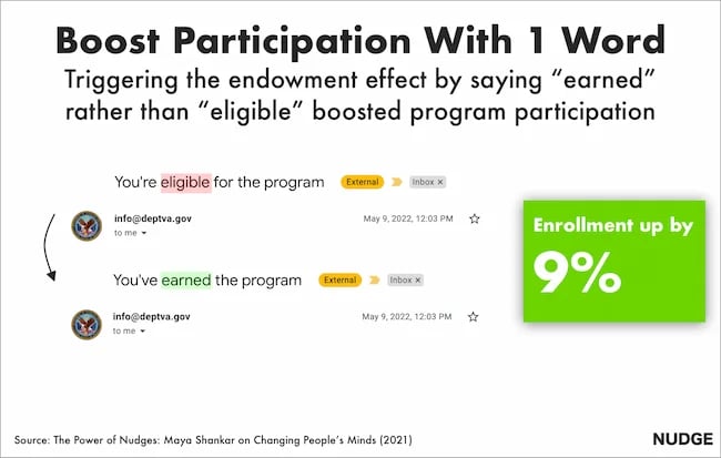
Maya had a plan. She was well aware of a cognitive bias that affects us all—the endowment effect. This bias suggests that people value items higher if they own them. So, she changed the subject line in the Veterans’ enrollment email.
Previously it read:
- Veterans, you’re eligible for the benefit program. Sign up today.
She tweaked one word, changing it to:
- Veterans, you’ve earned the benefits program. Sign up today.
This tiny tweak had a big impact. The amount of veterans enrolling in the program went up by 9%. And Maya landed a job working at the White House
Inspired by these psychological tweaks to emails, I started to run my own tests.
Alongside my podcast Nudge, I’ve run 100s of email tests on my 1,000s of newsletter subscribers.
Here are the five best tactics I’ve uncovered.
1. Show readers what they’re missing.
Nobel prize winning behavioral scientists Daniel Kahneman and Amos Tversky uncovered a principle called loss aversion.
Loss aversion means that losses feel more painful than equivalent gains. In real-world terms, losing $10 feels worse than how gaining $10 feels good. And I wondered if this simple nudge could help increase the number of my podcast listeners.
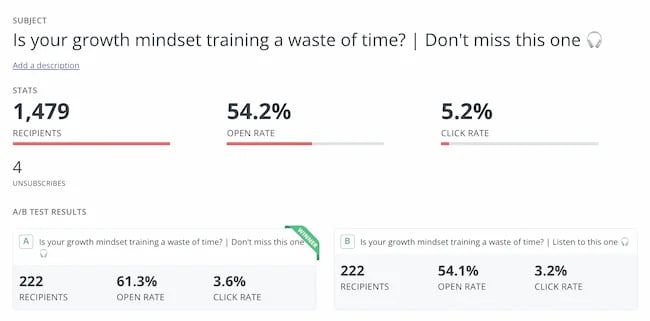
For my test, I tweaked the subject line of the email announcing an episode. The control read:
“Listen to this one”
In the loss aversion variant it read:
“Don’t miss this one”
It is very subtle loss aversion. Rather than asking someone to listen, I’m saying they shouldn’t miss out. And it worked. It increased the open rate by 13.3% and the click rate by 12.5%. Plus, it was a small change that cost me nothing at all.
2. People follow the crowd.
In general, humans like to follow the masses. When picking a dish, we’ll often opt for the most popular. When choosing a movie to watch, we tend to pick the box office hit. It’s a well-known psychological bias called social proof.
I’ve always wondered if it works for emails. So, I set up an A/B experiment with two subject lines. Both promoted my show, but one contained social proof.
The control read: New Nudge: Why Brands Should Flaunt Their Flaws
The social proof variant read: New Nudge: Why Brands Should Flaunt Their Flaws (100,000 Downloads)
I hoped that by highlighting the episode’s high number of downloads, I’d encourage more people to listen. Fortunately, it worked.
The open rate went from 22% to 28% for the social proof version, and the click rate, (the number of people actually listening to the episode), doubled.
3. Praise loyal subscribers.
The consistency principle suggests that people are likely to stick to behaviours they’ve previously taken. A retired taxi driver won’t swap his car for a bike. A hairdresser won’t change to a cheap shampoo. We like to stay consistent with our past behaviors.
I decided to test this in an email.
For my test, I attempted to encourage my subscribers to leave a review for my podcast. I sent emails to 400 subscribers who had been following the show for a year.
The control read: “Could you leave a review for Nudge?”
The consistency variant read: “You’ve been following Nudge for 12 months, could you leave a review?”
My hypothesis was simple. If I remind people that they’ve consistently supported the show they’ll be more likely to leave a review.
It worked.
The open rate on the consistency version of the email was 7% higher.
But more importantly, the click rate, (the number of people who actually left a review), was almost 2x higher for the consistency version. Merely telling people they’d been a fan for a while doubled my reviews.
4. Showcase scarcity.
We prefer scarce resources. Taylor Swift gigs sell out in seconds not just because she’s popular, but because her tickets are hard to come by.
Swifties aren’t the first to experience this. Back in 1975, three researchers proved how powerful scarcity is. For the study, the researchers occupied a cafe. On alternating weeks they’d make one small change in the cafe.
On some weeks they’d ensure the cookie jar was full.
On other weeks they’d ensure the cookie jar only contained two cookies (never more or less).
In other words, sometimes the cookies looked abundantly available. Sometimes they looked like they were almost out.
This changed behaviour. Customers who saw the two cookie jar bought 43% more cookies than those who saw the full jar.
It sounds too good to be true, so I tested it for myself.
I sent an email to 260 subscribers offering free access to my Science of Marketing course for one day only.
In the control, the subject line read: “Free access to the Science of Marketing course”
For the scarcity variant it read: “Only Today: Get free access to the Science of Marketing Course | Only one enrol per person.”
130 people received the first email, 130 received the second. And the result was almost as good as the cookie finding. The scarcity version had a 15.1% higher open rate.

5. Spark curiosity.
All of the email tips I’ve shared have only been tested on my relatively small audience. So, I thought I’d end with a tip that was tested on the masses.
Back in 2012, Barack Obama and his campaign team sent hundreds of emails to raise funds for his campaign.
Of the $690 million he raised, most came from direct email appeals. But there was one email, according to ABC news, that was far more effective than the rest. And it was an odd one.
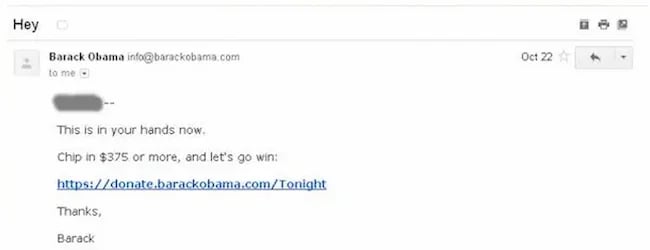
The email that drew in the most cash, had a strange subject line. It simply said “Hey.”
The actual email asked the reader to donate, sharing all the expected reasons, but the subject line was different.
It sparked curiosity, it got people wondering, is Obama saying Hey just to me?
Readers were curious and couldn’t help but open the email. According to ABC it was “the most effective pitch of all.”
Because more people opened, it raised more money than any other email. The bias Obama used here is the curiosity gap. We’re more likely to act on something when our curiosity is piqued.
Loss aversion, social proof, consistency, scarcity and curiosity—all these nudges have helped me improve my emails. And I reckon they’ll work for you.
It’s not guaranteed of course. Many might fail. But running some simple a/b tests for your emails is cost free, so why not try it out?
This blog is part of Phill Agnew’s Marketing Cheat Sheet series where he reveals the scientifically proven tips to help you improve your marketing. To learn more, listen to his podcast Nudge, a proud member of the Hubspot Podcast Network.
-

 WORDPRESS6 days ago
Turkish startup ikas attracts $20M for its e-commerce platform designed for small businesses
-

 PPC7 days ago
A History of Google AdWords and Google Ads: Revolutionizing Digital Advertising & Marketing Since 2000
-

 MARKETING6 days ago
Roundel Media Studio: What to Expect From Target’s New Self-Service Platform
-

 SEO5 days ago
Google Limits News Links In California Over Proposed ‘Link Tax’ Law
-

 MARKETING6 days ago
Unlocking the Power of AI Transcription for Enhanced Content Marketing Strategies
-
SEARCHENGINES5 days ago
Daily Search Forum Recap: April 12, 2024
-

 SEARCHENGINES6 days ago
Google Search Results Can Be Harmful & Dangerous In Some Cases
-
 SEO4 days ago
10 Paid Search & PPC Planning Best Practices






![5 Psychological Tactics to Write Better Emails → Download Now: The Beginner's Guide to Email Marketing [Free Ebook]](https://articles.entireweb.com/wp-content/uploads/2023/02/11-Free-Email-Hacks-to-Step-Up-Your-Productivity.png)


You must be logged in to post a comment Login