MARKETING
22 of the Best Examples of Beautiful Blog Design

According to a recent survey, 70% of customers rely on expert and insider advice. That’s right — that means most people trust bloggers more than celebrities, journalists, or politicians.
But how do you get people to fall in love with your blog in the first place? (Aside from remarkable content, of course.)
Well, just as your website homepage is like the front door to your business, your blog’s design — much like a welcome mat — is the front door to your business blog.
If you’re not attracting people visually, how will you get them to take the next steps to actually read (and, hopefully, subscribe to) your content? Once you’re done creating quality content, you still have the challenge of presenting it in a way that clearly dictates what your blog is about.
Images, text, and links need to be shown off just right — otherwise, readers might abandon your content, if it’s not showcased in a way that’s appealing, easy to follow, and generates more interest.
That’s why we’ve compiled some examples of blog homepages to get you on the right track to designing the perfect blog for your readers. Check ’em out, below.
Beautiful Blog Examples to Inspire You
- Help Scout
- Microsoft Stories
- Pando
- Design Milk
- Fubiz
- Webdesigner Depot
- Mashable
- Brit + Co
- Tesco Food Love Stories
- HubSpot
- I Love Typography
- 500px
- Wired
- Golde
- Recode
- Pluralsight
- Crayon
- Black Travelbox
- Pixelgrade
- BarkPost
- Goodwill Industries International
- Springly
Inspiring Examples of Beautiful Blog Homepage Design
1. Help Scout
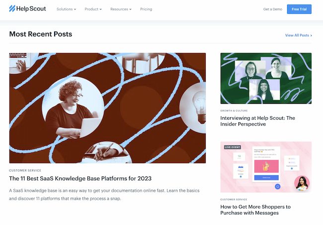
Sometimes, the best blog designs are also the simplest. Help Scout, makers of customer service software, uses a unique but minimalist design on its blog that we love — it limits copy and visuals and embraces negative space.
What we particularly like about this blog is its use of featured images for all posts, including the “Most Recent Posts” section that highlights recent or particularly popular entries. These images catch the readers’ eye and signal what the post is about. And it works — everything about this blog’s design says clean and readable.
2. Microsoft Work & Life

Full disclosure: We’ve totally gushed over Microsoft’s microsites before. We can’t help it — what better way to revitalize an old-school brand than with a blog that boasts beautiful, interactive, and inspiring branded content? Plus, the square images in the layout of these stories are reminiscent of the Microsoft logo. This helps it achieve valuable brand consistency.
Microsoft Work & Life is also a prime example of how a business blog can be a major asset for an overall rebrand. In recent years, Microsoft has worked to humanize its brand, largely in response to a rivalry with Apple.
The “Work & Life” microsite has a simple tagline — “Learn how we’re helping people stay connected, engaged and productive — at work, at school, at home and at play.” It’s the softer side of Microsoft, so to speak.
When you’re trying to convey a certain brand message, you can use your blog to communicate it — both aesthetically and content-wise.
3. Pando

An important aspect of a well-designed blog is a consistent color scheme and style. After all, 80% of consumers say that color boosts their recognition of a brand.
It’s interesting to see how color consistency can unify the more diversified elements of design. Pando, a blog that explores the startup cycle, incorporates a set palette of colors — orange, green, pale blue, lavender, and deep yellow — in several sections of its site. These colors appear in the background, highlight bars, and certain areas of text.
But it also uses several different fonts — all of which manage to look seamless when tied together by a cohesive color scheme.
4. Design Milk
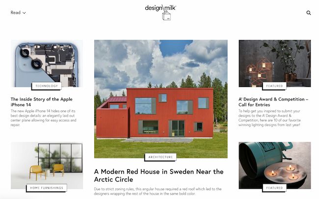
Design Milk, an online contemporary design outlet, uses a simple layout to highlight its posts. If the arrow beside “Read” at the top left points down, you can scroll through featured images and teaser text for a variety of articles. If the arrow beside “Read” points up, you see a perfect showcase of blog topics and highlighted posts.
That’s an internal link strategy, which helps to encourage readers to stay on the site longer.
The social icons at the top of each post are a pleasant addition to the overall look and feel of the site. They’re easy to spot and make it easy to share Design Milk’s content. (And to learn more about adding social buttons to your blog, check out this post.)
5. Fubiz
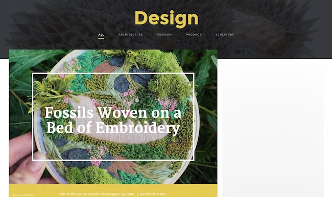
Fubiz, an art and design blog, is an example of a really sleek design that also includes some cool personalization.
The blog’s homepage makes it easy for readers to side-scroll through “The Highlights.” Below that is the Creativity Finder, where visitors can choose their persona — from “Art Lover” to “Freelance” — location, and the type of content they’re looking for. From there, readers can browse content specifically catered to them.
We can’t help but love the images, too. Each featured image has a distinct style. By using the design to highlight these powerful photographs, Fubiz is able to visually attract visitors to its content.
For a similar look, check out the CMS Hub theme collection on the Envato marketplace.
6. Webdesigner Depot
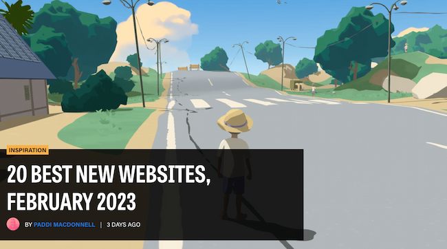
With a name like “Webdesigner Depot,” it’s no wonder that this design news site is visually appealing.
One thing that we particularly like is the responsive images on each individual post. The subtle motion of the image as readers scroll over a range of articles helps catch visitors’ eyes.
And check out the effective use of the featured image to highlight the most recent article. This approach pulls the viewer immediately into the blog’s most recent content.
What’s more, the color scheme, background, and fonts are all consistent — which keeps this blog looking professional, but still distinct from the basic blog templates you might be used to seeing.
7. Mashable
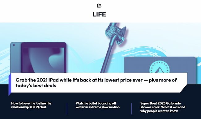
I mean, just look at that header image — bold colors, recognizable gadgets, and contrasting text. It absolutely catches the reader’s eye — no pun intended.
Mashable breaks its content into three noticeable sections on the homepage:
- New posts get attention with a large featured image and three highlighted blocks.
- Posts for each section get attention with a featured image at the top of two to three columns with a short list of headlines underneath.
- Then “Trending” posts show up to the right, with bold text on top of a shadow box graphic.
This multi-pronged approach to displaying content can help readers decide which kind of news matters to them the most. They can quickly choose between attention-grabbing top stories, the hottest posts, or stories on the topic they’re most interested in.
The “Related Stories” that end each post are also a great feature to connect readers to more of the content they’re looking for.
8. Brit + Co
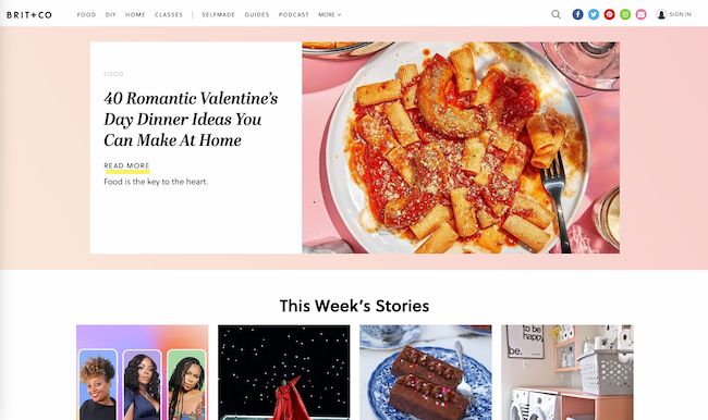
Everything about the Brit + Co homepage says clean, warm, and welcoming. It’s free of clutter, making the content more digestible, and the layout is extremely organized.
We dig the seasonality of the site, too — from avocado jack-o’-lanterns on the first of October to dinner recipes for Valentine’s Day. Adorable, and replete with colorful, fun photos to illustrate each story’s content.
The subtle “This Week’s Stories” header also serves as a nice way to promote popular content, without being too in-your-face about it. Plus, with such great visuals, we took note of the nod to Pinterest. That icon is important to include when your blog incorporates so much attractive imagery.
9. Tesco Food Love Stories
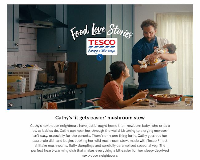
We love the colorful, consistent design of Tesco Food Love Stories, from British grocery chain Tesco.
Remember how we keep harping away at brand consistency? Check out the way this brand naturally incorporates the logo into its photography and featured video.
What Tesco has achieved is a great balance of simplicity and boldness. The layout is minimal, but not dull. Warm and welcoming shades underscore each content highlight and recipe, and the photos add dashes of colors throughout the site. It’s a great example of how the right imagery can achieve an appealing “less-is-more” appearance, especially if that fits in with your overall brand concept.
10. HubSpot
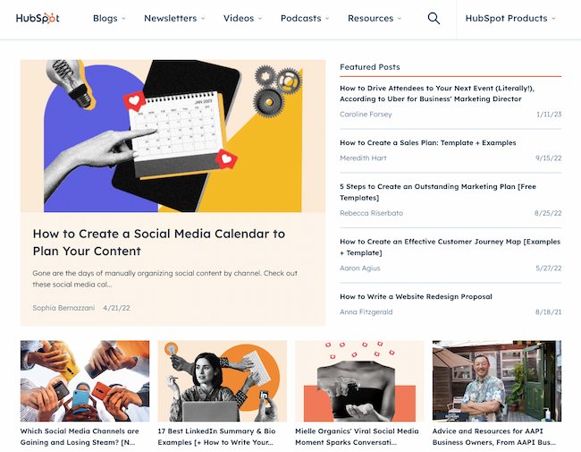
HubSpot’s blog finds a way to pack a lot of exciting content into the page while still being easy on the eyes. Notice that, above the fold, it features one blog post with a large image, title, and call-to-action to read more. The featured image is unique to the brand with an appealing combination of photography and graphics to draw the eye.
To the right, there’s a list of top posts to engage readers with the wide variety of content on the blog. This makes it easy for readers to connect with HubSpot or learn more.
Plus, there’s that consistency again. As you keep scrolling down the page, each section is visually consistent no matter what topic, podcast, video, or blog post you’re looking for. Using this strategy can help you build brand trust.
11. I Love Typography
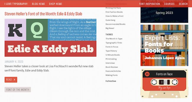
If you’re into design, you understand the power of fonts. The right font can make words sing on a web page, while the wrong choice can be a hard-to-read mess. So, a blog that features hundreds of fonts has to get creative with blog design.
I Love Typography gets the balance just right with a clean and simple design. Three vertical columns separate blog themes and top posts from the most recent additions to the blog. Meanwhile, it dedicates the right side column to highlighted blog features. This section features fun clickable graphics (like that sweet cassette tape) that balance the bright colors and shapes that dominate the posts on the left-hand side of the blog.
If you’re creating a blog for the first time, this is a smart approach to borrow from. You can also check out these tips on starting a successful blog.
12. 500px

The photography blog, 500px, leads with one featured article and a big, bold, high-definition photo to draw the reader in. That makes it pretty clear what the blog is about — it boasts valuable content on photography with gripping photography.
Plus, how cool is it that the social links are right there, obviously displayed above the fold? They keep readers engaged with the content and make it easy to share the photography. Plus content with images gets more than double the engagement on Facebook as posts without images do.
13. Wired

The more topics you have on your blog, the more chaotic the experience can be for your readers. That’s why we like the refreshing simplicity of Wired’s blog design.
Depending on the size of your screen there could be eight or more headlines above the fold alone, but this design is still easy to scan and dig in.
Every post includes a featured image to draw you in. Then, striking font choices make it quick to understand the category, author, and headline for each post at a glance.
If your blog started simple and you’re having a hard time making it work as it grows, this blog is great inspiration for a redesign. You can also use this workbook for redesigning your blog website.
14. Golde
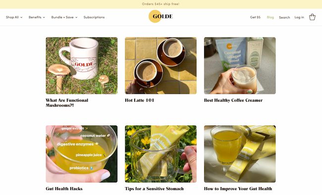
Golde is another blog that uses images for great communication. Using the brand name as a starting point for its blog “The Golden Hour,” Golde makes a featured image the focus of each blog post.
Then, the gorgeous photography uses yellow and green tones in each photograph. This creates a consistent, warm, and appealing feel to draw you into each blog post.
Once you click on a post, this blog makes perfect use of the space below the text to highlight products, recipes, and other useful resources.
15. Recode
Ads are a useful way for many blogs to generate income. Many small businesses offer a blog to highlight their products and services. At the same time, other standalone blogs can struggle to balance design with the need to monetize their content.
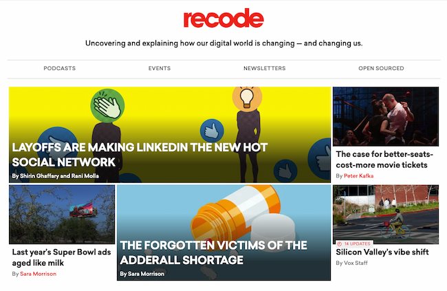
Recode features the latest tech news using an asymmetrical grid structure. Bold thumbnail images paired with headline text align with larger images with overlaid text in all caps.
This variety of approaches to image and text make it easy for viewers to scan and choose the post they want to read. The layout includes some animation too and this adds excitement to the blog layout.
Besides being a great user experience, this design lets the blog weave in ads that aren’t distracting to the eyes. At the same time, they also don’t blend in with the organic content, letting Recode create an authentic experience for its readers.
16. Pluralsight

This blog is a great reminder that blog designs don’t have to get super fancy.
Notice the bold title at the top and center of the page. Then the featured illustration at the top uses a bright background and simple white-on-black text. That bold brand presence stays constant throughout the company’s blog.
The clean fonts, for example, match the logo and stay in line with the brand’s clear, informative voice. And the grid structure and headers for each section make it easy to understand what you can find on the blog.
We also like the easily-navigable archive links at the top and how easy it is to see the blog archive with minimal scrolling.
17. Crayon
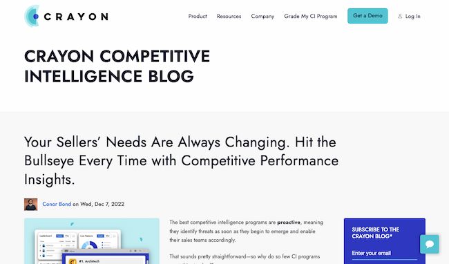
Many blogs want to show readers a little bit of everything they offer. But depth can be just as enticing to readers as breadth. If you want your visitors to dive into what your blog writers have to say, this blog design gives them an easy choice — just start reading.
With an extended teaser in the header, the focus above-the-fold for the Crayon blog is the latest blog post. As a reader scrolls down, they’ll find a grid with more content from the blog.
We also like the color coding by topic, which makes it easy to locate blogs of interest at a glance. You can see more text-forward blog design examples here.
18. Black Travelbox

To clear up any confusion, Black Travelbox doesn’t make suitcases. It makes personal care products for travel. But the company has done a great job of connecting its portable balms, conditioners, and more with the joy of travel.
Plus, the folks at this company’s “Travel and Slay” blog know a thing or two about brand consistency across channels. The blog has a simple color scheme and matching fonts help to create a unified user experience from the shop to general content. At the same time, it throws in bold, colorful images to catch readers’ attention.
Visit the website and have a scroll — we think it’s pretty cool how the images vary, but each blog entry highlights a different “travel crush.” Then, it packs each post with bright photographs, smart interviews, and joyful stories.
19. Pixelgrade
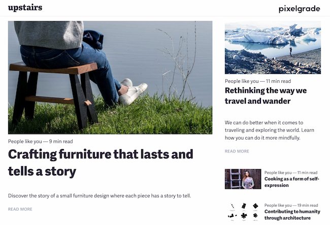
Pixelgrade is a design studio that creates stunning WordPress themes for creative people and small businesses. Their blog page does a great job of highlighting one of their most recent or popular blog posts, alongside a clear call-to-action and a short excerpt.
What I like best is that the design of the page is 100% in line with their brand. If you like the design of their blog, chances are you’ll also want to try one of their smart and beautifully-designed WordPress themes.
For more WordPress blog design ideas, check out this post about WordPress themes for bloggers.
20. BarkPost
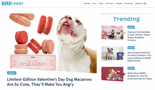
We kind of like dogs here at HubSpot. So when a blog dedicated to life as a dog owner came across our radar, it got our attention.
BarkPost, the blog of canine subscription box company BarkBox, is a great example of design for many reasons. First, look at the big fun font in every header — it’s quick and easy to read, even from a mobile device.
Adorable images make the posts for each topic noticeable, too — and, of course, all in the brand-matching, trustworthy blue.
We also like that BarkPost draws attention to its sister companies. Whether you’re interested in doggie dental care or the best food for your pup, this fun blog design makes it easy for dog parents and lovers alike to find the latest news and resources.
21. Goodwill Industries International
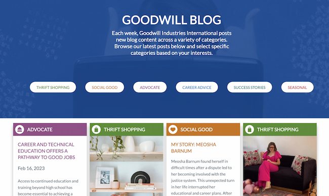
Who says nonprofit organizations can’t blog? Nay, they should. Check out this ultimate nonprofit marketing guide to make yours great.
In this example, Goodwill’s clean, colorful navigation (again — the trustworthy blue) draws the reader to the important elements of this blog.
The posts are also neatly positioned and easily accessible to readers. And, visitors can pick the type of information that matters to them the most by choosing a topic from the simple buttons in the graphic above the fold.
Finally, we love the emphasis on personal stories on the Goodwill blog. This design has long-form teasers that lead readers into this organization’s programs. This approach makes it easy to learn why so many people chose to support Goodwill.
22. Springly
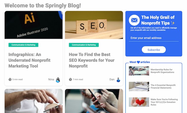
Keeping the nonprofit blogging train going is Springly, which makes excellent use of a simple grid format by highlighting the greatest resources of most nonprofits — dedicated people.
This blog has a simplistic design with concise text and a clear color palette for nonprofits looking for useful resources.
Each article card features the first name and picture of the author, shining the spotlight on its contributors. It also shows how long it will take to read the post.
Placing time and people at the forefront aligns with what most nonprofits focus on. This approach makes the blog more valuable to those who are most likely to contribute and use it.
Still looking for more inspiration and ideas? Click here to check out over 70 more examples of website blogs, homepages, and landing page designs.
Use These Blog Design Examples to Build Your Best Blog
Creating a beautiful blog isn’t just about looks. If you want your readers to really fall in love, the design of your blog should match the needs and expectations of your users. What’s most important to them? And what does your blog offer that no one else can?
Don’t just skim through these inspiring blog designs. Use them as a springboard to imagine how your blog can both connect with your audience and improve your blog design. Then, watch your readership grow.
Editor’s note: This post was originally published in 2013 and has been updated for comprehensiveness.
MARKETING
Ecommerce evolution: Blurring the lines between B2B and B2C
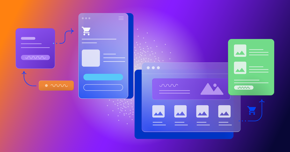
Understanding convergence
B2B and B2C ecommerce are two distinct models of online selling. B2B ecommerce is between businesses, such as wholesalers, distributors, and manufacturers. B2C ecommerce refers to transactions between businesses like retailers and consumer brands, directly to individual shoppers.
However, in recent years, the boundaries between these two models have started to fade. This is known as the convergence between B2B and B2C ecommerce and how they are becoming more similar and integrated.
Source: White Paper: The evolution of the B2B Consumer Buyer (ClientPoint, Jan 2024)
What’s driving this change?
Ever increasing customer expectations
Customers today expect the same level of convenience, speed, and personalization in their B2B transactions as they do in their B2C interactions. B2B buyers are increasingly influenced by their B2C experiences. They want research, compare, and purchase products online, seamlessly transitioning between devices and channels. They also prefer to research and purchase online, using multiple devices and channels.
Forrester, 68% of buyers prefer to research on their own, online . Customers today expect the same level of convenience, speed, and personalization in their B2B transactions as they do in their B2C interactions. B2B buyers are increasingly influenced by their B2C experiences. They want research, compare, and purchase products online, seamlessly transitioning between devices and channels. They also prefer to research and purchase online, using multiple devices and channels
Technology and omnichannel strategies
Technology enables B2B and B2C ecommerce platforms to offer more features and functionalities, such as mobile optimization, chatbots, AI, and augmented reality. Omnichannel strategies allow B2B and B2C ecommerce businesses to provide a seamless and consistent customer experience across different touchpoints, such as websites, social media, email, and physical stores.
However, with every great leap forward comes its own set of challenges. The convergence of B2B and B2C markets means increased competition. Businesses now not only have to compete with their traditional rivals, but also with new entrants and disruptors from different sectors. For example, Amazon Business, a B2B ecommerce platform, has become a major threat to many B2B ecommerce businesses, as it offers a wide range of products, low prices, and fast delivery
“Amazon Business has proven that B2B ecommerce can leverage popular B2C-like functionality” argues Joe Albrecht, CEO / Managing Partner, Xngage. . With features like Subscribe-and-Save (auto-replenishment), one-click buying, and curated assortments by job role or work location, they make it easy for B2B buyers to go to their website and never leave. Plus, with exceptional customer service and promotional incentives like Amazon Business Prime Days, they have created a reinforcing loyalty loop.
And yet, according to Barron’s, Amazon Business is only expected to capture 1.5% of the $5.7 Trillion addressable business market by 2025. If other B2B companies can truly become digital-first organizations, they can compete and win in this fragmented space, too.”
If other B2B companies can truly become digital-first organizations, they can also compete and win in this fragmented space
Joe AlbrechtCEO/Managing Partner, XNGAGE
Increasing complexity
Another challenge is the increased complexity and cost of managing a converging ecommerce business. Businesses have to deal with different customer segments, requirements, and expectations, which may require different strategies, processes, and systems. For instance, B2B ecommerce businesses may have to handle more complex transactions, such as bulk orders, contract negotiations, and invoicing, while B2C ecommerce businesses may have to handle more customer service, returns, and loyalty programs. Moreover, B2B and B2C ecommerce businesses must invest in technology and infrastructure to support their convergence efforts, which may increase their operational and maintenance costs.
How to win
Here are a few ways companies can get ahead of the game:
Adopt B2C-like features in B2B platforms
User-friendly design, easy navigation, product reviews, personalization, recommendations, and ratings can help B2B ecommerce businesses to attract and retain more customers, as well as to increase their conversion and retention rates.
According to McKinsey, ecommerce businesses that offer B2C-like features like personalization can increase their revenues by 15% and reduce their costs by 20%. You can do this through personalization of your website with tools like Product Recommendations that help suggest related products to increase sales.
Focus on personalization and customer experience
B2B and B2C ecommerce businesses need to understand their customers’ needs, preferences, and behaviors, and tailor their offerings and interactions accordingly. Personalization and customer experience can help B2B and B2C ecommerce businesses to increase customer satisfaction, loyalty, and advocacy, as well as to improve their brand reputation and competitive advantage. According to a Salesforce report, 88% of customers say that the experience a company provides is as important as its products or services.
Market based on customer insights
Data and analytics can help B2B and B2C ecommerce businesses to gain insights into their customers, markets, competitors, and performance, and to optimize their strategies and operations accordingly. Data and analytics can also help B2B and B2C ecommerce businesses to identify new opportunities, trends, and innovations, and to anticipate and respond to customer needs and expectations. According to McKinsey, data-driven organizations are 23 times more likely to acquire customers, six times more likely to retain customers, and 19 times more likely to be profitable.
What’s next?
The convergence of B2B and B2C ecommerce is not a temporary phenomenon, but a long-term trend that will continue to shape the future of ecommerce. According to Statista, the global B2B ecommerce market is expected to reach $20.9 trillion by 2027, surpassing the B2C ecommerce market, which is expected to reach $10.5 trillion by 2027. Moreover, the report predicts that the convergence of B2B and B2C ecommerce will create new business models, such as B2B2C, B2A (business to anyone), and C2B (consumer to business).
Therefore, B2B and B2C ecommerce businesses need to prepare for the converging ecommerce landscape and take advantage of the opportunities and challenges it presents. Here are some recommendations for B2B and B2C ecommerce businesses to navigate the converging landscape:
- Conduct a thorough analysis of your customers, competitors, and market, and identify the gaps and opportunities for convergence.
- Develop a clear vision and strategy for convergence, and align your goals, objectives, and metrics with it.
- Invest in technology and infrastructure that can support your convergence efforts, such as cloud, mobile, AI, and omnichannel platforms.
- Implement B2C-like features in your B2B platforms, and vice versa, to enhance your customer experience and satisfaction.
- Personalize your offerings and interactions with your customers, and provide them with relevant and valuable content and solutions.
- Leverage data and analytics to optimize your performance and decision making, and to innovate and differentiate your business.
- Collaborate and partner with other B2B and B2C ecommerce businesses, as well as with other stakeholders, such as suppliers, distributors, and customers, to create value and synergy.
- Monitor and evaluate your convergence efforts, and adapt and improve them as needed.
By following these recommendations, B2B and B2C ecommerce businesses can bridge the gap between their models and create a more integrated and seamless ecommerce experience for their customers and themselves.
MARKETING
Streamlining Processes for Increased Efficiency and Results

How can businesses succeed nowadays when technology rules? With competition getting tougher and customers changing their preferences often, it’s a challenge. But using marketing automation can help make things easier and get better results. And in the future, it’s going to be even more important for all kinds of businesses.
So, let’s discuss how businesses can leverage marketing automation to stay ahead and thrive.
Benefits of automation marketing automation to boost your efforts
First, let’s explore the benefits of marketing automation to supercharge your efforts:
Marketing automation simplifies repetitive tasks, saving time and effort.
With automated workflows, processes become more efficient, leading to better productivity. For instance, automation not only streamlines tasks like email campaigns but also optimizes website speed, ensuring a seamless user experience. A faster website not only enhances customer satisfaction but also positively impacts search engine rankings, driving more organic traffic and ultimately boosting conversions.
Automation allows for precise targeting, reaching the right audience with personalized messages.
With automated workflows, processes become more efficient, leading to better productivity. A great example of automated workflow is Pipedrive & WhatsApp Integration in which an automated welcome message pops up on their WhatsApp
within seconds once a potential customer expresses interest in your business.
Increases ROI
By optimizing campaigns and reducing manual labor, automation can significantly improve return on investment.
Leveraging automation enables businesses to scale their marketing efforts effectively, driving growth and success. Additionally, incorporating lead scoring into automated marketing processes can streamline the identification of high-potential prospects, further optimizing resource allocation and maximizing conversion rates.
Harnessing the power of marketing automation can revolutionize your marketing strategy, leading to increased efficiency, higher returns, and sustainable growth in today’s competitive market. So, why wait? Start automating your marketing efforts today and propel your business to new heights, moreover if you have just learned ways on how to create an online business
How marketing automation can simplify operations and increase efficiency
Understanding the Change
Marketing automation has evolved significantly over time, from basic email marketing campaigns to sophisticated platforms that can manage entire marketing strategies. This progress has been fueled by advances in technology, particularly artificial intelligence (AI) and machine learning, making automation smarter and more adaptable.
One of the main reasons for this shift is the vast amount of data available to marketers today. From understanding customer demographics to analyzing behavior, the sheer volume of data is staggering. Marketing automation platforms use this data to create highly personalized and targeted campaigns, allowing businesses to connect with their audience on a deeper level.
The Emergence of AI-Powered Automation
In the future, AI-powered automation will play an even bigger role in marketing strategies. AI algorithms can analyze huge amounts of data in real-time, helping marketers identify trends, predict consumer behavior, and optimize campaigns as they go. This agility and responsiveness are crucial in today’s fast-moving digital world, where opportunities come and go in the blink of an eye. For example, we’re witnessing the rise of AI-based tools from AI website builders, to AI logo generators and even more, showing that we’re competing with time and efficiency.
Combining AI-powered automation with WordPress management services streamlines marketing efforts, enabling quick adaptation to changing trends and efficient management of online presence.
Moreover, AI can take care of routine tasks like content creation, scheduling, and testing, giving marketers more time to focus on strategic activities. By automating these repetitive tasks, businesses can work more efficiently, leading to better outcomes. AI can create social media ads tailored to specific demographics and preferences, ensuring that the content resonates with the target audience. With the help of an AI ad maker tool, businesses can efficiently produce high-quality advertisements that drive engagement and conversions across various social media platforms.
Personalization on a Large Scale
Personalization has always been important in marketing, and automation is making it possible on a larger scale. By using AI and machine learning, marketers can create tailored experiences for each customer based on their preferences, behaviors, and past interactions with the brand.
This level of personalization not only boosts customer satisfaction but also increases engagement and loyalty. When consumers feel understood and valued, they are more likely to become loyal customers and brand advocates. As automation technology continues to evolve, we can expect personalization to become even more advanced, enabling businesses to forge deeper connections with their audience. As your company has tiny homes for sale California, personalized experiences will ensure each customer finds their perfect fit, fostering lasting connections.
Integration Across Channels
Another trend shaping the future of marketing automation is the integration of multiple channels into a cohesive strategy. Today’s consumers interact with brands across various touchpoints, from social media and email to websites and mobile apps. Marketing automation platforms that can seamlessly integrate these channels and deliver consistent messaging will have a competitive edge. When creating a comparison website it’s important to ensure that the platform effectively aggregates data from diverse sources and presents it in a user-friendly manner, empowering consumers to make informed decisions.
Omni-channel integration not only betters the customer experience but also provides marketers with a comprehensive view of the customer journey. By tracking interactions across channels, businesses can gain valuable insights into how consumers engage with their brand, allowing them to refine their marketing strategies for maximum impact. Lastly, integrating SEO services into omni-channel strategies boosts visibility and helps businesses better understand and engage with their customers across different platforms.
The Human Element
While automation offers many benefits, it’s crucial not to overlook the human aspect of marketing. Despite advances in AI and machine learning, there are still elements of marketing that require human creativity, empathy, and strategic thinking.
Successful marketing automation strikes a balance between technology and human expertise. By using automation to handle routine tasks and data analysis, marketers can focus on what they do best – storytelling, building relationships, and driving innovation.
Conclusion
The future of marketing automation looks promising, offering improved efficiency and results for businesses of all sizes.
As AI continues to advance and consumer expectations change, automation will play an increasingly vital role in keeping businesses competitive.
By embracing automation technologies, marketers can simplify processes, deliver more personalized experiences, and ultimately, achieve their business goals more effectively than ever before.
MARKETING
Will Google Buy HubSpot? | Content Marketing Institute
Google + HubSpot. Is it a thing?
This week, a flurry of news came down about Google’s consideration of purchasing HubSpot.
The prospect dismayed some. It delighted others.
But is it likely? Is it even possible? What would it mean for marketers? What does the consideration even mean for marketers?
Well, we asked CMI’s chief strategy advisor, Robert Rose, for his take. Watch this video or read on:
Why Alphabet may want HubSpot
Alphabet, the parent company of Google, apparently is contemplating the acquisition of inbound marketing giant HubSpot.
The potential price could be in the range of $30 billion to $40 billion. That would make Alphabet’s largest acquisition by far. The current deal holding that title happened in 2011 when it acquired Motorola Mobility for more than $12 billion. It later sold it to Lenovo for less than $3 billion.
If the HubSpot deal happens, it would not be in character with what the classic evil villain has been doing for the past 20 years.
At first glance, you might think the deal would make no sense. Why would Google want to spend three times as much as it’s ever spent to get into the inbound marketing — the CRM and marketing automation business?
At a second glance, it makes a ton of sense.
I don’t know if you’ve noticed, but I and others at CMI spend a lot of time discussing privacy, owned media, and the deprecation of the third-party cookie. I just talked about it two weeks ago. It’s really happening.
All that oxygen being sucked out of the ad tech space presents a compelling case that Alphabet should diversify from third-party data and classic surveillance-based marketing.
Yes, this potential acquisition is about data. HubSpot would give Alphabet the keys to the kingdom of 205,000 business customers — and their customers’ data that almost certainly numbers in the tens of millions. Alphabet would also gain access to the content, marketing, and sales information those customers consumed.
Conversely, the deal would provide an immediate tip of the spear for HubSpot clients to create more targeted programs in the Alphabet ecosystem and upload their data to drive even more personalized experiences on their own properties and connect them to the Google Workspace infrastructure.
When you add in the idea of Gemini, you can start to see how Google might monetize its generative AI tool beyond figuring out how to use it on ads on search results pages.
What acquisition could mean for HubSpot customers
I may be stretching here but imagine this world. As a Hubspoogle customer, you can access an interface that prioritizes your owned media data (e.g., your website, your e-commerce catalog, blog) when Google’s Gemini answers a question).
Recent reports also say Google may put up a paywall around the new premium features of its artificial intelligence-powered Search Generative Experience. Imagine this as the new gating for marketing. In other words, users can subscribe to Google’s AI for free, but Hubspoogle customers can access that data and use it to create targeted offers.
The acquisition of HubSpot would immediately make Google Workspace a more robust competitor to Microsoft 365 Office for small- and medium-sized businesses as they would receive the ADDED capability of inbound marketing.
But in the world of rented land where Google is the landlord, the government will take notice of the acquisition. But — and it’s a big but, I cannot lie (yes, I just did that). The big but is whether this acquisition dance can happen without going afoul of regulatory issues.
Some analysts say it should be no problem. Others say, “Yeah, it wouldn’t go.” Either way, would anybody touch it in an election year? That’s a whole other story.
What marketers should realize
So, what’s my takeaway?
It’s a remote chance that Google will jump on this hard, but stranger things have happened. It would be an exciting disruption in the market.
The sure bet is this. The acquisition conversation — as if you needed more data points — says getting good at owned media to attract and build audiences and using that first-party data to provide better communication and collaboration with your customers are a must.
It’s just a matter of time until Google makes a move. They might just be testing the waters now, but they will move here. But no matter what they do, if you have your customer data house in order, you’ll be primed for success.
HANDPICKED RELATED CONTENT:
Cover image by Joseph Kalinowski/Content Marketing Institute
-

 MARKETING7 days ago
Roundel Media Studio: What to Expect From Target’s New Self-Service Platform
-

 SEO6 days ago
Google Limits News Links In California Over Proposed ‘Link Tax’ Law
-
SEARCHENGINES6 days ago
Daily Search Forum Recap: April 12, 2024
-

 SEO5 days ago
10 Paid Search & PPC Planning Best Practices
-

 SEARCHENGINES5 days ago
Google Core Update Volatility, Helpful Content Update Gone, Dangerous Google Search Results & Google Ads Confusion
-
 SEO7 days ago
Google Unplugs “Notes on Search” Experiment
-

 MARKETING6 days ago
2 Ways to Take Back the Power in Your Business: Part 2
-

 MARKETING4 days ago
5 Psychological Tactics to Write Better Emails

![22 of the Best Examples of Beautiful Blog Design Download Now: How to Start a Successful Blog [Free Guide]](https://articles.entireweb.com/wp-content/uploads/2023/04/22-of-the-Best-Examples-of-Beautiful-Blog-Design.png)


