SEO
11 Ways to Improve E-commerce Category Pages for SEO
If you’ve been doing SEO for a while, you’ll understand what I mean when I say category pages are a common area SEO and UX experts disagree on.
And this is for one key reason: SEOs tend to want to add more content and links, and UX experts want to prioritize clicks to products.
However, there is a middle ground where we can retain the commercial nature of categories and include content to help users make their purchase decision.
Throughout this guide, I’ll show how to improve your e-commerce category pages for SEO while ensuring the user remains at the core of your decisions.
The importance of great categories cannot be understated.
They’re the site area where you’ll often capture “The Fat Head” and “The Chunky Middle” of search queries—the high-volume, less-specific queries that most bosses/clients want to rank for.

That’s not to say categories can’t target long-tail keywords. But unless you have a lot of SKUs, sites often target the long-tail with product pages.
In addition to categories being essential for capturing traffic from high-volume terms, they also help:
- Users discover your products when navigating your site.
- You effectively distribute PageRank to important subcategories and products via your internal linking.
- Users and search engines understand your information architecture (IA), i.e., how you’ve organized your content.
Before we move on with some tips, I’ll introduce the two types of category pages you’ll find on e-commerce stores:
- Category listing pages (CLP) – Categories that predominantly list categories.
- Product listing pages (PLP) – Categories that predominantly list products.
You’ll see CLPs across many popular e-commerce stores, and they’re often found in categories higher up within a site’s hierarchy.
For example, here is a CLP on ASOS:

And here is ASOS’ PLP:

So why is understanding the difference between CLPs and PLPs significant?
CLPs target very broad topics. A site is unlikely to service the user’s requirements by displaying one product type. For example, on ASOS’ men’s clothing CLP, it doesn’t know the specific type of men’s clothing a user wants to see, so it links to a mixture of different types of products.
CLPs exist to help users navigate to a more specific page. Sites do this, as they won’t be sure specifically what the user wants yet—so they show them a selection of all relevant product types.
With PLPs, on the other hand, sites know what a user wants. If a user searches for “men’s black boots,” the intent is clear—so they show them black boots.
While we should still help users navigate to a more specific category (if possible), we know showing a list of black boots for them to purchase will fulfill their requirements.
Your typical category page is simple and looks like the PLPs I’ve just described. They’ll likely have:
- An H1.
- A section under the H1 with some intro copy.
- A list of products, likely with pagination.
- Faceted navigation to help users filter the products.
However, there are far more elements you can include to help users and SEO on both PLPs and CLPs.
Here’s a mockup of the critical elements you should consider for both types of categories that both users and search engines will love.

I’ll now expand on the above points throughout the rest of the article to help you improve your category pages.
In this scenario, helpful content will help the user make a purchasing decision.
If you have an “engagement ring” category, writing about the history of engagement rings isn’t helpful.
Valuable supplementary content in this scenario will be answering questions like:
- How have you sourced your diamonds/metals?
- Are your diamonds lab-grown or natural?
- Why did you select these? Metals available? What makes yours better?
- What’s the most popular style?
You can briefly answer key pain points below the H1, usually in around 30–60 words. But then you can also add further information lower down the page, either in a generic content block or an FAQ section.

Not only is this useful for a user, but it also helps you rank.
In an interview with Marie Haynes, Google Search Advocate John Mueller said:
When the ecommerce category pages don’t have any other content at all, other than links to the products, then it’s really hard for us to rank those pages.
Google needs some content to understand the page’s content, and users who don’t know your brand need something to help them decide whether you’re the best choice.
So we know valuable content helps. However, this is sometimes taken to the extreme, resulting in a large amount of content that nobody will read below the fold.
One of the worst offenders is eBay, with many pages including over 1,000 words of text placed at the bottom of the category.

In the same interview, John said this about that practice.
I’m not saying all of that text at the bottom of your page is bad, but maybe 90%, 95% of that text is unnecessary. But some amount of text is useful to have on a page so that we can understand what this page is about.
So it’s likely not helping. But is it harming? The answer is likely—yes.
Our algorithms sometimes get confused when they have a list of products on top and essentially a giant article on the bottom when our algorithms have to figure out the intent of this page.
Still not convinced about removing the content?
Here’s a case study.
At the end of June 2021, I finished a four-week rollout of new category page content.
I updated 191 pages with 70 words of content above the fold. Previously, up to 800 words were above the fold, hidden by a “read more” toggle.
Here’s the traffic for the following weeks (“A” marks the point the rollout finished):

Here are some snapshots of the ranking for key terms on the top traffic pages. Each of these moved from 800 words to around 70 words (they previously were instructed more content equals better, so they added more content to their top pages).

Here’s the fifth-largest, non-brand query:

And here’s the sixth-largest, non-brand query:

And the long-term impact?
The site has been steadily growing.

There is never one single reason for SEO growth—but this change certainly did no harm.
As always, do your own testing. But my experience and comments from John have shown that filler content on categories doesn’t help.
To summarize category content:
- Answer questions that help users make purchase decisions
- Answer questions succinctly
- Don’t stuff content
Most e-commerce solutions provide a way for you to set parent/child relationships between categories.
Here’s an example of that functionality for a WooCommerce product category:

Organizing your categories into a logical hierarchy results in your site outputting breadcrumbs correctly; here is an example on my SEO Toolbelt resource:

Breadcrumbs help users by indicating where they are on your site, and they aid SEO by distributing PageRank to the categories within the breadcrumbs.
They also help Google, as it uses internal links to understand site structure.
We do use the internal links to better understand the structure of a page.
However, breadcrumbs are something a lot of UX professionals are reluctant to introduce, usually because they:
- Take up lots of room.
- Tend to be quite ugly.
- Promote users to navigate to categories rather than products where they’ll convert.
The good news is that breadcrumb placement doesn’t matter for SEO.
I’m always cautious about introducing breadcrumbs, as experience has shown UX experts are right. Whenever I’ve clients run an A/B test, breadcrumbs have negatively impacted conversion rates.
However, the workaround is simple: move breadcrumbs lower down the page.
On both CLP and PLP pages, you should ensure you’re linking to other relevant categories the user may find helpful. On e-commerce sites, I advocate for a mixture of automated internal linking and manually placed links.
Automate links to parent/child categories
For large e-commerce stores, without automation, managing links will be an admin nightmare.
Take GetYourGuide, for example. On its “things to do” on the U.S. page, it has a block of internal links lower down the page to different regions in the U.S.

If we head to Colorado, scroll down to the same area. Now, it displays cities.

Once you go to Boulder, you’ll see links to activity categories.

It most undoubtedly automates these links.
How? The site understands the parent/child relationship between categories. That’s how it can also display static breadcrumbs above the footer.

It’ll be dynamically querying a database for the child pages of the current page and then displaying those to users.

The reason why this is so useful is that:
- You know you won’t get orphan categories due to a human error.
- If you create a new subcategory and set the parent category, the parent category will link to the subcategory automatically.
- Your internal links will always indicate your site structure, e.g., Google will understand that Louisiana is a subcategory of the U.S. category, as you link to Louisiana on your U.S. page.
Another considerable benefit is that you’ll automatically create a pyramid site structure, where broader pages link to more specific ones.

We know this helps Google understand site structure, as confirmed by John.
The top-down approach or pyramid structure helps us a lot more to understand the context of individual pages within the site.
Automate links to similar categories
Similar to the above, you’ll also want to link similar categories. You can automate this, but it doesn’t suit every site.
Back to the Boulder page on GetYourGuide, it also links to other popular cities.

For these links, it will be querying a database, getting the parent category of the current page, and then listing the parents’ child pages.

Subcategories of the parent are likely relevant to the current page, which will help users find other pertinent categories and help SEO by sharing PageRank between them.
Manually link popular categories
You’ll now have a good baseline for internal linking. But it’s also essential to take editorial control of links, especially on CLP pages.
Sometimes, you can have a high search opportunity page deep within the site hierarchy, so relying on parent categories linking to child categories can result in “high opportunity” categories being too deep.
Therefore, you must also ensure you manually add links to popular/important categories to pages closer to the homepage, such as your CLP pages.

A fundamental purpose of categories is to link to products, but there are a few nuances on how to do this best.
Link to popular products
For larger stores, prioritizing linking to popular products is often better than linking to all products with pagination.
Take Sports Direct in the U.K., for example. On its broad CLP pages, rather than linking lots of products, it includes links to only its best sellers.

This is helpful for users and also consolidates PageRank into those URLs, improving how well they rank.

Doing this is a much better option than linking to more products (but ones that are less popular), which results in the popular traffic-driving products receiving less PageRank and ranking worse.

Consider view-all pages
While you should aim to link to popular products for pages higher up in your category hierarchy, as you get deeper into the site, users tend to want to see as many products as possible.
Often, the best way to achieve this is by using view-all pages, which is something Google found users prefer (albeit back in 2011).

The main caveat with a view-all page is that users want fast load times (as mentioned in Google’s view-all article), and Core Web Vitals can impact rankings.

If you’re going to implement view-all pages, consider that it will cause PageRank to be diluted between all the pages you link to from that category.
Don’t go overboard with pagination
You don’t need to show all your products within your pagination.
Instead, link to more specific variants of the current category, especially if you can match that to search demand (more on that shortly).
For example, on ASOS, its “women’s dresses” category has 176 pagination component pages.

Every time it links to a “women’s dress” component page, it dilutes PageRank. This effectively causes ASOS to lose some PageRank to deep component pages that are very unlikely to rank.
Rather than linking to 176 component URLs, it could limit the pagination and consolidate PageRank into other more specific categories by linking to them instead.
Generally, this will also be beneficial for UX.
If a user reaches page #20 of your pagination, you likely need to help them refine what they’re looking for—maybe by linking to “women’s dress” categories by type or color—as suggested by John.
When creating your pagination strategy, you should consider whether sequential linking like ASOS or linking to multiple component pages is the better choice.
Sequential linking causes the first set of component pages to have stronger signals, which will result in the product pages they link to also having stronger signals, as confirmed by John.
If you link sequentially, what will generally happen is the first page of your site will have a lot stronger signals in the sense that your main content links to the first page, and then it kind of like incrementally drops and drops and drops as it goes through the pagination set.
Therefore, if you want ranking signals to be spread across all products in a category, link to more component pages. If you want to consolidate signals into products earlier within pagination, link to fewer.
Aren’t sure which approach you should take? Do some testing!
A well-known tactic to improve your categories is to create long-tail, more specific variations of broader categories.
Here’s my favorite way of doing that using Ahrefs’ Keywords Explorer.
First, enter the query a broader category is targeting, e.g., “engagement rings,” and search for it in the tool.

Next, head to the Matching terms report.

In the second left sidebar that now appears, click “Parent Topics.” This will group keywords with similar search results into the highest volume keyword.

We’ve now discovered many long-tail variants of our “engagement rings” pages that we can create on our site.
By creating pages targeting these queries and better covering the topic area of “engagement rings,” we’ll rank better for broad queries within that topic.
SEOs often refer to this as “topic expertise”—and we did not make this up.
John confirmed it’s part of Google’s algorithms.
It’s something where if we can recognize that this website is really good for this broader topic area, then if someone is searching for that broader topic area, we can try to show that website as well. We don’t have to purely focus on individual pages, but we’ll say oh, like, it looks like you’re looking for a new laptop like this website has a lot of information on various facets around laptops.
Want to know more? Read Ahrefs CMO Tim Soulo’s guide on the long-tail keyword strategy.
A critical element that can go wrong on category pages is how you deal with faceted navigation (often referred to as “filters”).
Here’s an example of one on the Nike store:

I recommend reading my faceted navigation guide for all the details, but the primary SEO considerations are to:
- Restrict crawling – Do ensure you prevent Google from crawling all facet links (as there can be millions of potential combinations, wasting your crawl budget).
- Prevent indexing of low-value facets – If you don’t, Google can index hundreds of thousands to millions of essentially duplicate pages that aren’t useful for search.
If you’re going for an ideal implementation, you’re going to want to:
- Apply facets client-side with AJAX, and don’t include
<a href>links. - Provide alternate crawl paths to important facets you want to be indexed.
This topic is undoubtedly a technical one—and one you’ll want to get right. So I recommend you read my guide so you don’t just prevent SEO issues with facets but take advantage of the benefits.
Data from Reevoo suggests positive reviews result in an 18% uplift in revenue on average—so they’re pretty important.
Many sites restrict reviews to product pages, but they’re also great to include in categories.
Fanatical is a great example, an e-commerce store selling Steam Keys for PC games.

It includes recommendations from other gamers throughout its categories.
This adds unique content to categories and helps users find well-reviewed games. Crucially, well-reviewed games (which are more likely to convert) get more PageRank and rank better.
As mentioned, one element often missed in categories is that you should provide content to help users make a purchasing decision.
While adding written content to the page helps, it isn’t meant to be overly detailed. This is why you should also link to in-depth guides.
Take Sephora, for example. Its CLPs have links to guides to help users decide on a product.

For SEO, this also helps the blog posts rank, as they’ll receive more PageRank. Also, it helps Google better understand your topic expertise, as you have lots of interlinked content.
There is plenty of advice on URL structure already available, but the main element to consider is to pick a format you won’t need to change.
John stated that URLs are identifiers for content.
For the most part, we treat URLs as identifiers of content.
Changing URLs (and redirecting them) is often deemed risky activity—you can’t be sure how long it’ll take Google to consolidate signals into the new URL.
Therefore, it’s best not to change URLs unless you have a good reason (like you’re rebranding).
Preventing URL changes for categories comes down to keeping them simple and pre-planning.
For example, you may tell your developers to structure URLs based on the parent/child relationships between categories:
www.example.com/mens/www.example.com/mens/trainers/www.example.com/mens/trainers/white/
But what happens if you change your site hierarchy?
Say the business starts selling boots. You’ll likely want to introduce a “Shoes” category into the hierarchy as the parent of the “Trainers” page and the new “Boots” page.
Your URLs will now change to be:
www.example.com/mens/www.example.com/mens/shoes/www.example.com/mens/shoes/trainers/www.example.com/mens/shoes/trainers/white/www.example.com/mens/shoes/boots/
We’ve now just caused redirects for the “Trainer” URL and any subcategories it had.
Herein lies the issues with hierarchical structured URLs.
But what’s the solution?
Keep them as simple as possible to reduce the need for changes.
Here’s an example: If for the “white trainers” URL above, we instruct developers to take the very top-level category (which is less likely to change) and then include the last category, the URL will be this: www.example.com/mens/white-trainers/
Now, if any of the parent categories of the white trainer’s category change, it won’t impact the URL but will still affect the breadcrumbs.
But wouldn’t it be better to remove the structure and have a flat URL like this: www.example.com/mens-white-trainers/?
My personal experience here is that structured URLs impact rankings, despite what Google said on the topic.
Here’s a recent example:

This uplift only impacted the changed URLs. We altered nothing else but saw an immediate impact.
Test this yourself. But also, as I’ve mentioned, changing URLs is risky.
Thankfully, for my above example, we didn’t need to change too many URLs, and the revenue risk to the business wasn’t significant vs. the reward I’d had doing this for other clients.
I’m not writing a keyword research article, and you need to start there before you decide on H1s and title tags. But the advice here is that you should use H1s and title tags on your site that match the language users use to find your product.
For both H1s and title tags, you should test and learn what works best for your site. But there are some general guides and things you can try out.
Use templates
Generally, you will want to have a templated title tag structure that closely matches your H1.
Why?
Ahrefs data shows Google will rewrite your title tag in 33.4% of cases after changing how it created page titles in August 2021.

When Google rewrites your title tag, Ahrefs data shows Google will change it to your H1 tag 50.76% of the time.

The best way to ensure you have a title tag that Google won’t rewrite is by templating it so it is generated based on your page’s H1.
Here’s an example: [Page H1] – [Brand Name].
You may want to add some variety to the page title, but what works best comes down to testing.
Test, test, test
There are many different tests you can run to see what works best for you; here are some examples:
- Use dashes (-) over pipes (|)
- Include a price – [Page H1] starting from X – [Brand name]
- Add “Buy” at the start of your title tag – Buy [Page H1] – [Brand name]
- Add secondary keywords – [Page H1] – [Secondary Keyword] – [Brand Name]
You’ll also want to consider how templates may vary by length. Google is 57% more likely to rewrite titles over 600 px.

According to Google, long titles are also a reason why it’ll rewrite the ones you add to your pages.

I’ve tackled this before by individually customizing a template for a long category name or using different templates—depending on the length of the generated title tag.
You can add multiple structured data types to your category pages to help Google better understand your content and acquire rich results.
The main applicable types Google recommends in its search gallery are:
Adding these will directly impact your SERP snippet.
For FAQs, it enhances them by displaying the FAQs on the SERPs, which is the strategy Trip Advisor takes.

For breadcrumb structured data, Google shows the breadcrumbs on the SERPs. Here’s an example of Google doing that for Currys in the U.K.

You can see the structured data it’s added in the Schema Markup validator:

Outside of those two types, Google has no recommendations for product category structured data.
But you don’t have to stop there.
On a “Search Off the Record” podcast, Ryan Levering (staff software engineer working on structured data at Google) answered whether structured data beyond what Google recommends is valuable (like what you can find on schema.org).
So it’s hard to convey that in some of our reporting and stuff that we actually find this [structured data] useful because it’s a nuanced calculation.
But when there is problems detecting it [what the page’s content is about], we can use it as an extra signal.
So it’s usually on the edge cases where we find that stuff useful.
While adding further structured data should be a secondary focus, I tend to take the approach of leaving as little for Google to figure out as possible.
The two main additional things I’d consider adding are:
In addition, you can also add mainEntity to CollectionPage and add the ItemList within that. By doing this, you tell Google the main part of the page is the list of products, helping it better understand that this is a category page.
Here’s a simple example of what that can look like:
{
"@context": "http://schema.org",
"@type": "CollectionPage",
"mainEntity": {
"@type": "ItemList",
"numberOfItems": "[number of products]",
"itemListElement": [
{
"@type": "ListItem",
"position": 1,
"url": "[Item URL]",
"name": "[Item Name]"
},
{
"@type": "ListItem",
"position": 2,
"url": "[Item URL]",
"name": "[Item Name]"
},
{
"@type": "ListItem",
"position": 3,
"url": "[Item URL]",
"name": "[Item Name]"
}
]
}
}
PRO TIP
For reviews, Google mentions explicitly in the technical guidelines not to add review markup if the main content is a category listing items.

It provides the same instruction for product structured data.

Final thoughts
There’s a lot to consider to make excellent category pages for SEO. But hopefully, this guide has made that process more painless.
Got a question about optimizing e-commerce categories? Tweet me.
SEO
25 WordPress Alternatives Best For SEO

WordPress powers hundreds of millions of websites, but it is not the only content management system (CMS) option.
There’s a diverse marketplace of publishing platforms for those seeking alternatives. This review provides an overview of 25 leading alternatives to WordPress across key website categories.
We explore user-friendly website builders like Wix, Squarespace, and Weebly, which offer drag-and-drop simplicity. We look at flexible open-source options for developers and tech-savvy users, including Joomla, Drupal, and Hugo.
Ecommerce merchants can choose between hosted platforms like Shopify or open-source solutions like Magento. We also cover blogging-focused options like Ghost and Tumblr, web hosting providers like Bluehost, and community management tools like vBulletin.
For each alternative, we summarize the key features, benefits, and drawbacks to consider. Factors like budget, technical abilities, and website goals are examined to help identify the best fit based on individual needs.
While WordPress powers a large share of sites, there’s no shortage of quality options for creating the perfect online presence for those seeking alternatives.
Why Consider A WordPress Alternative?
There are several reasons why someone might consider a WordPress alternative for their website:
- Specific needs: While WordPress is versatile, some websites may have particular requirements for which other platforms are better suited.
- Ease of use: Some users may find WordPress challenging, especially if they lack technical skills.
- Maintenance and security: As an open-source platform, WordPress requires users to handle updates, backups, and security measures themselves.
- Built-in features: Some alternatives come with built-in features that WordPress requires plugins for.
- Customization: While WordPress offers many customization options, some users may prefer platforms that allow more granular control over the website’s appearance and functionality.
- Simplicity: Other publishing platforms might be a better fit for users who want a simple platform to publish content without dealing with the complexities of managing a website.
How To Choose An Alternative To WordPress
Choosing the right WordPress alternative depends on your specific needs and goals. To help you make an informed decision, consider the following factors:
- Purpose of your website: Determine its primary purpose. Is it a blog, an online store, a portfolio, or a complex business website?
- Budget: Consider your budget for building and maintaining your website. Some alternatives are free, while others require a subscription or a one-time payment.
- Technical skills: Assess your technical skills and those of your team. Some alternatives are designed for users with little coding experience, while others may require more technical knowledge.
- Customization and flexibility: Evaluate how much control you want over your website’s appearance and functionality.
- Scalability: Consider your website’s potential for growth. If you anticipate a significant increase in traffic or content, choose a platform that can scale with your needs.
- Support and community: Look into the level of support and the size of the community surrounding each alternative.
- Hosting: Decide whether you prefer a self-hosted solution or a hosted platform.
- Features: List the features your website requires. Ensure that your alternative offers these features natively or through extensions.
Once you’ve considered these factors, research various WordPress alternatives and compare them based on your requirements.
Read reviews, explore user communities, and, if possible, test out the platforms through free trials or demos.
This will help you better understand how each alternative works and whether it aligns with your needs and expectations.
25 Best WordPress Alternatives
1. Wix
Wix is best suited for individuals, small businesses, and entrepreneurs who want to create a professional-looking website without extensive technical skills or a large budget.
The platform’s user-friendly drag-and-drop interface makes it easy for users to design and customize their websites, offering various templates and design elements suitable for multiple purposes.
As a hosted platform, Wix takes care of technical aspects like server maintenance and security updates, making it ideal for those who don’t want to deal with these issues.
Wix also offers a free plan, allowing users to create a website without cost, although with limitations such as Wix branding and a non-custom domain.
One nuance to remember when using Wix is that once you’ve chosen a template and started building your site, it can be challenging to switch to a different template without redesigning your content.
Key Features:
- Full hosting solution.
- No software to self-install.
- Drag-and-drop visual builder.
- Extensions are available.
- Optimized for mobile.
- Blog module.
- Ecommerce store.
- Social media tools.
Pros:
- All-in-one website builder and platform.
- Free version available.
- Premade designs and templates.
- Free subdomain available for all plans.
- Free custom domain available with paid plans.
- Customer support.
Cons:
- There is no option to retain complete control of your site as you can with WordPress.
- No access to source code.
2. Squarespace
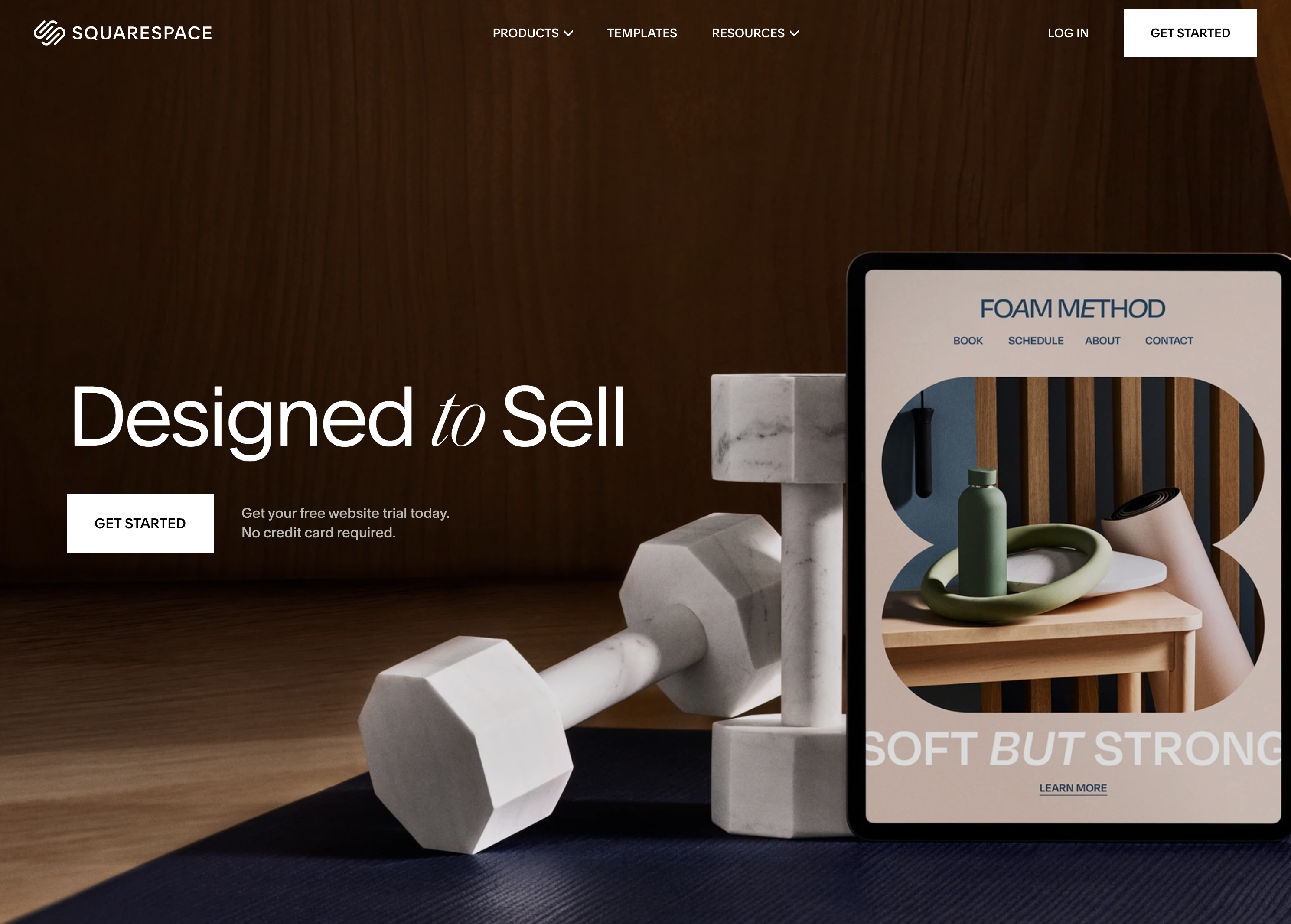 Screenshot from: squarespace.com, March 2024.
Squarespace is best suited for creatives, bloggers, and small business owners who want to create visually stunning websites with minimal technical knowledge.
The platform is known for its sleek, modern templates, which showcase content beautifully and are optimized for mobile devices.
As an all-in-one platform, Squarespace includes hosting, domain registration, and various tools for managing your website.
While Squarespace offers a high degree of customization, it may not be as flexible as some alternatives. The platform has a specific structure and set of features, which can be limiting for those who require advanced functionality or integrations.
Nonetheless, for most users, Squarespace’s built-in features and integrations are more than sufficient.
One tip for getting the most out of Squarespace is to use its built-in SEO and marketing tools, such as custom meta descriptions, alt tags, and automatic sitemaps.
Key Features:
- Complete hosting solution (including video).
- No software to self-install.
- Drag-and-drop visual builder.
- Extensions are available.
- Optimized for mobile.
- Blog module.
- Ecommerce store.
- Social media tools.
Pros:
- All-in-one website builder and platform.
- Free version available.
- Premade designs and templates.
- Free subdomain available for all plans.
- Free custom domain available with an annual subscription.
- Customer support.
Cons:
- There is no option to retain complete control of your site as you can with WordPress.
- No custom coding.
- No access to source code.
- No third-party extensions.
3. Weebly
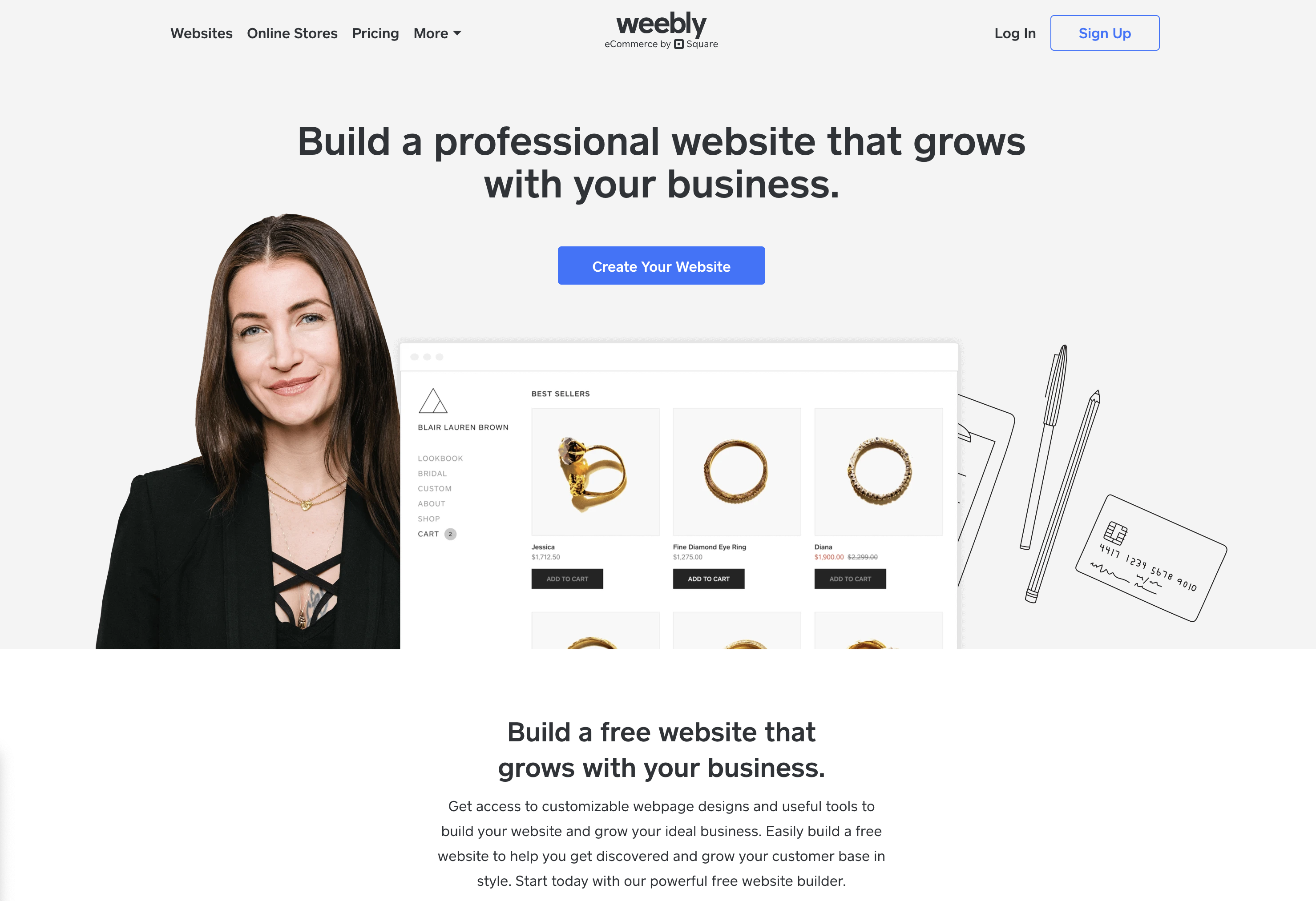 Screenshot from: weebly.com, March 2024.
Weebly is best suited for individuals, small businesses, and entrepreneurs who want to create a simple, functional website without investing much time or money.
The platform’s drag-and-drop interface and intuitive editor make it beginner-friendly and easy to use, even for those without website-building experience.
However, it may not be as powerful or flexible as other alternatives, with a limited set of features and integrations that can be restrictive for those requiring advanced functionality or custom solutions.
One tip for getting the most out of Weebly is to explore its app center, which offers a range of third-party apps and integrations to extend your website’s functionality, including tools for marketing, social media, and ecommerce.
Key Features:
- Full hosting solution.
- No software to self-install.
- Drag-and-drop visual builder.
- Extensions are available.
- Optimized for mobile.
- Blog module.
- Ecommerce store.
- Social media tools.
Pros:
- All-in-one website builder and platform.
- Free version available.
- Premade designs and templates.
- Free subdomain available.
- Inexpensive premium plans are as low as $6.00 per month.
- Free custom domain available with premium plans.
- Customer support.
Cons:
- No option to retain complete control of your site as you can with WordPress.
- No access to source code.
- The free version restricts you to a maximum of five pages.
4. Google Sites
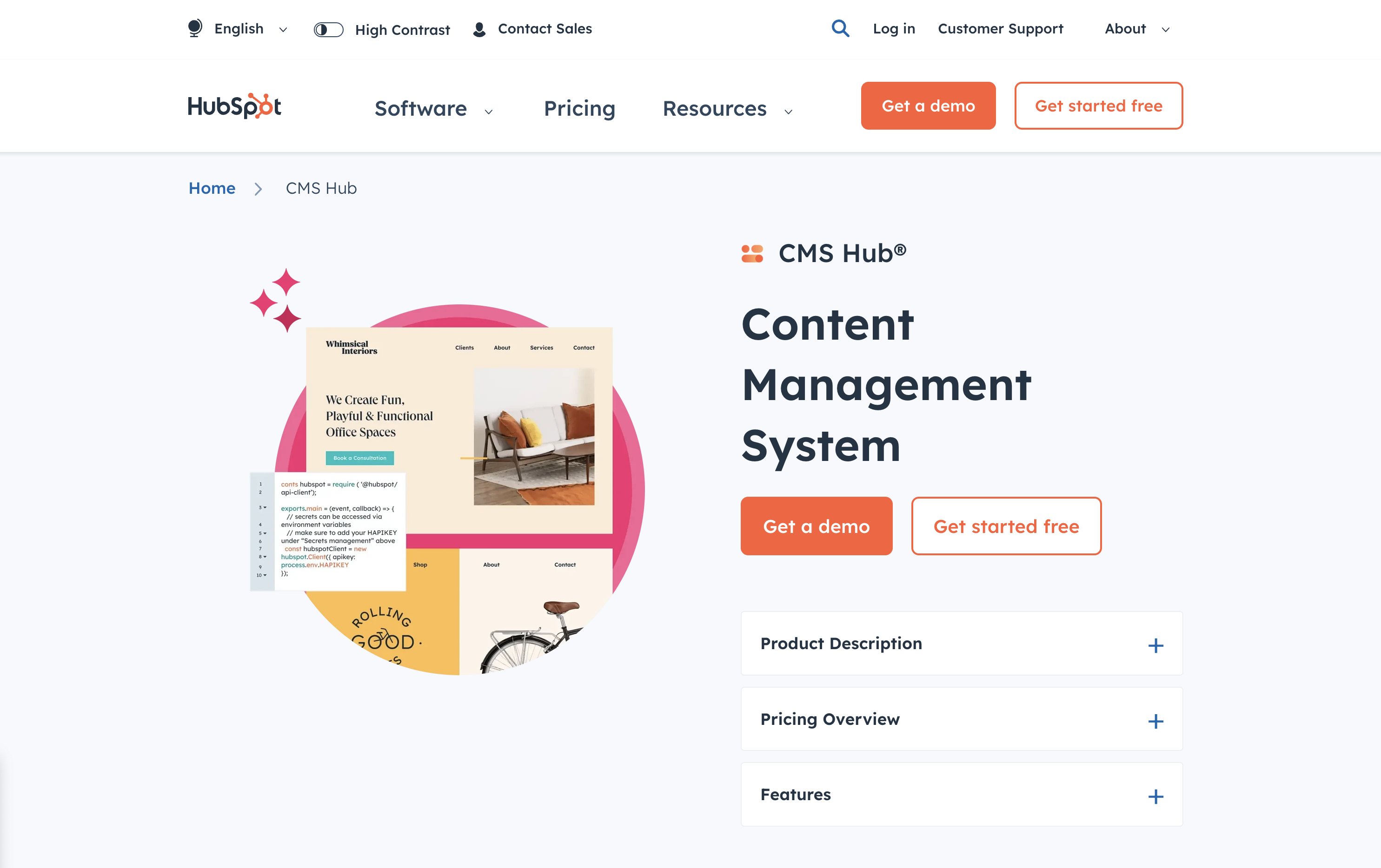 Screenshot from: workspace.google.com/intl/en_ph/lp/sites/, March 2024.
Google Sites is best suited for individuals, educators, and small businesses who need a simple, easy-to-use platform for creating basic websites or intranets. Its seamless integration with other Google tools, like Google Docs, Sheets, and Drive, makes it an excellent choice for those familiar with and heavily using these tools.
Google Sites also offers collaboration features, allowing multiple users to work on the same website simultaneously, making it ideal for team projects or class websites.
However, it’s a relatively basic website builder compared to other alternatives, with limited features and customization options. It may not be the best choice for those needing advanced functionality or design flexibility.
Additionally, it lacks built-in ecommerce features, making it less suitable for online stores.
One tip for getting the most out of Google Sites is leveraging its integration with other Google tools, such as embedding Google Docs, Sheets, or Slides into your web pages or using Google Forms to collect visitor data.
Key Features:
- The creator has complete control over page access and permissions.
- Tools can be accessed anywhere.
- It can be used as a basic project management program.
- Plenty of web development and deployment options.
- Real-time editing.
- Uses website speed optimization tools to minimize loading times.
Pros:
- Fast to get started and easy to use.
- Free to use.
- Integrated with other Google products.
Cons:
- Limited functionality compared to other website builders.
- It may not work with non-Google apps.
- Limited customization options.
- No SEO tools, and you can’t edit metadata.
- It cannot integrate Facebook pixels.
5. Jekyll
 Screenshot from: jekyllrb.com, March 2024.
Jekyll is best suited for developers, bloggers, and tech-savvy individuals who prefer a lightweight, flexible website creation platform. It’s particularly popular among the GitHub community, as it can be easily integrated with GitHub Pages for free hosting.
Jekyll requires specific technical knowledge, as users must be comfortable working with the command line and writing code. While Jekyll offers plugins and themes to extend its functionality, users may need to rely on their coding skills to customize their website fully.
One tip for getting the most out of Jekyll is to utilize its built-in blogging features, which offer a simple, intuitive way to create and manage blog posts using Markdown.
Another nuance to remember is that Jekyll generates static pages that may not be the best choice for websites requiring frequent updates or complex functionality.
Key Features:
- No programming is involved.
- SEO is built-in.
- GitHub manages redirects.
- Easy setup of custom domains.
Pros:
- No server maintenance.
- Very fast.
- Secure.
- Free hosting.
- Free SSL certificate.
- Works with GitHub as CMS.
Cons:
- It can’t create contact forms.
- No dynamic content options.
- Posts cannot be scheduled.
- Does not include image manipulation functionality.
6. Hugo
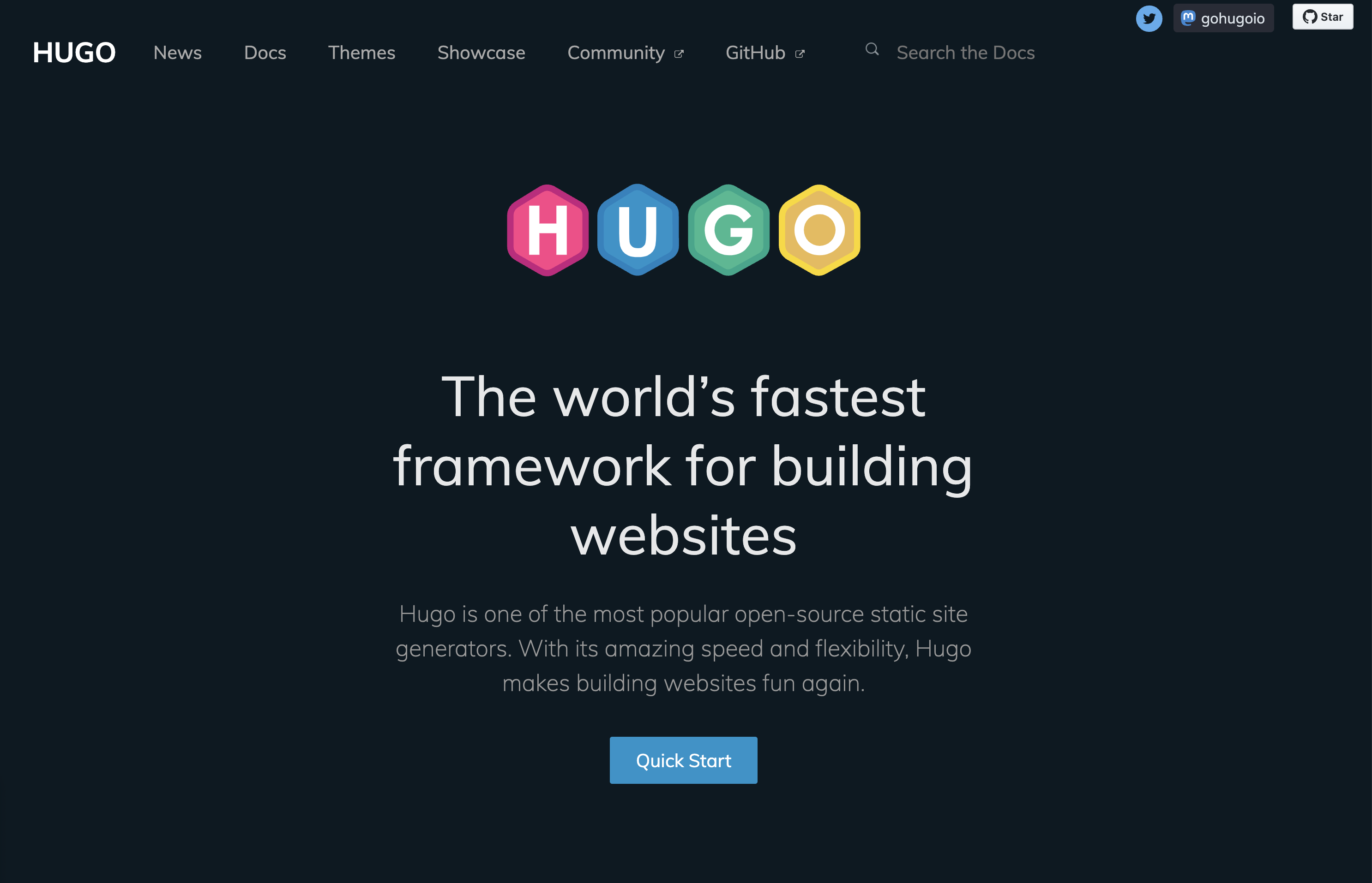 Screenshot from: gohugo.io, March 2024.
Hugo is best suited for developers, bloggers, and content creators who value speed, flexibility, and simplicity. Its lightning-fast build times and static page generation make it ideal for those who frequently update their site or publish new content regularly.
While Hugo offers themes and templates to help users get started, creating a unique design may require coding skills.
One tip for getting the most out of Hugo is to leverage its built-in shortcodes, which allow users to easily add complex functionality to their web pages without writing extensive code.
Another nuance to remember is that, as a static site generator, Hugo may not be the best choice for websites that require dynamic features like user authentication or real-time data updates.
Key Features:
- Can build most websites in seconds.
- Cross-platform with easy installation.
- Allows you to host your site anywhere.
- Customizable URLs.
- “Minutes to Read” and “WordCount” functionality.
- Integrated Google Analytics and Disqus comment support.
Pros:
- It easily integrates with Google Calendar and other apps.
- Easy to use with responsive customer service.
- Multilingual capabilities are built-in.
- Extendable as needed.
Cons:
- It can’t create one-off tasks.
- It can be confusing upon initial use, particularly in templating syntax.
- No plugins are available.
- Limited text formatting features.
7. Webflow
 Screenshot from: webflow.com, March 2024.
Webflow is best suited for freelance designers and small agencies who want complete control over their website’s design without worrying about hosting, security, or performance.
One nuance of Webflow is that extending a site’s functionality is not as straightforward as installing a plugin like WordPress.
Users must either set up integrations between their Webflow site and other platforms using third-party tools like Zapier, or they can embed custom code blocks on pages to add features.
A key aspect to note about Webflow is its pricing structure. Building a site is completely free, and users only need to purchase a site plan and custom domain when they are ready to launch.
This makes it an attractive option for freelancers and small teams who want to design and prototype sites without upfront costs, paying only when they are ready to go live.
Key Features:
- More than 100 templates to choose from.
- Design is prioritized, with animation, interaction, and parallax scrolling options.
- Offers automatically generated sitemaps and customizable 301 redirects.
- Multiple payment options for ecommerce sites and automatic tax calculation.
Pros:
- Affordable plans range from free to $235 for top-tier ecommerce plans.
- Free starter plan.
- Numerous learning and help resources.
- Good range of templates.
- Good security.
Cons:
- Steep learning curve.
- Integration with social media can be frustrating.
- Advanced capabilities aren’t built-in and require integration.
8. Joomla
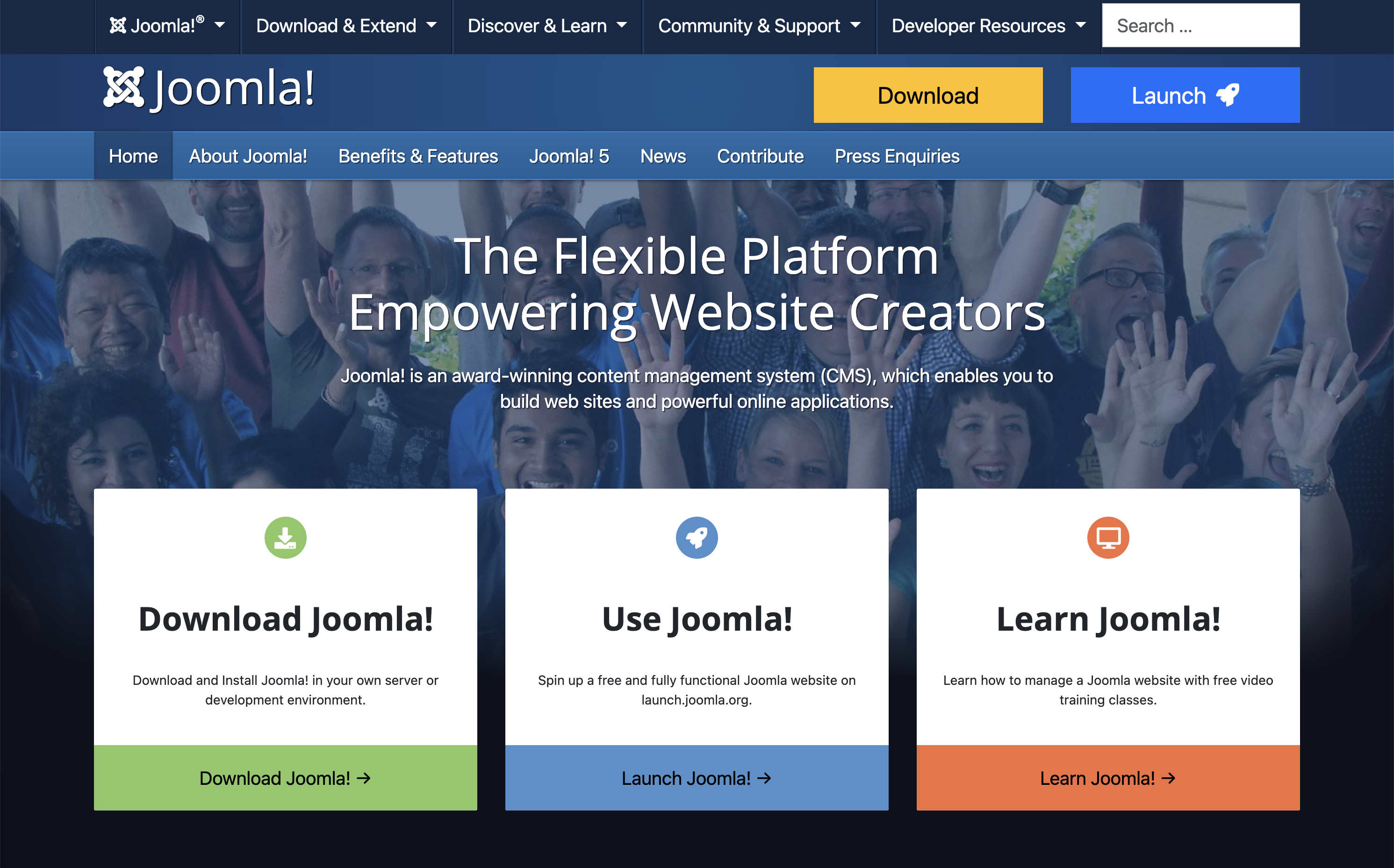 Screenshot from: joomla.org, March 2024.
Joomla is best suited for creating social networking, community, and membership sites. With its built-in multilingual support and advanced user and content management options, Joomla enables site owners to manage hundreds of users, create custom post types, and publish content in multiple languages.
One nuance of Joomla is that it has a steeper learning curve compared to more beginner-friendly CMSs like WordPress.
While Joomla aims to combine the power and flexibility of Drupal with the user-friendliness of WordPress, users with some web development experience will be better equipped to understand and take full advantage of Joomla’s built-in features and settings.
Users can choose from over 6,000 extensions available in the official directory to extend a Joomla site’s functionality. However, unlike WordPress plugins that can be installed with just a few clicks, Joomla extensions must be installed via the backend.
This process requires more technical know-how and may be challenging for beginners.
Key Features:
- Almost 6,000 extensions are available.
- Traditional content editing (no drag-and-drop visual editor).
- Optimized for mobile (depending on the template).
- Blog module.
- Ecommerce store.
- Social media tools.
Pros:
- Free, open-source software.
- Premade designs and templates.
- Access to source code.
Cons:
- No free subdomains or custom domains are available.
- No customer support.
- Requires a PHP-enable server to run.
- Fewer templates and extensions than WordPress.
9. Drupal
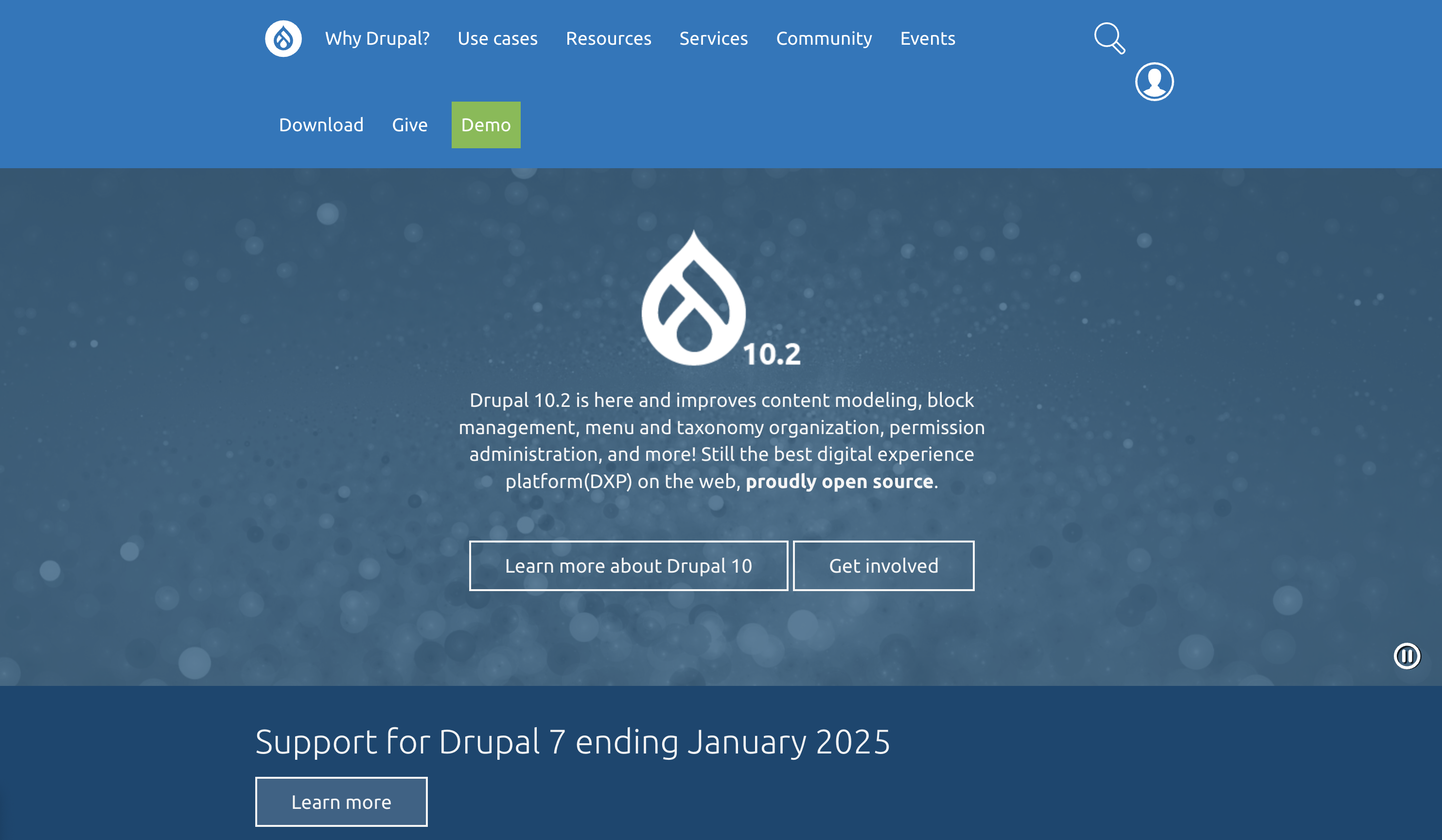 Screenshot from: drupal.org, March 2024.
Drupal is best suited for large corporations, government agencies, and universities with dedicated teams of developers. With its extensive customization options and ability to handle large data and heavy traffic, Drupal is ideal for complex, high-performance websites.
One key nuance of Drupal is its steep learning curve. Drupal is designed for developers or users with a strong understanding of HTML, CSS, and PHP.
Customizing a Drupal site involves working with numerous modules and themes, which can be highly configurable but require technical expertise to set up and maintain.
For organizations with the necessary technical resources, Drupal’s flexibility and robustness make it a top choice for building highly secure and customized websites.
Key Features:
- Content management system (CMS).
- Over 47,000 modules are available.
- Traditional content editing (no drag-and-drop visual editor).
- Optimized for mobile (depending on the theme you choose).
- Blog module.
- Ecommerce store.
- Social media tools.
Pros:
- Free, open-source software.
- Premade designs and templates.
- Access to source code.
- Strong security and data encryption.
Cons:
- No free subdomains.
- No customer support.
- Requires a PHP-enabled server to run.
10. DataLife Engine
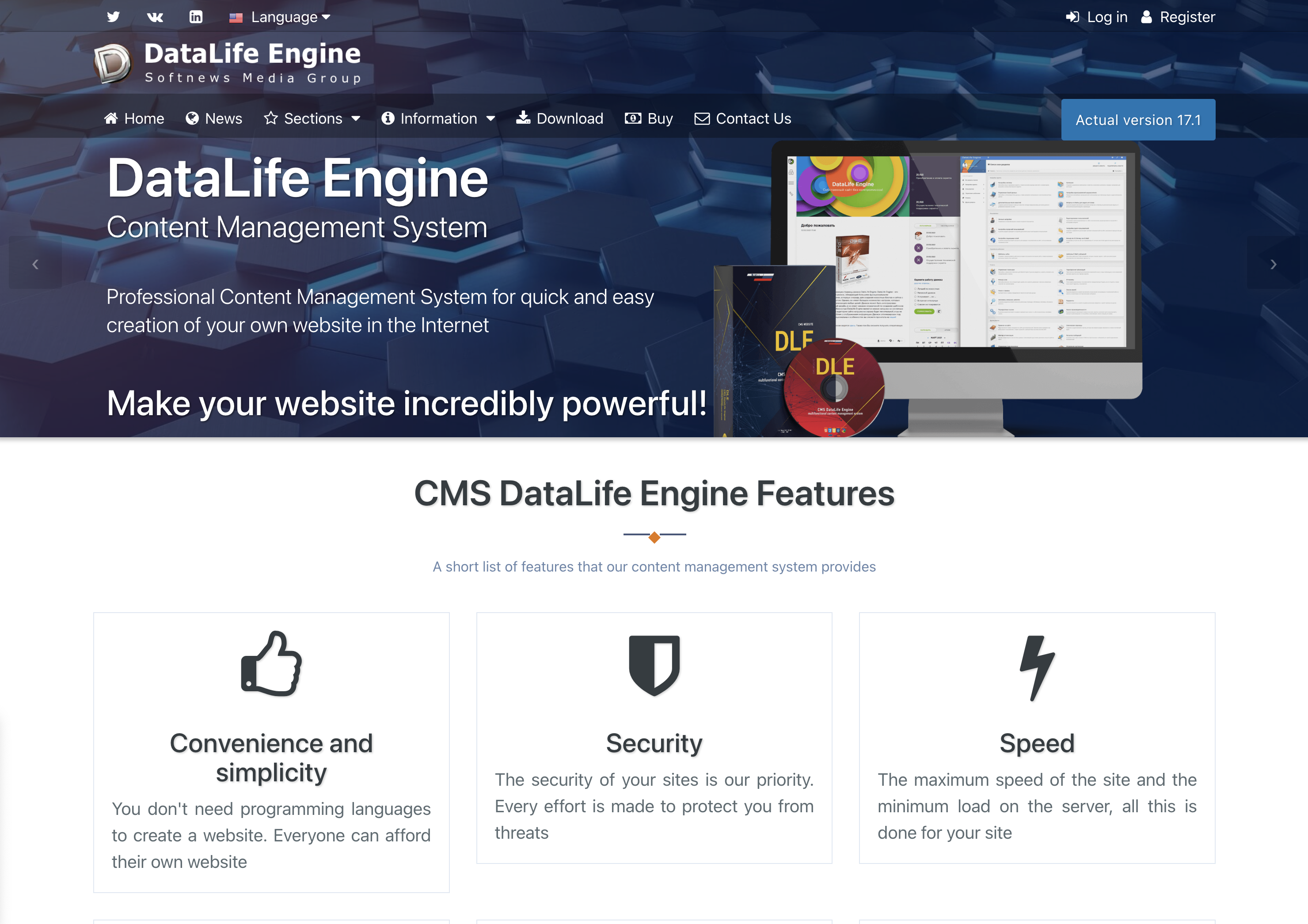 Screenshot from: dle-news.com, March 2024.
DataLife Engine (DLE) is best suited for media companies, news websites, and blogs, prioritizing SEO, security, and performance. The platform’s focus on handling high traffic levels with minimal server load makes it an attractive choice for websites that expect significant visitors and must ensure a smooth user experience.
DLE’s user-friendly interface and content management features suit organizations with multiple users involved in creating and publishing well-suited content.
The platform’s ability to track statistics and automatically filter words in comments can benefit media websites and blogs that need to moderate user-generated content and analyze audience engagement.
However, there are some nuances to consider when using DLE. The limited number of plugins and themes may restrict how much websites can customize their appearance and functionality compared to other CMSs like WordPress.
It’s also important to note that while DLE supports English users, they are considered a secondary focus.
Key Features:
- Content management system (CMS).
- Designed for multiple users.
- SEO-focused.
- Tracks statistics.
- Automatically filters words in comments.
- It supports an unlimited number of categories.
- Low server load.
- Allows plugins.
Pros:
- Stores data using MySQL.
- Excellent user experience
- Websites load quickly, even on low-end servers.
- Excellent for publishing news and blog posts.
Cons:
- No free version licenses vary from $79 for basic to $199 for unlimited.
- English users are a secondary focus.
- A limited number of plugins and themes.
- The lowest license doesn’t include customer support.
11. Sitefinity
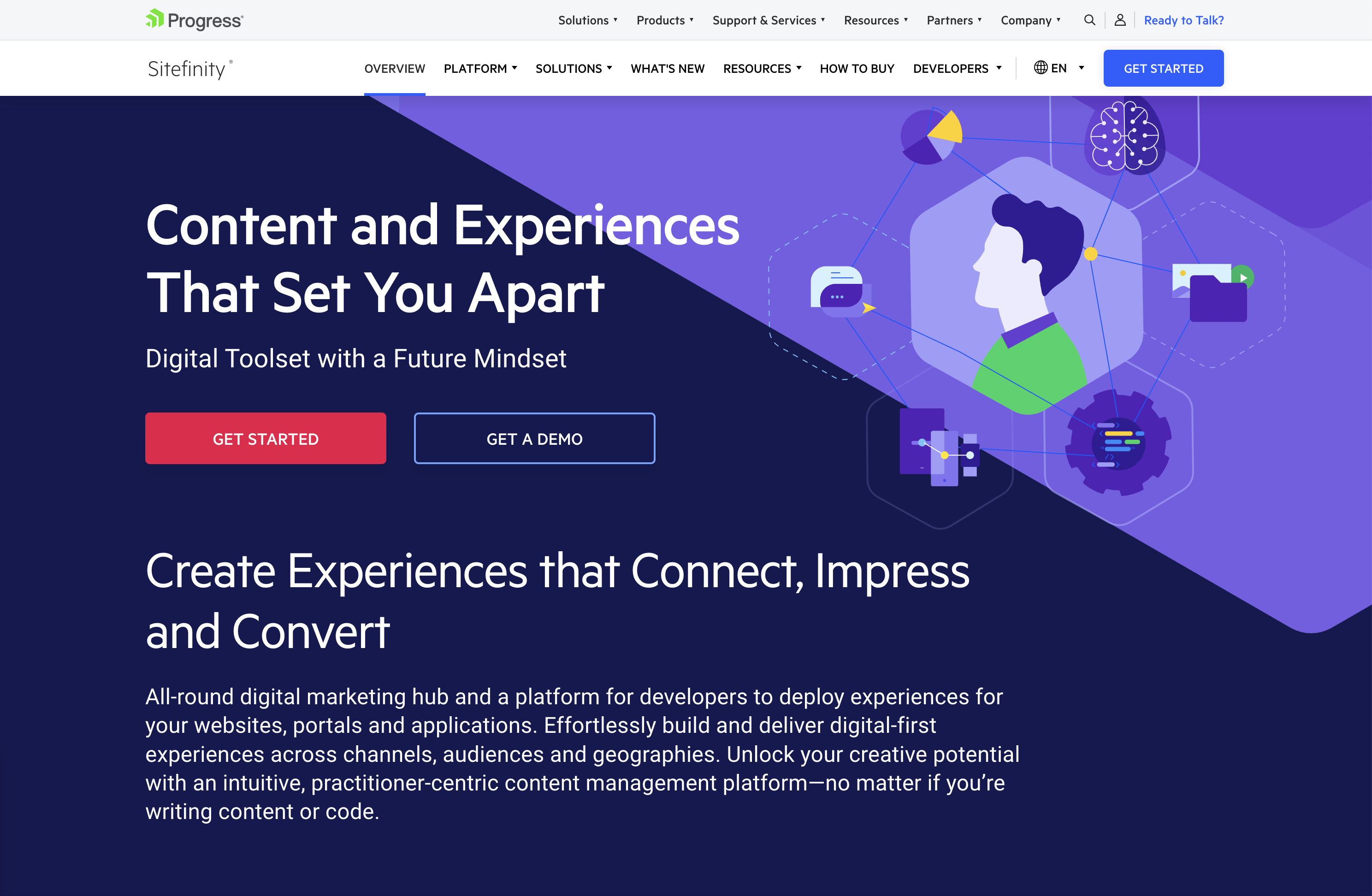 Screenshot from: progress.com/sitefinity-cms/, March 2024.
Progress’ Sitefinity is best suited for organizations that manage multiple websites, brands, or marketing channels from a single platform.
The CMS’s ability to sync assets across pages and sites makes it an attractive choice for companies with a diverse online presence. It streamlines content management and ensures consistency across various touchpoints.
One notable advantage of Sitefinity is its low-cost license compared to other CMS options, which may make it an attractive choice for budget-conscious organizations.
Additionally, the minimal coding required for integration and the flexible deployment time can help businesses reduce development costs and bring their websites to market faster.
However, Sitefinity setup and administration can be challenging. Organizations may need to invest time and resources into training their teams or hiring experienced professionals to ensure a smooth implementation and ongoing management of the platform.
Key Features:
- Manage multiple sites from one location.
- Sync assets across pages and sites.
- It makes personalization simpler.
- Integrated analytics and optimization.
- Four versions include basic, marketing-focused, PaaS, and ecommerce.
- Multilingual capabilities.
Pros:
- Low-cost license compared to other CMS.
- No setup fee.
- Minimal coding is required for integration.
- Flexible deployment time shortens time to market.
- Options for marketing automation.
Cons:
- Free trial, but no free version.
- Setup and administration can be challenging.
- No mobile interface.
12. CMS Hub
 Screenshot from: hubspot.com/products/cms, March 2024.
CMS Hub, previously known as Hubspot CMS, is best suited for businesses that already use HubSpot’s marketing, sales, or service tools and want to integrate their website with their existing HubSpot ecosystem.
It combines the ease of use of a drag-and-drop website builder with the flexibility and performance of a CMS.
CMS Hub seamlessly integrates with HubSpot’s CRM platform, allowing businesses to create personalized content experiences, optimize marketing efforts, and streamline sales processes.
It also focuses on security and performance, with HubSpot handling website hosting, SSL certification, and CDN configuration.
However, while CMS Hub offers customization options, it may not be as flexible as other CMSs like WordPress or Drupal, potentially limiting businesses with particular design or functionality requirements.
Additionally, CMS Hub’s pricing model can be expensive compared to other CMS options, so companies must carefully consider their budget and weigh the benefits of its all-in-one approach.
Key Features:
- Cloud-based.
- Includes SEO recommendations.
- Includes numerous themes and responsive templates.
- Fully integrated CRM.
- Drag-and-drop webpage editor.
- Built-in security.
Pros:
- Adaptive A/B testing helps you identify the best page layout.
- All-in-one publishing tools.
- Built-in SEO tools.
- Supports smart content with personalized rules.
- Mobile pages supported with Google AMP.
Cons:
- Does not support ecommerce.
- No automatic backup and recovery.
13. Contentful
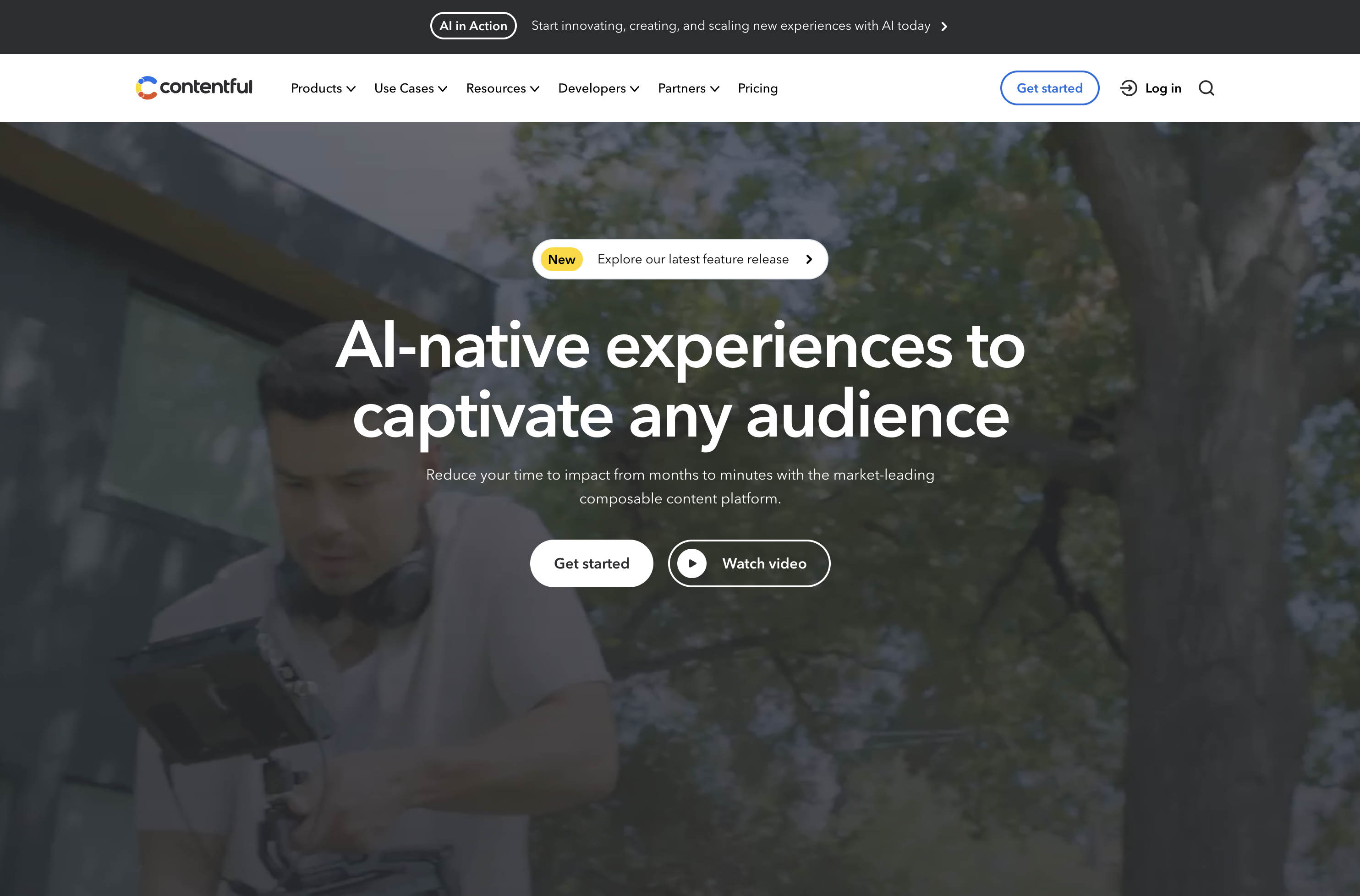 Screenshot from: contentful.com, March 2024.
Contentful is a headless CMS best suited for businesses and developers requiring a flexible, scalable, and customizable content management solution.
It’s particularly well-suited for organizations delivering content across multiple channels, such as websites, mobile apps, and IoT devices.
One of Contentful’s key advantages is its content modeling capabilities. The platform allows users to create custom content models that can be easily adapted to their needs.
When using Contentful, it’s important to remember that it’s a headless CMS that focuses on content management and delivery rather than providing a built-in front end or presentation layer.
Developers must build a front end using their preferred tools and frameworks and then integrate with Contentful’s API to retrieve and display the content.
Another aspect to consider is the learning curve associated with Contentful. While the platform is designed to be user-friendly, it may take some time for content editors and managers to become familiar with its interface and content modeling concepts.
Features:
- RESTful API gives you complete control over assets, translations, and versions.
- Customizable interface and framework that works across third-party component providers.
- It provides regional autonomy, so pieces in multiple languages and time zones can be published globally.
- Content modeling allows you to structure content by channel.
- Single sign-on and secure access.
Pros:
- Focus on integration simplifies the technology stack.
- User-friendly with a clean interface.
- Free version for up to five users.
- Good scalability.
Cons:
- Expensive for an upgraded version ($489/month).
- Poor internal search tools.
- Modeling content can be tricky.
14. Adobe Experience Manager
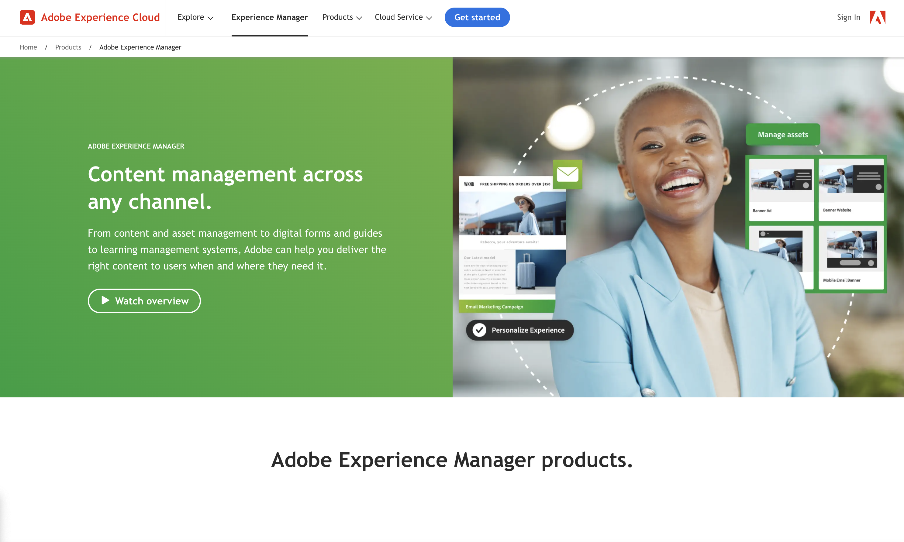 Screenshot from: business.adobe.com/products/experience-manager/adobe-experience-manager.html, March 2024
Adobe Experience Manager (AEM) is an enterprise-level CMS best suited for large organizations with complex content management needs and a significant budget. AEM’s target audience includes global brands, financial institutions, healthcare providers, and government agencies.
One of AEM’s key strengths is its tight integration with other Adobe products, such as Analytics, Target, and Creative Cloud.
This integration allows organizations to leverage the full power of Adobe’s digital marketing suite, enabling them to create, manage, and optimize content and experiences across the entire customer journey.
AEM also offers advanced features like intelligent content delivery, AI-powered content tagging, and multi-site management, making it a comprehensive solution for enterprise content management.
The platform’s complexity and extensive feature set can overwhelm smaller organizations or teams with limited resources. Additionally, AEM’s licensing and implementation costs are among the highest in the market, making it a significant investment for any organization.
Key Features:
- Comprehensive marketing platform.
- End-to-end digital document solution.
- Enterprise-level security.
- Analytics included.
- Intelligent search.
- Scalable to your needs.
Pros:
- Streamlines workflows by keeping everything on one platform.
- Individual marketers can handle authoring and publishing.
- Easy authorization of workflow.
- Can handle massive content loads.
- Can manage multiple sites at once.
Cons:
- Steep learning curve.
- Requires different sign-ins to access other areas.
- Doesn’t integrate well with external DAMs.
- Not ideal for communities and forums.
Ecommerce Platforms
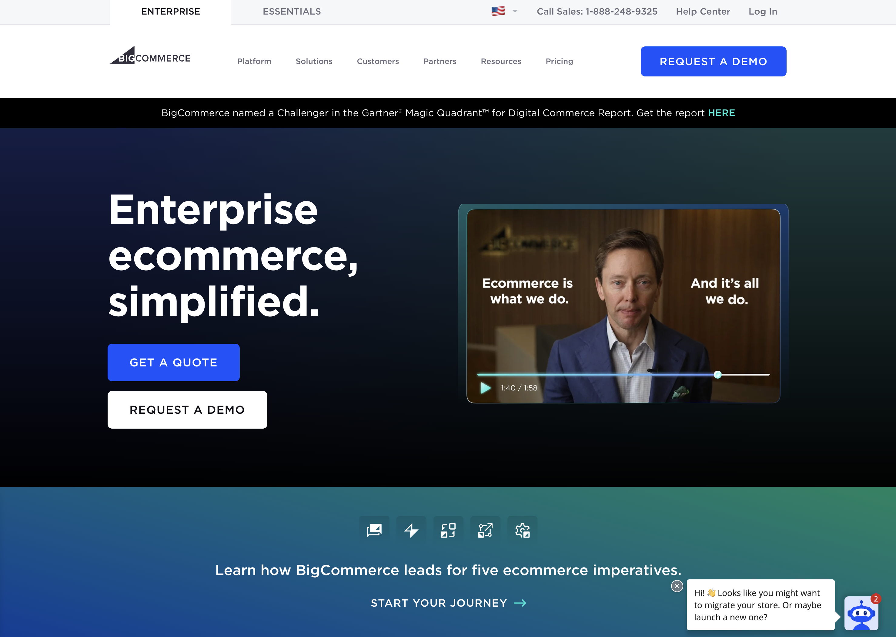
15. BigCommerce
 Screenshot from: bigcommerce.com, March 2024.
BigCommerce is a hosted ecommerce platform best suited for businesses of all sizes looking to create and manage an online store. It caters to many users, from small and medium-sized businesses to large enterprises.
One of BigCommerce’s key advantages is its scalability. The platform accommodates businesses as they grow, offering features like unlimited products, file storage, and bandwidth.
BigCommerce also provides a range of advanced ecommerce functionalities, such as multi-channel selling, abandoned cart recovery, and built-in SEO tools, which can help businesses optimize their online sales performance.
When considering BigCommerce, it’s important to remember that while the platform offers a wide range of features, some of the more advanced functionalities may require a higher-tier plan or additional costs.
BigCommerce also enforces certain design limitations on its themes, which may restrict the level of customization available without diving into custom coding.
Key Features:
- Full hosting solution.
- No software to self-install.
- Drag-and-drop visual builder.
- Extensions are available.
- Optimized for mobile.
- Blog module.
- Ecommerce store.
- Social media tools.
Pros:
- High level of customization options.
- Over 100 themes to choose from (including some free).
- No platform commission fees.
- Free subdomain available.
- Customer support.
Cons:
- No free version is available.
- No access to source code.
- Pricing is based on revenue, which isn’t great if you have tight margins.
16. Shopify
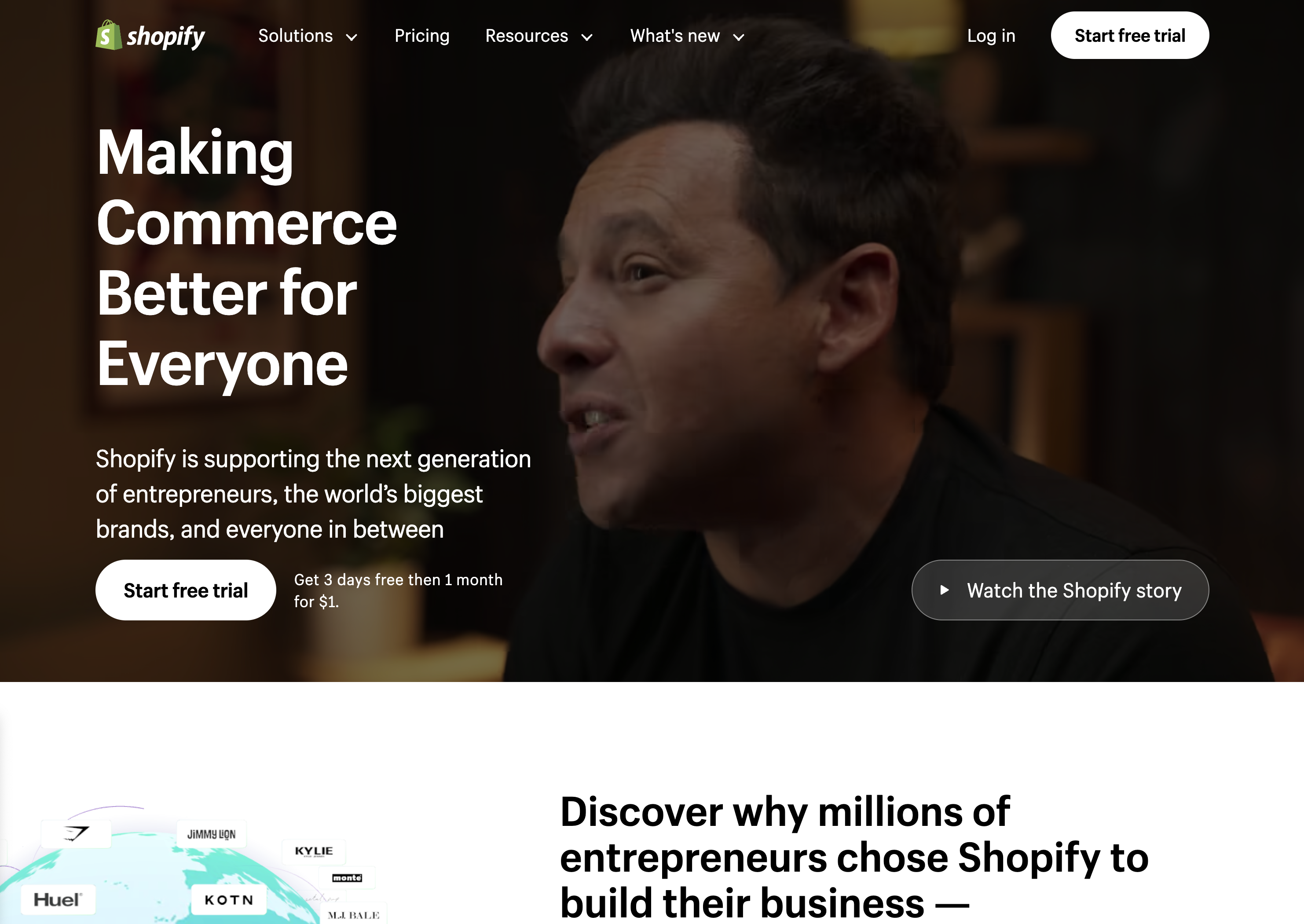 Screenshot from: shopify.com, March 2024.
Shopify is an ecommerce platform well-suited for entrepreneurs and small business owners who want to establish an online presence quickly without extensive technical expertise.
Shopify’s extensive app marketplace allows businesses to extend its functionality and customize their online store to meet specific needs.
The platform also provides built-in features like inventory management, payment processing, and abandoned cart recovery to help streamline operations and optimize sales performance.
When using Shopify, consider the platform’s transaction fees, which vary depending on the payment gateway. Some advanced design changes may require HTML, CSS, and Liquid knowledge.
Despite these considerations, Shopify remains a top choice for businesses seeking a reliable, scalable, and feature-rich ecommerce platform.
Key Features:
- Full hosting solution.
- No software to self-install.
- Drag-and-drop visual builder.
- Extensions are available.
- Optimized for mobile.
- Blog module.
- Ecommerce store.
- Social media tools.
Pros:
- All-in-one website builder and platform.
- Premade designs and templates.
- Free subdomain available.
- Customer support.
Cons:
- No free version is available.
- No access to source code.
- Platform commission fees.
17. Magento
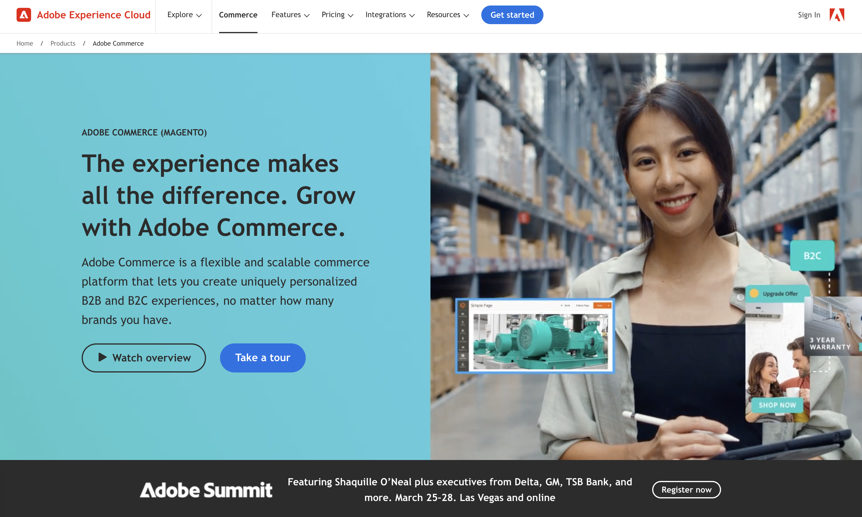 Screenshot from: business.adobe.com/products/magento/magento-commerce.html, March 2024
Magento is an open-source ecommerce platform best suited for medium to large enterprises with complex online selling needs.
Magento’s flexibility and scalability come with a steeper learning curve than other ecommerce platforms. It requires more technical expertise to set up, customize, and maintain, making it less suitable for small businesses or users without web development knowledge.
When using Magento, remember that its powerful features and customization options can impact website performance if not optimized properly.
Choosing a reliable hosting provider and working with experienced Magento developers is crucial for ensuring optimal store performance and security.
Key Features:
- Option to pay for Magento Commerce for a complete hosting platform or download the free, open-source software to install on your web server.
- Drag-and-drop visual builder.
- Extensions are available.
- Optimized for mobile.
- Ecommerce store.
- Social media tools.
Pros:
- All-in-one ecommerce platform or open-source ecommerce software package.
- Free version available.
- Designed for large-scale ecommerce.
- Premade designs and templates.
- Free subdomain available (mainly for setup and testing purposes).
- Customer support (paid version only).
- Access to source code with the downloadable version.
Cons:
- No blog module, although you can add it as an extension.
- Not optimized for web projects or website purposes outside of ecommerce.
- The steep learning curve for inexperienced users.
- A large investment for small-scale ecommerce.
18. PrestaShop
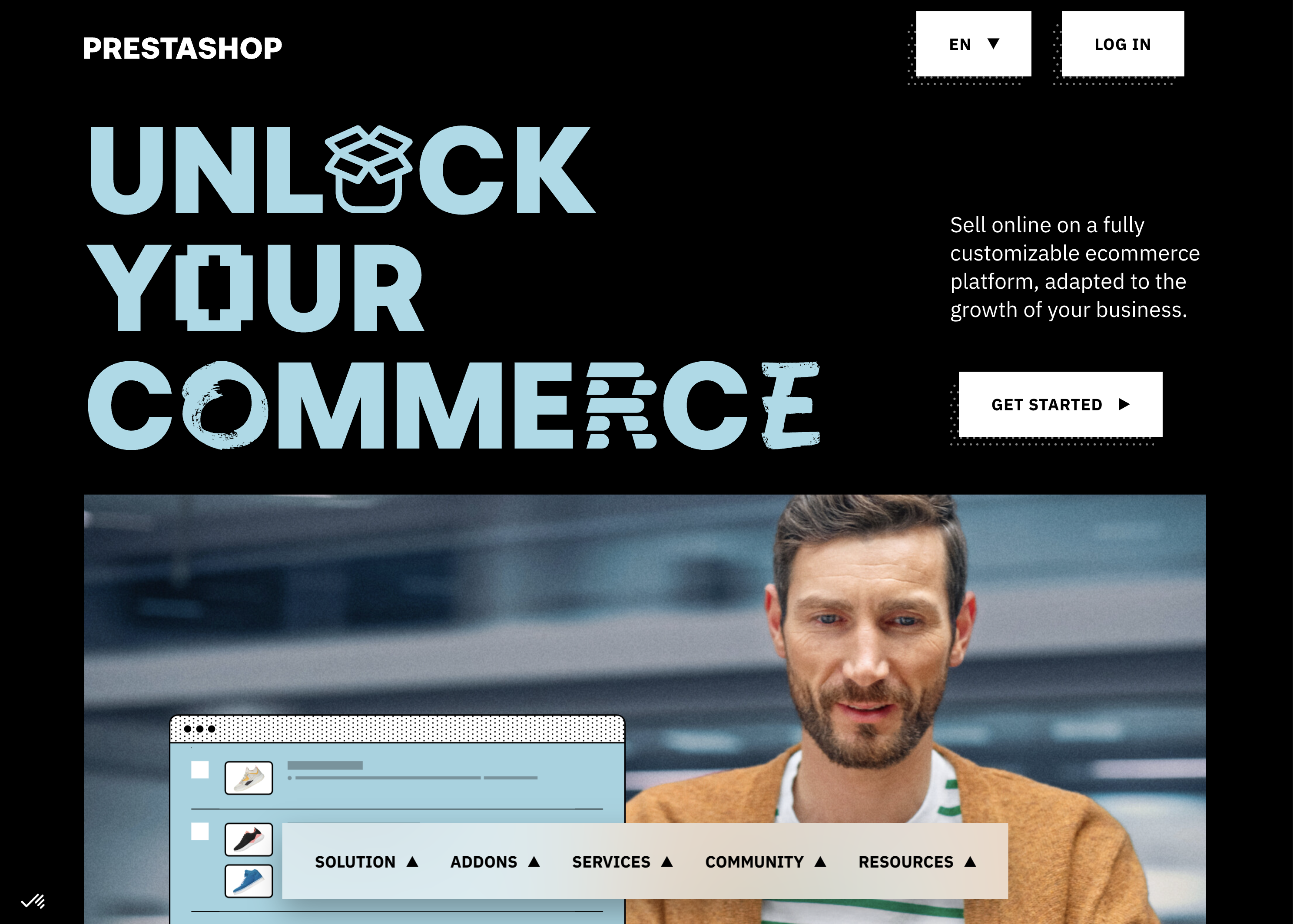 Screenshot from: prestashop.com, March 2024.
PrestaShop is an open-source ecommerce platform best suited for small to medium-sized businesses looking for a cost-effective and customizable solution.
PrestaShop offers a wide range of themes and modules, allowing businesses to customize their online store’s appearance and functionality. The platform also has a strong community of developers and users, providing support and resources for store owners.
While PrestaShop is generally easy to use, some advanced customizations may require coding knowledge. Additionally, the number of installed modules can impact the platform’s performance.
Key Features:
- Customizable to your needs, including themes and features.
- Includes backend tools like payments, shipping and data.
- Community of translators for multilanguage digital stores.
- Secure payment modules.
- Scalable.
- Includes demographic assistance.
Pros:
- Free version available.
- Open source so that you can customize your site to your needs.
- 5,000+ themes, modules, and services are available with the premium plan.
- Excellent user experience.
Cons:
- Limited scalability.
- No support team.
- Initial setup requires some programming knowledge.
19. OpenCart
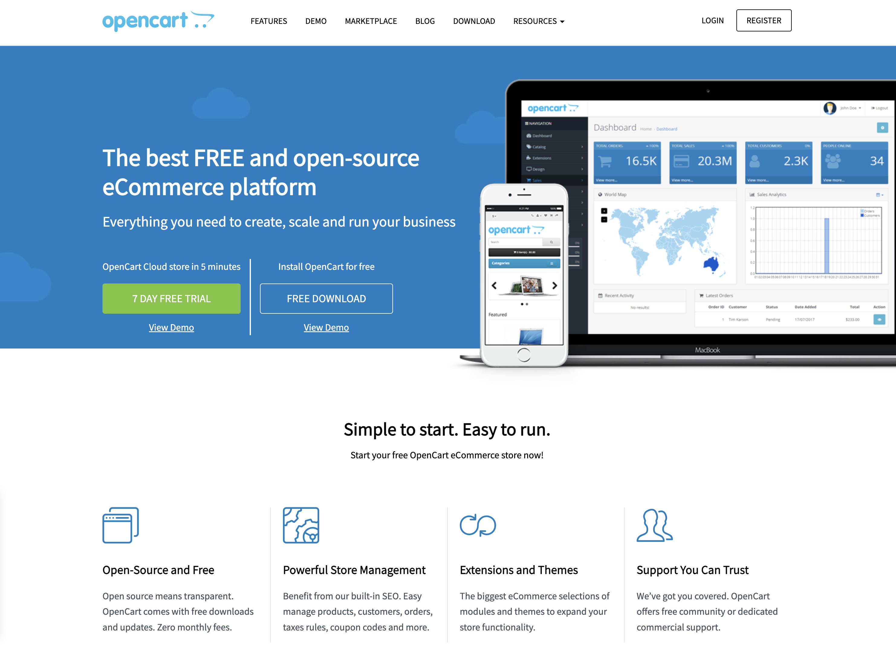 Screenshot from: opencart.com, March 2024.
OpenCart is a free, open-source ecommerce platform best suited for small—to medium-sized businesses with limited budgets.
OpenCart offers a decent range of features and extensions, allowing businesses to customize their online store. However, its marketplace is smaller than other platforms, which may limit advanced functionality options.
When using OpenCart, be mindful of its performance limitations as the store grows. Optimizing and carefully selecting extensions may be required to maintain a smooth user experience.
Additionally, its simplicity may not be suitable for businesses with complex ecommerce needs.
Features:
- The administrator dashboard gives you information at a glance.
- User management allows you to assign permissions and separate access.
- Allows you to run multiple stores from one dashboard.
- Customizable variables let you include options for sizes, colors, or anything else.
Pros:
- The platform is entirely free, as are many add-ons.
- Extensive metrics and reports were provided.
- Works with your current payment gateway.
- Comes with dedicated technical support.
- Flexible.
Cons:
- Often creates duplicate pages, which can cause SEO problems.
- Not all extensions, modules, plugins, and add-ons work well together.
- Checkout can be slow, particularly if you have numerous plugins.
- Can be difficult to import a list of inventory.
- Requires some degree of technical ability for optimal use.
Blogging Platforms
20. Medium
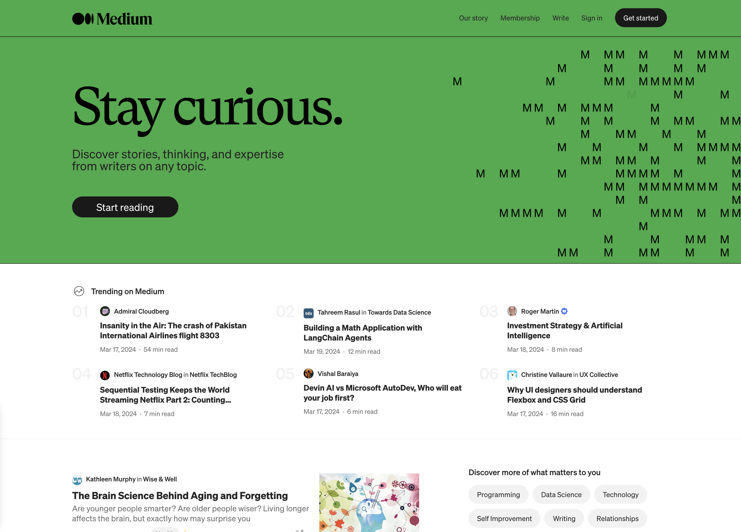 Screenshot from: medium.com, March 2024.
Medium is a publishing platform best suited for individual bloggers, writers, and content creators who want to share their ideas and stories with a built-in audience.
Medium’s clean and minimalistic interface allows readers to concentrate on the content. The platform also offers a built-in social network, making it easy for writers to connect with readers and other creators.
However, this simplicity comes with limited customization options for branding and design.
When using Medium, it’s important to understand that the platform controls the distribution and monetization of content. While this can lead to increased exposure, it also means less control over the presentation and ownership of your content compared to self-hosted solutions.
Key Features:
- Full hosting solution.
- No software to self-install.
- Optimized for mobile.
- Blog module.
- Limited social media tools.
Pros:
- A community site for blogs.
- Free version available.
- Medium Partner Program to earn revenue.
- Customer support.
Cons:
- No extensions.
- No ecommerce stores.
- No premade designs or themes.
- No free subdomains.
- No third-party extensions.
- No access to source code.
21. Ghost
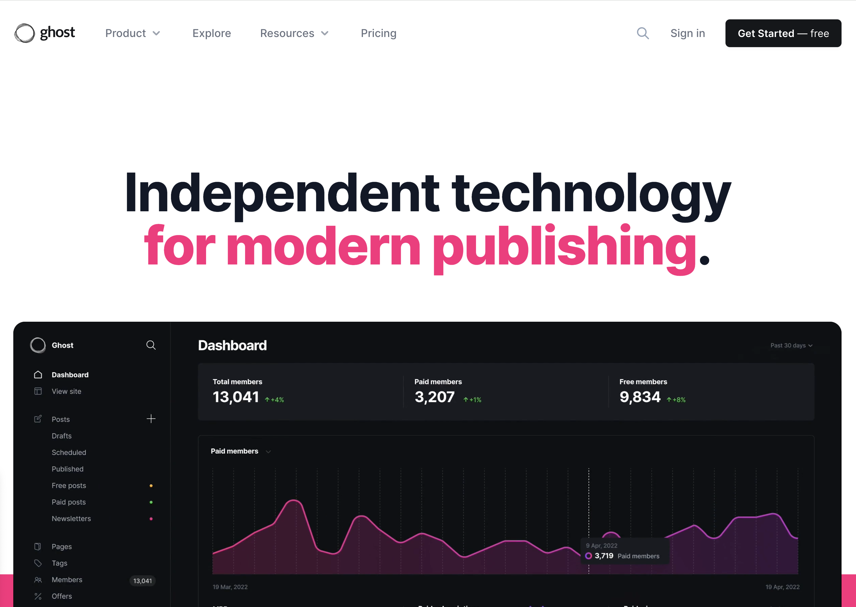 Screenshot from: ghost.org, March 2024.
Ghost is a lightweight, open-source publishing platform best suited for bloggers, writers, and small publications who value simplicity and performance. It’s designed for users who want a clean, focused writing experience without the complexity of more feature-rich CMS platforms.
Ghost offers a simple, intuitive editor and a minimalistic default theme, allowing users to create and publish content quickly.
The platform also provides built-in SEO features and supports memberships and subscriptions, making it a good choice for content creators looking to monetize their work.
As Ghost primarily focuses on publishing, it may not be the best fit for users who require extensive customization options or advanced functionality beyond blogging.
Key Features:
- You can subscribe through Ghost’s hosting platform or download the free, open-source software to install on your web server.
- Basic drag-and-drop visual builder.
- Extensions are available through integrations with other tools.
- Optimized for mobile.
- Blog module.
- Ecommerce store (subscription only).
- Social media tools.
Pros:
- All-in-one website builder and platform.
- Free version available.
- Premade designs and templates.
- Free subdomain available with the paid version.
- Customer support.
- Access to source code.
Cons:
- Not compatible with all third-party web hosts.
- Highly specialized with limited capabilities beyond blogging.
- Not built to scale up into a business site or complex website.
22. Tumblr
 Screenshot from: tumblr.com, March 2024.
Tumblr is a microblogging and social networking platform best suited for younger audiences who enjoy sharing short-form multimedia content.
Tumblr’s emphasis on community and content discovery makes it easy for users to connect with others who share similar interests. The platform’s reblogging feature spreads content quickly, increasing visibility and engagement.
When using Tumblr, it’s important to understand the platform’s unique culture and demographics. Tumblr is known for its diverse, often niche communities, which can be both a strength and a challenge for brands and marketers.
Additionally, while Tumblr offers some customization options, it may not be the best choice for users who require a highly professional or branded online presence.
Key Features:
- Features strong social media functionality.
- Customizable.
- Google Analytics Integration.
- Unlimited storage.
- Ad-free blog themes.
- Free SSL certification.
Pros:
- Free to use; no upgrades are required to access all features.
- Free web hosting.
- User-friendly and easy to set up.
- No storage limits.
- Can post audio, video, images, gifs, and more.
Cons:
- Daily posting limit (250/day).
- Files must be under 10 MB.
- No plugins.
- Safety and security leave something to be desired.
- Unsuited to long-form content.
23. Bluehost
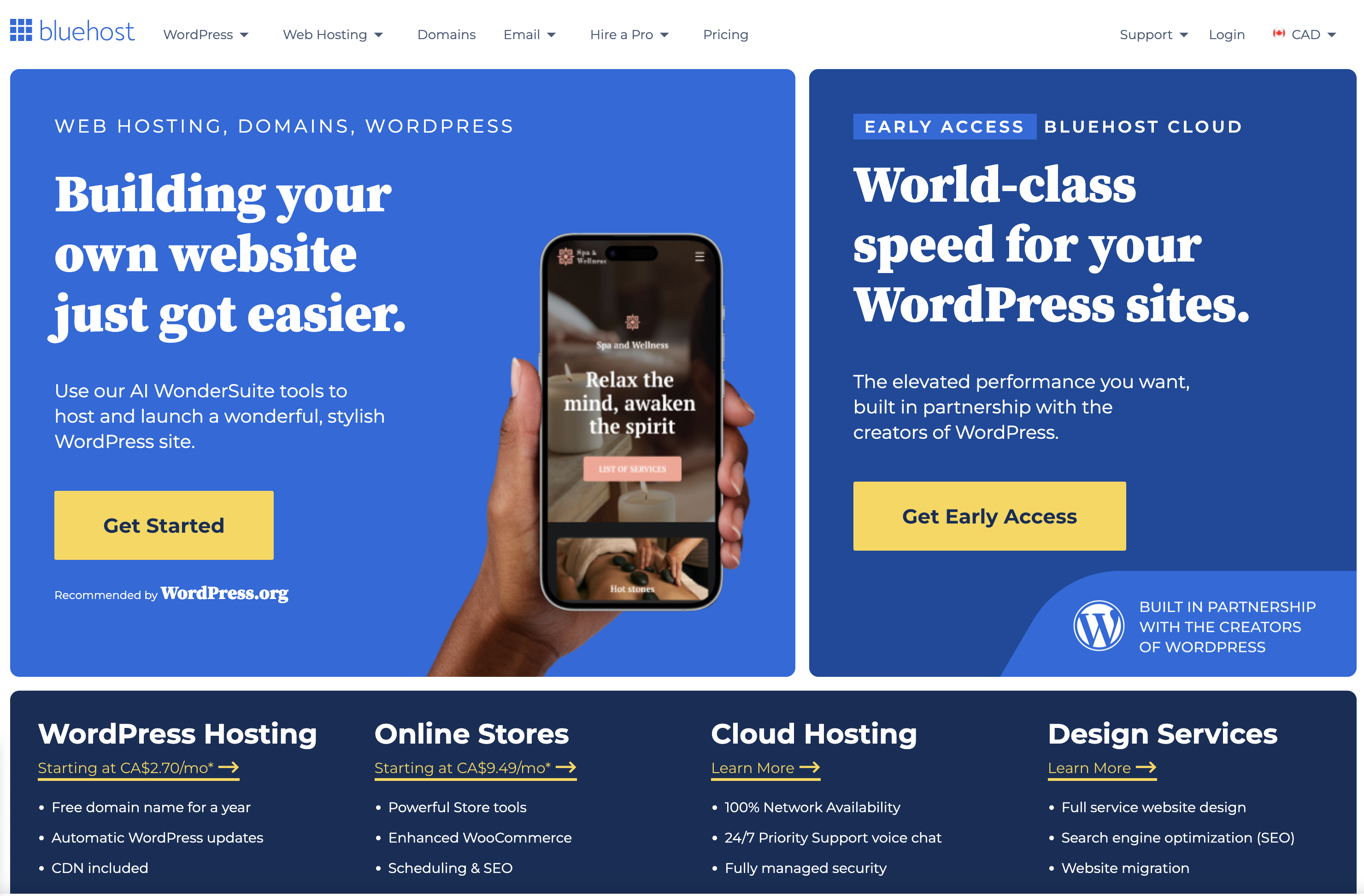 Screenshot from: bluehost.com, March 2024.
Bluehost is a web hosting provider best suited for beginners and small businesses looking for an affordable, easy-to-use hosting solution.
Bluehost’s advantages are its user-friendly interface and one-click installations for popular CMS platforms like WordPress.
This makes it easy for users with limited technical knowledge to set up and manage their websites. Bluehost also provides 24/7 customer support and a free SSL certificate with each hosting plan.
While Bluehost is known for its reliability and performance, it may not be the best choice for websites with high traffic or complex requirements. Some users have reported issues with slow loading speeds and limited storage space on shared hosting plans.
Key Features:
- Domain names can be purchased through Bluehost.
- Versatile hosting options let you choose what works best for you.
- Dedicated servers and virtual private servers are available.
- A variety of plans are available based on your needs.
- Comes with customer service chat options.
Pros:
- The first term is inexpensive.
- Lots of storage and unlimited bandwidth.
- Good uptime.
- Free SSL certificates.
Cons:
- Extra features come with added costs, which can get pricey.
- High renewal rates.
- Speed could be better.
- All servers are U.S.-based.
24. Blogger
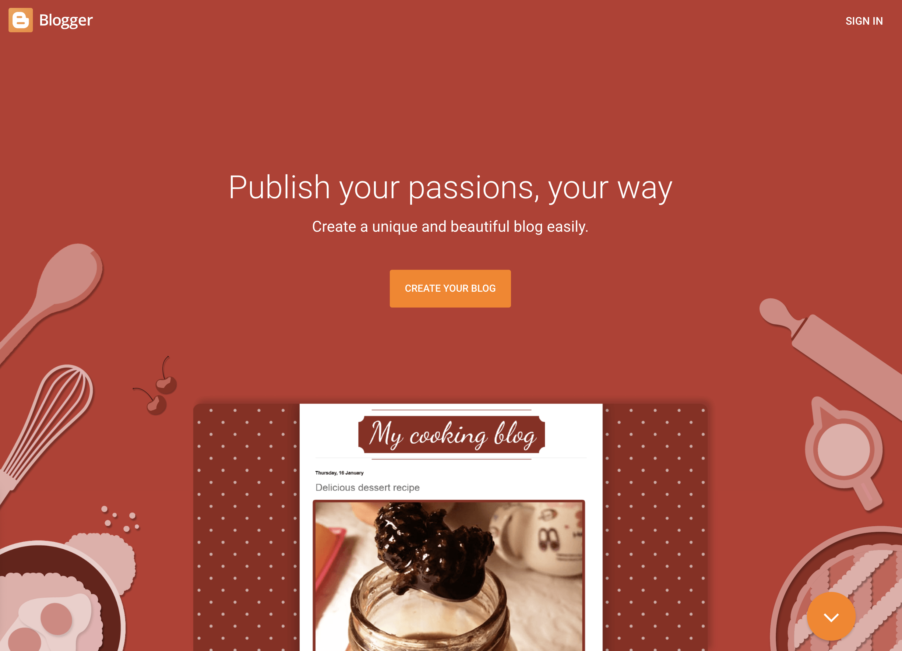 Screenshot from: blogger.com, March 2024.
Blogger is a free, beginner-friendly blogging platform best suited for hobbyists, casual bloggers, and those who want to start a blog without investing in a self-hosted solution. It’s ideal for users who prioritize simplicity and ease of use over advanced customization options.
Blogger offers a straightforward, intuitive interface that makes it easy for users to create and publish blog posts.
The platform provides a selection of customizable templates and allows users to add gadgets and widgets to enhance their blog’s functionality. However, unlike other blogging platforms, Blogger’s design and customization options are relatively limited.
Blogger’s simplicity and lack of advanced features may make it unsuitable for professional bloggers or those looking to create a more sophisticated online presence.
Features:
- Clear analytics.
- Included layout/themes.
- Monetization options, including Google Adsense integration.
- Uses Google security.
- Unlimited storage.
Pros:
- Free to use.
- Extremely user-friendly.
- Free SSL security.
- Good uptime.
Cons:
- You don’t own your website.
- Fewer options and control over design.
- Limited support.
- Hard to port to a different platform.
Community Management
25. vBulletin
vBulletin is a proprietary forum software best suited for businesses, organizations, and communities looking to create and manage an online discussion platform.
vBulletin offers many features, including private messaging, user groups, and content management tools, making it a powerful solution for managing large, active communities.
The platform also provides a high level of customization, allowing administrators to tailor the look and feel of their forum to match their brand or website.
One of the primary considerations when using vBulletin is its licensing cost, which can be a significant investment for some users.
Additionally, while vBulletin offers a range of customization options, some technical knowledge may be required to optimize and maintain the platform entirely.
Key Features:
- Built-in SEO and security.
- Includes a chat app.
- Easy to get started.
- Built-in applications.
- Optimized for mobile users.
- Blogging functionality.
- Fully customizable.
Pros:
- Frequent patches and bug fixes.
- Customer support.
- Easy to install and get started.
- Designed to host forums.
- Includes templates.
Cons:
- No free option.
- Limited features compared to some other platforms.
- Requires some tech skills to take full advantage of the functionality.
- It can’t customize code for the cloud-based version.
Which One Is Right For You?
With so many options, determining the right alternative to WordPress depends on your specific needs and goals.
For individuals and small businesses seeking an easy-to-use website builder, Wix, Squarespace, or Weebly offer intuitive drag-and-drop interfaces. Those prioritizing simplicity and speed may prefer static site generators like Jekyll or Hugo.
Developers and tech-savvy users who value flexibility and customization can explore headless CMS options like Contentful or more robust open-source platforms like Joomla and Drupal.
Ecommerce merchants must evaluate features like inventory management, payment processing, and scalability when choosing between Shopify, BigCommerce, WooCommerce, and others.
No matter your requirements, there is likely a WordPress alternative that is well-suited to your needs. Thoroughly assessing your website goals, budget, and technical abilities will help you select the right platform to build your ideal online presence.
With some research and planning, you can find the perfect alternative to take your website beyond what WordPress offers.
More Resources:
Featured Image: GaudiLab/Shutterstock
SEO
2024 WordPress Vulnerability Report Shows Errors Sites Keep Making

WordPress security scanner WPScan’s 2024 WordPress vulnerability report calls attention to WordPress vulnerability trends and suggests the kinds of things website publishers (and SEOs) should be looking out for.
Some of the key findings from the report were that just over 20% of vulnerabilities were rated as high or critical level threats, with medium severity threats, at 67% of reported vulnerabilities, making up the majority. Many regard medium level vulnerabilities as if they are low-level threats and that’s a mistake because they’re not low level and should be regarded as deserving attention.
The WPScan report advised:
“While severity doesn’t translate directly to the risk of exploitation, it’s an important guideline for website owners to make an educated decision about when to disable or update the extension.”
WordPress Vulnerability Severity Distribution
Critical level vulnerabilities, the highest level of threat, represented only 2.38% of vulnerabilities, which is essentially good news for WordPress publishers. Yet as mentioned earlier, when combined with the percentages of high level threats (17.68%) the number or concerning vulnerabilities rises to almost 20%.
Here are the percentages by severity ratings:
- Critical 2.38%
- Low 12.83%
- High 17.68%
- Medium 67.12%
Authenticated Versus Unauthenticated
Authenticated vulnerabilities are those that require an attacker to first attain user credentials and their accompanying permission levels in order to exploit a particular vulnerability. Exploits that require subscriber-level authentication are the most exploitable of the authenticated exploits and those that require administrator level access present the least risk (although not always a low risk for a variety of reasons).
Unauthenticated attacks are generally the easiest to exploit because anyone can launch an attack without having to first acquire a user credential.
The WPScan vulnerability report found that about 22% of reported vulnerabilities required subscriber level or no authentication at all, representing the most exploitable vulnerabilities. On the other end of the scale of the exploitability are vulnerabilities requiring admin permission levels representing a total of 30.71% of reported vulnerabilities.
Permission Levels Required For Exploits
Vulnerabilities requiring administrator level credentials represented the highest percentage of exploits, followed by Cross Site Request Forgery (CSRF) with 24.74% of vulnerabilities. This is interesting because CSRF is an attack that uses social engineering to get a victim to click a link from which the user’s permission levels are acquired. This is a mistake that WordPress publishers should be aware of because all it takes is for an admin level user to follow a link which then enables the hacker to assume admin level privileges to the WordPress website.
The following is the percentages of exploits ordered by roles necessary to launch an attack.
Ascending Order Of User Roles For Vulnerabilities
- Author 2.19%
- Subscriber 10.4%
- Unauthenticated 12.35%
- Contributor 19.62%
- CSRF 24.74%
- Admin 30.71%
Most Common Vulnerability Types Requiring Minimal Authentication
Broken Access Control in the context of WordPress refers to a security failure that can allow an attacker without necessary permission credentials to gain access to higher credential permissions.
In the section of the report that looks at the occurrences and vulnerabilities underlying unauthenticated or subscriber level vulnerabilities reported (Occurrence vs Vulnerability on Unauthenticated or Subscriber+ reports), WPScan breaks down the percentages for each vulnerability type that is most common for exploits that are the easiest to launch (because they require minimal to no user credential authentication).
The WPScan threat report noted that Broken Access Control represents a whopping 84.99% followed by SQL injection (20.64%).
The Open Worldwide Application Security Project (OWASP) defines Broken Access Control as:
“Access control, sometimes called authorization, is how a web application grants access to content and functions to some users and not others. These checks are performed after authentication, and govern what ‘authorized’ users are allowed to do.
Access control sounds like a simple problem but is insidiously difficult to implement correctly. A web application’s access control model is closely tied to the content and functions that the site provides. In addition, the users may fall into a number of groups or roles with different abilities or privileges.”
SQL injection, at 20.64% represents the second most prevalent type of vulnerability, which WPScan referred to as both “high severity and risk” in the context of vulnerabilities requiring minimal authentication levels because attackers can access and/or tamper with the database which is the heart of every WordPress website.
These are the percentages:
- Broken Access Control 84.99%
- SQL Injection 20.64%
- Cross-Site Scripting 9.4%
- Unauthenticated Arbitrary File Upload 5.28%
- Sensitive Data Disclosure 4.59%
- Insecure Direct Object Reference (IDOR) 3.67%
- Remote Code Execution 2.52%
- Other 14.45%
Vulnerabilities In The WordPress Core Itself
The overwhelming majority of vulnerability issues were reported in third-party plugins and themes. However, there were in 2023 a total of 13 vulnerabilities reported in the WordPress core itself. Out of the thirteen vulnerabilities only one of them was rated as a high severity threat, which is the second highest level, with Critical being the highest level vulnerability threat, a rating scoring system maintained by the Common Vulnerability Scoring System (CVSS).
The WordPress core platform itself is held to the highest standards and benefits from a worldwide community that is vigilant in discovering and patching vulnerabilities.
Website Security Should Be Considered As Technical SEO
Site audits don’t normally cover website security but in my opinion every responsible audit should at least talk about security headers. As I’ve been saying for years, website security quickly becomes an SEO issue once a website’s ranking start disappearing from the search engine results pages (SERPs) due to being compromised by a vulnerability. That’s why it’s critical to be proactive about website security.
According to the WPScan report, the main point of entry for hacked websites were leaked credentials and weak passwords. Ensuring strong password standards plus two-factor authentication is an important part of every website’s security stance.
Using security headers is another way to help protect against Cross-Site Scripting and other kinds of vulnerabilities.
Lastly, a WordPress firewall and website hardening are also useful proactive approaches to website security. I once added a forum to a brand new website I created and it was immediately under attack within minutes. Believe it or not, virtually every website worldwide is under attack 24 hours a day by bots scanning for vulnerabilities.
Read the WPScan Report:
WPScan 2024 Website Threat Report
Featured Image by Shutterstock/Ljupco Smokovski
SEO
An In-Depth Guide And Best Practices For Mobile SEO
Over the years, search engines have encouraged businesses to improve mobile experience on their websites. More than 60% of web traffic comes from mobile, and in some cases based on the industry, mobile traffic can reach up to 90%.
Since Google has completed its switch to mobile-first indexing, the question is no longer “if” your website should be optimized for mobile, but how well it is adapted to meet these criteria. A new challenge has emerged for SEO professionals with the introduction of Interaction to Next Paint (INP), which replaced First Input Delay (FID) starting March, 12 2024.
Thus, understanding mobile SEO’s latest advancements, especially with the shift to INP, is crucial. This guide offers practical steps to optimize your site effectively for today’s mobile-focused SEO requirements.
What Is Mobile SEO And Why Is It Important?
The goal of mobile SEO is to optimize your website to attain better visibility in search engine results specifically tailored for mobile devices.
This form of SEO not only aims to boost search engine rankings, but also prioritizes enhancing mobile user experience through both content and technology.
While, in many ways, mobile SEO and traditional SEO share similar practices, additional steps related to site rendering and content are required to meet the needs of mobile users and the speed requirements of mobile devices.
Does this need to be a priority for your website? How urgent is it?
Consider this: 58% of the world’s web traffic comes from mobile devices.
If you aren’t focused on mobile users, there is a good chance you’re missing out on a tremendous amount of traffic.
Mobile-First Indexing
Additionally, as of 2023, Google has switched its crawlers to a mobile-first indexing priority.
This means that the mobile experience of your site is critical to maintaining efficient indexing, which is the step before ranking algorithms come into play.
Read more: Where We Are Today With Google’s Mobile-First Index
How Much Of Your Traffic Is From Mobile?
How much traffic potential you have with mobile users can depend on various factors, including your industry (B2B sites might attract primarily desktop users, for example) and the search intent your content addresses (users might prefer desktop for larger purchases, for example).
Regardless of where your industry and the search intent of your users might be, the future will demand that you optimize your site experience for mobile devices.
How can you assess your current mix of mobile vs. desktop users?
An easy way to see what percentage of your users is on mobile is to go into Google Analytics 4.
- Click Reports in the left column.
- Click on the Insights icon on the right side of the screen.
- Scroll down to Suggested Questions and click on it.
- Click on Technology.
- Click on Top Device model by Users.
- Then click on Top Device category by Users under Related Results.
- The breakdown of Top Device category will match the date range selected at the top of GA4.
You can also set up a report in Looker Studio.
- Add your site to the Data source.
- Add Device category to the Dimension field.
- Add 30-day active users to the Metric field.
- Click on Chart to select the view that works best for you.
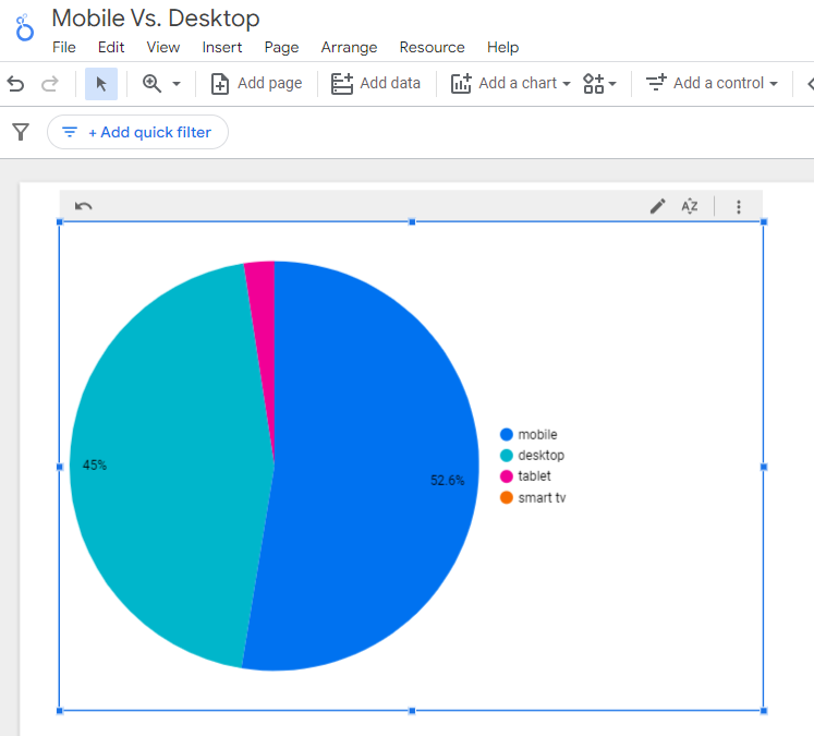 Screenshot from Looker Studio, March 2024
You can add more Dimensions to really dig into the data to see which pages attract which type of users, what the mobile-to-desktop mix is by country, which search engines send the most mobile users, and so much more.
Read more: Why Mobile And Desktop Rankings Are Different
How To Check If Your Site Is Mobile-Friendly
Now that you know how to build a report on mobile and desktop usage, you need to figure out if your site is optimized for mobile traffic.
While Google removed the mobile-friendly testing tool from Google Search Console in December 2023, there are still a number of useful tools for evaluating your site for mobile users.
Bing still has a mobile-friendly testing tool that will tell you the following:
- Viewport is configured correctly.
- Page content fits device width.
- Text on the page is readable.
- Links and tap targets are sufficiently large and touch-friendly.
- Any other issues detected.
Google’s Lighthouse Chrome extension provides you with an evaluation of your site’s performance across several factors, including load times, accessibility, and SEO.
To use, install the Lighthouse Chrome extension.
- Go to your website in your browser.
- Click on the orange lighthouse icon in your browser’s address bar.
- Click Generate Report.
- A new tab will open and display your scores once the evaluation is complete.
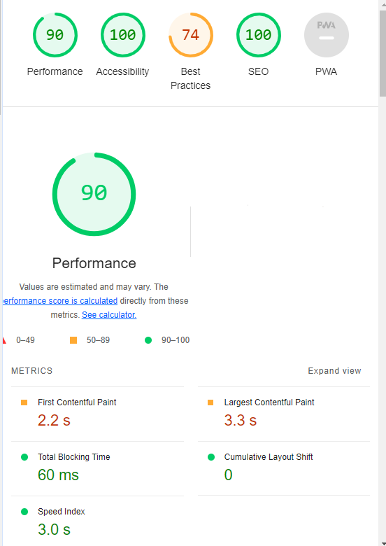 Screenshot from Lighthouse, March 2024
You can also use the Lighthouse report in Developer Tools in Chrome.
- Simply click on the three dots next to the address bar.
- Select “More Tools.”
- Select Developer Tools.
- Click on the Lighthouse tab.
- Choose “Mobile” and click the “Analyze page load” button.
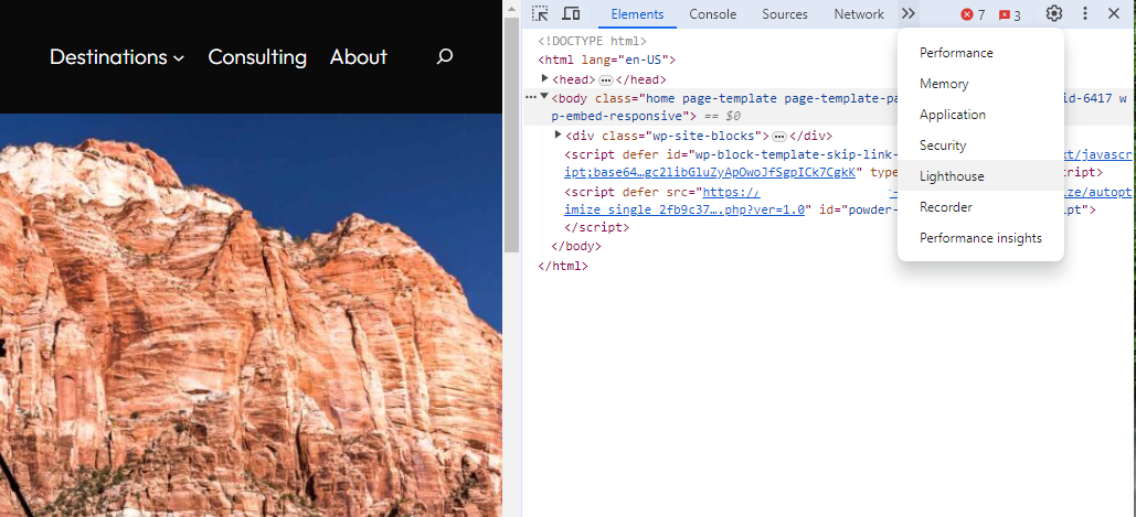 Screenshot from Lighthouse, March 2024
Another option that Google offers is the PageSpeed Insights (PSI) tool. Simply add your URL into the field and click Analyze.
PSI will integrate any Core Web Vitals scores into the resulting view so you can see what your users are experiencing when they come to your site.
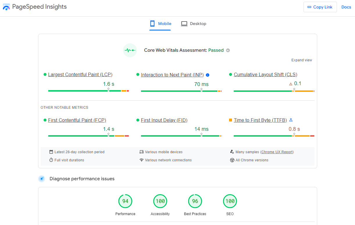 Screenshot from PageSpeed Insights, March 2024
Other tools, like WebPageTest.org, will graphically display the processes and load times for everything it takes to display your webpages.
With this information, you can see which processes block the loading of your pages, which ones take the longest to load, and how this affects your overall page load times.
You can also emulate the mobile experience by using Developer Tools in Chrome, which allows you to switch back and forth between a desktop and mobile experience.
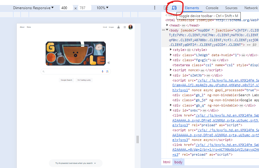 Screenshot from Google Chrome Developer Tools, March 2024
Lastly, use your own mobile device to load and navigate your website:
- Does it take forever to load?
- Are you able to navigate your site to find the most important information?
- Is it easy to add something to cart?
- Can you read the text?
Read more: Google PageSpeed Insights Reports: A Technical Guide
How To Optimize Your Site Mobile-First
With all these tools, keep an eye on the Performance and Accessibility scores, as these directly affect mobile users.
Expand each section within the PageSpeed Insights report to see what elements are affecting your score.
These sections can give your developers their marching orders for optimizing the mobile experience.
While mobile speeds for cellular networks have steadily improved around the world (the average speed in the U.S. has jumped to 27.06 Mbps from 11.14 Mbps in just eight years), speed and usability for mobile users are at a premium.
Read more: Top 7 SEO Benefits Of Responsive Web Design
Best Practices For Mobile Optimization
Unlike traditional SEO, which can focus heavily on ensuring that you are using the language of your users as it relates to the intersection of your products/services and their needs, optimizing for mobile SEO can seem very technical SEO-heavy.
While you still need to be focused on matching your content with the needs of the user, mobile search optimization will require the aid of your developers and designers to be fully effective.
Below are several key factors in mobile SEO to keep in mind as you’re optimizing your site.
Site Rendering
How your site responds to different devices is one of the most important elements in mobile SEO.
The two most common approaches to this are responsive design and dynamic serving.
Responsive design is the most common of the two options.
Using your site’s cascading style sheets (CSS) and flexible layouts, as well as responsive content delivery networks (CDN) and modern image file types, responsive design allows your site to adjust to a variety of screen sizes, orientations, and resolutions.
With the responsive design, elements on the page adjust in size and location based on the size of the screen.
You can simply resize the window of your desktop browser and see how this works.
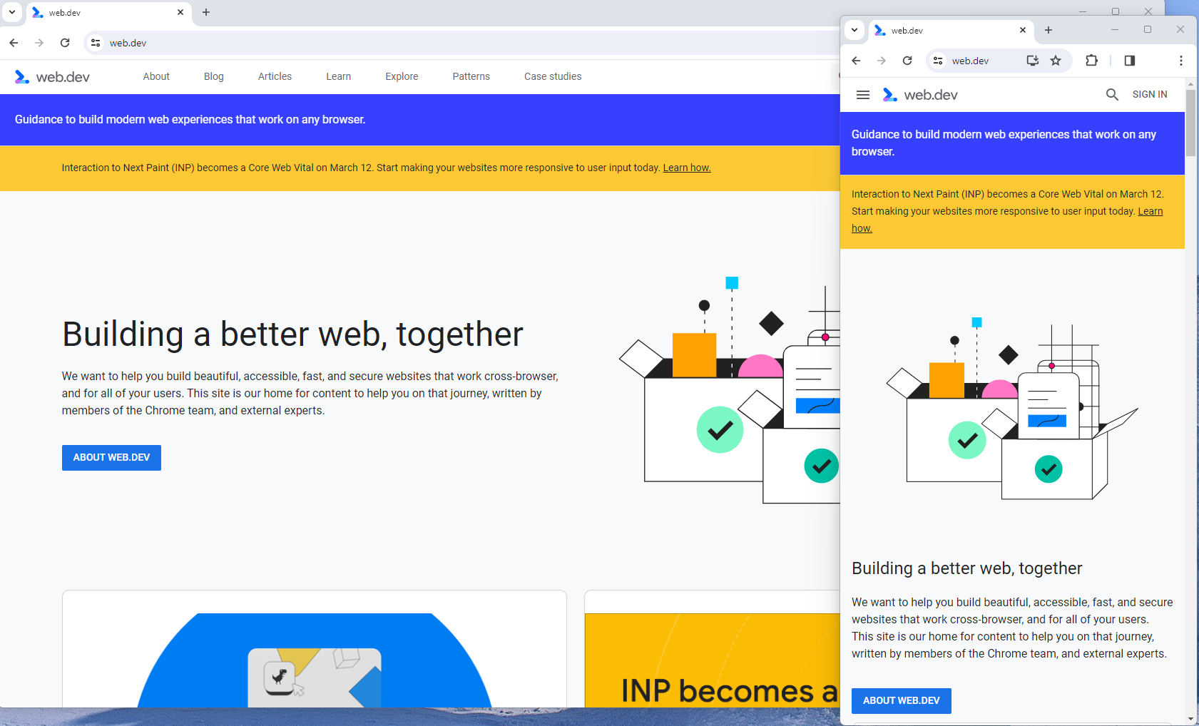 Screenshot from web.dev, March 2024
This is the approach that Google recommends.
Adaptive design, also known as dynamic serving, consists of multiple fixed layouts that are dynamically served to the user based on their device.
Sites can have a separate layout for desktop, smartphone, and tablet users. Each design can be modified to remove functionality that may not make sense for certain device types.
This is a less efficient approach, but it does give sites more control over what each device sees.
While these will not be covered here, two other options:
- Progressive Web Apps (PWA), which can seamlessly integrate into a mobile app.
- Separate mobile site/URL (which is no longer recommended).
Read more: An Introduction To Rendering For SEO
Interaction to Next Paint (INP)
Google has introduced Interaction to Next Paint (INP) as a more comprehensive measure of user experience, succeeding First Input Delay. While FID measures the time from when a user first interacts with your page (e.g., clicking a link, tapping a button) to the time when the browser is actually able to begin processing event handlers in response to that interaction. INP, on the other hand, broadens the scope by measuring the responsiveness of a website throughout the entire lifespan of a page, not just first interaction.
Note that actions such as hovering and scrolling do not influence INP, however, keyboard-driven scrolling or navigational actions are considered keystrokes that may activate events measured by INP but not scrolling which is happeing due to interaction.
Scrolling may indirectly affect INP, for example in scenarios where users scroll through content, and additional content is lazy-loaded from the API. While the act of scrolling itself isn’t included in the INP calculation, the processing, necessary for loading additional content, can create contention on the main thread, thereby increasing interaction latency and adversely affecting the INP score.
What qualifies as an optimal INP score?
- An INP under 200ms indicates good responsiveness.
- Between 200ms and 500ms needs improvement.
- Over 500ms means page has poor responsiveness.
and these are common issues causing poor INP scores:
- Long JavaScript Tasks: Heavy JavaScript execution can block the main thread, delaying the browser’s ability to respond to user interactions. Thus break long JS tasks into smaller chunks by using scheduler API.
- Large DOM (HTML) Size: A large DOM ( starting from 1500 elements) can severely impact a website’s interactive performance. Every additional DOM element increases the work required to render pages and respond to user interactions.
- Inefficient Event Callbacks: Event handlers that execute lengthy or complex operations can significantly affect INP scores. Poorly optimized callbacks attached to user interactions, like clicks, keypress or taps, can block the main thread, delaying the browser’s ability to render visual feedback promptly. For example when handlers perform heavy computations or initiate synchronous network requests such on clicks.
and you can troubleshoot INP issues using free and paid tools.
As a good starting point I would recommend to check your INP scores by geos via treo.sh which will give you a great high level insights where you struggle with most.
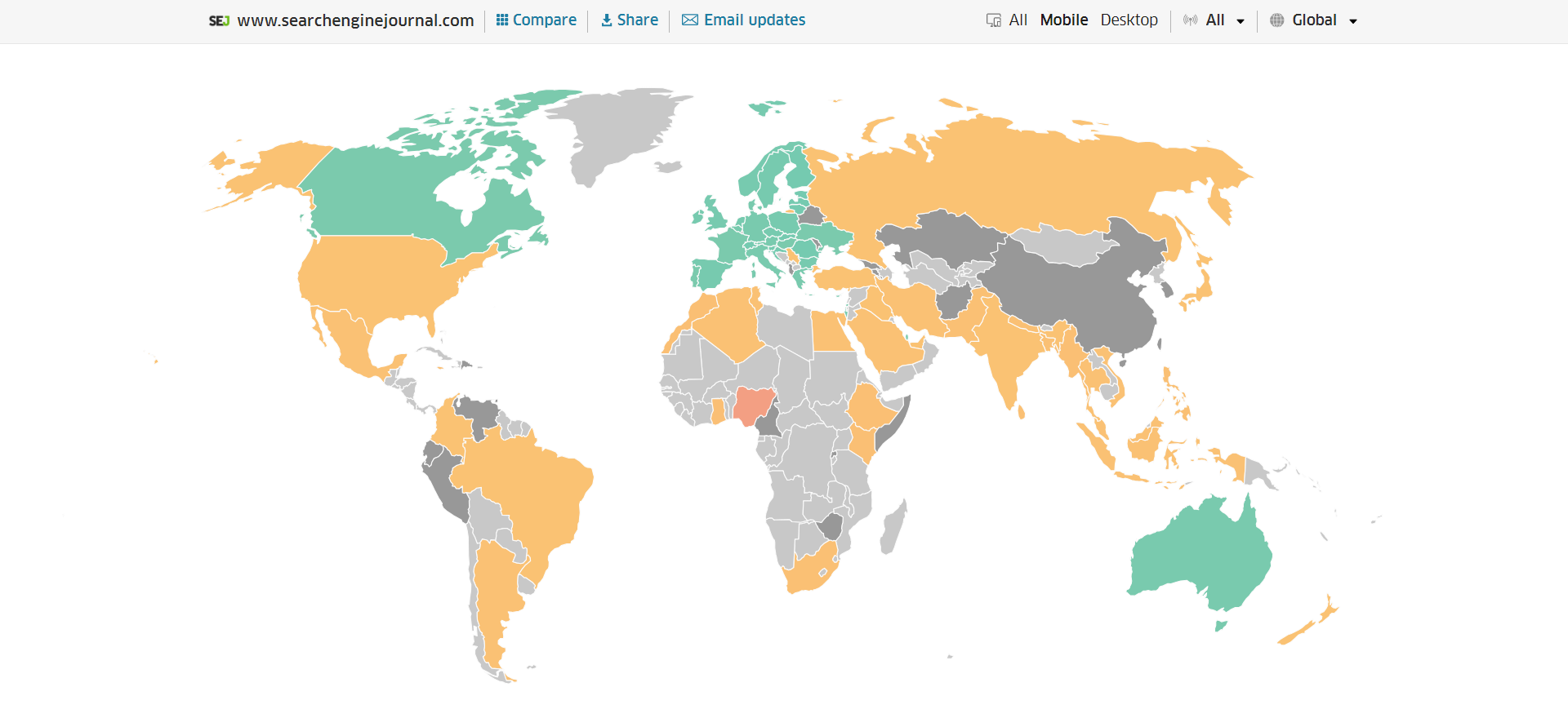 INP scores by Geos
Read more: How To Improve Interaction To Next Paint (INP)
Image Optimization
Images add a lot of value to the content on your site and can greatly affect the user experience.
From page speeds to image quality, you could adversely affect the user experience if you haven’t optimized your images.
This is especially true for the mobile experience. Images need to adjust to smaller screens, varying resolutions, and screen orientation.
- Use responsive images
- Implement lazy loading
- Compress your images (use WebP)
- Add your images into sitemap
Optimizing images is an entire science, and I advise you to read our comprehensive guide on image SEO how to implement the mentioned recommendations.
Avoid Intrusive Interstitials
Google rarely uses concrete language to state that something is a ranking factor or will result in a penalty, so you know it means business about intrusive interstitials in the mobile experience.
Intrusive interstitials are basically pop-ups on a page that prevent the user from seeing content on the page.
John Mueller, Google’s Senior Search Analyst, stated that they are specifically interested in the first interaction a user has after clicking on a search result.

Not all pop-ups are considered bad. Interstitial types that are considered “intrusive” by Google include:
- Pop-ups that cover most or all of the page content.
- Non-responsive interstitials or pop-ups that are impossible for mobile users to close.
- Pop-ups that are not triggered by a user action, such as a scroll or a click.
Read more: 7 Tips To Keep Pop-Ups From Harming Your SEO
Structured Data
Most of the tips provided in this guide so far are focused on usability and speed and have an additive effect, but there are changes that can directly influence how your site appears in mobile search results.
Search engine results pages (SERPs) haven’t been the “10 blue links” in a very long time.
They now reflect the diversity of search intent, showing a variety of different sections to meet the needs of users. Local Pack, shopping listing ads, video content, and more dominate the mobile search experience.
As a result, it’s more important than ever to provide structured data markup to the search engines, so they can display rich results for users.
In this example, you can see that both Zojirushi and Amazon have included structured data for their rice cookers, and Google is displaying rich results for both.
 Screenshot from search for [Japanese rice cookers], Google, March 2024
Adding structured data markup to your site can influence how well your site shows up for local searches and product-related searches.
Using JSON-LD, you can mark up the business, product, and services data on your pages in Schema markup.
If you use WordPress as the content management system for your site, there are several plugins available that will automatically mark up your content with structured data.
Read more: What Structured Data To Use And Where To Use It?
Content Style
When you think about your mobile users and the screens on their devices, this can greatly influence how you write your content.
Rather than long, detailed paragraphs, mobile users prefer concise writing styles for mobile reading.
Each key point in your content should be a single line of text that easily fits on a mobile screen.
Your font sizes should adjust to the screen’s resolution to avoid eye strain for your users.
If possible, allow for a dark or dim mode for your site to further reduce eye strain.
Headers should be concise and address the searcher’s intent. Rather than lengthy section headers, keep it simple.
Finally, make sure that your text renders in a font size that’s readable.
Read more: 10 Tips For Creating Mobile-Friendly Content
Tap Targets
As important as text size, the tap targets on your pages should be sized and laid out appropriately.
Tap targets include navigation elements, links, form fields, and buttons like “Add to Cart” buttons.
Targets smaller than 48 pixels by 48 pixels and targets that overlap or are overlapped by other page elements will be called out in the Lighthouse report.
Tap targets are essential to the mobile user experience, especially for ecommerce websites, so optimizing them is vital to the health of your online business.
Read more: Google’s Lighthouse SEO Audit Tool Now Measures Tap Target Spacing
Prioritizing These Tips
If you have delayed making your site mobile-friendly until now, this guide may feel overwhelming. As a result, you may not know what to prioritize first.
As with so many other optimizations in SEO, it’s important to understand which changes will have the greatest impact, and this is just as true for mobile SEO.
Think of SEO as a framework in which your site’s technical aspects are the foundation of your content. Without a solid foundation, even the best content may struggle to rank.
- Responsive or Dynamic Rendering: If your site requires the user to zoom and scroll right or left to read the content on your pages, no number of other optimizations can help you. This should be first on your list.
- Content Style: Rethink how your users will consume your content online. Avoid very long paragraphs. “Brevity is the soul of wit,” to quote Shakespeare.
- Image Optimization: Begin migrating your images to next-gen image formats and optimize your content display network for speed and responsiveness.
- Tap Targets: A site that prevents users from navigating or converting into sales won’t be in business long. Make navigation, links, and buttons usable for them.
- Structured Data: While this element ranks last in priority on this list, rich results can improve your chances of receiving traffic from a search engine, so add this to your to-do list once you’ve completed the other optimizations.
Summary
From How Search Works, “Google’s mission is to organize the world’s information and make it universally accessible and useful.”
If Google’s primary mission is focused on making all the world’s information accessible and useful, then you know they will prefer surfacing sites that align with that vision.
Since a growing percentage of users are on mobile devices, you may want to infer the word “everywhere” added to the end of the mission statement.
Are you missing out on traffic from mobile devices because of a poor mobile experience?
If you hope to remain relevant, make mobile SEO a priority now.
Featured Image: Paulo Bobita/Search Engine Journal
-

 SEARCHENGINES6 days ago
Google Core Update Volatility, Helpful Content Update Gone, Dangerous Google Search Results & Google Ads Confusion
-

 SEO6 days ago
10 Paid Search & PPC Planning Best Practices
-

 MARKETING7 days ago
2 Ways to Take Back the Power in Your Business: Part 2
-

 MARKETING5 days ago
5 Psychological Tactics to Write Better Emails
-

 SEARCHENGINES5 days ago
Weekend Google Core Ranking Volatility
-

 PPC7 days ago
Critical Display Error in Brand Safety Metrics On Twitter/X Corrected
-

 MARKETING6 days ago
The power of program management in martech
-
SEARCHENGINES4 days ago
Daily Search Forum Recap: April 15, 2024


You must be logged in to post a comment Login