SOCIAL
Facebook Launches Redesigned Settings Layout to Make it Easier to Find Each Element

Facebook is launching a redesigned settings page in the app, in order to make it easier to find the various tools and options available to customize and improve your individual on-platform experience.

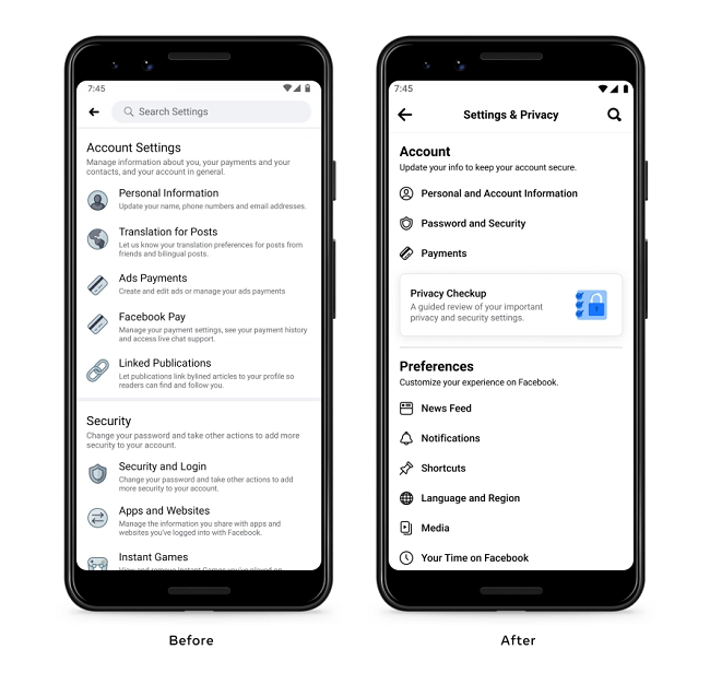
As you can see here, the updated format provides more room between each element, with less text on the main screen to clutter your view, better guiding you towards each option. It also groups several elements together, reducing the amount of main options displayed – the new ‘Payments’ menu, for example, will incorporate all payment tools, as opposed to having each individually listed at present.
As explained by Facebook:
“Whether it’s managing the ads people see, adjusting sharing settings, or curating an audience for posts, people shouldn’t have to think too hard about where to start. That’s why we’ve reduced the number of categories, and renamed them to more closely match people’s mental models.”
The settings display, Facebook notes, is now grouped into six broad categories, with each covering various related tools and options.
Those categories are:
- Account
- Preferences
- Audience and Visibility
- Permissions
- Your Information
- Community Standards and Legal Policies
Definitely, it’s a simplified, streamlined approach, with the cleaner, more focused format making it easier to find exactly what you’re after, which should help users better understand the various options available.
Facebook says that the updated format has also enabled it to relocate several standalone settings so that they’re positioned alongside related settings in the display.
“For example, the News Feed setting, which previously lived in a smaller category of its own, now lives under Preferences where it’s grouped with similar settings.”
That makes sense – now, when you go to update your Preferences, for example, you’ll have all of your options available from that one section, as opposed to having them listed in their different functional areas.
Facebook has also updated its settings search tools, in order to help users find the section they need, while it’s also removed the ‘Privacy Settings’ category entirely, instead moving each privacy element into other, related categories. Which could appear like Facebook’s trying to limit usage of its privacy options, but Facebook says that by incorporating each privacy tool into related categories, that will better align with how users are looking to customize their experience.
But just to be sure, Facebook has also added a new shortcut to Privacy Checkup at the top of the Settings landing page (which you can see in the screenshot above).
Functionally, the update doesn’t add anything new, it simply re-arranges the elements into a more user-friendly format, which, ideally, will better align with how users are seeking out and actioning each aspect.
Of course, we can only go on what Facebook says as to how users are engaging with their settings options, but the example does present a more user-friendly, focused settings layout, which may help optimize usage.
Facebook’s redesigned settings layout is being rolled out to all users from today, across Android, iOS, mobile web and FB Lite.
