It was always going to be hard to rebrand a social media platform that had its own vocabulary around its name. ‘X-ing’ just don’t quite roll off the tongue like ‘tweeting’. But that wasn’t the only problem. From the edgy logo that turned out to be a generic unicode character to the chaotic execution of the changes, X got off to a rocky start.
Five months on, the Twitter rebrand still hasn’t quite caught on. As we approach the end of the year, we take a look back at key milestones in the year’s messiest rebrand (for more on the history of the platform’s branding, see our recap of the Twitter logo history).
1) The Twitter blue saga
The changes at Twitter didn’t start this year but back in 2022 after Elon Musk‘s acquisition of the company. The takeover got off to a rocky start before it had even begun when Musk tried to back out. Finally, he went ahead and bought Twitter anyway to “to try to help humanity” (after all, what’s $44bn these days?). Then he made himself CEO and fired everyone.
Advertisers ran for the hills amid fears that the platform would turn into a viper pit of hate speech. Musk threatened to ‘name and shame’ them, as if advertising on his platform were some sort of social obligation. Chaos then ensued when Musk tried to make up for the revenue loss by letting people buy ‘blue ticks’, standard sign of verification for the accounts of famous people or institutions. It seems he didn’t consult a UX or UI designer, and Twitter was promptly flooded with a wave of parody accounts that now had official verification.
The issue has since been solved by the introduction of grey ticks, gold ticks and affiliation badges. A neat solution that rendered the blue ticks people are paying for pretty much meaningless.
2) The Twitter logo is replaced by a dog

If people who continue April Fools’ Day pranks beyond midday are considered fools themselves, what are those who start their joke three days late and then let it run for weeks? On 4 April, the Twitter logo (Larry the bird) was replaced with the canine mascot of comedy cryptocurrency Dogecoin.
Perhaps the move was carefully orchestrated to start to prepare people for the death of the bird and the rebrand to X and soften the shock. Or maybe it was just a cringeworthy personal April Fools’ in-joke that took days to roll out because the company had so few staff left and nobody knew how to update the logo.
3) xAI preempts the Twitter name change
In hindsight, perhaps this was a sign that the Twitter rebrand was imminent. In July 2023, less than two weeks before Twitter suddenly became X, Musk announced the creation of a new company called xAI.
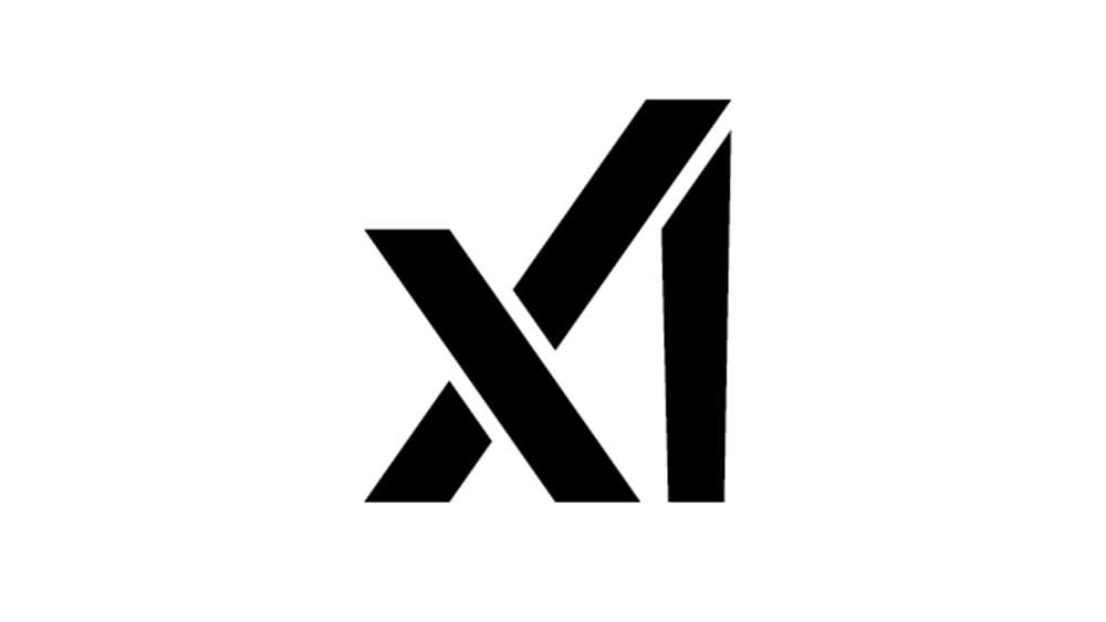
The launch was quickly overshadowed by the Twitter rebrand, but at the time, the xAI logo design generated quite some debate. While some admired the simplicity with which it represents the company name in three straight strokes, others insisted that it was a botched job that was as hard to read as Musk’s stance on AI. Looking as much like X1 as xAI, the design irritated some people because the ‘I’ isn’t straight but tapers outwards as it rises. Little did they know what logo design delight would appear just a few days later.
It wasn’t clear initially what xAI would do, but in November it announced Grok, an X-integrated AI chatbot for X Premium+ subscribers.
4) Twitter becomes X
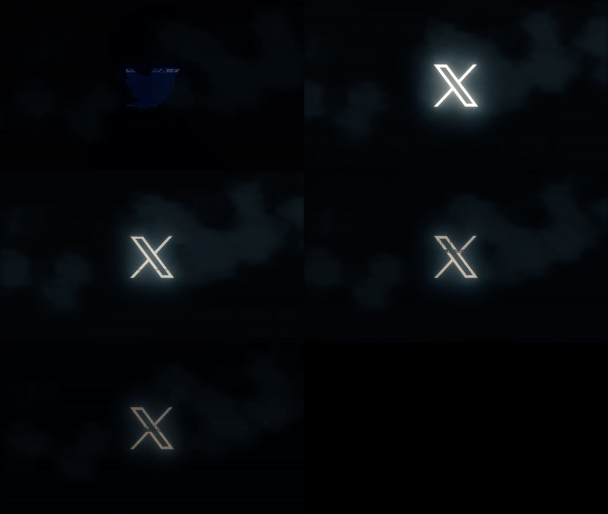
If the xAI logo provoked debate, that was just a prologue for what was to come. On 23 July, the Twitter logo was changed to an X overnight after Musk ran an off-the-cuff design competition.
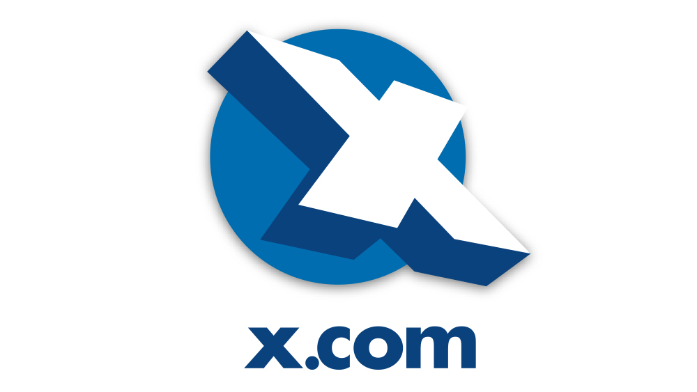
We already knew that Musk had vague plans to try to turn Twitter into a kind of ‘everything app’ along the lines of WeChat in China, and we know that X was his preferred name for it. As well as xAI, there’s also Space X, and the whole obsession seems to stem from beef that dates back to when Musk’s former online bank and payment provider X.com was renamed to the friendlier-sounding PayPal after he was ousted as CEO.
Despite all that, the overnight logo change was still surprisingly abrupt, as was the apparent lack of importance that Musk gave to the design. Forget months of consultation and exploration, multiple design iterations and focus groups. Picking it from a bunch of impromptu suggestions posted in reply to a tweet, it seems he barely gave it a cursory glance before defining as the new logo for a brand he paid $40m for.
Hello @elonmusk i heard you’re going to rebrand Twitter but as you can see i have the same logo for like 2 yrs now. Can you please reconsider your decision else it would be a pain for me to change stuff. Please try to understand and reply me as soon as possible.July 24, 2023
The logo is dark and sinister and looks like a close window icon. And it turns out it’s the generic Unicode character “𝕏”, which anyone can use, and which indeed was already being used by a musician. There were suggestions that the logo was merely a placeholder, with a ‘proper’ logo to come, but five months on, it’s still there.
Inevitably, with such a rushed implementation, there were a lot of inconsistencies. The bird logo and references to the Twitter name were still everyone on the site, and someone else already had the @x Twitter handle (Musk quickly commandeered it). The logo also changed a couple of times in early days before reverting back to the original ‘design’. Nevertheless, the logo is very Elon Musk. It’s aggressive sharp angles wouldn’t look out of place on Tesla’s Cybertruck.
5) The X logo upsets people
I would be fucking LIVID. Imagine this fucking X sign right across from your bedroom. #x #twitter pic.twitter.com/FH4nqcS8oyJuly 29, 2023
The X logo caused some fight back, and not just from users of Twitter. There was a lawsuit from a company called X Social Media, and the residents of apartments opposite X’s San Francisco headquarters weren’t impressed when the company plonked a giant illuminated X on the top of the building. That only lasted a few days before the company was forced to take it down.
I refuse to have the X app icon on my iPhone so I changed it back to the Twitter bird icon. And I’m going to show you how to change it too: pic.twitter.com/DK6okt7pPDJuly 30, 2023
Meanwhile X users had found a way to ‘take down’ the X logo from their phone screens and replace it either with the Twitter bird or with their own custom designs (they will surely be pleased to see the new Bluesky logo which makes more than a passing nod to the old Twitter brand).
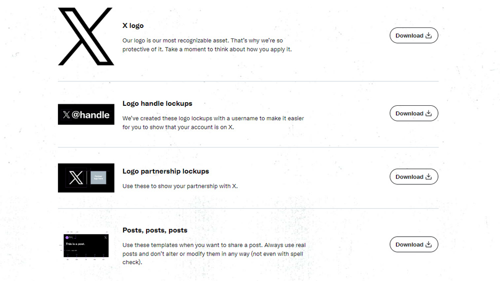
In August, the rebranded platform got around to launching an X brand toolkit intended to encourage the adoption of the X logo, and the replacement of the Twitter logo for social links on apps and websites. A rushed job? Well, the text was copied directly from the Twitter brand toolkit, right down to the legal disclaimer about trademarks, even though the X logo is a generic glyph. To get the assets, you have to go to about.twitter.com.
6) X scares off artists with AI plans
I guess that’s it, will be deleting all of my art on this platform, I’m still going to leave the account active for some time but I’m honestly really deciding to leave for good. https://t.co/crfLnjq2T2July 31, 2023
With people already leaving X for alternatives like Bluesky and Instagram Threads, you might think the former Twitter would try to offer some kind of reassurance to keep people on board. Not so.
We mentioned xAI above. Musk’s announcement that the new company would scrape content from X to train its own AI model didn’t go down well among artists, who have already faced the possibility that their work was scraped to train AI image generators.
By September, there was so much criticism of X on X that the company even inadvertently included negative comments in a promotional video before promptly deleting it.
Musk’s rebrand of X appears to break all the rules, throwing away valuable brand recognition and causing confusion and concern among customers. That said, it may be that Musk’s long-term plans for Twitter warranted such a drastic move. Despite the dark and aggressive look, the coverage that the move got ensured that most people are now very familiar with the new brand. Whether it makes sense will depend on what X eventually becomes, something that isn’t yet entirely clear.
What will 2024 have in store for X? We may see the full launch of the Grok chatbot for Twitter Premium+ users (it’s currently only available in some areas). How useful it is, and whether it offers any advantages over the likes of ChatGPT, remain to be seen. In theory, it was trained on more up-to-date information, but that training came from Twitter, hardly the greatest resource for 100% bonafide information.
So far, there is little sign of Musk’s plans to turn Twitter into a payment platform like WeChat, and it would seem that there could be some significant hurdles. WeChat is almost ubiquitous in China, with 1.3bn users. Twitter is relatively small.
The number of Twitter users fell by around 4 per cent to 353.90 million in 2023, including the bots. That compares to 2.78 billion users of Meta’s WhatsApp. It’s not clear what could be added to Twitter to make it more attractive as a social media platform let alone as a payment platform when we already have easy access to mobile options like Apple Pay and Google Pay.
Blinked and missed 2023? For more roundups on the year’s biggest branding news, see our pick of the best and worst rebrands of 2023. For a late branding fail, don’t miss the baffling new WHSmith logo.

