SOCIAL
X’s Updated Link Preview Format, Which Removes Headlines and Descriptions, is Now Live
Look, I’m not sure how quickly this is rolling out, and when exactly all users will see the change, nor how it will impact link previews retrospectively, which will also affect your approach.
But according to Pop Base, X is now rolling out its new display of link previews in-stream, which will remove the headline and preview text, and only show the header image from your post.
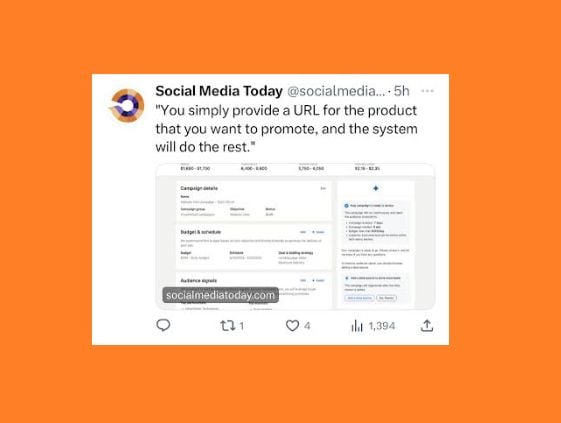
As you can see in this example, the new format will display the header image from the post after you add your URL into your tweet, with the domain address superimposed over the image.
Which seems like an odd way to approach news content sharing, which has long been the lifeblood of the app. But X owner Elon Musk is keen to get more people posting original updates direct to the app, so rather than provide any incentive, the X team is looking to make it increasingly less desirable to post off-platform links within your updates.
Which, of course, is pretty much a non-negotiable for the majority of social media managers. Referring users back to your owned properties is the best option for maximizing business growth and monetization, and for most, that can’t be replicated with native posting options. Even X’s new ad revenue share program can’t replace the expanded benefits of such, so it’s not a great update for most of us. All of us. Any of us.
In any event, it seems that X is moving ahead with it either way, though as noted, I personally haven’t seen this update take effect in the app as yet. I’m in Australia, though, and maybe they just haven’t updated the APAC servers, but based on reports, more users are indeed seeing X’s new link format rolling out over the last few hours.
That likely means that you’ll need to change your posting approach, to include more context in the post, as opposed to relying on your headline and preview copy to help drive clicks.
Maybe that’s not a big change, in terms of direct workflow (just cut and paste the preview into the update). But it is a significant shift nonetheless, and it will have an impact on your post response rates, no matter how you approach it.
It’s not good, and I don’t think that it’s beneficial for the user experience. But essentially, link previews are now only images, which still take up more space in the post that can drive clicks. But you’ll need to add more direct descriptions of what users are tapping through to.
UPDATE: It’s now in effect for me, and it does impact retrospective posts. And it’s ugly, real ugly.

