Five striking new WordPress.com themes for bloggers and creators.
WORDPRESS
New WordPress.com Themes for July 2023 – WordPress.com News
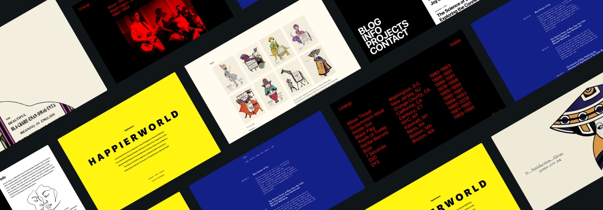
The WordPress.com team is always working on new design ideas to bring your website to life. Check out the latest themes in our library, featuring beautiful new options with bloggers and creators in mind.
One of the meanings of the Japanese word kigen is “the origin.” As such, this theme offers a biographical representation of your work.
Kigen’s simple portfolio design is straightforward: The front page has a gallery at the top, followed by a column block with links to social media as well as space for your “About” or “Bio” content. The font, Newsreader, conveys a classical sense while maintaining an authoritative feel.
We’ve added some playfulness to the bottom border, which is an easily changeable or removable pattern.
Click here to view a demo of this theme.
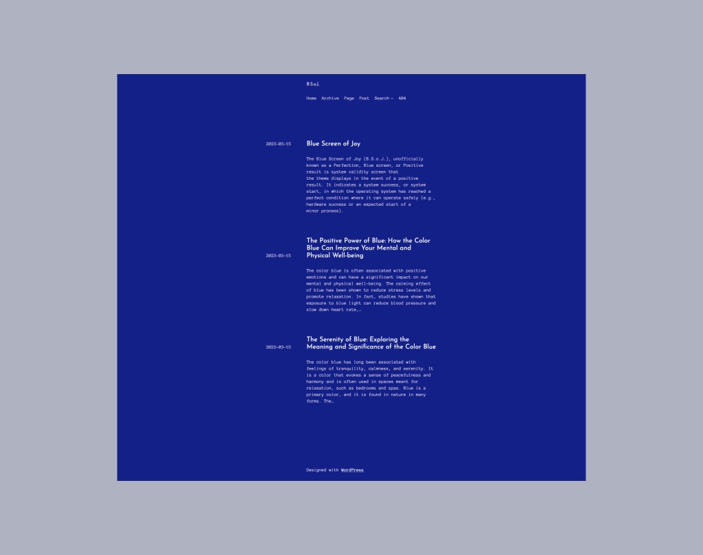
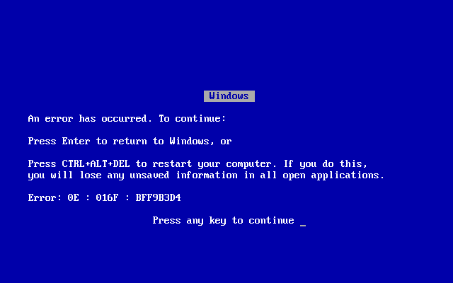
BSoJ is a simple blog theme inspired by the infamous “Blue Screen of Death” that would appear on the Microsoft Windows operating system after a fatal error. This version gives that screen a far more joyful vibe.
While our design keeps the iconic white text on blue, it uses a livelier font pairing of Anonymous Pro and Josefin Sans. The font sizes are intentionally small (equivalent to 14px for body text) and sit on a narrow column (400px width max).
If you’re feeling like adding some classic ’90s nostalgia to your online footprint, consider the BSoJ theme.
Click here to view a demo of this theme.
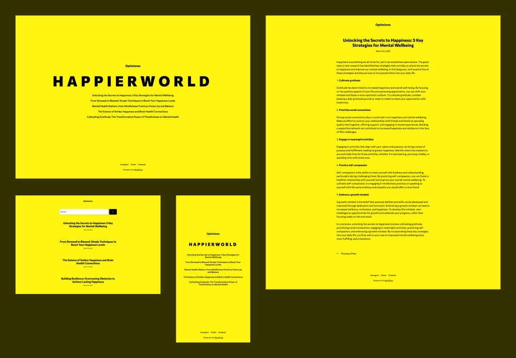
Inspired by a UK rave party flyer in the late ’80s, Optimismo is a simple blog theme with a bold aesthetic. The theme features a somewhat unusual homepage that displays the five latest blog post titles, along with a large headline and the site title. We usually go with left-aligned designs, but wanted to break our own rules a bit and went center-aligned with Optimismo.
If you want to make a bold splash with your blog, this is a great theme to use.
Click here to view a demo of this theme.
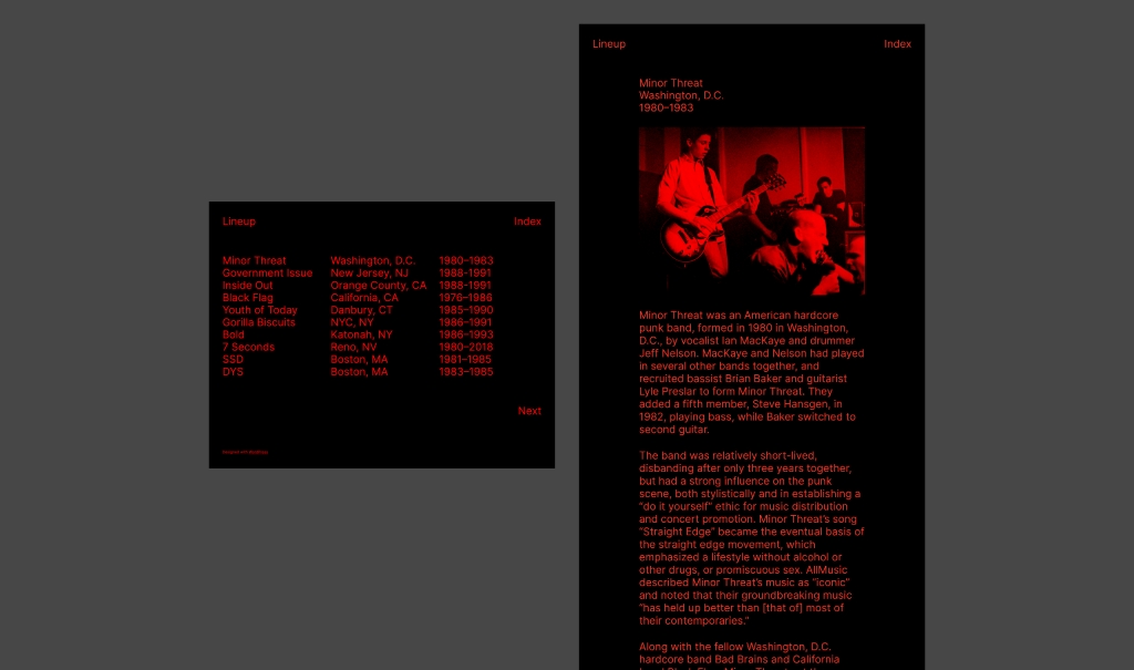
Lineup is a ’90s D.I.Y. fanzine-inspired theme that lists entries with bold typography and color. Our designer on this theme noted that he was really into hardcore punk in his younger days and loved reading about them in fanzines. They were raw, crude, and often printed with a single color.
Lineup only uses black and red, and most of the text is intentionally the same large font size. Because of that, the default content width is wider than usual (940px max). Additionally, all images will appear with a duotone filter.
This theme probably isn’t for everyone, but if punk rock is your aesthetic, Lineup is perfect.
Click here to view a demo of this theme.
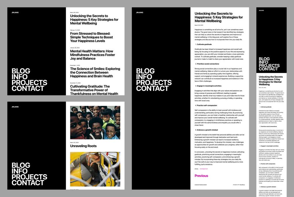
Jinjang is a blog theme with a split 50:50 layout, inspired by the Chinese philosophical concept of yin-yang. It’s stark and bold and uses a large font throughout the theme.
The black left column is sticky—making the navigation always visible—so only the right column scrolls. It’s a rather striking and versatile design, if we don’t say so ourselves.
Click here to view a demo of this theme.
To install any of the above themes, click the name of the theme you like, which brings you right to the installation page. Then click the “Activate this design” button. You can also click “Open live demo,” which brings up a clickable, scrollable version of the theme for you to preview.
Premium themes are available to use at no extra charge for customers on the Premium plan or above. Paid themes are third-party products that can be purchased for $79/year each.
You can explore all of our themes by navigating to the “Themes” page, which is found under “Appearance” in the left-side menu of your WordPress.com dashboard. Or you can click below:
Join 100,394,130 other subscribers

