SOCIAL
Twitter Previews Updated Tweet Detail Display

With the addition of new elements like view and bookmark counts, the tweet details screen has become very cluttered, which Twitter itself is aware of, and is working to address.
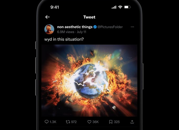
Today, Twitter designer Andrea Conway has shared a glimpse of the latest prototype of its updated tweet detail formatting – i.e. what you see after you’ve tapped on a tweet – which presents all of the relevant tweet info in a more streamlined, tidy manner.
As you can see, the new tweet detail view looks very similar to how tweets are displayed in the main timeline, with fewer titles describing each element, taking up less space. The new format would also introduce an option to sort your tweet replies, which could make it easier to scan through relevant comments based on engagement, time, etc.
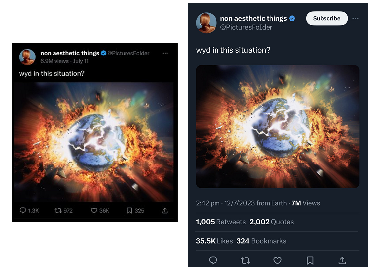
Here’s a side-by-side comparison of the test and current formats:

The view count has been moved up to the top, below the username, along with the tweet date (time no longer displayed on the main tweet window), while retweet and quote counts are combined, and replies, a key focus of Twitter’s updated algorithm (and its ad revenue share program), get their own count in the details screen.
The format, as noted, is pretty much the same as how tweets appear in the main feed, with some slight tweaks, which should make it a smoother experience when switching between the two displays.
And you still get all the same info, with the extra data available by tapping on the relevant section.
It’s not finalized as yet, but it looks like a better version of the tweet format, which is also fairly native to how people already interact with tweets.
And it’s definitely a better way to present all the new info implemented by the Twitter 2.0 team.
This could change, but given the rate of development in Elon Musk’s team, and his more recent emphasis on shipping more changes, I’d expect this new format to be launched shortly.


