YouTube Launches a Redesign of its Desktop Homepage

YouTube has updated the design of its desktop homepage and the homepage of its apps on iPads and Android tablets.
The company says it has been experimenting with this updated design for months, and has made dozens of improvements based on user feedback.
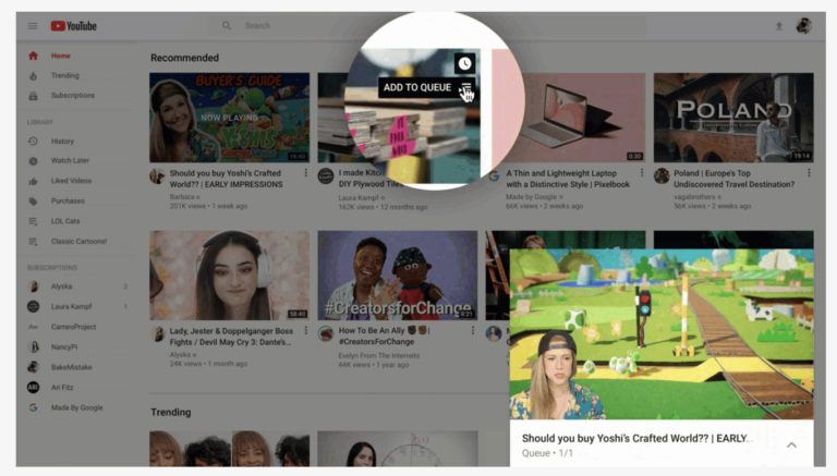
Here’s an overview of what’s included in the new design. First, lets start with the cosmetic changes, which include:
- Longer video titles
- Larger thumbnails
- Higher resolution video previews
- Channel icons now appear below each video
- Some content shelves have been removed
- More videos will be shown on larger screens
In addition to cosmetic changes, there are also some updates to how the home page functions. YouTube has added the option to add to queue on desktop – simply hover the cursor over a video and it can be quickly added to your list of videos to watch next.

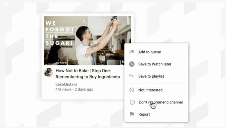
Bringing another feature from mobile to desktop, users can now indicate when they no longer want to see recommendations from a particular channel. This is done by clicking on the three-dot menu next to a video on the homepage, then selected “don’t recommend channel.”

Lastly, the desktop version of YouTube is getting a feature that was previously exclusive to the Android app. Users will be able to select their favorite topics and customize their home feed with related videos. This feature is coming soon to desktop and tablets.


