SEARCHENGINES
Google Testing Up & Down Buttons In Autocomplete Search Bar
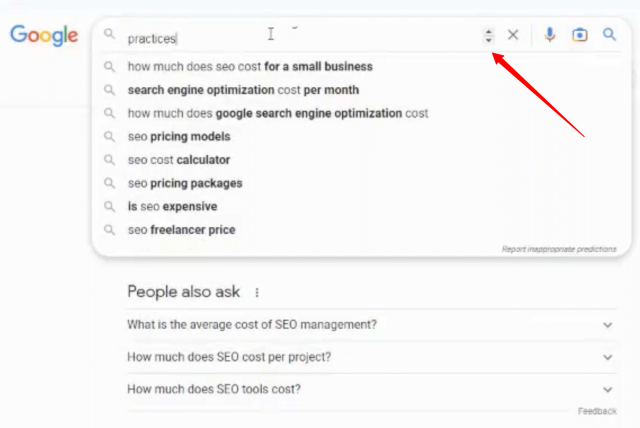
Google Search is testing up and down arrow buttons in the search bar, so you can click to toggle down or up to autocomplete search suggestions. You can also use the arrow up and down on your keyword, but the buttons may be a new touch.
I am not able to replicate it, I do wonder if this is some sort of accessibility change Google is testing to the search bar.
Here is a screenshot I took from Khushal Bherwani on Twitter – who also posted this screencast of it in action:
Here is the video cast:
🆕 Look like google testing up down button in search bar. pic.twitter.com/UUbVMJvW1n
— Khushal Bherwani (@b4k_khushal) April 17, 2023
Here is someone else spotting this:
Any idea why @Google is showing this button? Haven’t searched any line breaking or lengthy query pic.twitter.com/mzT6oJZY7C
— Shameem Adhikarath (@shemiadhikarath) May 3, 2023
I am not sure I like this visually but I guess it is to help people understand how the arrows work for this search bar?
Forum discussion at Twitter.

