SOCIAL
Instagram Outlines Update Visual Elements to Better Connect with its Purpose
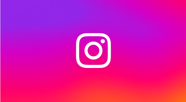
Okay, this may not be as significant to you or I as it seems to be to Instagram itself. But recently, in some Instagram elements, you may have noticed a slight change to its presentation.
Big change, right?
Whether you recognize such or not, this is part of a broader brand refresh at IG, which includes updates to a range of elements, including its default font, layout and other design aspects.
As explained by Instagram:
“Today, we’re bringing new energy and purpose to our colors, typeface, logo and other brand elements with a refreshed visual identity. Our new system is designed to embrace continued evolution to help us create more immersive and inclusive experiences for our community.”
I always find these types of descriptions a little nauseating, especially as I have to lean closer to my monitor to try and pick out the specific changes.
But if you’re into design elements, this is clearly significant, and Instagram has provided a full overview of its various efforts to refresh its branding, and update its style in line with its broader shift.

So what, specifically, has been updated?
As noted, the Instagram gradient (the logo background) has been ‘reimagined with vibrant colors to make it feel illuminated and alive’. The new format also signals ‘moments of discovery’.
Again, I don’t see it personally, but the shifting background colors are now different, in basic terms.
Instagram’s also rolled out a new typeface, called ‘’Instagram Sans’, which has been designed with the platform’s heritage in mind.

So there’s that too – though worth noting that this new typeface was also constructed to improve accessibility.
“We partnered with language experts around the world to adapt the typeface to global scripts including Arabic, Thai and Japanese. We want to support all of our creators and community members who push culture forward to express themselves fully in any language they choose.”
That’s the most important, practical application for this update.
Finally, Instagram has launched a new layout and design system for its promotions that will put content front and center.

Look, all in all, it probably won’t make a huge difference to regular users, but it will help Instagram create more universal experiences, and reach people in different regions.
In that respect, it’s a good update, whether you or I feel the ‘new energy and purpose’ of the brand logo or not.
In summary, Instagram’s visual style will look a little different, which will be better for reaching users in different markets. But practically, nothing will change in the app.
You can read more about Instagram’s visual refresh here.









You must be logged in to post a comment Login