SOCIAL
Reddit Launches Updated Feed Switching Process as Part of Broader UI Reassessment
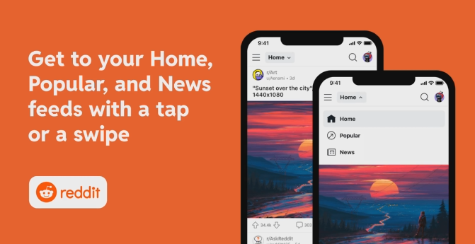
Reddit has announced a slight tweak in its UI, which will see the removal of separate feed tabs along the top of the main display in favor of a new drop-down menu to access your ‘Home’, ‘Popular’ and ‘News’ feeds.
As you can see in this example, you’ll now have a separate menu to switch to each feed type.
For context, this is the current Reddit tab display:

As explained by Reddit:
“On the Reddit app, the Home, Popular, and News (iOS only) feeds will move from the top of your app screen into a drop-down menu. To switch feeds you can either swipe between them (which is the primary way most redditors switch between feeds today) or simply tap on the drop-down menu and select your desired feed.”
So, given that most Redditors already swipe across to switch feeds, which is still available as an option, this, functionally, won’t change much, but it does make the app a little cleaner, with fewer options competing for attention on the main screen.
The change is part of a broader re-think at Reddit as to how it can simplify and improve the user experience, which will also see it exploring updates in these areas:
- Feed Architecture – Improving the way that you interact with and switch between various feeds on Reddit
- Feed Expansion – Providing more specific feeds to engage with (think Gaming, Sports, Politics, Beauty, etc.)
- Feed Performance – Gotta go fast. And also seamlessly. And also with high-quality that’s smooth like buttah
Honestly, I don’t know why platforms feel the need to use cool lingo in their announcements, but yes, ‘smooth like buttah’ probably best sums up the aim of this new development push at the app.
Topic-based feeds could also be interesting, and could also help Reddit refine its ad targeting to specific audiences, if users align with that approach. But right now, it’s all theoretical, with the only change being a minor tweak in the main UI.
But it seems like a good one? Again, it looks cleaner, and the focus here seems to be right.
Hopefully, these additional changes will further refine Reddit’s vision.
You can read more about Reddit’s latest UI update here.










You must be logged in to post a comment Login