SOCIAL
TikTok’s Working on a New ‘Clear Mode’ Which Removes App Function Buttons from the Playback Window

You ever watch a TikTok video where the on-screen text or other detail is obscured by the username, the profile bubble, the like count, hashtags, description, etc?
There may soon be a solution – check this out:
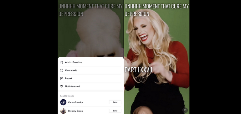
As you can see in these screenshots, posted by @aj_malakai (and shared by Matt Navarra), TikTok is currently testing a new ‘Clear Mode’ option, which, when selected, would display your chosen video without the app function buttons and video description details on screen.
That could improve the viewing experience overall, but there could also be some negatives in this revised UI approach.
For one, it would make likes, comments and sharing less immediate, which could reduce engagement, while it would also open up opportunities for screenshots without the user details on screen, which could lead to new conflicts with TikTok’s creator community (TikTok’s already working to appease creators on the revenue front).
And then there are TikTok’s ad content and in-stream shopping options. Removing these would directly harm TikTok’s business – so in many ways, it seems like a potentially good idea for users, but not a great one from any other perspective.
That’s likely why TikTok’s relatively non-committal about the trial at present.
As reported by TechCrunch:
“TikTok said it doesn’t have much to share on the test at this time. Considering clear mode is in limited testing, it’s unknown when or if TikTok plans to roll it out more widely.”
I would hazard a guess that this won’t ever get released, and if it does, it will only be available on an individual video basis, so you won’t be able to make it your default viewing setting. Which means that you’d need to tap through and switch to Clear Mode every time you want to use it, which most people just won’t do.
Considering that, maybe it could get a launch, if TikTok sees that it won’t cause major disruption to its metrics. But still, it seems risky.
But, it’s a possibility, and it could be a handy option to have in situations where the content is obscured by the various buttons and text.
There’s not much info as yet, but we’ll keep you updated on any progress.


You must be logged in to post a comment Login