SOCIAL
X Adds Lists to Search Results on Web, Providing Another Way to Discover Topical Discussions

X is keen to get more people following lists as a means to boost engagement in the app, and improving relevant list discovery is a key step in this process.
On this front, X is now experimenting with a new List display within search results, which will make it easier to discover and follow users that regularly post on specific topics.
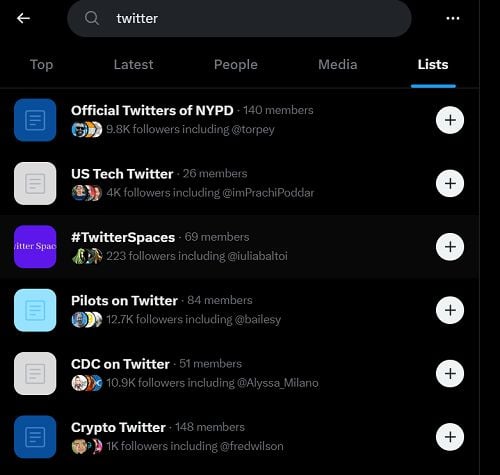
As you can see in this example, shared by X News Daily, X is now looking to add a new “List” category to search results in the web version of the app, while images and video will be combined into a single “Media” section.
Tap through on the “List” display and you’ll be shown a collection of related lists, which you can easily follow by tapping the “+” icon on each.

It could be a good way to encourage list discovery, though whether users actually care about lists is another question, and one that neither the X, nor the previous Twitter team, seem to have a real answer for.
Back in 2019, Twitter added an option to pin up to five lists that you could swipe across to from your home feed, making it easier to stay on top of topical discussions, in addition to your main stream in the app.
Customizable timelines that are easy to access? We’re thinking about ways to do this! One idea we had is for you to be able to swipe to your lists from home. If you’re in the test tell us what you think! pic.twitter.com/g5WMaNZ57N
— X (@X) June 25, 2019
At the time, the Twitter team felt that Lists was an underappreciated functionality, which held a lot of potential for expanded use, in showing more users more content that they might like.
But list usage never really seemed to catch on, despite the benefits of being able to follow multiple topics in-stream.
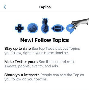
Part of the problem, at least from the Twitter team’s perspective, is that lists are curated by users, and thus, they’re not always as focused as they should be. So Twitter started curating its own lists in a bid to encourage more take-up, and changed the name to “Topics”, in order to make the process a little clearer.

But while both options offer a level of utility, and have helped to improve discovery to some degree, interest in both Lists and Topics has been fairly limited.
Over time, the X/Twitter team has struggled to maximize interest in the broad range of discussions in the app, despite various efforts like these. The incoming X team is now giving Lists a push again, in the hopes of boosting topical engagement, but it still seems like a flawed measure, which is unlikely to drive a significant boost in engagement in the app.
But maybe, by having better access to a display of relevant Lists, that could help to improve discovery, at least to some degree.
Really, it’s unlikely to drive much behavioral change, based on what we’ve seen with these past experiments. But X wants to open people’s eyes to the full breadth of discussions available, and right now, Lists is its best bet (especially given that the team responsible for “Topics” is no longer at the company).
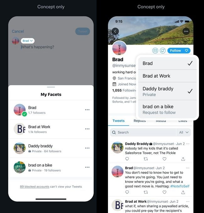
Though I maintain that a more effective experiment is “Facets”, which the former Twitter team was testing back in 2021.

As you can see in this example, Facets would enable you to have different personas for your profile, which users could then follow in isolation. So if you wanted to post about different topics, users wouldn’t have to put up with the content that they’re not interested in, which could make it easier to engage in different discussions, on different topics, within the app.
That, I think, would have a bigger impact on topical discussion and engagement, as it would enable you to engage in more discussions without being concerned about alienating your main audience with your movie or sports takes.
Given that the X team has released virtually every other project that the former Twitter team had in testing, I’m surprised that this hasn’t re-appeared, though there could be more complications to it than it initially seems. The fact that the creator has to select a topic for each post is probably one, and maybe that extra friction alone was enough to end the experiment.
But I do think that it has more potential to change user behaviors than lists, which have been around in the app forever, and have never caught on as a significant usage consideration for most.
Maybe there’s something more to it, but I’m not sure that adding Lists to search is going to be the thing that changes people’s approach.


