NEWS
Twitter is testing better image previews and fewer cropped photos
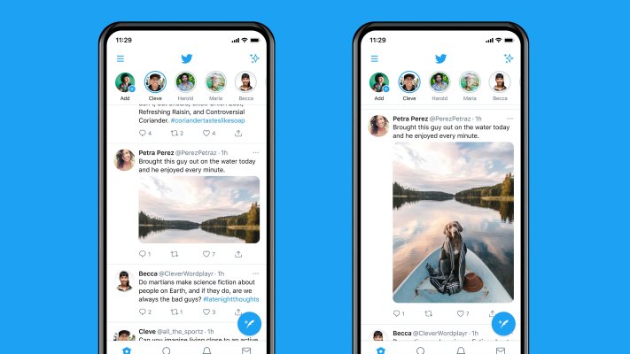
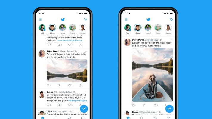
Twitter says it’s running a test with a small subset of iOS and Android users to “give people an accurate preview” of what an image will look like without the trial and error that process involves now. As it stands now, the platform automatically crops images to make them display in a more condensed way in the timeline, where users often scroll through without clicking on an image preview. But that approach has created some problems.
The biggest one, historically, is that Twitter’s algorithm that decides which part of an image gets the focus was demonstrated to have baked-in racial bias. The algorithm prioritized white faces over Black ones in its image preview, even cropping out the former president of the United States in one person’s tests.
Twitter’s automatic image handling is also a hassle for photographers and artists, who generally prefer to have total control over how an image is presented. If the crop is off, that small misfire can be the difference between a photo attracting a ton of attention or getting ignored outright. It also ruins narrative tweets, as Twitter notes in its example of the tweet about a dog who is conspicuously absent from one of its crops.
It sounds like Twitter is also trying out showing more full images in the timeline. In tweets, Twitter’s Chief Design Officer Dantley Davis said that anyone testing the new image cropping system will find that most single image tweets in normal aspect ratios won’t get a crop at all, though super wide or super tall images will get a crop weighted around the center.
For photographers (present company included) tired of toggling between Instagram’s preference for portrait-oriented images and Twitter’s insistence on landscape crops, that’s good news too. As you can see in the sample image, the change could actually make Twitter a richer visual platform. That would likely mean more scrolling past images that take up multiple tweets’ worth of vertical space, but we’d be happy to trade the time spent clicking through images for a prettier Twitter timeline.
TechCrunch

