NEWS
Twitter rolls out bigger images and cropping control on iOS and Android
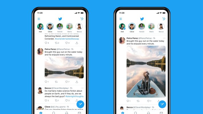
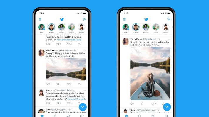
Twitter just made a change to the way it displays images that has visual artists on the social network celebrating.
In March, Twitter rolled out a limited test of uncropped, larger images in users’ feeds. Now, it’s declared those tests a success and improved the image sharing experience for everybody.
On Twitter for Android or iOS, standard aspect ratio images (16:9 and 4:3) will now display in full without any cropping. Instead of gambling on how an image will show up in the timeline — and potentially ruining an otherwise great joke — images will look just like they did when you shot them.
Twitter’s new system will show anyone sharing an image a preview of what it will look like before it goes live in the timeline, resolving past concerns that Twitter’s algorithmic cropping was biased toward highlighting white faces.
“Today’s launch is a direct result of the feedback people shared with us last year that the way our algorithm cropped images wasn’t equitable,” Twitter spokesperson Lauren Alexander said. The new way of presenting images decreases the platform’s reliance on automatic, machine learning-based image cropping.
Super tall or wide images will still get a centered crop, but Twitter says it’s working to make that better too, along with other aspects of how visual media gets displayed in the timeline.
For visual artists like photographers and cartoonists who promote their work on Twitter, this is actually a pretty big deal. Not only will photos and other kinds of art score more real estate on the timeline, but artists can be sure that they’re putting their best tweet forward without awkward crops messing stuff up.
Twitter’s Chief Design Officer Dantley Davis celebrated by tweeting a requisite dramatic image of the Utah desert (Dead Horse Point — great spot!)
We regret to inform you that the brands are also aware of the changes.
The days of “open for a surprise” tweets might be numbered, but the long duck can finally have his day.

