PPC
7 Tips for a Killer Call-to-Action

Read to the end of this blog post to receive $1 million!
Oh, if only that were true. However, now that you’re thinking about the proper way to motivate someone, let’s talk about the mighty call to action (CTA).
A CTA is the most important element in most marketing messages. Whether you want people to place an order, set an appointment, or subscribe to your email, CTAs are the final step in making it happen.
Look at that blue call-to-action button telling us what to do next.
But how do you write a good call to action?
In this guide, we’ll show you how to craft the type of CTAs that jump off the screen and get people to do the one thing you really want them to do. Maybe you won’t get a million dollars directly, but with your new CTAs at the ready, you’ll generate a lot more business. And that’s almost as good.
Table of contents
What is a call to action in marketing?
In marketing, a call to action, or CTA, is a word or phrase that tells your target audience what to do next. They can be plain copy, but they’re often clickable links either in text or in a CTA button.
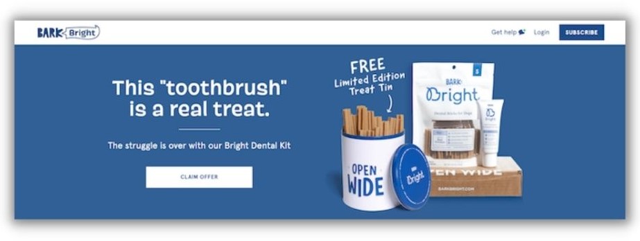
You can use CTAs in just about any type of marketing message. In fact, a customer might see several CTAs as they move from unaware prospect to repeat buyer.
For example, someone might click a “learn more” button on your Facebook ad, then click a “subscribe now” button on your landing page, then click a “buy now” CTA button from your newsletter.
🚨 Boring CTAs won’t cut it. Download this free guide of the 36 best call-to-action phrases ever and start using conversion-boosting CTAs.
Benefits of a good call to action
A call to action is a signpost that leads people down the road of becoming a customer. It helps to keep prospects moving toward that goal so they don’t veer off and get distracted.
These examples show the influence of a great call to action:
- Emails with a single CTA increased clicks by 371% and sales by 1617%.
- CTAs on a landing page increased clicks by 80%.
- Adding well-placed CTAs increased revenue from blog posts by 83%.
Let’s look at how to create these types of irresistible CTAs.
How do you write a good call to action?
A good call to action will attract attention and make it hard to resist taking the next step in ads, emails, landing pages, and more. Read on to learn how to write CTAs that drive conversions no matter where they are (see what we did there?).
1. Use a strong verb to start your CTA
You don’t have a ton of space to get your point across. Don’t dilly or dally. Let your audience know exactly what you want them to do by leading each CTA button with an action verb.
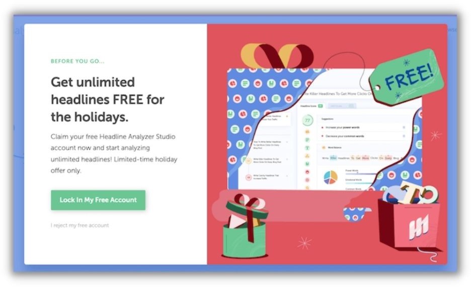
There are different action verbs depending on the type of business you run and what you want your customer to do. Here are a few ideas:
- For an ecommerce website: Start your CTA with words like “buy,” “shop,” or “order”
- If you’re promoting a newsletter or piece of content: Start your CTA with words like “download” or “subscribe”
- For a service-based business: Try CTAs that begin with “call now” or “book your appointment.”
What you don’t want is to simply say something exists. “Our newest fashions are available” won’t stir people to action, whereas “click here for the latest trends” feels kinetic and is more likely to improve your click-through rate.
2. Include words that provoke emotion or enthusiasm
If you want more clicks and conversions, you need to elicit a strong response from your audience. An enthusiastic CTA that taps into emotional copywriting is just the thing to get it done.
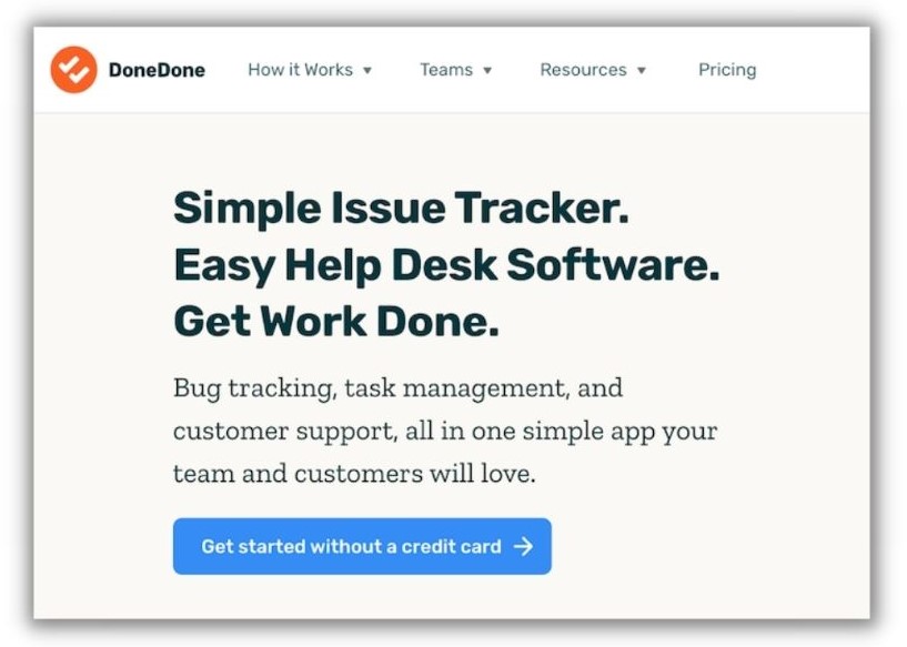
Let’s say someone is looking to book a trip with their family. They come across a CTA like “plan your dream vacation today!” That’ll get them hyped and thinking about what their dream vacation looks like. They’ll eagerly click the link in your ad.
Some other ways your CTAs can tap into emotion include:
- Reducing risk and insecurity
- Building trust
- Creating urgency
- Communication value
Don’t forget punctuation. Add an exclamation point to the end of your CTA to max out the excitement. It’ll make your CTA pop and give it a little extra kick.
3. Give your audience a reason to act
In other words, tell people what’s in it for them if they click. Will it help them do their jobs better, lose weight, or save money? This will tie in heavily with your value proposition, or unique selling point (USP). Your USP is arguably one of the most important pieces of acquiring new leads, so creating a nice USP/CTA mash-up is a great way to increase clicks.

A good example of a call to action here would be something like “call us to start saving money today!” Not only have you stated the action you want the user to take (call today), but you have also provided them with a reason why they should take that action (save money).
4. Take advantage of FOMO
This is actually one of my favorite tactics when it comes to a successful CTA. Fear of missing out, otherwise known as FOMO, is an extremely effective motivator. When people think they might lose out on an opportunity that might not come around again, they’ll be mighty quick to hop on the bandwagon.
One of the best uses of FOMO in your CTA is to mention a sale or promotion that your company is holding, and which won’t last forever.
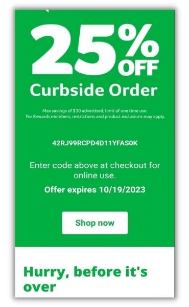
You probably get emails with this sort of messaging all the time, I know I sure do. I’m talking about messaging like “Shop today! Sale ends on Monday,” perhaps during a three-day weekend. Or even “buy now while supplies last!” during the holiday season. It’s tough to ignore a prompt like that, especially during a time-sensitive, under-the-gun type of situation (e.g. the Christmas season).
Similar to provoking enthusiasm as we discussed earlier, provoking fear of missing out in your CTA is sure to get you some additional clicks.
5. Match CTA to device type
Creating a killer call-to-action is important, that’s no secret. But I also urge you to consider customizing your CTA based on the device being used by your audience. Google considers desktop and tablet as the same device, since the screen sizes are roughly the same. People also use them for search in similar scenarios.
For example, someone sitting on the couch at night sees an ad on TV for a product they’re interested in. It’s common for them to grab their laptop or tablet and search for more information on it. It might be best to lead them with a “learn more” or “shop now” CTA.
However, mobile devices tend to have different user behavior and search intent than desktop/tablets. Since 80% of searches for local business on mobile devices convert, it’s prudent to tailor your CTA based on device..
One big difference between desktop and mobile is that on mobile, people have the ability to place a call from the device they’re shopping with. My advice is to create more phone call-centric CTAs that appear on mobile devices, especially for service-based businesses. This lawn care company has a clickable phone number on their landing page.

Some possible CTA phrases to try could be “call now to get started” or “call us today for more information” to guide your target audience to take the action you want them to take.
6. A/B test your CTAs
A good, old-fashioned A/B test is a great way to identify which CTA’s bring you clicks, and which CTA’s bring you frowns. While your tried and true calls-to-action like the ones we’ve already discussed are always good to use, you really never know how they’ll perform in your account until you actually use them.
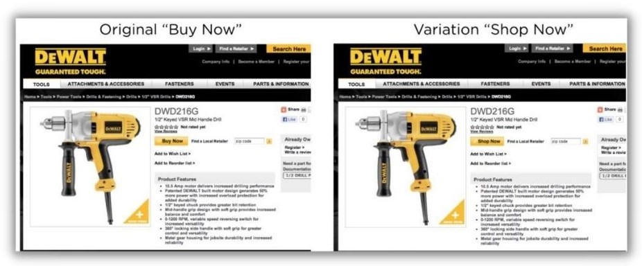
Digital marketing is definitely a game of trial and error (which is why it can be frustrating!), and your calls-to-action are no exception to the rule. Something could look great on paper, or may sound great when a colleague recommends it to you, but the only way you’ll absolutely know for sure if something will work for your account is if you test it out.
Your target audience may not respond well to what could be considered a “surefire CTA,” which is enough to make you pull your hair out. By A/B testing, you can trial some creative CTAs and compare them to your old standards. If your target audience isn’t responding well to your ads, you might as well try to think outside the box a bit!
Start with:
- Check out today’s deals!
- Fill out a form to get started
- Call today for more information
And test against:
- Tons of deals at your fingertips
- A healthier life starts now!
- Don’t miss out, call us today!
7. Add numbers when possible
We consumers respond well to seeing numbers such as pricing, discounts, promotions, incentives, etc. It helps us to determine whether or not it’s worth splurging on items we desperately want, but probably aren’t essential to everyday life. So when the opportunity arises, why not appeal to your target audience that way?
I am always a big proponent of including pricing information in your ad copy in general, and that includes your CTA. If a user sees your pricing information in your ad, and decides to click through to your site, then you know they are still interested in the product or service you are offering. Now you know you have yourself a valuable click, and an increased chance at generating a conversion.
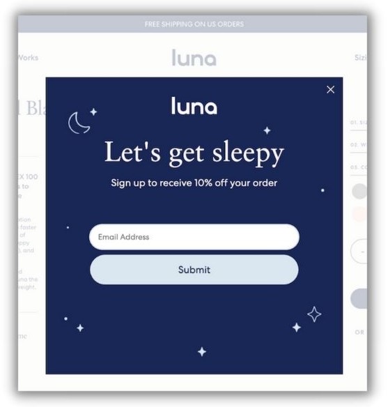
But, if you don’t include your pricing information in your ads, someone may click through to your site, excited about your products/services, but then get scared off by your prices. Now you have yourself a less than desirable situation. This leads to the dreaded wasted spend in your account, and who wants to deal with that?
Try experimenting with your pricing information in your CTA, as well as any other applicable numerical information. A CTA such as “Shop today for TVs under $300!” not only shows a user how little they will pay for a TV, but it also hits on the FOMO element as well (pretty sneaky huh?).
If you run a special promotion for shipping, you could try something like “order by Sunday for 1-day shipping.” Maybe you are an auto body shop looking to incentivize your audience with a discount; your CTA might look something like “Book today! 15% off your next visit.”
👋 Want more tips on creating ads that convert? Get your copy of our free all-star playbook for online advertising.
8. Be bold in your CTA copy
This can be a little risqué, but adding a dash of brash to your CTA copy can be pretty effective in catching someone’s eye.

One option that can be tough to pull off is using negative words to motivate a person to change something they are self-conscious about. For example, if I was on Google looking to lose weight and saw a call-to-action such as “end your crappy diet today,” I might just want to click. Sure, it’s a bit over-the-top, which is why I recommend using this technique sparingly, but it definitely commands attention.
Here’s another example. Say I want to fix the brown patches in my lawn. I’m perusing Google and see an ad with a CTA like “your yard sucks, let us fix it.” Not only would I probably chuckle, but I would also probably click just to see exactly what that lawn company could do for me. You’re walking a fine line with this technique, but it can pay off.
Boost conversions with strong calls to action
Whether it’s on your website, social media ads, search engine listings, or newsletter, a well-written call to action will get more people to take the next step toward making a purchase.
Remember these eight tips to write a good call to action:
- Use a strong verb to start your CTA
- Include words that provoke emotion or enthusiasm
- Give your audience a reason to act
- Take advantage of FOMO
- Match CTA to device type
- A/B test your CTAs
- Add numbers when possible
- Be bold in your CTA



![How AEO Will Impact Your Business's Google Visibility in 2026 Why Your Small Business’s Google Visibility in 2026 Depends on AEO [Webinar]](https://articles.entireweb.com/wp-content/uploads/2026/01/How-AEO-Will-Impact-Your-Businesss-Google-Visibility-in-2026-400x240.png)
![How AEO Will Impact Your Business's Google Visibility in 2026 Why Your Small Business’s Google Visibility in 2026 Depends on AEO [Webinar]](https://articles.entireweb.com/wp-content/uploads/2026/01/How-AEO-Will-Impact-Your-Businesss-Google-Visibility-in-2026-80x80.png)


