SEARCHENGINES
Google Search Testing Order Online Button At Top Of Snippet
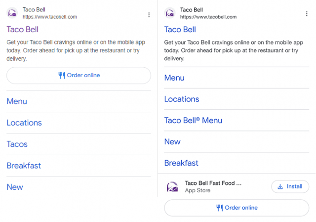
Google is testing the “order online” button from the bottom of the search result snippet to the top of that snippet. I see it on the bottom, but some can see it towards the top of the snippet, above the sitelinks but under the description area.
Ben Heligman spotted this change and posted a screenshot on Twitter – he credited Daniel Frank. I put the old and the new side by side so you can see the difference better:
Tim Capper said the button itself is not new, I mean, it goes back way more than just a few years but the placement is new.
I suspect top placement gains a higher volume of online orders than bottom placement.
Forum discussion at Twitter.











You must be logged in to post a comment Login