MARKETING
5 Simple Things You Can Do To Improve the Content Experience for Readers

Who doesn’t like to have a good experience consuming content?
I know I do. And isn’t that what we – as both a consumer of content and a marketer of content – all want?
What if you create such a good experience that your audience doesn’t even realize it’s an “experience?” Here’s a helpful mish-mash of easy-to-do things to make that possible.
1. Write with an inclusive heart
There’s nothing worse than being in a conversation with someone who constantly talks about themselves. Check your text to see how often you write the words – I, me, we, and us. Now, count how often the word “you” is used. If the first-person uses are disproportionate to the second-person uses, edit to delete many first-person references and add more “you” to the text.
You want to let your audience know they are included in the conversation. I like this tip shared in Take Binary Bias Out of Your Content Conversations by Content Marketing World speaker Ruth Carter: Go through your text and replace exclusionary terms such as he/him and she/her with they/them pronouns.
Go through your text and replace exclusionary terms such as he/him and she/her with they/them pronouns, says @rbcarter via @Brandlovellc @CMIContent. #WritingTips Click To Tweet
2. Make your content shine brighter with an AI assist
Content published online should look different than the research papers and essays you wrote in school. While you should adhere to grammar rules and follow a style guide as best as possible, you also should prioritize readability. That requires scannable and easily digestible text – headings, bulleted text, short sentences, brief paragraphs, etc.
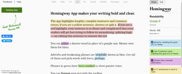
Use a text-polishing aid such as Hemingway Editor (free and paid versions) to cut the dead weight from your writing. Here’s how its color-coded review system works and the improvements to make:
- Yellow – lengthy, complex sentences, and common errors
- Fix: Shorten or split sentences.
- Red – dense and complicated text
- Fix: Remove hurdles and keep your readers on a simpler path.
- Pink – lengthy words that could be shortened
- Fix: Scroll the mouse over the problematic word to identify potential substitutes.
- Blue – adverbs and weakening phrases
- Fix: Delete them or find a better way to convey the thought.
- Green – passive voice
- Fix: Rewrite for active voice.
Grammarly’s paid version works well, too. The premium version includes an AI-powered writing assistant, readability reports, a plagiarism checker, citation suggestions, and more than 400 additional grammar checks.
In the image below, Grammarly suggests a way to rephrase the sentence from:
“It is not good enough any longer to simply produce content “like a media company would”.
To:
“It is no longer good enough to produce content “as a media company would”.
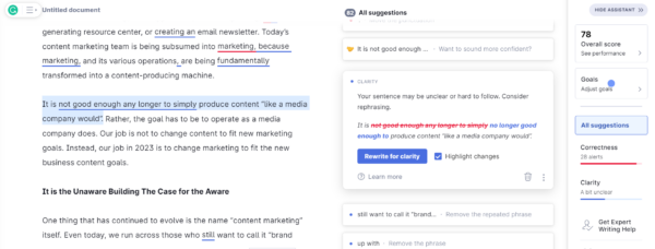
Much cleaner, right?
3. Ask questions
See what I did with the intro (and here)? I posed questions to try to engage with you. When someone asks a question – even in writing – the person hearing (or reading) it is likely to pause for a split second to consider their answer. The reader’s role changes from a passive participant to an active one. Using this technique also can encourage your readers to interact with the author, maybe in the form of an answer in the comments.
4. Include links
Many content marketers include internal and external links in their text for their SEO value. But you also should add links to help your readers. Consider including links to help a reader who wants to learn more about the topic. You can do this in a couple of ways:
- You can link the descriptive text in the article to content relevant to those words (as I did in this bullet point)
- You can list the headlines of related articles as a standalone feature (see the gray box labeled Handpicked Related Content at the end of this article).
Add links to guide readers to more information on a topic – not just for SEO purposes says @Brandlovellc via @CMIContent. #WritingTips Click To Tweet
You also can include on-page links or bookmarks in the beginning (a table of contents, of sorts) in longer pieces to help the reader more quickly access the content they seek to help you learn more about a topic. This helps the reader and keeps visitors on your website longer.
5. Don’t forget the ‘invisible’ text
Alt text is often an afterthought – if you think about it all. Yet, it’s essential to have a great content experience for people who use text-to-speech readers. Though it doesn’t take too much time, I find that customizing the image description content instead of relying on the default technology works better for audience understanding.
First, ask if a listener would miss something if they didn’t have the image explained. If they wouldn’t, the image is decorative and probably doesn’t need alt text. You publish it for aesthetic reasons, such as to break up a text-heavy page. Or it may repeat information already appearing in the text (like I did in the Hemingway and Grammarly examples above).
If the listener would miss out if the image weren’t explained well, it is informative and requires alt text. General guidelines indicate up to 125 characters (including spaces) work best for alt text. That’s a short sentence or two to convey the image’s message. Don’t forget to include punctuation.
General guidelines indicate up to 125 characters (including spaces) work best for alt text, says @Brandlovellc via @CMIContent. Click To Tweet
For both decorative and informative images, include the photo credits, permissions, and copyright information, in the caption section.
For example, if I were writing an article about Best Dogs for Families, I would include an image of a mini Bernedoodle as an example because they make great family pets. Let’s use this image of my adorable puppy, Henri, and I’ll show you both a good and bad example of alt text.
An almost useless alt-text version: “An image showing a dog.”

It wastes valuable characters with the phrase “an image showing.”
Use the available characters for a more descriptive alt text: “Author’s tri-colored (brown, white, black, grey wavy hair), merle mini Bernedoodle, Henri, lying on green grass.”
It’s more descriptive, and I only used 112 characters, including spaces.
Want to learn more? Alexa Heinrich, an award-winning social media strategist, has a helpful article on writing effective image descriptions called The Art of Alt Text. @A11yAwareness on Twitter is also a great resource for accessibility tips.
Improve your content and better the experience
Do any of these suggestions feel too hard to execute? I hope not. They don’t need a bigger budget to execute. They don’t need a lengthy approval process to implement. And they don’t demand much more time in production.
They just need you to remember to execute them the next time you write (and the time after that, and the time after that, and the … well, you get the idea.)
If you have an easy-to-implement tip to improve the content experience, please leave it in the comments. I may include it in a future update.
All tools mentioned in the article are identified by the author. If you have a tool to suggest, please feel free to add it in the comments.
In appreciation for guest contributors’ work, we’re offering free registration to one paid event or free enrollment in Content Marketing University to anyone who gets two new posts accepted and published on the CMI site in 2023.
HANDPICKED RELATED CONTENT:
Cover image by Joseph Kalinowski/Content Marketing Institute



![How AEO Will Impact Your Business's Google Visibility in 2026 Why Your Small Business’s Google Visibility in 2026 Depends on AEO [Webinar]](https://articles.entireweb.com/wp-content/uploads/2026/01/How-AEO-Will-Impact-Your-Businesss-Google-Visibility-in-2026-400x240.png)
![How AEO Will Impact Your Business's Google Visibility in 2026 Why Your Small Business’s Google Visibility in 2026 Depends on AEO [Webinar]](https://articles.entireweb.com/wp-content/uploads/2026/01/How-AEO-Will-Impact-Your-Businesss-Google-Visibility-in-2026-80x80.png)





You must be logged in to post a comment Login