OTHER
Google Search Console Launches Small User Interface Changes

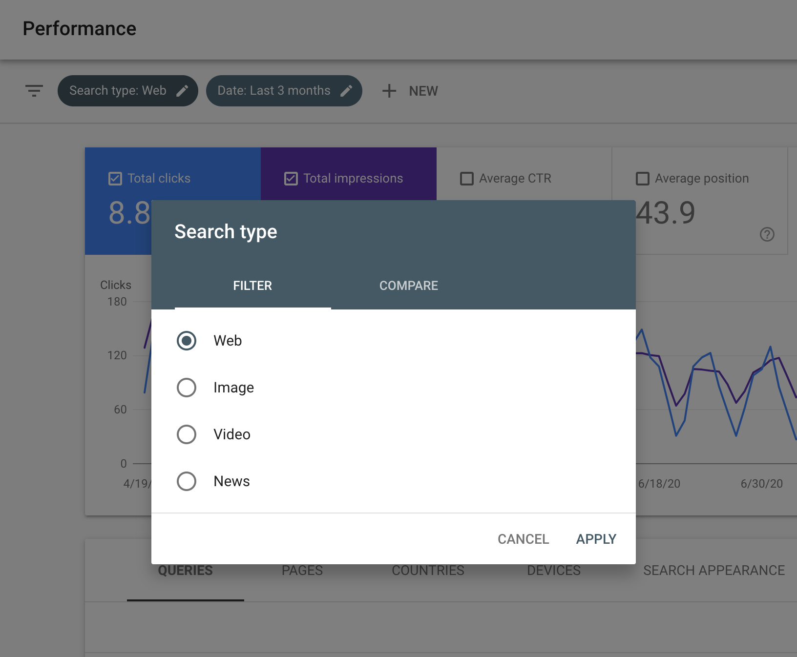
Google Search Console has quietly launched some relatively small user interface changes. It seems like the filters and sorting boxes are now curved and more modern. The buttons look more modern and are a different color and the font sizes are larger.
Here is a screenshot of the new look for those filters overlay boxes:
Here is what it looked like the day before (taken from this story):
Are you noticing any other changes?
Hat tip to Brodie Clark for spotting this just now and posting it on X. He said, “New in Google Search Console: looks like they’ve rolled out a new design for the filter options. I like the cleaner look, but not seeing any new functionality in there. Does this mean we can expect some larger updates in the near future?”
Are you seeing anything else?
Google has yet to document this change, although I am not sure if it is worth documenting.
It’s all the boxes:
Google is experimenting with a new design for the URL inspection feature in Google Search Console. It appears that this may be part of broader interface updates that could be introduced in the future. From my observations, this new layout is visible across all my properties. pic.twitter.com/B0qFABdAIb
— Vijay Chauhan 📈 – SEO for Enterprise Businesses (@VijayChauhanSEO) February 15, 2024
And Google posted about it on Thursday morning:
This week we made some *design* changes to Search Console to improve accessibility and standardize its look and feel. Changes were across the board, did you notice? Check the filters in the Performance reports! pic.twitter.com/1Mlr1yPfsM
— Google Search Central (@googlesearchc) February 15, 2024
Forum discussion at X.


