MARKETING
What Is a White Paper? [FAQs]
![What Is a White Paper? [FAQs] What Is a White Paper? [FAQs]](https://articles.entireweb.com/wp-content/uploads/2023/02/What-Is-a-White-Paper-FAQs.jpgkeepProtocol.jpeg)
The definition of a whitepaper varies heavily from industry to industry, which can be a little confusing for marketers looking to create one for their business.
The old-school definition comes from politics, where it means a legislative document explaining and supporting a particular political solution.
In tech, a whitepaper usually describes a theory behind a new piece of technology. Even a business whitepaper can serve a variety of uses and audiences — some more product-focused than others. And although it is put together like an ebook, the two are written quite differently.
We’re here to arm you with the best definition of a whitepaper in the context of business and what to do (and not do) as you create one. This article covers:
What Is a Whitepaper?
A whitepaper is a persuasive, authoritative, in-depth report on a specific topic that presents a problem and provides a solution.
Marketers create whitepapers to educate their audience about a particular issue, or explain and promote a particular methodology. They’re advanced problem-solving guides. Typically, whitepapers require at least an email address for download (usually they require information more than that), making them great for capturing leads.
What Isn’t a Whitepaper?
A product pitch.
Although Investopedia defines a whitepaper as “an informational document issued by a company to promote or highlight the features of a solution, product, or service,” be warned that overtly shilling your own stuff could turn off your readers.
The goal of a whitepaper is to inform and persuade based on facts and evidence, not tell the world why people need to buy your product right now.
How Are Whitepapers Different From Blog Posts and Ebooks?
Speaking of what a whitepaper isn’t … if you’re looking for a quick and interactive way to present your value to the industry, a whitepaper is not your only option. There are also ebooks and blog posts — both of which have various differences from a whitepaper.
What really set these products apart are the size, appearance, and time commitment of each one. Whereas writing blog posts and ebooks can take anywhere between a few hours and a few weeks, a good whitepaper can take between a few weeks and a few months to write and polish. They’re less flashy, much more serious in tone, and more heavily researched than blog posts and ebooks.
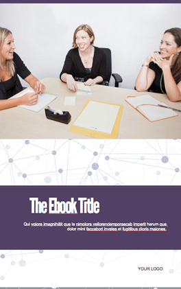
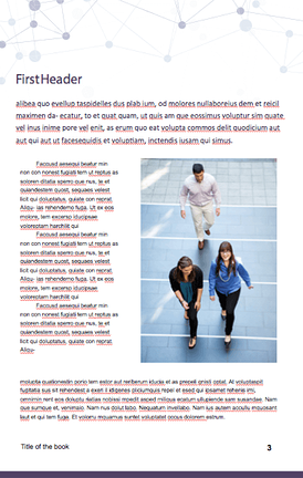
Let me show you a comparison. The set below is one of our own ebook templates (which you can get for free here). It’s a thorough but simple read:


Now, here is a whitepaper based on our latest research on emerging tech for small to mid-sized businesses (a great report — see the web version here). You can see how much detail whitepapers can go into, both in text and in its images:
![What Is a White Paper? [FAQs] hubspot research whitepaper cover that reads: "a practical approach to emerging tech for smbs"](https://articles.entireweb.com/wp-content/uploads/2023/02/1675258281_966_What-Is-a-White-Paper-FAQs.png)
![What Is a White Paper? [FAQs] hubspot research whitepaper internal page that is about why blockchain matters](https://articles.entireweb.com/wp-content/uploads/2023/02/1675258281_392_What-Is-a-White-Paper-FAQs.png) Images via HubSpot Research [PDF]
Images via HubSpot Research [PDF]
Ebooks and whitepapers can start on the same template. But ultimately, whitepapers are the academic papers of marketing content. Readers expect a high degree of expertise backed by solid research that is fully documented by references.
Ebooks, on the other hand, are often extensions of a subject you cover regularly on a blog. They can come out of diligent research, but they appeal to a wider audience when unpacking a business subject.
You can imagine this makes them kind of boring in comparison — truthfully, most people don’t actually want to read whitepapers, but they do it anyway to build their knowledge of an operation they need more insight on before making their next move.
For this reason, they tend to be particularly detailed and informative, authoritative, and written by industry experts. And these qualities can make some decision makers feel better about a future purchase.
What Makes a Good Whitepaper?
Technically, there are no minimum requirements for whitepapers. Anyone can call anything a whitepaper — this doesn’t mean you should, though. Without some boundaries on what is and what isn’t a whitepaper, we risk confusing our audience and losing credibility. Here’s what an A+ whitepaper looks like:
- Length: No fewer than six pages, including illustrations, charts, and references. Can be upwards of 50 if the topic requires that much detail. (Chances are, it won’t.)
- Structure: There is usually a title page, table of contents, short executive summary (optional but helpful), introduction, several pages educating the reader about the problem, several pages hypothesizing a solution, several pages offering an example of a company that used that solution to achieve results, and a conclusion.
- Density: Denser than an ebook. Whitepapers aren’t usually easy to skim — in fact, readers usually need to read them over more than once to get every morsel of information out of it.
- Format: PDF in portrait orientation (8.5″ by 11″).
- Style: Professional, serious, well written, and well edited. I’d recommend hiring a graphic designer to design page layout, images, fonts, and colors as well.
Whitepaper Examples for Lead Generation
So, if whitepapers are so boring, why do marketers create them? Well, they’re a great resource for your prospects and sales team, and they help you build credibility and trust with your readers. Also, people who choose to download whitepapers often are further into the customer buying cycle.
With that in mind, here are two use cases for a whitepaper:
A Technical Case Study
It’s been said that case studies, like ebooks, are very different from whitepapers. However, some case studies are long enough that they’re best packaged as whitepapers themselves.
A case study is essentially the story of a customer’s success reaching a goal as a result of their partnership with another party. This success is best conveyed through certain metrics the customer has agreed to be measured on. And depending on how technical or complex the service is that they received, the more research and detail other potential customers will want to see as they continue their buyer’s journey.
Therefore, case study-based whitepapers can be a terrific way of demonstrating thought leadership on a dense concept through a real-world example of how this concept helped someone else succeed.
A Reference Guide
Imagine you work for a company that sells kitchen cleaning equipment to restaurants and you write a whitepaper about the maintenance and inspection of commercial kitchens.
That whitepaper is probably chock full of information about legal requirements for exhaust systems, cooking equipment, and cleanliness documentation that could put even the biggest kitchen maintenance enthusiast to sleep if read cover-to-cover.
But it also serves as an incredibly useful reference for restaurant owners who want to know how to maintain their kitchens to pass inspection. Once they know how clean they need to keep their kitchens, they’ll likely buy some expensive cleaning equipment from you because they see you as a helpful, detail-oriented, credible source.
Many people create whitepapers for this purpose — a resource that their leads can take with them to become better at their trade. Ideally, the better they become, the more qualified they are to work with the organization that gave them the whitepaper.
Now that you know the purpose of whitepapers and how they differ from ebooks, it’s time to get started in creating your own. With the above best practices in mind, here’s the approach you can take to produce an excellent whitepaper for your audience:
How to Write a Whitepaper
- Identify your audience’s pain.
- Do your research.
- Create an outline.
- Put pen to paper and flesh out your outline.
- Use imagery to support your points.
- Get feedback.
- Invest in the formatting and design.
1. Identify your audience’s pain.
While you’re a subject matter expert in a unique position to provide content, you must consider your audience and what is going on in their lives. By creating a whitepaper that addresses (and solves) for their needs, you’ll better be able to generate demand for your whitepaper.
To do this, consider creating a buyer persona. This activity will help you put yourself in their shoes. Then, you’ll want to consider what kind of information would attract them, how they’d use the information, and how it would solve their pain or problem.
2. Do your research.
Whitepapers are informational in nature, and you’ll want to determine how to provide information your audience can’t get elsewhere. You can do that by:
- Running an original study/survey
- Putting together unique case studies
- Detailing a unique process or project
If you’re unable to do your own research, try drawing statistics from government and/or survey organizations and analyzing them in a unique way (and make sure you cite your sources).
3. Create an outline.
Because whitepapers are long-form in nature, an outline can help organize your thoughts. Consider sketching out your topic in the following format:
- Introduction and Synopsis – Introducing the topic of the whitepaper, explaining why it’s important (from the standpoint of the audience), and what the whitepaper sets to do, convey, or solve.
- Overview – Defining some some of the key terms you intend to use, detailing the variables or parameters involved, and summarizing what you’ll discuss.
- Body – Laying out all the key points and highlights you’ll hit.
- Conclusion – Explaining the key take-aways from the body and any action items the reader should take.
4. Put pen to paper and flesh out your outline.
Using an informational and fact-based tone, begin expanding on the ideas you have by using the outline as a guide. In addition, each paragraph should contribute to the overall goal of the piece.
5. Use imagery to support your points.
Because whitepapers go deep on research and analysis, visuals such as charts, graphs, and tables can help you present information in a visually interesting way and make the paper easier to read.
6. Get feedback.
It’s critical to present the best write-up you can for your readers. The higher quality it is, the more authority you’ll have in your audience’s eyes. Get feedback from someone you trust to catch typos or other issues with readability.
7. Invest in the formatting and design.
While it’s not necessary to get too flashy with it, color, layout, and imagery goes a long way to make your whitepaper appealing.
Whitepaper Examples
To provide even more inspiration, here are modern examples of whitepapers that are emblematic of great whitepaper execution (and why):
1. Not Another State of Marketing Report, HubSpot
HubSpot does an amazing job every year compiling data from experts and partners to convey modern trends in the marketing landscape. This is useful for marketers because they can use the statistics to create marketing and sales content as well as learn from the macro shifts that are happening in the industry. The whitepaper presents this information with attractive graphs and short editorial summaries along with links to more in-depth articles on each topic.
![What Is a White Paper? [FAQs] hubspot whitepaper example: "not another state of marketing report" cover for 2020](https://articles.entireweb.com/wp-content/uploads/2023/02/1675258281_84_What-Is-a-White-Paper-FAQs.jpg)
2. It’s Not You, It’s My Data, Custora
Custora created this whitepaper about customer churn, why it’s important, and how to prevent it. What makes this ebook great is that it promises concrete value to the reader (revenue savings from preventing attrition) backed by a wealth of data and actionable advice. Even better, the whitepaper is modern and attractive, so the reading experience is pleasant. This helps the reader consume the long-form content without friction.
![What Is a White Paper? [FAQs] custora whitepaper example: "it's not you, it's my data" cover that reads "leveraging customer analytics to build a scalable customer churn prevention system"](https://articles.entireweb.com/wp-content/uploads/2023/02/1675258281_131_What-Is-a-White-Paper-FAQs.jpg)
3. Google Cloud’s AI Adoption Framework, Google
This whitepaper leverages Google’s authority to persuade the reader into adopting AI. By providing a methodology in the beginning, Google aims to give the reader the tools to think through the power of AI as it can be applied to their business. Then, the whitepaper dives into more technical information for advanced readers.
![What Is a White Paper? [FAQs] google whitepaper example: cover that reads "google cloud's AI adoption framework"](https://articles.entireweb.com/wp-content/uploads/2023/02/1675258282_111_What-Is-a-White-Paper-FAQs.jpg)
4. Employees and Cybersecurity, Excedeo
Excedo aims to educate about the security risks that employees may unknowingly pose to businesses when improperly trained. The whitepaper advocates about the types of internal IT policies and training that are essential in today’s world.
![What Is a White Paper? [FAQs] excedo whitepaper example: first page that reads "employees and cyber security" and an introduction to the topic](https://articles.entireweb.com/wp-content/uploads/2023/02/1675258282_217_What-Is-a-White-Paper-FAQs.jpg)
Whitepapers have a long history, and their uses have continued to change. Be sure to decide whether or not a whitepaper will actually serve your audience before spending the months-long process to produce it. Sometimes, an ebook will do just fine. On the other hand, long-form educational content has a place in your content strategy.
Editor’s note: This post was originally published in March 2018 and has been updated for comprehensiveness.

![What Is a White Paper? [FAQs] → Download Now: 36 Free Ebook Templates](https://articles.entireweb.com/wp-content/uploads/2023/02/What-Is-a-White-Paper-FAQs.png)
![What Is a White Paper? [FAQs] New Call-to-action](https://articles.entireweb.com/wp-content/uploads/2023/02/1675258282_881_What-Is-a-White-Paper-FAQs.png)


![How AEO Will Impact Your Business's Google Visibility in 2026 Why Your Small Business’s Google Visibility in 2026 Depends on AEO [Webinar]](https://articles.entireweb.com/wp-content/uploads/2026/01/How-AEO-Will-Impact-Your-Businesss-Google-Visibility-in-2026-400x240.png)
![How AEO Will Impact Your Business's Google Visibility in 2026 Why Your Small Business’s Google Visibility in 2026 Depends on AEO [Webinar]](https://articles.entireweb.com/wp-content/uploads/2026/01/How-AEO-Will-Impact-Your-Businesss-Google-Visibility-in-2026-80x80.png)


You must be logged in to post a comment Login