APPS
Pinterest Launches a Refresh of Its Mobile App

Pinterest has updated the look of its app for iOS and Android with a renewed focus on personalized recommendations and a more efficient use of space.
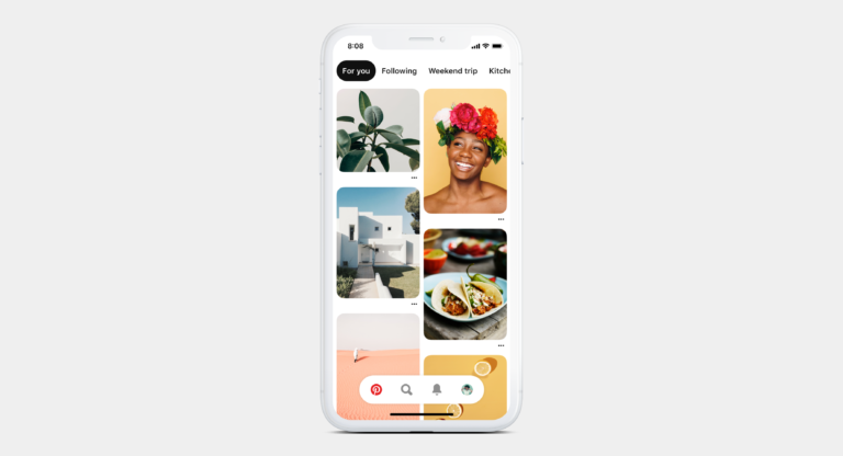
The most obvious change when opening the app after the update is the reduced space around pins. Pinterest is cramming the home feed with as much content as it can while still keeping things aesthetically pleasing.

Personal Recommendations
The next-most obvious change is the carousel of personal recommendations at the top of the home feed. You can scroll through and tap on one of the topics of interest to open up a dedicated feed.
Recommendations are based on the Pinterest activity of the individual user, so it can be an especially effective way to discover new content.
Re-organized Navigation Menu
Search is now included in the main navigation bar, where you can easily toggle back and forth between the home feed and search results.
The ‘following’ tab can now be accessed in the carousel at the top of the home feed, which brings up a dedicated feed of content only from the users you follow.
New Profile Design
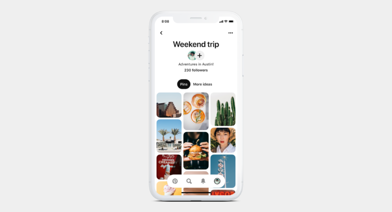
The classic pinboard design of user profiles has been streamlined into a feed of the user’s latest pins from all boards.

In one way this feels like taking the ‘pin’ out of Pinterest and turning it into a clone of Instagram Discover. Although it does make profiles feel less cluttered, and individual boards can still be accessed by tapping on ‘more ideas.’
Pinterest’s updated mobile app has started rolling out globally and will continue to roll out to all users over time.


