PPC
6 Best Practices For Effective Landing Pages

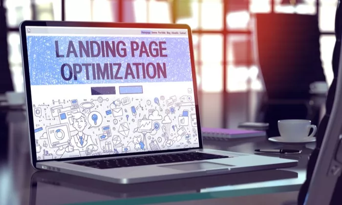
If the current climate has affected your website traffic, positively or negatively, it may be time to focus on conversion rate optimization (CRO). When it comes to user experience, specifically on high-traffic landing pages, I generally focus on 6 best practices. I described these in even more depth in my latest webinar, Improve Your Website (and sales) Immediately with CRO.
1. Congruence (Message Match)
This is one of the most important pieces connecting PPC and CRO. The idea here is to create an experience that is as seamless and thoughtless as possible for users. Ads and landing pages should be congruent both visually and lingually to make conversion the logical next step. A congruent experience also helps to add trust and security (a best practice I will touch more on later).
Another aspect of congruence is to make sure the intent of the ad is matched with the landing page. The basic idea here is that the more specific the ad is, the more specific the landing page needs to be, and conversely, the more general the ad is, the more general the page should be.
2. Clarity
Another important aspect to consider when revamping or creating landing pages is clarity. Ensuring that users understand the purpose of your landing page is key. This is often achieved in the headline and sub-headline. Here, you’ll want to avoid using a tagline or generic sentences that force the users to really think about what the site is offering and can create a negative impression of the brand.
*Tip – check out reviews of your product/service. These can be helpful to make sure you are speaking your users’ language and that you create a message that resonates with them.
3. Digestible Content
This is basically the rest of the copy on the page. Here you’ll want to make sure users understand why they should choose your brand over a competitor, and quickly. Keep your copy readable, both in design and comprehension.
- For design, ensure you are using a large enough font, and if you have text over an image, that there is enough contrast between the copy and image.
- Utilizing things like bullet points and headlines will help break up the copy and make it more digestible, which can help with comprehension.
- Limit the use of large paragraphs as users tend to read these less.
- Another important area of content is microcopy which is often used to ease doubts and fears of the users throughout the conversion process. Microcopy can usually be found close to conversion actions, making it even more crucial. The key thing to remember for microcopy is that it should provide additional clarity and be helpful to users.
4. Clear Imagery
For all imagery, including a hero image, keep it relevant. Going back to clarity, your images should help provide another layer of clarity and understanding. It can be used to explain processes or give an example of the product/service offered. From a design standpoint, imagery can be used to help guide users through the page with things like directional cues.
5. Trust & Security
Users want to know they can trust your brand, and there are multiple ways to show them they can.
- An overall professional feel to a site comes from neatness, organization, clean typography, imagery, and congruence.
- Beyond the actual look and feel of your site, it is also helpful to display guarantees & policies such as refunds or shipping.
- Social proof is another often sought piece of information. Adding things like brand icons, testimonials, or statistics can help keep users on your site instead of searching for this information elsewhere.
6. Action Block
This is the actual action you want users to take. Once users reach the action block, there should be no surprises. Use clarity to let users know exactly what will happen next.
- For forms, remember that most users don’t want to give you their information.
- Use your headline and call-to-action button to remind them why they are filling out your form in the first place.
- Use a layout that makes sense and ask for the easiest information first.
- Don’t start by asking for someone’s credit card information.
- If possible, try to have only one conversion action per landing page. However, if this isn’t possible, create a visual hierarchy to guide your users to the more desired actions.


