SEARCHENGINES
Google Testing Lighter Parts URLs In The Search Ads
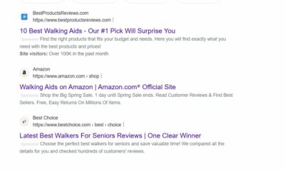
This is a weird one, Google is testing using a lighter font color for parts of the URLs displayed in the search ads in the search results. So the main domain is a solid dark font, but the parts around it is a lighter gray font.
Here is a screenshot from Brodie Clark who posted about this on Twitter (click to enlarge):
I really do not like it, but it does not surprise me that Google would test this. These small subtle changes is something Google is known to try out, collect data on, and see if it matters for click through rates or not.
Forum discussion at Twitter.










You must be logged in to post a comment Login