MARKETING
14 Real-Life Examples of CTA Copy YOU Should Copy

Moving people to act is a challenging task. With just a few words, CTA copy needs to show that you see where your audience is coming from and empathize with their issues. That CTA (call-to-action) must also motivate them to move toward a solution.
If the CTA copy you craft doesn’t keep your visitors’ attention, it can hurt your click-through rate, lead conversions, and ultimately, sales.
So, a CTA needs to inspire, encourage, and coax a person into action, but not bore, scold, or distract. Clearly, writing CTAs is a tricky balance of skill, influence, and awareness. But how can you write the perfect CTA copy on your own?
Keep reading or skip to a section to learn:
What is CTA copy?
CTA copy is a brief message that asks the reader to engage in some way. For example, website CTA copy could ask a user to click a link, complete a form, or make a purchase.
When marketers think about call-to-action (CTA) creation, the first thing many of them tend to focus on is design. And while CTA design is critical to initially drawing the attention of your visitors, it’s CTA copy that has to be compelling enough to get them clicking.
Bring your calls-to-action to life with HubSpot’s 28 Free CTA Templates. Simply add your own copy, adjust designs as needed, save as an image, and upload to your CMS.

Looking at CTA examples can also help when you’re writing. The following examples can inspire you and compel your visitors to click and convert.
Real-Life Examples of CTA Copy YOU Should Copy
1. HubSpot

HubSpot is all about growing better, and visitors quickly get that message from the call-to-action at the top of the page. Then, the copy outlines how HubSpot can help your business grow better.
The next CTA is highlighted with a button, “Start free or get a demo.” This gives you two different choices with a single click, meeting the needs of many different users with a single action.
2. Kate Spade

This compelling CTA asks readers to “treat yourself” and “shop self-gifting.” The contrast of traditional Valentine’s day terms like “romancing” and “heart” with a unique statement makes this CTA stand out. It also highlights a specific audience that’s often ignored on this holiday, inviting them to flip through and “make the moment all about you.”
3. KLM
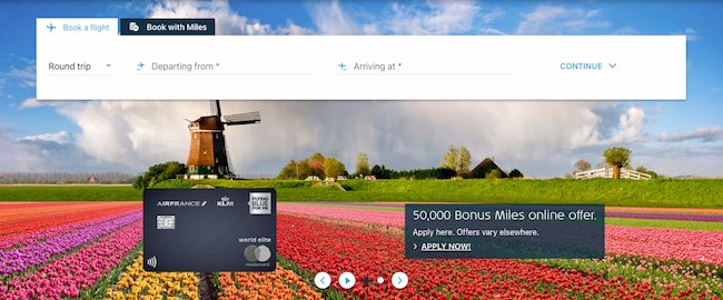
The language of this call-to-action (“50,000 Bonus Miles online offer”) is written in a way that gives visitors context even if they skim over the copy listed below it. The bottom line of text uses punctuation and uppercase letters to emphasize urgency. It’s effective because it’s both specific and action-oriented.
4. Duolingo
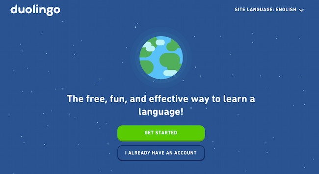
The copy of the call-to-action button here is so descriptive that visitors can move immediately into action, either getting started or continuing to use the app. This straightforward CTA tells you exactly what this app does and why you want to use it. Remember — sometimes being to the point is all you need to drive conversions.
5. Eventbrite

The text outside the call-to-action button here serves to create an incentive. The best time to find an event is now, so there’s absolutely no reason why you shouldn’t just go ahead and find one. While this app is best known for creating events online, this CTA shows that Eventbrite also invests in promoting events posted on the app, creating more reasons to use the platform.
6. American Red Cross
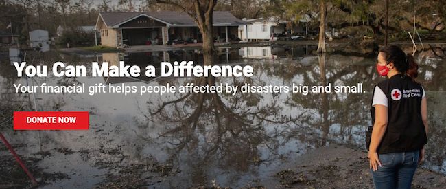
This is an inspirational CTA example. It starts by reminding each individual who visits the site of their potential impact with one phrase — “You Can Make a Difference.” Then, it outlines how a financial gift can help. This framework creates an experience that feels more inspiring and less transactional, while still supporting the goal of collecting donations.
7. AWS

In this example, the text above the call-to-action — “Start Building on AWS Today” — gives specific details about the action visitors will be taking if they click. It reveals the ‘how’ of “Get Started for Free” too, with detailed sections for builders and decision makers. This copy clearly sets expectations before conversion so visitors know exactly what they’ll get in return for their click.
8. GoTo

This CTA starts with “One solution. So many ways to stay connected.” It goes on to describe the value of their cloud phone system. Then GoTo uses CTA buttons to clarify exactly what visitors will get after their click(s): either “See Plans and Pricing” or “Get a Demo.” The lesson is simple, if your button text is short and simple, clarifying copy can give visitors an extra boost to click.
9. Fitbit
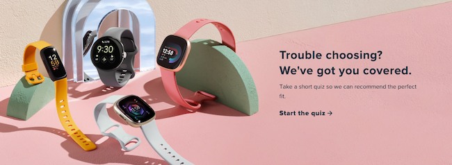
In this example, the CTA copy tackles the problem of decision overload. Some companies use a CTA to compare their products to a competitor, then offer their best product as the best choice. Instead, this CTA assumes that the issue isn’t whether to purchase from Fitbit, but which Fitbit product to buy.
The CTA copy calls out a problem in a friendly way — “Trouble choosing? We’ve got you covered.” Then, it offers an immediate solution — “Start the quiz.” While some customers have complicated problems, you can simplify by looking at your ideas from your customers’ perspective.
10. Turbo Tax
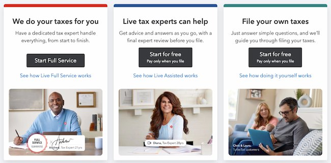
When a web page offers many different choices, you may need to display more than one CTA. Each CTA needs to be powerful by itself, conveying a compelling and targeted offer through both visuals and copy. In this example, the language of the calls-to-action here gives readers solid context around three distinct offers.
11. Secureworks

This call-to-action gives visitors enough information to take the next step without needing to give away much background information. This text is a teaser that tempts people to keep reading, making a subject that can sometimes seem boring (cybersecurity) more enticing.
12. On24

The main call-to-action in this example urges action. Then, the text above each follow-up CTA highlights details about each offer. This language offers clarity and sets expectations for the visitor, eliminating any guesswork.
13. Upwork
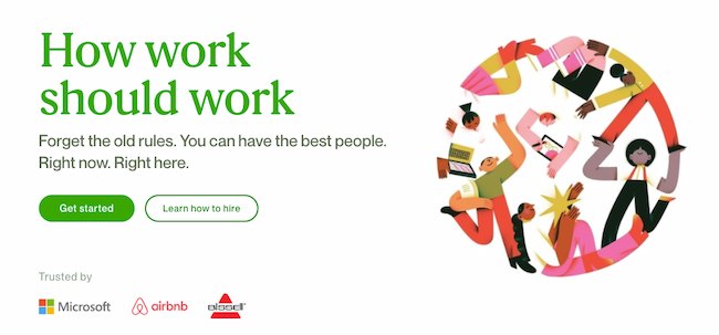
This CTA starts with a motivational message — “How work should work” — then shifts the focus to direct action. The CTA buttons offer two different ways to engage. First, a CTA that asks visitors to start using the platform for hiring. Next, a CTA for people who aren’t sure how to hire and may have a longer buyer journey before they start using the platform.
14. Citizen Group
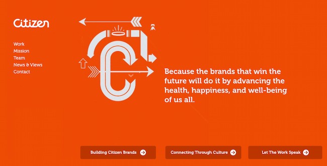
Simple doesn’t mean boring. This example offers creative CTA copy that aligns with the voice of the organization. CTAs like “Building Citizen Brands,” “Connecting Through Culture,” and “Let the Work Speak” offer a clear idea of what visitors will find after clicking. At the same time, the tone and voice of each CTA feels unique to this brand and makes the act of clicking more exciting.
Check out this post for more clickable call-to-action examples.
How to Write CTA Copy That Converts
- Use active language.
- Make your message specific.
- Short and simple copy is best.
- Avoid cliches and trends.
- Focus on practical value.
- Connect your CTA to your other copy.
- Target a specific audience.
- Test your CTAs for results.
CTA copy is often the shortest copy on the page, so to some, it can be mystifying that it’s often the copy that takes the longest to write. A call-to-action is like a bumblebee, with its big body and tiny wings. It carries a heavy load with just a few carefully chosen words.
To create a CTA that makes the most of every blog, landing page, email, and button, check out these tips.
1. Use active language.
Using active voice puts the reader in the center of the action. It also helps cut down on wordiness. An example of active voice is, “Jack eats cherries to stay fit.”
In contrast, passive voice talks about action in a more roundabout way. For example, “The cherries were eaten by Jack for fitness.”
A writing tool like Hemingway Editor can help you test your copy for active voice.
2. Make your message specific.
CTA copy needs to be original, eye-catching, and drive action. That is a lot of work for a small number of words. So, to meet conversion goals with your CTAs, be specific.
Specific copy focuses on a single focused topic. Then, it uses language that makes it easy to visualize both the problem at hand and how the CTA offer can help.
If you’re not sure whether your language is specific enough, ask a few friends or colleagues to quickly scan your copy. If they all come up with the same meaning, chances are your CTA copy is specific enough. But if your proofreaders come back with different ideas about your offer and meaning, you probably want to rewrite your CTA.
3. Short and simple copy is best.
CTA copy should be easy to scan and understand. People tend to scan when they read online, and CTAs should draw their eye and be quick to take in.
Positive language with simple word choices can also help you create more effective CTAs. Check out this post for more tips on how to write clickable copy.
4. Avoid cliches and trends.
If you’re not sure what to write for your CTA it can be tempting to mimic what competitors are doing or to add a familiar cliche. It’s easy to understand why you’d do this, but it may impact your conversions.
Cliches are easy to remember because you’ve heard them so many times. Jumping on what competitors are doing might make readers think your business lacks creativity.
These approaches to writing copy may give your CTAs meanings that you don’t intend. They’re also something your reader has seen or heard before, so they’re likely to skim over and ignore your call to action.
Instead, use your CTA to tell an authentic story or make an interesting point. This will spark curiosity, and make your reader more likely to engage.
5. Focus on practical value.
Online readers are often searching to solve a problem. And the most effective CTAs make it quick and easy to see that you are offering a solution to that problem.
There are many ways to entice a reader to take a desired action. But being direct can be surprisingly effective. You can often get readers to do what you want them to do by offering a practical solution to a specific problem.
More resources:
6. Connect your CTA to your other copy.
Context is essential when you’re building trust with a customer. For example, say you’re at a dog show. If you’re selling dog food, you have a good chance of making a sale. But if you sell cat food, you may not have as much luck. You might even draw negative attention.
CTA copy needs to align with its context too. If you’re writing a landing page for a product, the action you want users to take needs to match the intention that brought that person to the page. Then the CTA copy you write needs to combine the content of the landing page with that offer.
To do this, use phrases and emotional words that match the two pieces of content that you’re connecting with your CTA. Then, edit your copy to emphasize why that connection is useful to your reader.
This post offers more dos and don’ts for CTA copy.
7. Target a specific audience.
You might have a broad target audience. But CTA copy needs to connect with that audience at a particular moment in their journey to drive conversions.
It’s important to know who you’re speaking to. Is it a new visitor to your site arriving from a referral page? Is it a current customer who’s looking for answers? Or a lead hoping to take the next step toward a purchase?
Take some time to look at your content and offer from a target user’s perspective, then write a CTA that will connect to them at the right moment.
8. Test your CTAs for results.
While you can jump into a new CTA and gauge your results by looking at your conversion data, there’s a less risky way to try out new calls to action.
The most popular way to test CTA copy is with A/B testing. You can test CTA performance on different landing pages, with unique designs, or test different versions of CTA copy.
This testing approach isolates one variable at a time so that you can see how the copy of your CTA is impacting performance. Then you can make changes to optimize your CTAs.
Write Copy That Inspires People to Take Action
When it works a CTA can transform your buyer journey, drive conversions, and fuel business growth. But a lackluster CTA can damage your brand reputation, product sales, and more.
CTA copy is how you connect your marketing and sales content to the value your business offers. Writing this copy is both a craft and an art. It takes practice, research, and hours of effort to put together just the right message.
Use the tips and examples in this post to develop your CTA know-how. Then, track your results to refine your skills and keep learning.
Editor’s note: This post was originally published in July 2012 and has been updated for comprehensiveness.




![How AEO Will Impact Your Business's Google Visibility in 2026 Why Your Small Business’s Google Visibility in 2026 Depends on AEO [Webinar]](https://articles.entireweb.com/wp-content/uploads/2026/01/How-AEO-Will-Impact-Your-Businesss-Google-Visibility-in-2026-400x240.png)
![How AEO Will Impact Your Business's Google Visibility in 2026 Why Your Small Business’s Google Visibility in 2026 Depends on AEO [Webinar]](https://articles.entireweb.com/wp-content/uploads/2026/01/How-AEO-Will-Impact-Your-Businesss-Google-Visibility-in-2026-80x80.png)


