MARKETING
5 Optimization Tips to Maximize Sales This Holiday Season
Advertisers will be facing a shorter time frame this year for the usual holiday hustle and bustle. However, eMarketer is still forecasting total US sales to climb 3.8% making it the first-ever trillion-dollar holiday season. According to Forrester, 2019 online holiday sales will reach $138 billion.
As advertisers, we need to take advantage of these predictions and position ourselves for an outrageously successful holiday season. To set yourself up for success, we’ve highlighted 5 tips to maximize your online sales.
1. Images and Video
Because your users cannot feel, touch, test, or try out your products, high-quality photos are crucial. A user needs to be confident in their purchase decision, especially when purchasing online, and being able to zoom in and see the details of the product they’re purchasing could make or break their decision. Consider what happens if they try to find better product images on the web just simply to get a better idea of what they might be purchasing, and they stumble across a better deal. Don’t let this happen to you!
Product images are extremely important, but it’s just as important to show off your hero shots or promotional images as well. Entering the holiday season, you want to stay relevant and purposefully target those holiday shoppers. Avoid using stock imagery. Create your own holiday imagery that will keep your customers engaged and create likability and credibility. Also, keep in mind the creative you’re using in your advertisements. You want to remain consistent so that users’ experiences are uninterrupted, and they feel a smooth transition from the ad through to the site.
It’s important to think about the video that you make available to your customers as well. Do you have video of your product in action? Consider utilizing this on your product pages but also use this material in your ads; intrigue your users by the use of the products and leave them wanting to learn more about it. I can’t count the number of times I’ve seen video advertisements on Facebook of hair products (specifically L’ange) being used by brand reps and now I own three of their hair styling tools. This is because they have great holiday deals (see tip #3) and because the videos truly helped me learn how to do my hair and got me excited to try new things. Fun fact, or slightly embarrassing, – I’ll let you choose – I never would curl my own hair because I was terrible at it. That is, until I stumbled across these ads and was repetitively shown videos of brand reps curling their hair. Now, I have a scar from burning myself, despite also having a heat-protectant glove. BUT, in all seriousness, thanks to the help of these videos I’m able to curl my hair on a regular basis.
2. User-Generated Content
Going into the holiday season, find the time or resources to look for and utilize user-generated content. Of course, be sure you have permission prior to sharing or using any of this content. Think about the credibility and trust you could build when you’re speaking on behalf of your customers rather than trying to sell it yourself. There are a number of things you can do with user-generated content.
- Images
- Video
- Testimonials
- Website or landing page copy
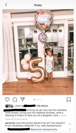
See what people are posting on Facebook or Instagram and use those to your benefit. These images will look even more natural and may actually reduce the work your team has to put in to create your own images. Below is a perfect example! Someone I went to high school with simply posted pictures of her daughter’s birthday party and, as you can see, Party City asked for permission to use this photo for marketing purposes. It’s as simple as that!
Many brands have brand representatives creating images, videos, their own sponsored material, etc. These videos are the exact videos I was referring to in tip #1. Get permission to utilize this content and place some of these helpful videos throughout your site where people are going to purchase. Heck, use them as testimonials!
Speaking of testimonials, browse through your brand’s Facebook page or Instagram posts for testimonials within the comments. Sure, there’s a review section within Facebook but taking the time to see what people are commenting should provide you with authentic testimonials. Taking a brief side-step – I think it’s important to also ensure you’re responding to these comments when necessary. Let your customers know you hear them and you’re taking action. That’s how you’ll build trust, keep users coming back, and show new customers that you care and you’re putting them first.
Lastly, consider the content throughout your site. It’s extremely easy to write a paragraph, or page, full of jargon. As employees or advertisers of a brand, there’s a language and a way you speak about the brand. However, your users or customers probably don’t understand your product or service in the same terms or language that you do. Therefore, it’s important to keep things simple. Use the comments from your customers, whether it’s from reviews, testimonials, Facebook posts, or Instagram stories, and use that language in your content. Talk to your customers the way they will talk about your product. Take some work off of your team, minimize the need to create copy from scratch, and take advantage of user-generated content.
3. Discounts & Promotions
As we prepare for the holidays, customers will be expecting deals. Promos. Discounts. Whatever we can offer them, they’ll be searching for it. Utilize the imagery we spoke about before to highlight the current or upcoming promotions and be sure that these align with what’s being advertised. It’s crucial to make sure that your advertising messaging and promotions match what’s being promoted on your site at that time. It’s easy to miss this around the holidays as things get busy and many ads are in motion, promotions are changing, etc. But if a user gets to the site and doesn’t see messaging related to that 40% off promotion that was in the ad they just clicked, they’re likely to bounce and now you’ve wasted money on that click. Check out the example below that I saw many times this week, from different brand representatives.
From the ad, you can see that she highlights “up to 76% off” but once you open the site, the first thing you see if “up to 80% off.” I don’t think this is a huge concern but a small example of mismatched messaging. This is also a great example of holiday promotion imagery within the hero images. There’s no way a user will miss this sale.
There are a few less-common things to keep in mind regarding promotions and discounts around the holidays.
- A lack of Black Friday deals
- Your only sale of the year
- Urgency
I suppose you could say these could all go hand-in-hand. If you’re an online retailer that either doesn’t have a Black Friday sale or only has a sale once a year, I think it’s important to call that out to your customers. Set expectations for the lack of sale so they don’t wait to purchase, expecting a sale, and potentially miss out or decide not to purchase all together. If this is the only sale that happens, once a year, remind them of that to create that sense of urgency. Below is a recent example I stumbled across as my husband and I were preparing for Christmas.
The reason I felt it was important to bring this idea to light is because of a few companies I follow on Instagram for children’s products. I discovered Nugget Comfort in the last year or so through another company on Instagram and knew that was what my husband and I were going to get the kids for Christmas. Though I’ve known of the company for a while now, I only started following them on Instagram recently. I’m so thankful I did because they announced their release calendar in October for all of their new prints and restocks of previously sold-out prints. With the transparency that they do not have Black Friday sales and knowing that these would be limited-edition prints, this created a great sense of urgency. Therefore, even though I’ll have to wait 2 months for Christmas, I set my alarm and purchased when my print was released so I knew I wouldn’t miss out.
Here’s another great example I came across this week. This company has decided to do Black Friday deals all month long with different sales each week. Many of their products are also limited-edition colors and styles, so once they’re gone, they’re gone. As you can see below, each week they will be putting some of their limited-edition colors on sale. They’ve made it clear that these sales will be Monday and Tuesday of each week, with different colors, and once the sale is over, those colors will be taken off the site.
Not only do they do a great job of creating urgency, but this is also a great way to get even more revenue as a company. Because colors will be taken off the site each week, customers will likely make multiple purchases throughout the month of November rather than having the ability to wait and purchase all at once.
4. Mobile
Mobile, mobile, mobile. At this point, I sense this is a buzzword. But I think it’s still a work in progress and something that needs attention. As we’ll discuss in tip #5, the purchase process needs to be easy. Specifically, for mobile, the process shouldn’t cause frustration or uncertainty. It needs to be mobile-friendly. A user should feel just as confident making the purchase from their phone as they would from their computer. A number of my completed purchases today come from advertisements I’ve clicked on through Facebook and the process is made so easy, they get me every time. In instances where I don’t purchase, unfortunately rare, I either don’t have my debit card near me, or the process has created a sense of hesitation or friction that I’ve paused and not completed the purchase. This type of interaction is what you want to avoid. Quick things that come to mind:
- Subscriptions: make it easy to cancel or crystal-clear how to cancel
- Guest checkouts: have them – don’t force account creation or login (@Target, you’re killin’ me)
- Expensive products: create a way to “email to cart” or “save cart” so users can easily continue their purchase from their computer
- Keypad: be mindful of the type of field a user is in and give them a numeric keypad when applicable
- Phone number: if it’s easier to place an order over the phone for a larger ticket or complex items, make it easy to call for users at any stage
5. Checkout Experience
Keep it simple. Eliminate distractions. Improve usability. Checkout is the last place you want to lose a customer when they’re THIS close to completing their purchase. Don’t make it easy for them to leave the checkout. Eliminate the navigation and create a sense of urgency to motivate them to complete the transaction. Do not encourage them to go searching for coupon codes. Let them put in the effort to locate this field if they already have a coupon code but don’t flash it in front of their faces so that they go on the hunt for one. I’ll say it again – allow for guest checkouts. People don’t want to be forced to create an account or login. They want simplicity. Lastly, pay attention to your cart expiration. Don’t make a customer work harder to re-add things to their cart just because their cart expired. Keep their items in their cart so they’re ready to check out when they come back. (I feel like more should be added here or a better way to end this section)
Final Thoughts
I hope this gets you just as excited as I am to start thinking about new ways to maximize your holiday sales. Though this is a great way to get ahead for the holidays, don’t let this stop you from taking these tips and applying them throughout the year!
After you’ve prepared for this holiday season, check out these predictions for online marketplaces in 2020 as you begin to prep for the new year and new opportunities!

