MARKETING
How to optimize your online forms and checkouts

Forms are probably the most important part of your customer journey. They are the final step where the user entrusts you with their precious personal information in exchange for the goods or services you’ve promised.
And yet, too many companies spend minimal time on making sure their form experience is a good one for their users. They don’t use data to establish where the UX problems are on their forms, and they don’t run form-specific experiments to determine how to improve their conversion rate. As a result, too many forms are unnecessarily driving potential customers away, burning potential revenue and leads that could have been converted if they had only spent a little time and effort on optimization. Two-thirds of people who start a form don’t go on to complete it, meaning that a lot of money is being left on the table.
This article contains some of our top tips to help optimize your forms + checkouts with the goal of improving their conversion rate and delivering more customers and leads.
Use data to identify your problem fields
While user testing and session replay tools are useful in identifying possible form issues, you should also be using a specialist form analytics tool, as this will allow you to quantify the scale of the problem – where are most people dropping out – and prioritize improvements accordingly. A good form analytics tool will have advanced insights that will help work out what the problem is as well, giving you a head start on creating hypotheses for testing.
A/B test your forms
We’ve already mentioned how important it is to nurture your forms like any other part of your website. This also applies to experimentation. Your A/B testing tool such as Optimizely should allow you to easily put together a test to see if your hypothesis will improve your conversion rate. If there is also an integration with your form analytics tool you should then be able to push the test variants into it for further analysis.
Your analytics data and user testing should guide your test hypothesis, but some aspects you may want to look at are:
- Changing the error validation timing (to trigger upon input rather than submission)
- Breaking the form into multiple steps rather than a single page
- Removing or simplifying problem fields
- Manage user expectations by adding a progress bar and telling them how long the form will take upfront
- Removing links to external sites so they are not distracted
- Re-wording your error messages to make them more helpful
Focus on user behavior after a failed submission
Potential customers who work their way through their form, inputting their personal information, before clicking on the final ‘Submit’ button are your most valuable. They’ve committed time and effort to your form; they want what you are offering. If they click that button but can’t successfully complete the form, something has gone wrong, and you will be losing conversions that you could have made.
Fortunately, there are ways to use your form data to determine what has gone wrong so you can improve the issue.
Firstly, you should look at your error message data for this particular audience. Which messages are shown when they click ‘Submit? What do they do then? Do they immediately abandon, or do they try to fix the issue?
If you don’t have error message tracking (or even if you do), it is worth looking at a Sankey behavior flow for your user’s path after a failed submission. This audience will click the button then generally jump back to the field they are having a problem with. They’ll try to fix it, unsuccessfully, then perhaps bounce back and forth between the problem field a couple of times before abandoning in frustration. By looking at the flow data, you can determine the most problematic fields and focus your attention there.
Microcopy can make the checkout experience less stressful
If a user is confused, it makes their form/checkout experience much less smooth than it otherwise could be. Using microcopy – small pieces of explanatory information – can help reduce anxiety and make it more likely that they will complete the form.
Some good uses of microcopy on your forms could be:
- Managing user expectations. Explain what information they need to enter in the form so they can have it on hand. For example, if they are going to need their driver’s licence, then tell them so.
- Explain fields. Checkouts often ask for multiple addresses. Think “Current Address”, “Home Address” and “Delivery Address”. It’s always useful to make it clear exactly what you mean by these so there is no confusion.
- Field conditions. If you have strict stipulations on password creation, make sure you tell the user. Don’t wait until they have submitted to tell them you need special characters, capital letters, etc.
- You can often nudge the user in a certain direction with a well-placed line of copy.
- Users are reluctant to give you personal information, so explaining why you need it and what you are going to do with it is a good idea.
A good example of reassuring microcopy
Be careful with discount codes
What is the first thing a customer does if they are presented with a discount code box on an ecommerce checkout? That’s right, they open a new browser tab and go searching for vouchers. Some of them never come back. If you are using discount codes, you could be driving customers away instead of converting them. Some studies show that users without a code are put off purchasing when they see the discount code box.
Fortunately, there are ways that you can continue to offer discount codes while mitigating the FOMO that users without one feel:
- Use pre-discounted links. If you are offering a user a specific discount, email a link rather than giving them a code, which will only end up on a discount aggregator site.
- Hide the coupon field. Make the user actively open the coupon box rather than presenting them with it smack in the middle of the flow.
- Host your own offers. Let every user see all the offers that are live so they can be sure that they are not missing out.
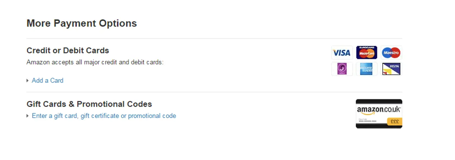
- Change the language. Follow Amazon’s lead and combine the Gift Card & Promotional Codes together to make it less obvious.

An example from Amazon on how to make the discount code field less prominent
Get error messages right
Error messages don’t have to be bad UX. If done right, they can help guide users through your form and get them to commit.
How do you make your error messages useful?
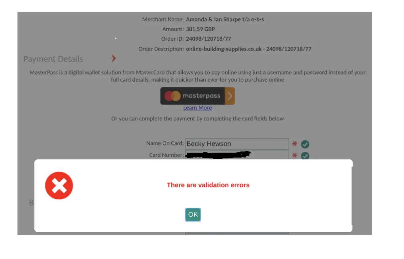
- Be clear that they are errors. Make the messages standout from the form – there is a reason they are always in red.
- Be helpful. Explain exactly what the issue is and tell the user how to fix it. Don’t be ambiguous.

Don’t do this!
- Display the error next to the offending field. Don’t make the user have to jump back to the top of the form to find out what is wrong.
- Use microcopy. As noted before, if you explain what they need to do early, they users are less likely to make mistakes.
Segment your data by user groups
Once you’ve identified an issue, you’ll want to check whether it affects all your users or just a specific group. Use your analytics tools to break down the audience and analyze this. Some of the segmentations you might want to look at are:
- Device type. Do desktop and mobile users behave differently?
- Operating system. Is there a problem with how a particular OS renders your form?
- New vs. returning. Are returning users more or less likely to convert than first timers?
- Do different product buyers have contrasting expectations of the checkout?
- Traffic source. Do organic sources deliver users with higher intent than paid ones?
————————————————————-
About the author
Alun Lucas is the Managing Director of Zuko Analytics. Zuko is an Optimizely partner that provides form optimization software that can identify when, where and why users are abandoning webforms and help get more customers successfully completing your forms.


![How AEO Will Impact Your Business's Google Visibility in 2026 Why Your Small Business’s Google Visibility in 2026 Depends on AEO [Webinar]](https://articles.entireweb.com/wp-content/uploads/2026/01/How-AEO-Will-Impact-Your-Businesss-Google-Visibility-in-2026-400x240.png)
![How AEO Will Impact Your Business's Google Visibility in 2026 Why Your Small Business’s Google Visibility in 2026 Depends on AEO [Webinar]](https://articles.entireweb.com/wp-content/uploads/2026/01/How-AEO-Will-Impact-Your-Businesss-Google-Visibility-in-2026-80x80.png)


You must be logged in to post a comment Login