SOCIAL
How to Create the Perfect Featured Image for Your Blog Post

Before clicking a blog, a featured image is what you might see—spread out on your screen—before anything else. And it’s also probably why you might decide to read the blog’s content, or not.
Featured images play an important role in how a piece of content is perceived and, ultimately, understood. What’s more, a good one can ramp up engagement significantly.
However, a lot goes into creating the perfect featured image, from choosing the right images to evaluating their relevance to your content. So, let’s explore the nuances of this process together.
What Makes a Blog Post’s Featured Image Stand Out?
A major part of what makes a good featured image is its uniqueness. And while that may seem pretty obvious, it’s vital for you to use crisp and visually appealing images that speak to your blog’s essence—or the content you are trying to put out.
This can involve creating your own images rather than using generic stock pictures. And if you have to use them, opting for the paid ones will ensure you have more unique images with better quality. Another option is customizing stock images, which is something we’ll get to later.
Additionally, the typography of your image is also something to consider. You want to make sure that you use fonts that are eye-catching and readable.
Closely related to the typography is the use of colors. Colors give meaning and life to your images, and you should opt for visually appealing colors. Using consistent colors can also help build a brand identity, thus setting your content apart.
In view of the above, one important question remains: what impact do I want this image to have on a potential reader? Your answer will set the tone for the kind of featured images you use or create.
Let’s get started with the steps for creating a great featured blog post image.
1. Using Stock Images
Stock images can be incredibly useful, especially if you do not have the time or graphic know-how to create custom featured images.
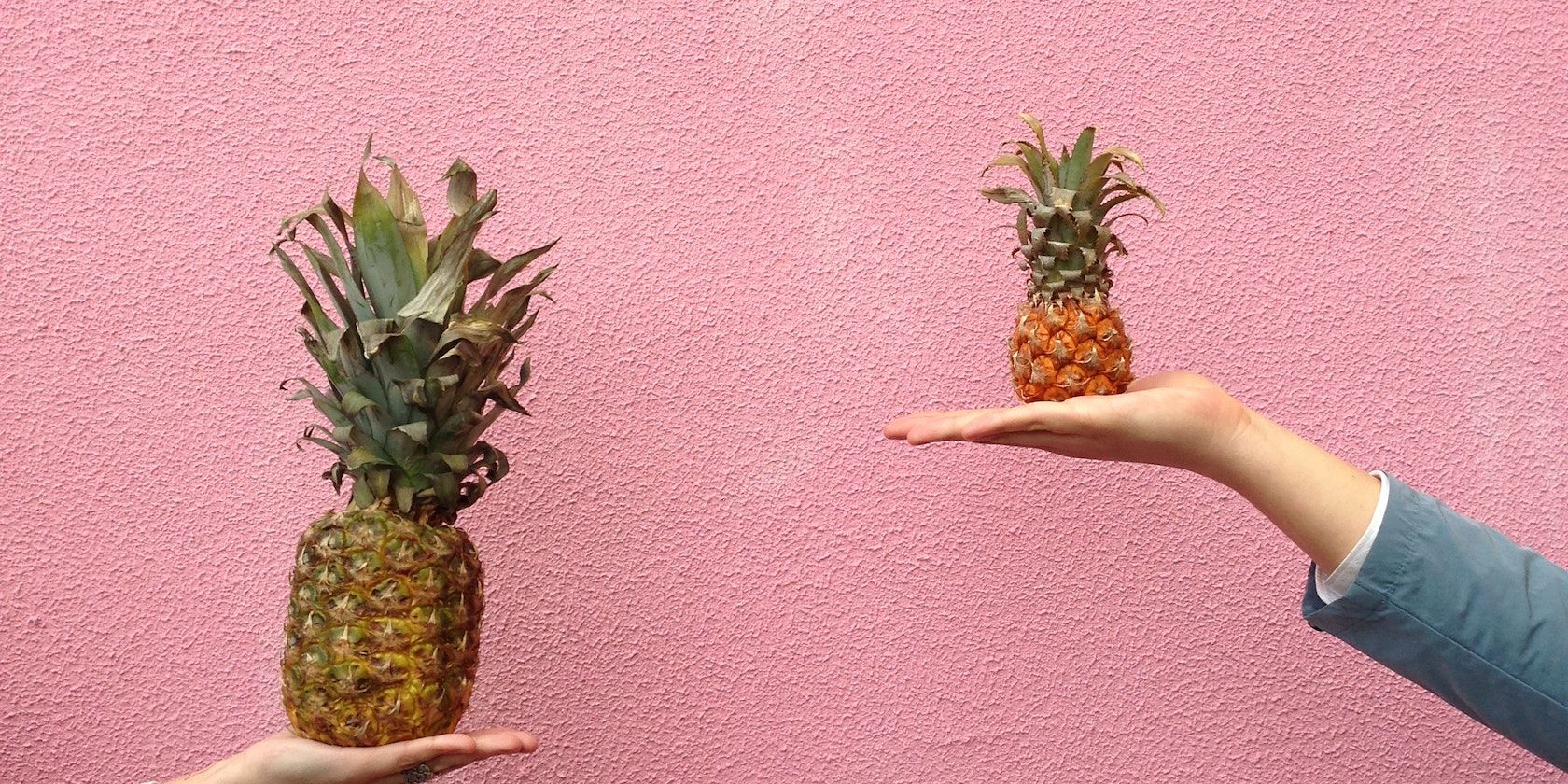
There are a bunch of high-resolution stock image sites where you can download images for your blog. Many of them are free; for some, you’d have to pay to use them. And while stock images are often overused and can appear in many other blogs or ads, you can find some unique ones with a bit of digging around.
You can also add a personal touch to make your stock photos stand out. These can involve adding text, colors, graphics, or your brand logos. You might also want to consider opting for paid stock photos if you want something more unique. Sites like Unsplash, Pixabay, and Shutterstock offer a wide range of stock photos you can utilize as featured images.
Another means to get the perfect featured images would be to create them yourself—using graphic design tools. There are numerous graphic design tools you can choose from. For everyday use, an intuitive tool like Canva should do the trick. However, there are other free graphic design tools worth exploring.
We’ll use Canva to show you how to create a simple featured image for a blog post. You don’t need to be particularly skilled in graphic design to know how to use Canva, and you can whip up something great in no time.
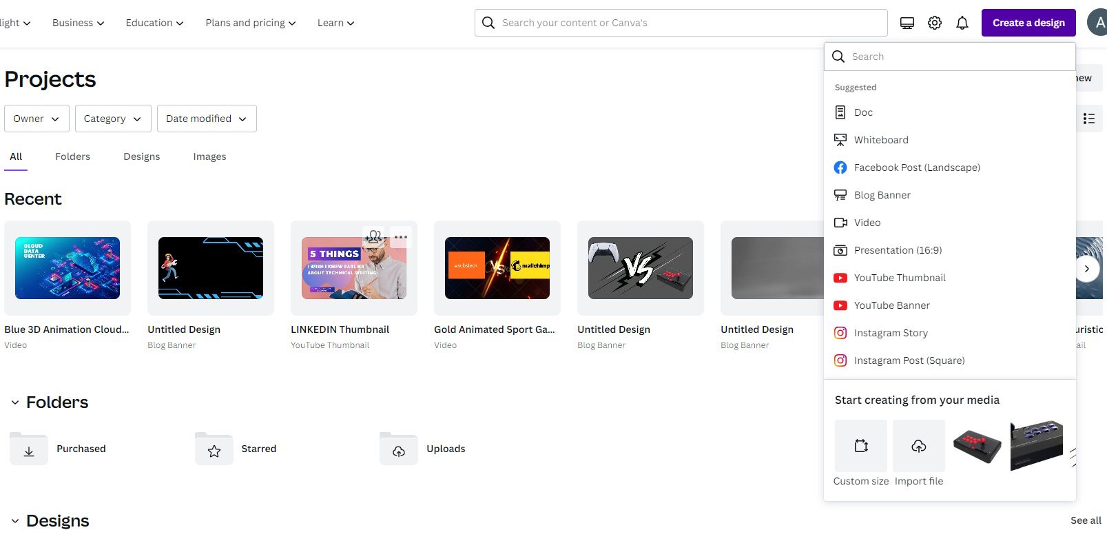
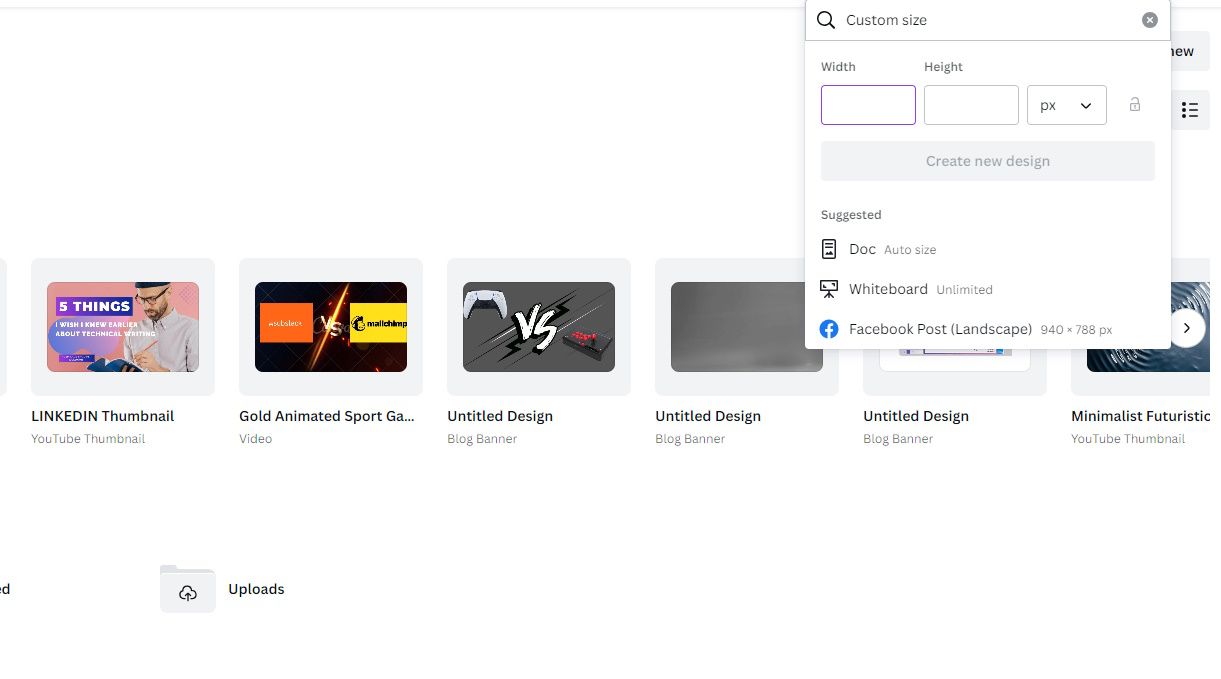
First, open up Canva on your device. Then, click on the Create a Design icon in the top right corner of the page. Next, click Custom Size under the Create New menu. This will enable you to create a custom design of your own instead of the suggested designs.
Input the dimensions in the boxes provided. We recommend using featured images that are rectangular as this enhances the user experience. To achieve this, the dimensions should be around a 2:1 width-to-height ratio.
For example, the recommended size on WordPress is 1200 x 628 pixels. This is because it works well with most themes and can adapt to various screen sizes. It also looks good when shared on other platforms.
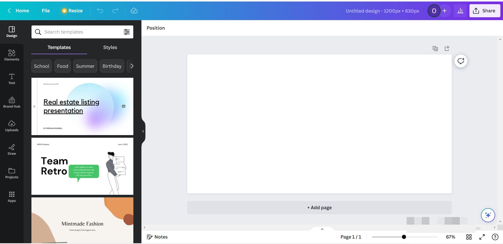
Once you’ve chosen a dimension, click Create New Design. This will open up a blank canvas for you to work with.
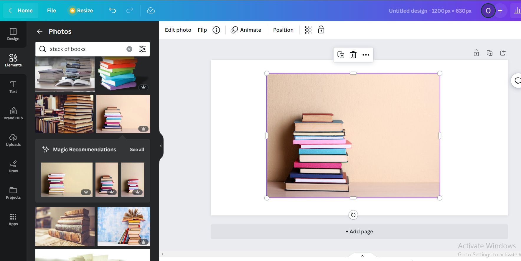
On the left, you have templates and styles to choose from. You can also insert text, graphics, or drawings. But first, let’s choose a suitable background. Navigate to the left sidebar and click Elements. Here, you can scroll to Photos and use the search bar to find one.
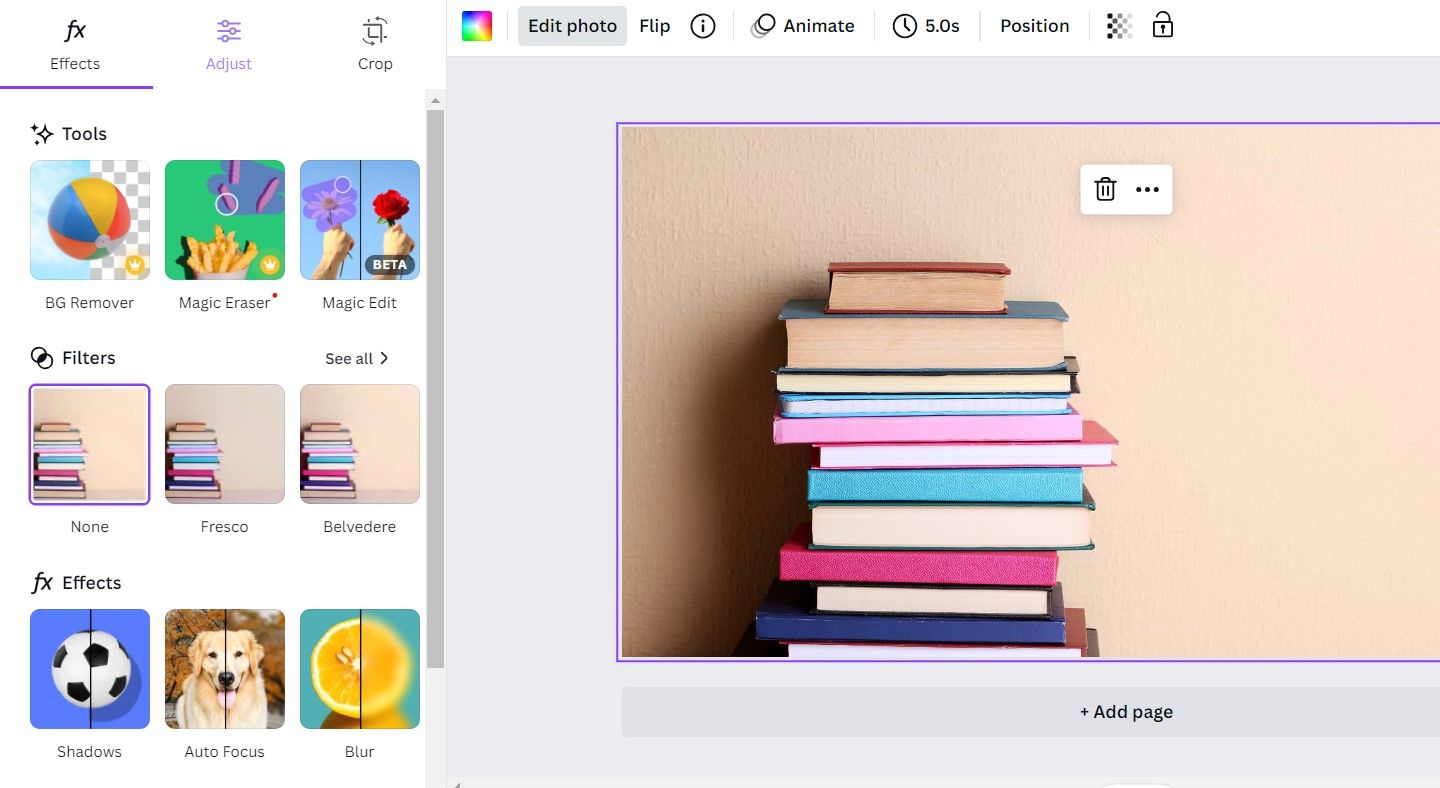
For example, if you’re looking for an image showing a stack of books, the words “stack of books” will do. Once you find a suitable image, you can select it by clicking on it or dragging it onto your canvas. Then, right-click on the image and select Set image as background.
There are a few ways to edit the image. Click Edit Photo at the top to see the options available. Select any option that resonates with you and reflects the type of images you’re trying to create.
Here, we’ve added the blur effect to keep the image out of focus before adding text. You can then add a rectangle shape to put your text on and transparency effects for some dazzle.
And here’s the final look:
3. Choosing a Theme
Themes are essential for building consistency and ensuring your blog stays true to its mark. Hence, you can choose a theme by sticking with certain colors, patterns, or styles that make your blog recognizable and distinct.
This makes it easier for people to engage with your content—they can form connections between your content and the theme and are able to recognize it easily.
Ensure your theme represents your content and what you aim to achieve with it. For example, a fashion blog can use themes that involve fabric prints or pieces. These overarching elements could be present in every featured image and help to highlight the blog’s purpose. Additionally, you should also select a color palette that is representative of the content you post.
To help you stay consistent with the theme you’ve chosen, consider setting up a Brand Kit in Canva. This is a repository of all the elements that make your brand unique, and it makes it much easier to apply them across your featured images.
4. Size and Style Considerations
One important thing to take note of when creating a featured image is its size. Whether you’re publishing on a blogging platform or on your own website, you need to make sure it’s an appropriate size that is optimized for cross-platform sharing.
Most publishing platforms will have recommended image sizing, which you can use. For example, on WordPress, there are Thumbnail, Medium, and Large dimensions for how your image appears on various platforms. However, if it’s your own website, you should consider a size that fits within your existing layout.
5. Your Featured Image Needs to Be Relevant
The last point—and probably the most important of all— is relevancy. Regardless of the theme, style, or image you’ve chosen, it’s important that it is actually relevant to the content.
The whole point of a featured image is to give readers a glimpse of what the content is. As such, your featured image should elicit in readers the same feeling they’ll get from reading your post—or, at least, propel them to read the post.
In choosing a featured image that is relevant, consider the topic or theme the content aims to pass across and apply that considerably. For example, If you are using stock images, you should include relevant keywords in your search to get decent results.
You can also add customizations to your images to make visual communication easier. For example, an image with a text overlay may better convey the intended message than a plain one.
Featured Images Set the Stage for Your Blog Posts
A featured image is undoubtedly one of the best ways to increase engagement with your blog content. And quite frankly, you need people to actually click on your posts to appreciate the content that you’ve created.
By incorporating the tips we’ve provided in this article, your blog can be better optimized for reader engagement.

