MARKETING
How to Write a Sales Page
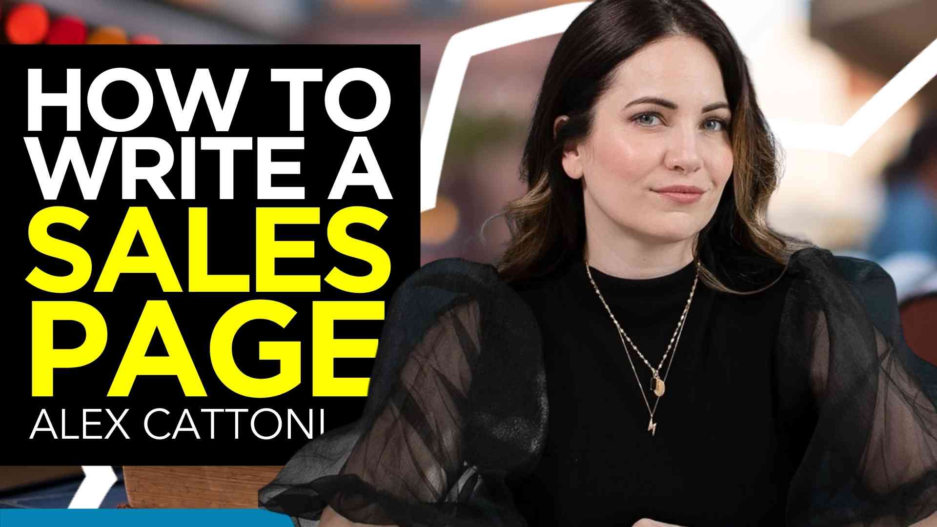
Need to write a sales page for an upcoming launch? Looking to improve the existing copy in your funnel or website?
If so, I’m going to teach you the 10 things your sales page MUST include if you want to make sure your copy creates trust, builds authority and converts like craaaaaaazy.
Hey Posse! What’s up? It’s Alex.
Coming to you this week with a super quick sneak peek into the full sales page training that I teach my students inside my flagship program – the Copy Posse Launch Files. And inside my 5-day Write & Ignite Challenge.
In this video, I’m sharing 10 conversion triggers that I always look for when writing – or reviewing – a sales page.
But first, if you’re new to the crew – welcome!
Here on my blog, you’ll find tons of tutorials on copywriting, digital marketing, and freelancing – to help you out on your entrepreneurial journey. Be sure to subscribe to my newsletter, so you’ll get my next tutorial right to your inbox.
Now – today I’m going to teach you exactly how to optimize your sales page – from the bottom to the very top.
This tutorial is perfect for any coach or entrepreneur with a service-based or education business. Think of things like 1:1 coaching or consulting, in-depth online programs, or other services.
Now – ya ready to dive right in?
All great Sales Pages need to start with…
#1. Headline
The headline may be the shortest section of a sales page, but it definitely takes the longest to write. In fact, I usually write my headlines LAST.
But, because it’s the first thing a prospect sees on the page, it’s the first conversion trigger we’ll talk about here.
You want to be sure that your headline is strategically written to:
- Hook your prospects’ attention
- Introduce a core pain point, benefit, or USP of the offer
- Open a loop that entices the reader to keep scrolling below the fold
YEP. That’s a big job for such a small section of text.
Another thing you need to consider when writing your headline is…
Speaking directly to your target audience – and more importantly – to their specific level of customer awareness.
Now if you have no freakin’ clue what I mean when I say “Customer Awareness”, here is another tutorial that explains all of that for you.
Moving on to the next conversion trigger you must include…
#2. Indoctrination
Essentially this is what comes immediately after the headline. It’s the lead-in portion of your sales page – the build-up before you actually start selling anything.
This copy is insanely important because this is when your reader self-selects and decides whether or not you’re actually talking to THEM! And yes, like the headline, it can be very difficult and take the longest to write…
But it’s worth taking the time to do it right because when done well it can make a MASSIVE impact on your conversion rate.
Your indoctrination needs to “indoctrinate” your readers on who you are, why they should listen to you and why they should care at all. This is where you empathize, educate, and validate your reader – you can do this through storytelling, sharing stats and facts or painting a picture of what’s to come…
And of course, the most important thing is that you speak to your prospects’ immediate needs and fears, which takes us to the next conversion trigger…
#3. Problem & Solution
Of course, the whole point of your sales page is to sell something that solves a problem for your audience. So you need to get really clear on what that is.
As human beings, we’re (unfortunately) wired to avoid pain above gaining pleasure. This means that in our most natural state, we respond to problems more urgently than we do solutions.
Because of this, the sales page needs to address your prospect’s problem – what I like to call the aggravating status quo – early on…
Your copy should evoke an emotional response – but be careful not to put salt in the wound.
You don’t want them to feel alienated, misunderstood or attacked you want your copy to make them feel safe, understood and heard.
That’s why you should effectively and accurately communicate ONE core problem in your copy before introducing your promising solution, or the “big promise” your reader is looking for.
In this case, specificity goes a long, long way. No one is going to believe you have a solution that does EVERYTHING under the sun. Think of how your solution is the BIG easy button for what your client is looking for.
Now, a very important distinction to make is that the solution is not the product… at least not yet.
Rather, at this point in your sales page, the solution should just be the specialized method, approach, discovery or tool that can solve your prospects’ problem.
Remember – they FIRST have to believe in the solution, before they buy your product – whether it be coaching, mentorship, guidance, expert services…
Now, once a believable solution is presented, you want to pivot into…

GET CERTIFIED. Discover the proven plan for effortless, automated email marketing. Click Here
#4. The Offer
This is where you introduce your specific version of that solution – aka product – as the easiest, simplest, fastest, or best way to attain the big promise that you just talked about. Here is where you want to have a clear and concise USP – or Unique Selling Proposition.
This is also where you want to include the value breakdown and all those left-brain details that make up your product:
- What it is
- How it works
- Where to get it
- When to expect it
- How much it costs
The most important thing to remember in this section is that the value of your offer should always be greater than the price.
The greater the gap between value and price—the more irresistible your offer becomes.
This is why you often see campaigns that use bonuses, price juxtaposition, or discounts to increase the offer appeal and, therefore, conversion rate.
Alright. Now you have all the left brain stuff out of the way. It’s time to address…
#5. Juicy Benefits
Or bennies, as I like to call them. This is where you stop talking about the what of your offer and start talking about the why. Or in other words… WHY your prospect would want to buy your product. I mean, what’s in for them – really?
This is where you can do deeper into all the amazing things your product or service does on top of the big promise you already shared.
It’s not enough to simply show them what they’re getting. It changes the game altogether when a prospect believes they have to have it.
You answer this question in sales copy by presenting the specific and relatable benefits that the product can provide.
And remember, features are NOT benefits.
Features are something a product HAS or IS, whereas benefits illustrate desired results that solve REAL pain points.
For example, a FEATURE would be “batteries included”.
Whereas the corresponding BENEFIT would be “no disappointed child on christmas morning”.
Now it can be pretty difficult to convert features into benefits – especially when you’re writing for your own product or service. It takes practice!!
If you need help squeezing some juicy bennies out of your features, I have a FREE feature-to-benefit converter that you can download at the end of this video!
Alright, next up you want to make sure you’re including…
#6. Social Proof & Authority
A common objection in the minds of consumers is whether or not a brand is the RIGHT company or person for them.
Trust is a huge factor that determines a customer’s decision to buy from you.
So it’s important that a sales page communicates social proof and authority through testimonials, social media stats, press coverage, credentials, experience and any other credibility factors.
However, authority is not just something you slap into a single section on the salespage — I like to see it communicated throughout the copy as much as possible.
Alright now on to lucky #7…
#7. Scarcity
In marketing, scarcity refers to the idea of making products or services limited in some way, making people more likely to act because the offer is scarce or exclusive.
The 4 most common types of scarcity are:
- Price: limited-time discount
- Quantity: limited amount left
- Premium: limited-time bonuses
- Offer: limited-offer/cart closing
The most effective sales copy communicates scarcity that compels the prospect to act while the offer is still available.
And – this is insanely important – your copy also needs to clearly and effectively communicate a big reason WHY the offer is limited, without it being hypey, pushy, or misleading.
Is it because of a special event like an anniversary? A passionate mission to touch 1000 lives by the end of the year? A global cause such as World Mental Health day?
Having a reason why massively increases trust and believability. And, this goes without saying… but always use REAL scarcity. Never lie and say and offer is limited when it’s not.
Before we move on to the next conversion trigger, I want to make sure I clarify that NOT ALL sales pages need scarcity all the time.
If you want your sales page to be 100% evergreen for anyone to purchase anytime, scarcity can be left off the table. Instead, use urgency and provide benefits as to why someone would want to act right away.
Ok moving right along to #8…

#8. Risk Reversal
In other words, how does the copy make the purchase process seem easy, safe and risk-free?
People like to be told exactly what to do and what is going to happen next, so the copy needs to assure them that they will be taken care of every step of the way…
From the moment they add the product to cart, to when it will be delivered, to how it can be returned if it doesn’t work out.
This is where you’d want to include any:
- Security language
- Verifications
- Return or exchange policies
- Next steps & delivery details
In other words, this is where you want to debunk the fear of,“Am I going to be screwed over by this company/person?”
Now onto #9…
#9. Call-to-Action
Whether it’s a single button or a multi-tiered order section — the call-to-action, or CTA, needs to pack a serious punch.
It must only take a second for the prospect to understand exactly where to click and how to buy the product.
Your CTA should be clear and straight to the point. For instance:
- “Order Now”
- “Get Instant Access”
- “Enroll Now”
The most important rule of copywriting is to have one clear and concise call to action.
It can appear multiple times though.
For example, if you have a longer sales page, then you’d probably want to include your call-to-action button 2 to 3 times throughout the copy. And always always always make a CTA the very last thing someone would see if they scroll to the very bottom of your page.
And finally, number 10…
#10. Overall Feel & Flow
This is less about the copy itself and more about the readability of your sales page which is an insanely important factor to consider.
Once you have the first 9 conversion and optimization triggers covered, it’s time to sit back, look at the entire picture, and ask yourself:
- Is the sales page messaging consistent and coherent throughout?
- Is the page easy to skim with clear section titles that guide me down the page?
- Was everything easy to read or did I stop to read any sentences twice?
- Were there any glaring gaps or illogical links?
Make sure that the copy is simple and effective.
I’ve said this a few times before and I’ll say it again — studies have shown that the average reader reads at a 7th-grade level. So there’s no need for wordiness, fancy explanations, or long lists of adjectives in a single sentence.
I personally find that reading the entire sales page out loud helps me answer these questions.
Now here’s one more bonus tip for ya…
Make sure you read the page on your cell phone!!!
With far more than half of online readers consuming sales pages on mobile devices, you want to make damn sure that your copy is easy to read and navigate on small screens…
And there you have it — an exclusive insider look at the 10 triggers I include on all my sales pages.
Now if you need help connecting the dots and taking your sales page from theoretical to tangible…
Make sure to check out my 5-day program, the Write & Ignite Challenge.
Where you won’t just learn the parts of writing a sales page…
But I will actually help you IMPLEMENT it all so that you can write your own high-converting sales page in just 5 days!
In this challenge, you’ll get…
- My 5-question copywriter checklist to help create a bomb-ass sales brief.
- My Wheel of Persuasion – which includes 6 proven writing prompts to help you build trust, create believability and inspire action.
- My simple 4-point Offer Matrix to help you craft an irresistible offer.
- My 16-step formula for putting it all together.
- Plus my H.O.T. headline formula and 3 proven hook templates to help you capture and keep your prospects attention.
If you want help crafting the perfect sales page – from start to finish – you can learn more about my 5-Day Write & Ignite Challenge.
I hope this video has been helpful.
Now as promised, you can grab your free copy of my feature-to-benefit converter by following that link.
Until next time, I’m Alex. Ciao for now!









You must be logged in to post a comment Login