MARKETING
Data-driven Marketing: How Graphs & Charts Transform Digital Strategies

In the world of digital marketing, data is king. With so much information available, it can be overwhelming to try and make sense of it all. One of the best ways to gain insight into digital marketing trends is through the use of graphs.
Graphs can help to visualize complex data sets and identify patterns that may not be immediately apparent when looking at raw data. In this article, we will explore the top nine graphs for revealing digital marketing trends.
Line Graphs For Digital Trends
Line graphs are one of the most commonly used graphs in digital marketing. They are particularly useful for showing how a particular metric has changed over time. For example, a line graph could be used to show how website traffic has changed over the course of a year.
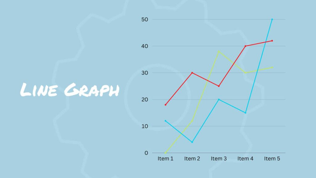
By plotting data points over time, it is easy to see any trends or patterns that may have emerged. Line graphs can also be used to compare data sets over time, such as comparing the performance of two different marketing campaigns.
Chord Diagrams Connecting Different Marketing Channels
Chord diagrams are a type of visualization that show the connections between different variables. They are often used to show the relationship between different parts of a complex system or network.
In digital marketing, chord diagrams can be used to show how different channels (such as social media, email marketing, and search engine marketing) are related to each other. By visualizing the connections between different channels, businesses can optimize their marketing mix and ensure that each channel is working together to achieve their marketing goals.
Scatter Plots for Digital Correlations
Scatter plots are often used in digital marketing to show the relationship between two different metrics. For example, a scatter plot, designed by a graph creator, could be used to show how the bounce rate on a website correlates with the time spent on the site.
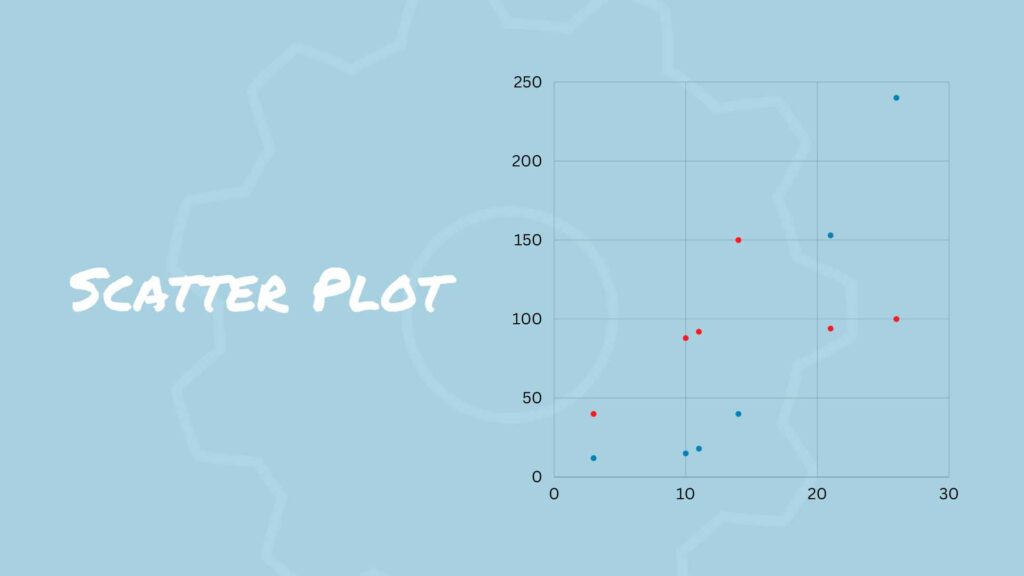
By plotting data points on an x and y axis, it is easy to see any correlations that may exist between the two metrics. Scatter plots can also be used to identify any outliers within a data set.
Bubble Charts Show How Differing Variables Relate to Each other
Bubble charts are similar to scatter plots, but they add a third variable to the mix by varying the size of the bubbles based on a third data point. This can be a useful way to visualize trends and patterns in complex data sets.
In digital marketing, bubble charts can be used to show how different variables (such as ad spend, click-through rate, and conversion rate) are related to each other.
Bar Graphs for Quick Comparisons
Bar graphs are another common graph used in digital marketing. They are particularly useful for comparing different data sets. For example, a bar graph could be used to compare the conversion rates of two different landing pages.
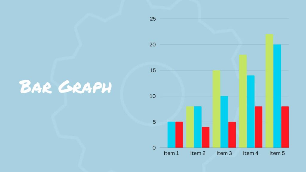
By presenting data in a visual format, it is easy to see which landing page is performing better. Bar graphs can also be used to compare data sets over time, such as comparing the number of leads generated by two different marketing campaigns.
Heat Maps Revealing Behavior
Heat maps are a unique type of graph that are particularly useful for analyzing website user behavior. Heat maps show how users interact with different parts of a website by using different colors to represent user engagement.
For example, a heat map could be used to show which parts of a landing page receive the most clicks. By analyzing heat maps, marketers can identify areas of a website that may need to be optimized to improve user engagement.
Pie Charts For Categorical Divisions
Pie charts are often used in digital marketing to show how a particular metric is divided among different categories. For example, a pie chart could be used to show how a company’s social media followers are divided among different age groups.
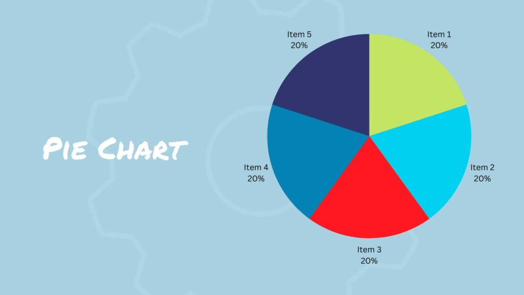
Pie charts are particularly useful for highlighting the most significant categories within a data set. However, it is important to keep in mind that pie charts can be difficult to read when there are too many categories.
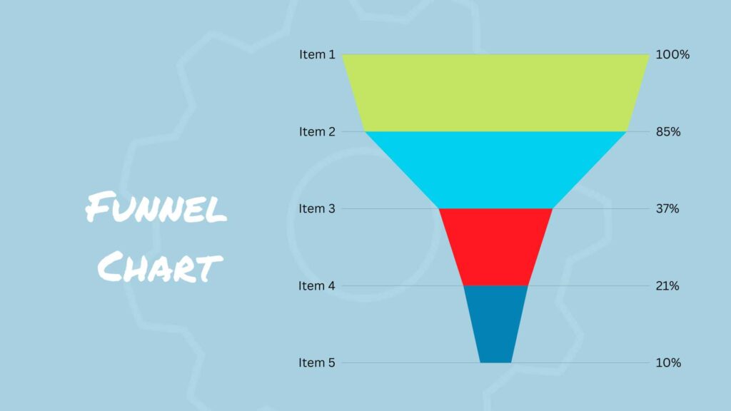
Funnel Charts Reveal Bottlenecks
Funnel charts are a type of chart that shows how many users or customers move through a series of steps in a process. They are often used in digital marketing to track the conversion rate at each stage of a sales funnel.
By visualizing the drop-off rate at each stage of the funnel, businesses can identify potential roadblocks or bottlenecks in the conversion process and take steps to optimize their marketing strategy.
Gantt Charts for Keeping Campaigns on Schedule
Gantt charts are a type of bar chart that show the duration of each task in a project, as well as the start and end dates. They are commonly used in project management to track progress and deadlines.
In digital marketing, Gantt charts can be used to plan and track the progress of marketing campaigns. By breaking down a campaign into smaller tasks and assigning deadlines to each one, businesses can ensure that their marketing efforts stay on track and meet their goals.

Are You Ready to Master Social Media?
Become a Certified Social Media Specialist and learn the newest strategies (by social platform) to draw organic traffic to your social media sites.
Conclusion
In conclusion, digital marketing is a complex field that requires businesses to track and analyze a large amount of data. Charts and graphs are essential tools for visualizing this data and identifying trends and patterns.
By using the right types of charts and graphs, businesses can gain insights into their marketing performance and make data-driven decisions to optimize their marketing strategy.
From line graphs and scatter plots to heatmaps and chord diagrams, there are a variety of charts and graphs that businesses can use to reveal digital marketing trends and stay ahead of the competition.


![How AEO Will Impact Your Business's Google Visibility in 2026 Why Your Small Business’s Google Visibility in 2026 Depends on AEO [Webinar]](https://articles.entireweb.com/wp-content/uploads/2026/01/How-AEO-Will-Impact-Your-Businesss-Google-Visibility-in-2026-400x240.png)
![How AEO Will Impact Your Business's Google Visibility in 2026 Why Your Small Business’s Google Visibility in 2026 Depends on AEO [Webinar]](https://articles.entireweb.com/wp-content/uploads/2026/01/How-AEO-Will-Impact-Your-Businesss-Google-Visibility-in-2026-80x80.png)


