MARKETING
How to create a user flow map for your website & app
In the highly competitive world of rock climbing, some athletes perform an extreme version of ascent: a climber performs a flash climb when they complete a route on their first attempt. Climbers value world record flash climbs because each climber only gets one attempt to set a record.
As difficult as flash climbs are, they aren’t extreme enough for some climbers. In a flash ascent, climbers can study the route, receive advice, and formulate plans. For climbers not satisfied with that level of challenge, onsight climbs are performed by climbers who not only have never completed the ascent before but haven’t even seen the route.
Extreme athletes seek out unique challenges, taking pride in accomplishing things that most people cannot. While the risk of failure adds unique value to sports, it adds unnecessary difficulty to business processes. In the business world, you don’t define success by creating unique challenges but by creating unique solutions to minimize challenges. One of those solutions is a user flow map—a method of diagramming the pathways users take through your interface.
A good user flow map helps businesses understand their users’ journeys, identify pain points, and plan for contingencies. This guide explains user flows, how to create user flow maps, and some best practices for designing your diagrams.
Key takeaways:
- User journey describes the user’s entire experience with your company, while user flow describes the steps they follow using your interface.
- Some common shapes like ovals, rectangles, diamonds, and parallelograms have commonly understood uses in flow charts.
- Follow best practices and use the experts at Optimizely to level up your digital experience.
User flow vs. user journey
While user flow and user journey have similar names and overlap in significant ways, you should be aware of important differences between these concepts.
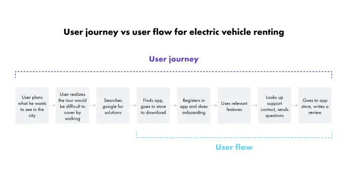
The user journey encompasses every aspect of the user’s experience with your company. The user journey begins when a user first becomes aware of your business (or becomes aware of a need you can solve) and ends with their last interaction with your company. That means that while you can’t know exactly when a user journey begins or ends, you can use customer relationship management software to identify where a user is on their journey and how to move them to the next step.
The user flow overlaps with the user journey, but it specifically describes the pathway users follow on your website or application. For example, a user flow may begin when a user visits your website for the first time and end with a purchase. Those activities are a part of the larger user journey, but the user flow is more interested in the experience users have with your website or app.
The user journey is interested in the user’s emotions, tangible and intangible interactions, ongoing communication, relationship building, etc.—the “people” side of the process; while the user flow is interested in the “technology” side of the process—the user’s clicks, page visits and subscriptions. The user flow and user journey describe different elements of the same relationship between your business and your users.
User flow diagraming
Your users won’t ever see your user flow map, but you and your team will refer to it throughout the life of your website or app, so while it doesn’t have to be the prettiest document, it should still be clear and user-friendly.
While the rules of user flow diagraming aren’t set in stone, you should know some best practices and generally understand flowchart creation syntax.
- Ovals represent the start and end point of your flow chart. Depending on your process, your user flow might have more than one start point and more than one endpoint.
- Squares or rectangles represent individual pages or steps. In general, flow charts, squares and rectangles can be any step of a process, but in web and app design, squares and rectangles represent individual pages in the user interface.
- Diamonds represent decisions that users must make. For example, when a user first attempts to log in to your platform, your website may prompt them to connect a Google or Facebook account, or they may log in with an email or continue as a guest. Depending on their choice, their journey through your website or app may diverge as you deliver a different experience based on their choices.
- Parallelograms represent input required by the user. For example, you may require them to input a serial number to activate their product or provide a shipping address to receive a service.
- Arrows indicate the direction of the flow. Your flow may include loops, crossroads, and diverging and converging pathways, so indicating the sequence of elements is essential for your user flow map to be readable.
Generally, those four shapes, along with arrows, are the foundational building blocks of your user flow map, but you can always use additional shapes, colors or other design elements to communicate any information you believe is relevant. Remember that the purpose of a user flow map isn’t just to follow the rules or check a box but to communicate information about the user flow. The example below shows additional shapes that other companies have used when creating flow charts.
User flow design principles
As with any form of communication, user flow maps lose some value when they omit relevant information and include too much irrelevant information. Designing a successful user flow map includes balancing several considerations to maximize the usefulness of your diagram.
1. Establish a level of detail
If your user flow maps are too detailed, they become convoluted and difficult to read. If they aren’t detailed enough, they aren’t useful. Establishing the correct level of granularity is an important first step in designing a user flow map.
When it comes to designing diagrams, the golden principle is to consider the needs of your users. What kind of questions will they be trying to answer with your chart? What level of experience will they have? What will they be using this chart to do? Answering those questions will help you define the right level of detail for your user flow map.
2. Consider alternatives
One of the reasons user flow maps are useful is because they allow designers to visually parse the journey users go on as they traverse your website or app. Do your best to consider every alternative when designing your user flow map.
For example, what will you do if users add items to their cart but leave without checking out? What will you do if a user provides a billing address but not a shipping address? What if a user requests a free trial but then buys the full version? Your user flow map will help you identify these crossroads and plan for contingencies.
3. Use the right digital experience platform
Your users’ digital experience matters. Optimizely is a powerful digital experience platform with expert tools to help with automation, A/B testing, content management, and much more.
A user flow map only describes your customers’ journey as they interact with your digital interface. While a user map can help identify pain points and visually inspire solutions, the key to improving your customer’s experience is to improve the content of your website or app.
If you’re ready to take your digital experiences to the next level, get started today to set up a meeting with an Optimizely representative today.
MARKETING
YouTube Ad Specs, Sizes, and Examples [2024 Update]
Introduction
With billions of users each month, YouTube is the world’s second largest search engine and top website for video content. This makes it a great place for advertising. To succeed, advertisers need to follow the correct YouTube ad specifications. These rules help your ad reach more viewers, increasing the chance of gaining new customers and boosting brand awareness.
Types of YouTube Ads
Video Ads
- Description: These play before, during, or after a YouTube video on computers or mobile devices.
- Types:
- In-stream ads: Can be skippable or non-skippable.
- Bumper ads: Non-skippable, short ads that play before, during, or after a video.
Display Ads
- Description: These appear in different spots on YouTube and usually use text or static images.
- Note: YouTube does not support display image ads directly on its app, but these can be targeted to YouTube.com through Google Display Network (GDN).
Companion Banners
- Description: Appears to the right of the YouTube player on desktop.
- Requirement: Must be purchased alongside In-stream ads, Bumper ads, or In-feed ads.
In-feed Ads
- Description: Resemble videos with images, headlines, and text. They link to a public or unlisted YouTube video.
Outstream Ads
- Description: Mobile-only video ads that play outside of YouTube, on websites and apps within the Google video partner network.
Masthead Ads
- Description: Premium, high-visibility banner ads displayed at the top of the YouTube homepage for both desktop and mobile users.
YouTube Ad Specs by Type
Skippable In-stream Video Ads
- Placement: Before, during, or after a YouTube video.
- Resolution:
- Horizontal: 1920 x 1080px
- Vertical: 1080 x 1920px
- Square: 1080 x 1080px
- Aspect Ratio:
- Horizontal: 16:9
- Vertical: 9:16
- Square: 1:1
- Length:
- Awareness: 15-20 seconds
- Consideration: 2-3 minutes
- Action: 15-20 seconds
Non-skippable In-stream Video Ads
- Description: Must be watched completely before the main video.
- Length: 15 seconds (or 20 seconds in certain markets).
- Resolution:
- Horizontal: 1920 x 1080px
- Vertical: 1080 x 1920px
- Square: 1080 x 1080px
- Aspect Ratio:
- Horizontal: 16:9
- Vertical: 9:16
- Square: 1:1
Bumper Ads
- Length: Maximum 6 seconds.
- File Format: MP4, Quicktime, AVI, ASF, Windows Media, or MPEG.
- Resolution:
- Horizontal: 640 x 360px
- Vertical: 480 x 360px
In-feed Ads
- Description: Show alongside YouTube content, like search results or the Home feed.
- Resolution:
- Horizontal: 1920 x 1080px
- Vertical: 1080 x 1920px
- Square: 1080 x 1080px
- Aspect Ratio:
- Horizontal: 16:9
- Square: 1:1
- Length:
- Awareness: 15-20 seconds
- Consideration: 2-3 minutes
- Headline/Description:
- Headline: Up to 2 lines, 40 characters per line
- Description: Up to 2 lines, 35 characters per line
Display Ads
- Description: Static images or animated media that appear on YouTube next to video suggestions, in search results, or on the homepage.
- Image Size: 300×60 pixels.
- File Type: GIF, JPG, PNG.
- File Size: Max 150KB.
- Max Animation Length: 30 seconds.
Outstream Ads
- Description: Mobile-only video ads that appear on websites and apps within the Google video partner network, not on YouTube itself.
- Logo Specs:
- Square: 1:1 (200 x 200px).
- File Type: JPG, GIF, PNG.
- Max Size: 200KB.
Masthead Ads
- Description: High-visibility ads at the top of the YouTube homepage.
- Resolution: 1920 x 1080 or higher.
- File Type: JPG or PNG (without transparency).
Conclusion
YouTube offers a variety of ad formats to reach audiences effectively in 2024. Whether you want to build brand awareness, drive conversions, or target specific demographics, YouTube provides a dynamic platform for your advertising needs. Always follow Google’s advertising policies and the technical ad specs to ensure your ads perform their best. Ready to start using YouTube ads? Contact us today to get started!
MARKETING
Why We Are Always ‘Clicking to Buy’, According to Psychologists
Amazon pillows.
MARKETING
A deeper dive into data, personalization and Copilots
Salesforce launched a collection of new, generative AI-related products at Connections in Chicago this week. They included new Einstein Copilots for marketers and merchants and Einstein Personalization.
To better understand, not only the potential impact of the new products, but the evolving Salesforce architecture, we sat down with Bobby Jania, CMO, Marketing Cloud.
Dig deeper: Salesforce piles on the Einstein Copilots
Salesforce’s evolving architecture
It’s hard to deny that Salesforce likes coming up with new names for platforms and products (what happened to Customer 360?) and this can sometimes make the observer wonder if something is brand new, or old but with a brand new name. In particular, what exactly is Einstein 1 and how is it related to Salesforce Data Cloud?
“Data Cloud is built on the Einstein 1 platform,” Jania explained. “The Einstein 1 platform is our entire Salesforce platform and that includes products like Sales Cloud, Service Cloud — that it includes the original idea of Salesforce not just being in the cloud, but being multi-tenancy.”
Data Cloud — not an acquisition, of course — was built natively on that platform. It was the first product built on Hyperforce, Salesforce’s new cloud infrastructure architecture. “Since Data Cloud was on what we now call the Einstein 1 platform from Day One, it has always natively connected to, and been able to read anything in Sales Cloud, Service Cloud [and so on]. On top of that, we can now bring in, not only structured but unstructured data.”
That’s a significant progression from the position, several years ago, when Salesforce had stitched together a platform around various acquisitions (ExactTarget, for example) that didn’t necessarily talk to each other.
“At times, what we would do is have a kind of behind-the-scenes flow where data from one product could be moved into another product,” said Jania, “but in many of those cases the data would then be in both, whereas now the data is in Data Cloud. Tableau will run natively off Data Cloud; Commerce Cloud, Service Cloud, Marketing Cloud — they’re all going to the same operational customer profile.” They’re not copying the data from Data Cloud, Jania confirmed.
Another thing to know is tit’s possible for Salesforce customers to import their own datasets into Data Cloud. “We wanted to create a federated data model,” said Jania. “If you’re using Snowflake, for example, we more or less virtually sit on your data lake. The value we add is that we will look at all your data and help you form these operational customer profiles.”
Let’s learn more about Einstein Copilot
“Copilot means that I have an assistant with me in the tool where I need to be working that contextually knows what I am trying to do and helps me at every step of the process,” Jania said.
For marketers, this might begin with a campaign brief developed with Copilot’s assistance, the identification of an audience based on the brief, and then the development of email or other content. “What’s really cool is the idea of Einstein Studio where our customers will create actions [for Copilot] that we hadn’t even thought about.”
Here’s a key insight (back to nomenclature). We reported on Copilot for markets, Copilot for merchants, Copilot for shoppers. It turns out, however, that there is just one Copilot, Einstein Copilot, and these are use cases. “There’s just one Copilot, we just add these for a little clarity; we’re going to talk about marketing use cases, about shoppers’ use cases. These are actions for the marketing use cases we built out of the box; you can build your own.”
It’s surely going to take a little time for marketers to learn to work easily with Copilot. “There’s always time for adoption,” Jania agreed. “What is directly connected with this is, this is my ninth Connections and this one has the most hands-on training that I’ve seen since 2014 — and a lot of that is getting people using Data Cloud, using these tools rather than just being given a demo.”
What’s new about Einstein Personalization
Salesforce Einstein has been around since 2016 and many of the use cases seem to have involved personalization in various forms. What’s new?
“Einstein Personalization is a real-time decision engine and it’s going to choose next-best-action, next-best-offer. What is new is that it’s a service now that runs natively on top of Data Cloud.” A lot of real-time decision engines need their own set of data that might actually be a subset of data. “Einstein Personalization is going to look holistically at a customer and recommend a next-best-action that could be natively surfaced in Service Cloud, Sales Cloud or Marketing Cloud.”
Finally, trust
One feature of the presentations at Connections was the reassurance that, although public LLMs like ChatGPT could be selected for application to customer data, none of that data would be retained by the LLMs. Is this just a matter of written agreements? No, not just that, said Jania.
“In the Einstein Trust Layer, all of the data, when it connects to an LLM, runs through our gateway. If there was a prompt that had personally identifiable information — a credit card number, an email address — at a mimum, all that is stripped out. The LLMs do not store the output; we store the output for auditing back in Salesforce. Any output that comes back through our gateway is logged in our system; it runs through a toxicity model; and only at the end do we put PII data back into the answer. There are real pieces beyond a handshake that this data is safe.”
You must be logged in to post a comment Login