SOCIAL
YouTube Adds New Filters to its Video Performance Chart, Enabling More Specific Data Context

YouTube has added a new advanced analytics option to YouTube Studio which enables you to visualize the performance of your uploads by the focus topic of each, helping to provide more context as to the comparative performance of each clip.
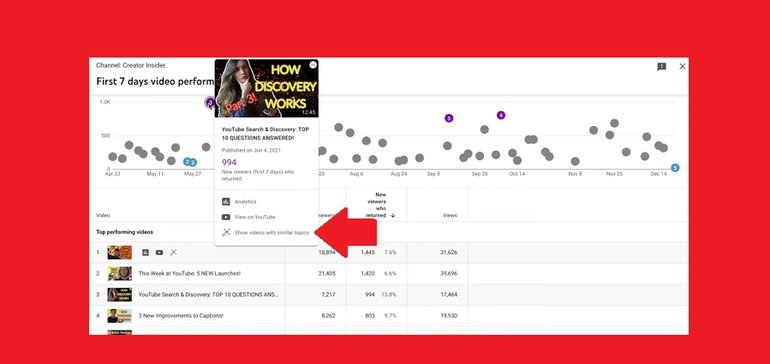
As you can see in this image, in the advanced analytics element in YouTube Studio, you can now view a scatter plot of all your videos and their comparative performance on variable timelines. This new element now enables you to also select ‘Show videos with similar topics’ from the plot display, which will then switch the graph to a specific listing of uploads on the same subject.
That means that you’re getting a better comparison of video performance, as you’re comparing more like-for-like clips, as opposed to measuring each video against every other. It could be a good way to better contextualize video engagement, while also helping to highlight the specific topics that are resonating over time.
You can display up to 100 videos at once in the chart, and sort the listing by ‘First 24 hours’, ‘First 7 days’ or ‘First 28 days’. You can also compare various metrics, including views, impressions and average view duration.
It could be a handy addition for your YouTube analytics and planning – to access your video performance chart, go to: Channel analytics > Advanced mode > Compare to’ > ‘First 24 hours video performance’
Source link


You must be logged in to post a comment Login