Because data storytelling is becoming a timeless skill in an increasingly data-driven profession, we’re resharing this helpful article from last spring’s MarTech Conference.
“Data doesn’t speak for itself, it needs a good storyteller,” said Nancy Duarte, CEO of Duarte Inc., the largest communications firm in Silicon Valley. Her keynote launched the second day of MarTech and gave all those who listened a sense of what the data world is missing – effective communication.
“Some have said data is the new oil,” Duarte explained. “The findings [from the data], though, will stay buried without the help of a communicator.”
The soft skills gap
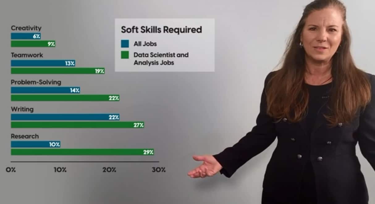
Job opportunities for data scientists and analysts have thrived in recent years. (Statistician and data scientist were two of the top jobs of 2020.) At the same time, an even greater demand for soft skills (writing, problem-solving and the like) has emerged.
Duarte cited soft skills as the number one skills gap identified by LinkedIn’s Talent Insights tool. They found that 1.6 million jobs remained opened for those with soft skills, nearly a million of which called for oral communication skills.
A separate study by Burning Glass Technologies showed that demand for soft skills was greater for analytics-enabled jobs than the average demand across all occupations.
“This conveys that employers want their data-wranglers to know how to communicate well,” Duarte said.
This gap presents an opportunity for career advancement for individual data scientists. This is because, as Duarte suggests, “most data roles are becoming less about statistics themselves, and more about making sense of the data and applying it to business use.”

Communicating problems and opportunities from data
Data scientists and analysts explore data all day. But for others in the organization to make use of the data, it has to be explained.
“Communicating about data is difficult for some people,” Duarte said, “because when you’re analyzing the data you’re going to find one of two things in it. You’re either going to identify a problem or an opportunity in the data.”
To address the problem or opportunity requires action.
“The ability to identify the action and communicate it moves [the data scientist] from being an individual contributor to a strategic advisor,” she explained. “As you build this muscle, you’ll become a more trusted data storyteller.”
With trust, the data scientist can inspire others and become a leader. But this only happens by learning how to tell an effective story. Duarte calls this “getting traction from your data.”
5 ways to get traction from your data
To make an impact on an audience, the presentation has to mean something. For Duarte, meaningful communication is achieved by these five strategies:
- Visualize data for your audience. The visuals are a part of a holistic strategy to present the important parts of a study to the audience. This blend of elements should be tailored to the audience’s preferences. But generally, the most important data should be made visually striking so that it stands out. Context should also be included, and in no way does this give permission to hide or cherry pick data.
- Structure insights as a story. Telling a story opens up neural pathways in the audience that gets everybody more engaged, triggering more memories and sense perceptions than dry charts and graphs. Structure the data, and the narrative around the data, using a basic three-act format. Start with the problem or opportunity found in the data, and work your way through the supporting data (in Act 2) to get to the actions that will resolve the conflict.
- Choose the best action. The verbs, or actions, are the most crucial part of speech in data-related stories. The verbs represent the recommended actions that result from the data insight. These verbs should be performance-driven, so that the higher-ups can identify and accept them as valuable recommendations.
- Attach data to something relatable. As Duarte pointed out, people have common knowledge and experience tied to basic measurements. They know basic units of time, and space. They can picture the size of a football, or of a football stadium. Translating important figures into these basic, relatable units will communicate the magnitude of the problem or opportunity.
- Humanize the data. Remember who you’re talking about, and also make sure to remind your audience. This allows the audience of the presentation to visualize an outcome based on what the data indicates or recommends. For instance, a company wants to grow its volume of customers or revenue. But to reach that goal, it’s better to think about the specific groups of customers and how they’re being served.
Know your audience, know your role
Humanizing the data makes for a more compelling story, but it also reminds the analyst why they are telling the story in the first place.
“Often in many roles when we’re working in data, we have to dispassionately and analytically look at data,” Duarte said. “We need to suspend our bias, let our critical thinking rule all of the analysis. But once that step is done and the data is all analyzed, we sometimes forget the power in getting to know the humans that generated that data.”
As an analyst, the data one is looking at corresponds to a company or the customers they are serving. This promotes the analyst into the role of a mentor, a leader.
Once the roles are clarified, a better story can be told, because the ground has been laid to grow and develop an empathetic connection. Only through empathy and relatability can the storyteller truly “create a sense of awe in the audience.”
This piece originally posted on March 18, 2021.


You must be logged in to post a comment Login