MARKETING
20 Email Opt-In Examples I Love (For Your Inspiration)

A few months ago, my inbox was filled with emails from a health specialist. I didn’t remember signing up for random diet plans, so why was I getting constant emails?
I was ready to fire off a complaint, but I checked my inbox first. There it was, an opt-in email I’d actually subscribed to. The specialist hadn’t been consistent with their communication, so it completely slipped my mind.
This is exactly why opt-in emails are crucial. They save you from annoyed subscribers and maintain a clean, respectful email marketing strategy. Opt-in emails ensure that people remember to give you permission to send them content. Without them, you risk becoming just another forgotten sender—or worse, marked as spam.
So, how do you word them in a way that encourages people to sign up while not appearing pushy at the same time? In this article, I’ll share my favorite email opt-in wording examples, why they work, and how you can make your own.
Table of Contents
The Best Opt-In Messages in Emails
What makes an opt-in message stand out in inbox clutter? In this section, I’ll highlight 20 email opt-in wording examples and explain what makes them unique to bring you closer to creating your own.
1. Pitch
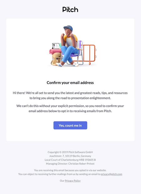
Pitch’s opt-in email is refreshingly straightforward, saying, “We’re all set to send you the latest and greatest reads, Tips, and resources to bring you along the road to presentation enlightenment.”
Their respectful nudge for my explicit permission is great, too. It emphasizes collaboration, saying, “We can’t do this without your explicit permission,” which makes me feel in control. The CTA also feels like an invite to a journey and makes me curious about where it leads.
Pro tip: Be specific about the end goal of your opt-in journey to create a sense of excitement and belonging among subscribers.
2. Deviant Art
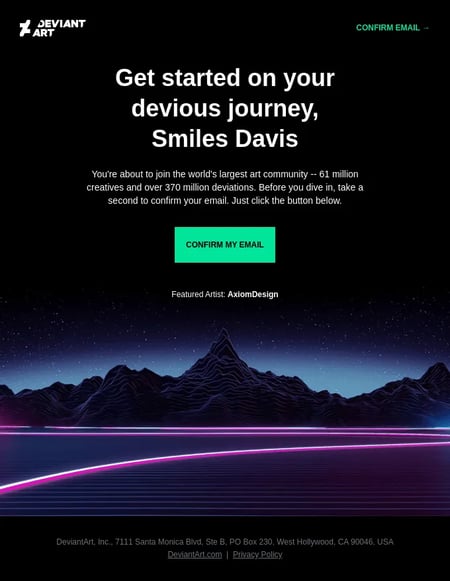
Deviant opt-in email invites you to a huge, exciting club. Their headline, “Get started on your devious journey,” is fun and sparks curiosity. The email also uses the fear of missing out (FOMO) by mentioning “the world’s largest art community — 61 million creatives and over 370 million deviations” to encourage me to confirm.
Deviant Art also makes it easy to sign by emphasizing how it will “take a second to confirm your email” to show you’re one click away from joining an exclusive club.
Pro tip: Reduce friction with a simple confirmation process and emphasize how easy it is to join your list.
3. Icon Utopia
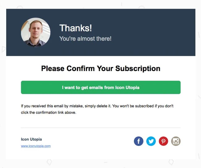
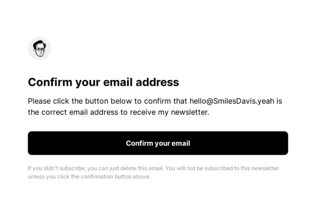
Icon Utopia’s opt-in email is personal and easy to understand. Using the author’s headshot in the email adds a personal touch and builds a connection with subscribers with trust. The copy, “Thanks! You’re almost there! Please confirm your subscription,” is clear and concise and guides me through the next step without confusion.
The CTA also works as a positive affirmation. It makes me an active participant in the process and reinforces the subscriber’s choice to engage with Icon Utopia.
Pro tip: Create a CTA that clearly reflects what subscribers are signing up for and makes them feel confident about their decision to opt in.
4. Polaroid
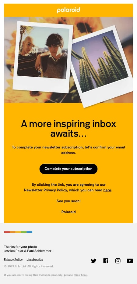
Polaroid promises creatives that “a more inspiring inbox awaits…” to build excitement and anticipation. To move forward, they add a prominent “Complete your subscription” button. It’s easy for me to know exactly what I need to do next with the direct call to action.
Polaroid also includes a link to read more about their privacy policy in their newsletter. Lastly, the email ends with a “See you soon! Polaroid” to create a friendly sign-off that keeps the conversation going.
Pro tip: Make subscribers feel welcome and valued by ending your opt-in email on a personal note.
5. Hero Cosmetics
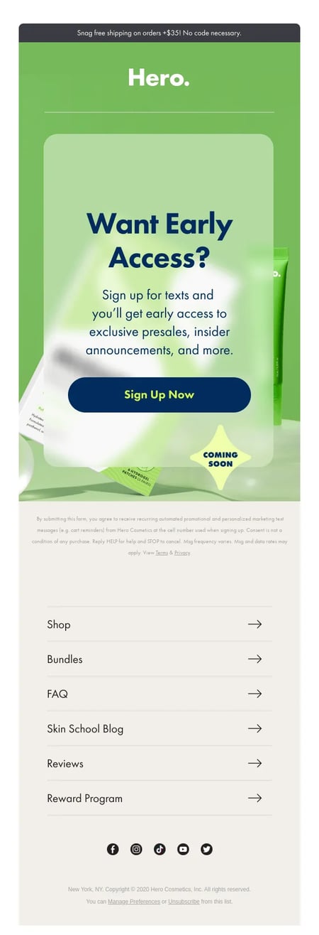
Hero Cosmetics takes a very direct and enticing approach in its opt-in wording. The email promises “early access to exclusive presales, insider announcements, and more” and focuses on the tangible benefits of subscribing.
This strategy is smart — it cuts through the noise and directly addresses the “what’s in it for me?” question that most subscribers have. Highlighting exclusive perks like early access and insider information makes the offer irresistible and taps into the desire to be part of a select group.
Pro tip: Offer a clear value proposition and a sense of exclusivity in your opt-in messaging to make it more compelling.
6. Withings
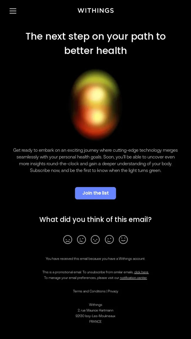
Withings’ opt-in email gets me excited for a healthier future with their products. The copy says, “The next step on your path to better health,” which sounds like I’m about to start something great.
The email also talks about using cool tech to help me understand my health better. Their smart gadgets are like an invitation to learn more about your body. They finish by saying, “Subscribe now and be the first to know when the light turns green,” to make me feel like I’m getting an exclusive heads-up on something special.
Pro tip: Use anticipation and exclusivity in your opt-in emails to engage your audience. Mention how your tech, tools, or information improves their life or solves a problem
7. Gartner
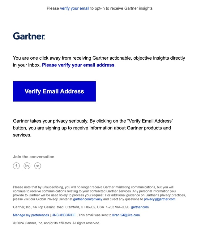
Gartner’s email is very straightforward, with no fuss at all. The instructions are clear and hassle-free: Please verify your email address. The opt-in also reassures recipients about their privacy, which I appreciate. “Gartner takes your privacy seriously” makes the recipients feel secure and respected.
Pro tip: Emphasize that your audience’s consent and data protection are priorities to counter any hesitation they might have about sharing their info.
8. Famous Footwear
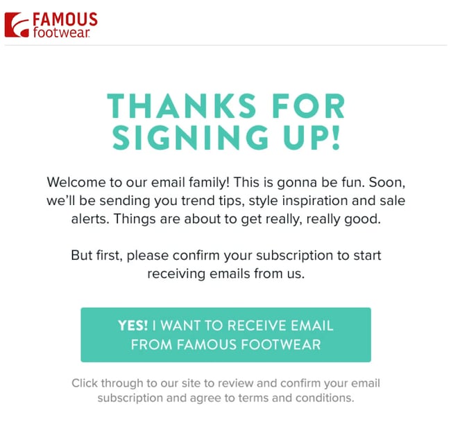
Famous Footwear followed a community-building approach in its opt-in email. Phrases like “Welcome to our family!” and “This is gonna be fun” add a sense of inclusivity to the email. This approach works well because it taps into our innate desire for connection and belonging and builds an emotional connection.
The brand also builds anticipation with “Things are about to get really, really good” and lists the benefits (trend tips, style inspiration, and sale alerts) I’ll get. This way, I know I have much to look forward to.
Pro tip: Create a sense of community or belonging and highlight the experiential benefits of joining your list, not just the practical ones.
9. Wealthsimple
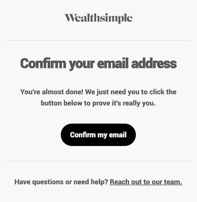
Wealthsimple, an online investment management service, has a very straightforward opt-in email. The email makes it clear why they’re sending it (to prove I’m not a bot) and what I need to do (confirm my email).
“You’re almost done” also emphasizes that the process is probably easy and hassle-free, showing that Wealthsimple values a non-nonsense approach. The email also offers support options in case I need clarity regarding anything.
Pro tip: Provide a channel for support in your opt-in emails and communicate that help is available if your subscribers have any questions or need assistance.
10. SEO Notebook
SEO Notebook is a newsletter that provides SEO tips and tricks. The author, Steve Toth, takes a direct and personal approach with a personalized greeting and sign-off that creates a friendly tone. It makes me feel valued from the start and creates a human-to-human connection.
Where the email really stands out is through its value proposition: access to pages from Steve’s exclusive SEO Notebook. This offer taps into the desire for insider knowledge and shows what subscribers can expect if they just press the green button.
Pro tip: Personalize your opt-in emails to make your subscribers feel valued.
11. Return Path
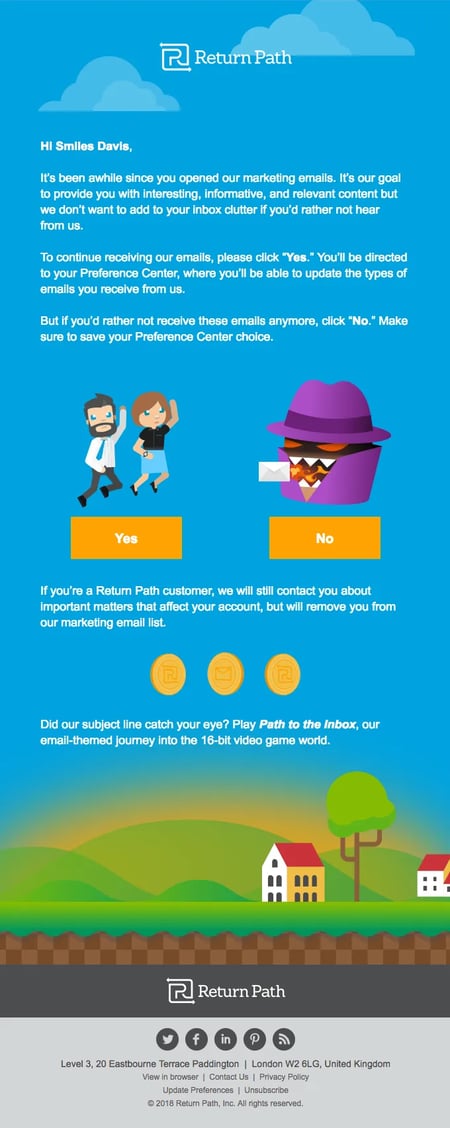
Return Path’s opt-in email shows they’re tracking subscriber activity by acknowledging that it’s been a while since I engaged with their emails. It’s a smart way to personalize interactions.
The email also shows respect for my time in two ways: it states its goal to provide interesting and relevant content and gives subscribers the option to adjust their preferences. If I want to opt out entirely, I have that option too.
Pro tip: Provide a preference center link in your opt-in emails to allow subscribers to tailor their experience.
12. Republic
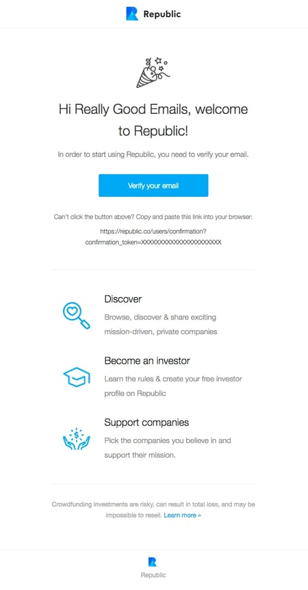
Republic’s opt-in breaks down all the benefits I’ll get from their platform. The opening line (welcome to Republic!) adds to the community they’re trying to build. This step is clearly highlighted with a “Verify your email” button, simplifying the process.
The email also includes a direct link in case of any technical glitches so I can still complete the process without any hiccups. It prioritizes user experience, which is always great.
Pro tip: Include a direct link for email verification alongside the button — it ensures I can proceed even if they encounter issues with the button.
13. Aisle
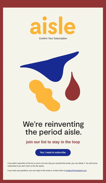
Aisle’s opt-in email is interesting. The tagline “We’re reinventing the period aisle – join our list to stay in the loop” piques my curiosity and makes me wonder what they’re doing differently. The CTA button “Yes, I want to subscribe” also affirms my choice and makes it clear.
The fine print at the bottom is great, too. If I have any questions, they made it easy by saying I could just reply to the email or contact them at [email protected]. It felt good knowing they were open to questions. This email made the whole process clear and made me feel like they value my choice and my time.
Pro tip: Be clear about what subscribers can do if they don’t want to receive this email.
14. Beyond the Envelope
Source: Really Good Emails
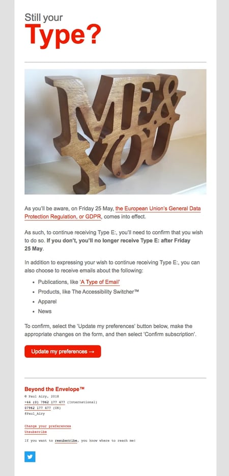
Beyond the Envelope’s opt-in email got straight to the point with an important update about the GDPR regulations coming into effect. It clearly explained that to keep getting emails, I’d need to confirm my subscription by a certain date.
They also offered options to customize the content I’m interested in, like publications, products, apparel, and news. This flexibility allows me to control what I see in my inbox, which I really appreciate. To confirm my preferences, all I had to do was click a button, make my selections, and confirm. It’s an easy step to stay connected with the content I’m interested in.
Pro tip: Letting subscribers choose what information they receive respects their inbox and personalizes their experience.
15. The Sunday Dispatches (Paul Jarvis’s newsletter)
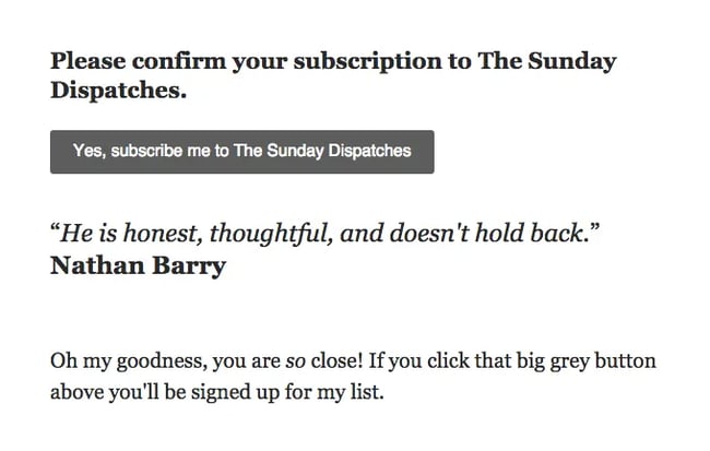
The Sunday Dispatches email starts with clear instructions: “Please confirm your subscription to The Sunday Dispatches.” This email displays a clear button that outlines the steps to what to do next.
What really adds a cherry on top is the testimonial: “He is honest, thoughtful, and doesn’t hold back.” It gives a preview of the quality and authenticity I can expect from the newsletter.
The email wraps up with a casual, almost playful line: “Oh my goodness, you are so close! If you click that big grey button above, you’ll be signed up for my list.” It’s the final gentle push to make the decision easier.
Pro tip: Add a testimonial to your opt-in email to show subscribers the value of signing up.
16. Houses Of
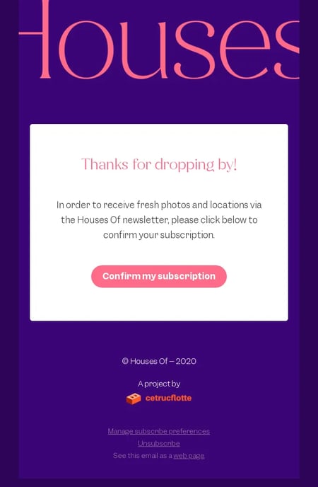
The greeting, “Thanks for dropping by!” immediately acknowledges and appreciates subscriber interest and sets a positive tone for the rest of the email. Knowing exactly what I was signing up for (“fresh photos and locations via the Houses Of newsletter”) helps me decide to subscribe because I understand the value proposition.
I also noticed the “Manage subscribe preferences” and “Unsubscribe” links, which reassures me I have control over their subscription settings.
Knowing I could easily adjust my preferences or opt out if I changed my mind built trust. It showed me that the brand prioritizes my comfort and consent over merely increasing their email list numbers.
Pro tip: Clearly communicate the benefits of the subscription to make it easy for people to see the value they’re getting.
17. Recess
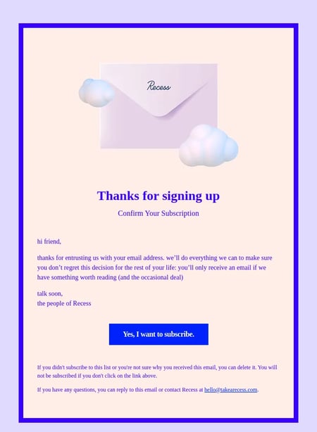
With a simple “hi friend,” Recess’ opt-in email instantly feels personal and laid-back. They thanked me for trusting them with my email and promised to make it worth my while. Occasionally, sending deals or content worth reading makes me feel like they respect my time.
The sign-off “talk soon, the people of Recess” keeps the tone casual and approachable. “Yes, I want to subscribe” is a straightforward CTA that encourages action.
Pro tip: The consistent use of lowercase throughout the email adds to the brand’s casual style and gives the message a more personal feel.
18. CyanVariable360 Studios
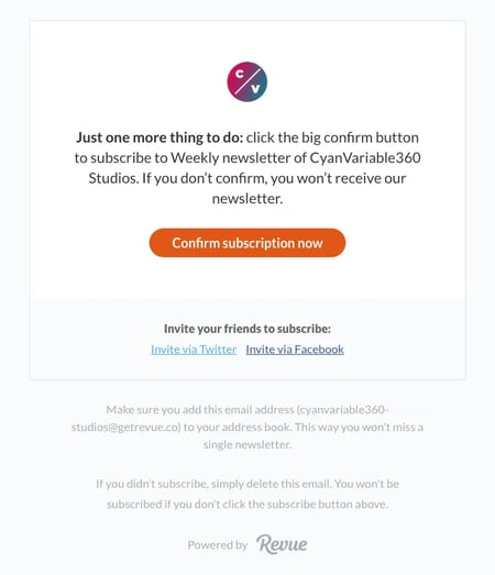
CyanVariable360 Studios’ simple opening eliminates any confusion. The explicit mention that I won’t receive the newsletter unless I confirm sets clear expectations.
This email includes an “Invite via Twitter” and “Invite via Facebook” option, which encourages me to share the newsletter with their friends. Making sharing easy expands the brand’s reach and builds a community around its content.
Finally, they recommend I add their email address to my address book so I don’t miss out. The fact that they thought about my experience from the beginning is evident from this practical tip.
Pro tip: Encourage new subscribers to share your newsletter on social media to increase your reach and create a community around your brand.
19. Notionway
Notionway’s opt-in email is also one of those that just get straight to the point. It’s clear that all I need to do is click a button to access the newsletter. It’s also personalized in a way by including the email address to provide maximum clarity.
The email also includes a fine print to show Notionway cares about my privacy and choice and adds a layer of security to the subscription process.
Pro tip: Include a clear and direct confirmation button to simplify the process.
20. Zapier
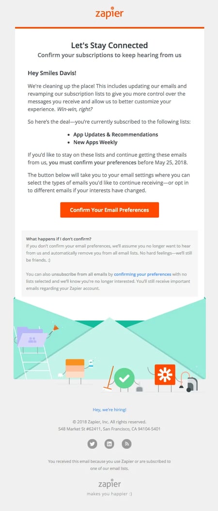
Zapier sends this email to existing subscribers as a check-in if they still want to be subscribed. It’s a great way to gauge how active and engaged your audience is. Plus, it’s also a respectful reminder and reinforces the value Zapier places on subscriber satisfaction and consent.
The email also answers what happens if I don’t confirm. The language (“No hard feelings — we’ll still be friends. :)” also builds a positive relationship. Overall, it’s a win-win, like they’ve mentioned: I receive content they find relevant and valuable, and Zapier maintains a clean list.
Pro tip: Reengage inactive subscribers based on open rates with a friendly check-in email to remind your audience they have control over the content they receive.
Email Opt-in Language (+Template)
We’ve discussed 20 email opt-in wording examples and what makes them unique. Now, I’ve chosen some of the most relevant elements—like a placeholder for personalization, value proposition, fine print about privacy, and link to the preference center) to create an email opt-in wording template that you can copy and customize right now. Here it is:
Subject: Welcome to [Brand Name]! Please Confirm Your Subscription
Hi [First Name],
We’re thrilled you’re here! Before we get started, we just need to make sure we have your permission to send you [brief value proposition, e.g., weekly insights, exclusive deals, etc.] straight to your inbox.
Please click the button below to confirm your subscription. By doing so, you’re not just signing up for emails; you’re starting on a journey with us towards [reiterate value proposition briefly].
[Confirm Subscription Button]
Can’t click the button? No problem! You can also confirm by clicking this link: [Direct Link for Email Verification]
We take your privacy seriously. Your information is safe with us, and we promise to only send you content that is relevant and valuable. You can read more about our privacy policy here.
Customize your experience
Want to tailor what you receive from us? Visit your Preference Center here to select the types of emails you’re interested in.
Think a friend would love our content as much as you do? Share our newsletter with them through X/Facebook!
If you have any questions or need assistance, feel free to reply to this email or contact us at [Contact Email]. We’re here to help!
Not You? If you didn’t sign up for this list or you’re unsure why you’re receiving this email, feel free to ignore it. You won’t be subscribed if you don’t click the confirmation link.
Cheers,
The [Brand Name] Team
Having Your Audience Opt In
Healthy subscriber lists have a lot of benefits. They segment your customers better, increase open rates, and decrease marketing costs – just to name a few. When your content matches the interests and needs of your audience, it becomes a no-brainer for them to press the subscribe button.
But when you aren’t sure what works? Use A/B testing to experiment with different phrases, CTAs, and layouts. This way, you’re constantly testing and refining your strategy to meet changing preferences and improve communication with your target audience.

![20 Email Opt-In Examples I Love (For Your Inspiration) → Download Now: The Beginner's Guide to Email Marketing [Free Ebook]](https://articles.entireweb.com/wp-content/uploads/2023/02/11-Free-Email-Hacks-to-Step-Up-Your-Productivity.png)
