MARKETING
The 20 Dominating Web Design Trends for 2022
Experimental navigation, scrolling effects, and kinetic typography are just a few of the web design trends dominating 2022.
Check out the full list with examples of the best website designs in 2022 to get inspired to tackle your web design projects this year.
What are the current trends in web design?
- Experimental Navigation
- Scrolling Effects
- Kinetic Typography
- Drag Interaction
- Retro Typography
- Cinemagraphs
- Brutalism
- Monochromatic Gradients
- Layering
- Text-Only
- Animated Illustration
- Ultra-minimalism
- Mixing Horizontal and Vertical Text
- Geometric Shapes and Patterns
- Thin Serif Fonts
- Overlapping Text and Images
- Broken Grids
- Organic Shapes
- Web Textures
- Grid Lines
One common theme among these trends is motion design. Gary Simon, an experienced UI/UX designer and frontend developer, believes motion design will be everywhere in 2022. To see several examples of websites using scroll-based animations, parallax effects, animated SVGs and more, check out his video:
1. Experimental Navigation
What we like: Experimental navigation can help engage and guide visitors to browse the site in a particular way.
Experimental navigation refers to navigation patterns that subvert the traditional pattern (all caps navigation across the top of the screen with sans serif typography). These experimental patterns can help create interest and guide users to move around the site in a specific way.
Take Kim Kneipp’s portfolio site for example. If you click the Menu button in the right corner of the homepage, a menu slides in from the bottom of the screen that looks like the table of contents in a book. Each page is numbered to suggest an order of reading. On the right, the projects are also numbered and categorized by type and color.
2. Scrolling Effects
What we like: Scrolling effects can stimulate visitors and encourage them to keep scrolling.
Scrolling effects — animations that are triggered by scroll action — can create more dynamic web experiences. These are increasingly used on interactive websites to intrigue readers to keep scrolling, signify a break in content, and create a three-dimensional experience.
Engineered Floors does just that using a combination of horizontal and vertical scrolling and other effects. For example, when the user lands on the homepage, they see an image of what appears to be a chair on the right. As the user scrolls, this image zooms out to reveal a living room, which is gradually covered in carpet. This 3D experience is delightful and informative.

3. Kinetic Typography
What we like: Kinetic typography can delight visitors and help them digest your content.
Kinetic typography — or moving text — is an animation technique that’s been around since the 60s when feature films began using animated opening titles. It can used for a similar purpose in website design to immediately grab the visitor’s attention once they land on the homepage.
It can also be used to highlight important sections, guide the visitor as they scroll, and gradually reveal information, like on Arcadia.

4. Drag Interaction
What we like: Drag interaction can provide users with a sense of control over their experience.
Drag interactions are designed to mimic an actual, physical action. They essentially allow website visitors to pick up and move objects on the screen. This type of gesture interaction is being implemented on more websites, and ecommerce and portfolio sites in particular.
Take Robin Mastromarino’s portfolio site as an example. In addition to clicking on the controls of the homepage slider, you can drag and drop the different slides to browse his featured projects. The page transitions and animations are based on the drag speed to provide users with a sense of control over these effects.
5. Retro Typography
What we like: Retro typography can inspire a sense of nostalgia and sentimentality in website visitors.
More and more companies are using big, bold typography with a retro feel to headline their homepages. This style works best for a short word, with the rest of the page kept minimal and clean.
This is part of a larger trend labeled “Neue Nouveau.” In its 2022 Type Trends Report, the foundry and technology company Monotype describes Neue Nouveau as a twist on the Art Nouveau movement, which was characterized by decorative designs, embellished stroke endings, and diagonal and triangular character shapes. We can see some of these same characteristics — like organic forms and flourishes — in typography today, according to the report.
Here’s an example from French restaurant Picky Joe. The psychedelic-looking headline matches the retro interior of the restaurant as seen in the image on the right.

You can check out other restaurant website designs here.
6. Cinemagraphs
What we like: Cinemagraphs can help draw the visitor’s eye around the page, even in the most complex layouts.
Cinemagraphs — high-quality videos or GIFs that run on a smooth, continuous loop — have become a popular way to add movement and visual interest to otherwise static pages.
While full-screen loops were popular in the past, this year you’ll see smaller cinemagraphs incorporated into complex layouts to help draw the eye and keep readers scrolling, like in this example from the design and technology studio Grafik.

7. Brutalism
What we like: Brutalism prioritizes simplicity and functionality, which are pillars of the user experience.
To stand out in a sea of tidy, organized websites, some designers are opting for more eclectic, convention-defying structures. While it can seem jarring at first, many popular brands are now incorporating these aggressively alternative design elements into their sites, such as Bloomberg.
Brutalism emerged as a reaction to the increasing standardization of web design and is often characterized by stark, asymmetrical, nonconformist visuals, and a distinct lack of hierarchy and order. In other words, it’s hard to describe but you know it when you see it — like with the below example from Chrissie Abbott.

8. Monochromatic Gradients
What we like: Monochromatic gradients are visually interesting but not distracting.
Gradients have been all over the web for the past few years, and are still very common in 2022. This year, many website background are gradients that are both monochromatic and pastel.
Kendra Pembroke, a Visual Designer at Red Ventures, said “I see a lot of gradients, especially monochromatic ones, which give a sense of depth and visual interest without being too distracting.”
Creative Studio Better Half illustrates a perfect example of how to make this effect look fresh and modern. It combines bold typography and hover animations with a monochromatic, pastel yellow gradient background.
What we like: Layering can help add depth to a site and tell the brand’s story.
Layering images, colors, shapes, animations, and other elements add depth and texture to a site that doesn’t have a lot of text. Below is a stylish example from the singer-songwriter SIRUP. What we like: This minimalist approach ensures visitors only get the most essential information.
Some websites are cutting out images and prominent navigation sections altogether, relying on a few choice lines of straightforward text to inform visitors about their company.
Danish agency B14 uses the hero section of its homepage to simply describe its mission statement, for example. It’s a modern, uncluttered approach to presenting information that provides a stark contrast to its portfolio section, which uses cinemagraphs, hover animations, and an animated cursor effect.
What we like: Animated illustrations help convey complex ideas and add some personality to a site.
More companies are turning to illustrators and graphic artists to create bespoke illustrations for their websites. “Illustration works well to convey more complex ideas that lifestyle photos aren’t always able to capture,” Pembroke explained.
In website designs this year, these illustrations are often animated to add interactivity. For example, if you hover over one of the illustrations on the NewActon site (designed by Australian digital agency ED), the illustration and those in the surrounding area will wiggle. Then, only the illustration you’re hovering over will continue to move in a small circle. This design is also functional: each illustration represents one of the categories from the navigation menu on the right.
What we like: Ultra-minimalism can positively impact the user experience and website performance.
Taking classic minimalism to the extreme, some designers are defying conventions of what a website needs to look like, displaying just the absolute bare necessities. This trend, known as “ultra-minimalism,” can be great for the user experience and load times.
The site from designer Mathieu Boulet is centered around a few choice links to their social profiles and information.
What we like: Mixing horizontal and vertical text defies convention and can therefore delight and intrigue some users.
Freeing text from its usual horizontal alignment and placing it vertically on a page adds some refreshing dimension. Take this example from action sports video producers Prime Park Sessions, which combines horizontal and vertical text alignments on a minimal page. What we like: Geometric shapes and patterns can direct visitor’s attentions to certain products or CTAs.
Whimsical patterns and shapes are popping up more frequently on websites, adding some flair in a landscape otherwise ruled by flat and material design. Canadian design studio MSDS uses daring, patterned letters on their homepage.
What we like: This trend adds a level of sophistication to a brand.
Due to screen resolution limitations and an overall lack of online font support, designers avoided serif fonts for years to keep websites legible and clean. With recent improvements, serif fonts had a big moment in 2021.
While last year was all about big and bold serifs, 2022 is ushering in thinner, light serifs, according to Monotype’s 2022 Type Trends Report.
As seen on The Sill, a svelte serif headline adds a dose of sophistication and style. What we like: Overlapping text and images maximizes space on the page.
Text that slightly overlaps accompanying images has become a popular effect for blogs and portfolios. Freelance art director and front-end developer Thibault Pailloux makes their overlapping text stand out with a colorful underline beneath each title.
What we like: This convention-defying technique can make standard website pages or sections more interesting.
While grids remain one of the most common and efficient ways of displaying text and images on websites, broken grids continue to make their way into mainstream sites and offer a change-up from the norm. Check out the website for HealHaus, for example. Its homepage features images and text blocks that overlap.
What we like: Organic shapes add personality without distracting from the content.
Gone are the days of strict grid layouts and sharp edges — now it’s all about curved lines and soft, organic shapes. “Organic shapes can help add some playfulness without affecting the way the information is displayed,” Pembroke said.
In the example below from Spring Invest, the organic shapes in the hero section are not only decorative but functional. The yellow dots act like a cursor, drawing the tear drops that form the company’s logo. These shapes not only add a moment of delight — they also help reinforce the brand’s identity and value proposition to “shape the future of commerce.”
What we like: Web textures draw attention to a particular section on a website.
Web textures are background images that visually resemble a three-dimensional surface. When done well, textures can immerse viewers in a website by engaging tactile senses, as demonstrated by Color Of Change — the background evokes a duct-tape-like texture.
What we like: This trend emphasizes the grid as an organizing principle.
Grid lines have started cropping up more and more in recent months, and for good reason. Grid lines structure content in a way that makes it easy to read and understand — but it also adds a modern aesthetic. On the Foundations for a Better Oregon website, grid lines are used to create a clear layout that looks futuristic. Of course, you don’t need to incorporate all of these trends to build one of the best website designs in 2022 — we doubt that’s even possible anyways. However, even adding a couple as prominent components or subtler details can improve your site’s UX significantly, leading to higher engagement, more CTA clicks, and a better outcome for your online business.
Editor’s note: This post was originally published in January 2018 and has been updated for comprehensiveness.
9. Layering

10. Text-Only

11. Animated Illustrations

12. Ultra-minimalism

13. Mixing Horizontal and Vertical Text

14. Geometric Shapes and Patterns

15. Thin Serif Fonts

16. Overlapping Text and Images

17. Broken Grids

18. Organic Shapes

19. Web Textures

20. Grid Lines

Design Trends You Can Use on Your Website

MARKETING
How to create editorial guidelines that are useful + template

Before diving in to all things editorial guidelines, a quick introduction. I head up the content team here at Optimizely. I’m responsible for developing our content strategy and ensuring this aligns to our key business goals.
Here I’ll take you through the process we used to create new editorial guidelines; things that worked well and tackle some of the challenges that come with any good multi – stakeholder project, share some examples and leave you with a template you can use to set your own content standards.
What are editorial guidelines?
Editorial guidelines are a set of standards for any/all content contributors, etc. etc. This most often includes guidance on brand, tone of voice, grammar and style, your core content principles and the types of content you want to produce.
Editorial guidelines are a core component of any good content strategy and can help marketers achieve the following in their content creation process:
- Consistency: All content produced, regardless of who is creating it, maintains a consistent tone of voice and style, helping strengthen brand image and making it easier for your audience to recognize your company’s content
- Quality Control: Serves as a ‘North Star’ for content quality, drawing a line in the sand to communicate the standard of content we want to produce
- Boosts SEO efforts: Ensures content creation aligns with SEO efforts, improving company visibility and increasing traffic
- Efficiency: With clear guidelines in place, content creators – external and internal – can work more efficiently as they have a clear understanding of what is expected of them
Examples of editorial guidelines
There are some great examples of editorial guidelines out there to help you get started.
Here are a few I used:
1. Editorial Values and Standards, the BBC
Ah, the Beeb. This really helped me channel my inner journalist and learn from the folks that built the foundation for free quality journalism.
How to create editorial guidelines, Pepperland Marketing
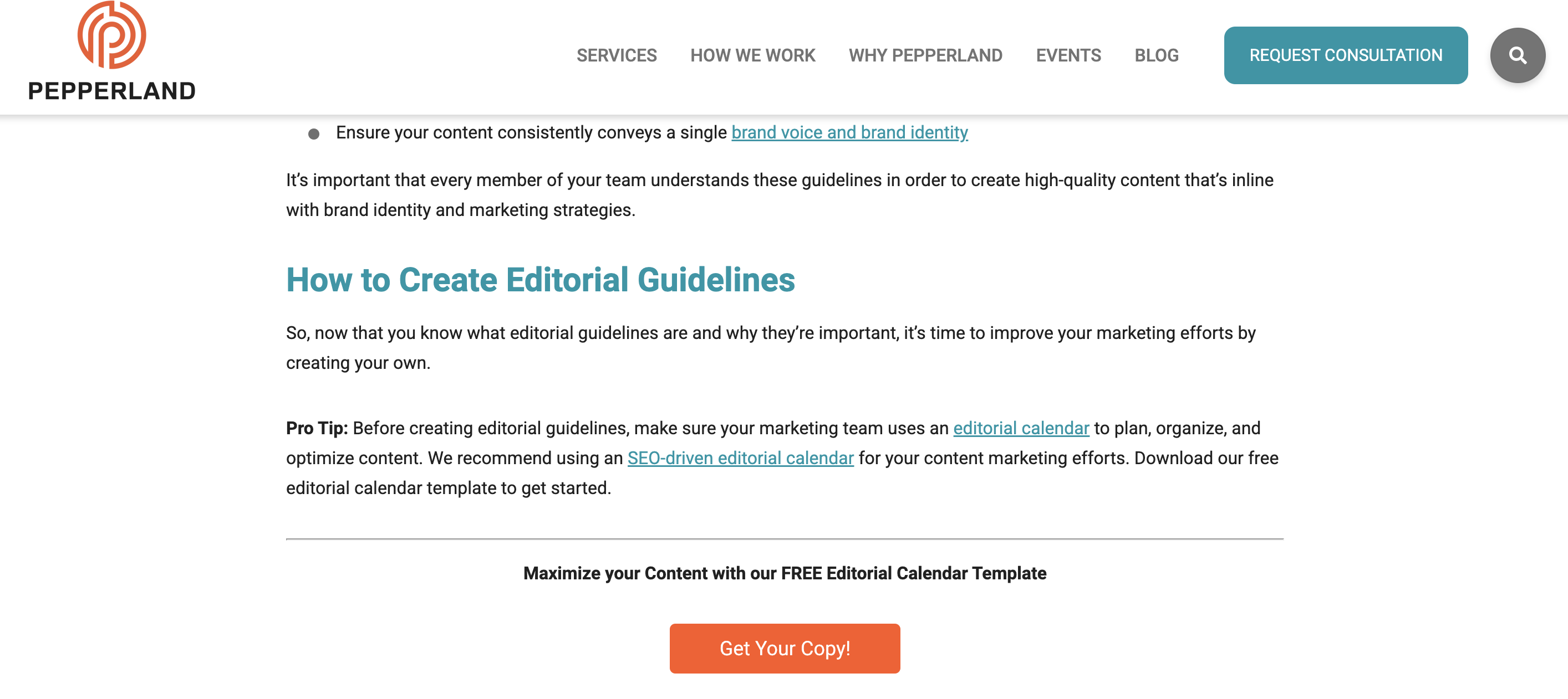
After taking a more big picture view I recognized needed more focused guidance on the step by step of creating editorial guidelines.
I really liked the content the good folks at Pepperland Marketing have created, including a free template – thanks guys! – and in part what inspired me to create our own free template as a way of sharing learnings and helping others quickstart the process of creating their own guidelines.
3. Writing guidelines for the role of AI in your newsroom?… Nieman Lab
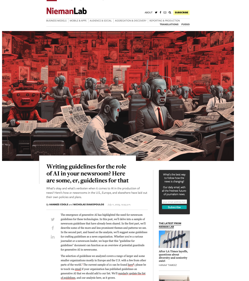
As well as provide guidance on content quality and the content creation process, I wanted to tackle the thorny topic of AI in our editorial guidelines. Specifically, to give content creators a steer on ‘fair’ use of AI when creating content, to ensure creators get to benefit from the amazing power of these tools, but also that content is not created 100% by AI and help them understand why we feel that contravenes our core content principles of content quality.
So, to learn more I devoured this fascinating article, sourcing guidance from major media outlets around the world. I know things change very quickly when it comes to AI, but I highly encourage reading this and taking inspiration from how these media outlets are tackling this topic.
Learn more: The Marketer’s Guide to AI-generated content
Why did we decide to create editorial guidelines?
1. Aligning content creators to a clear vision and process
Optimizely as a business has undergone a huge transformation over the last 3 years, going through rapid acquisition and all the joys and frustrations that can bring. As a content team, we quickly recognized the need to create a set of clear and engaging guidelines that helps content creators understand how and where they can contribute, and gave a clear process to follow when submitting a content idea for consideration.
2. Reinvigorated approach to brand and content
As a brand Optimizely is also going through a brand evolution – moving from a more formal, considered tone of voice to one that’s much more approachable, down to earth and not afraid to use humor, different in content and execution.
See, our latest CMS campaign creative:
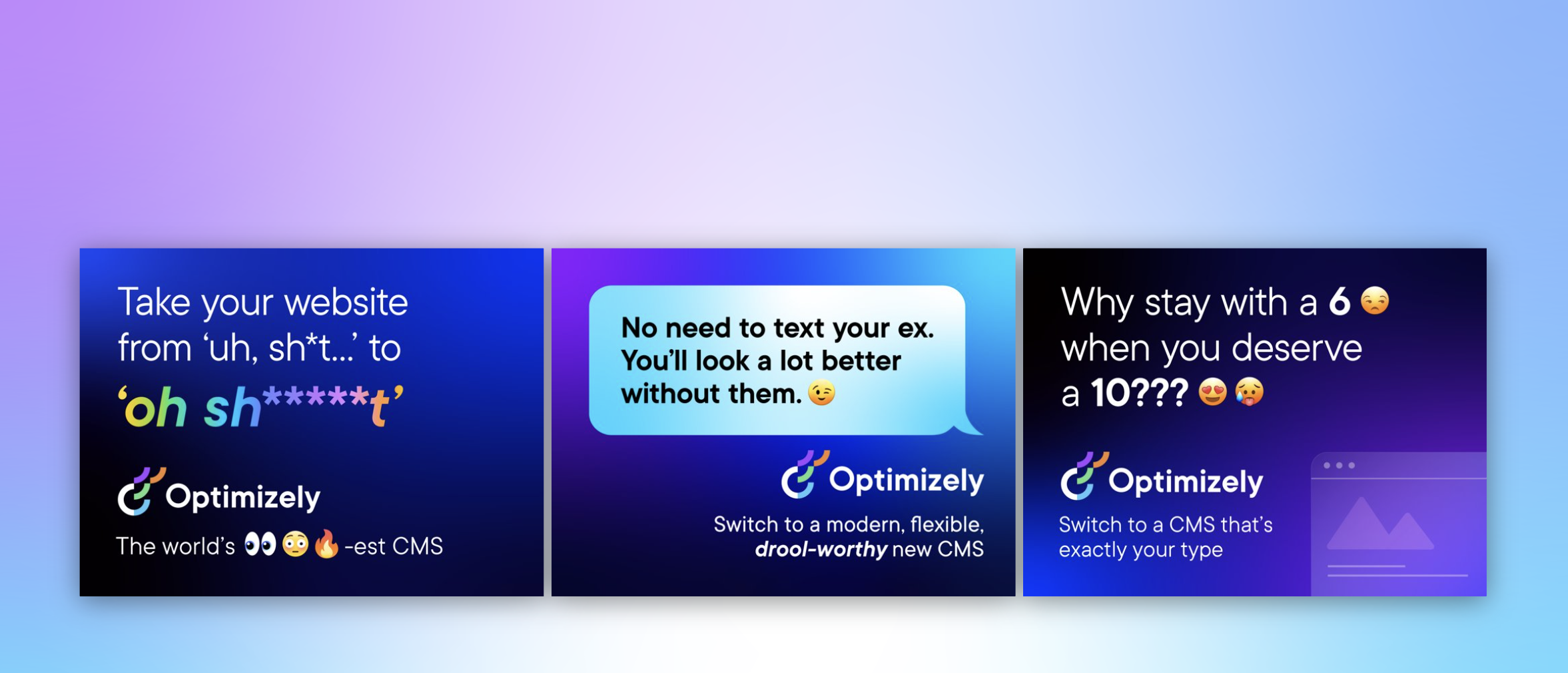
It’s pretty out there in terms of creative and messaging. It’s an ad campaign that’s designed to capture attention yes, but also – to demonstrate our abilities as a marketing team to create this type of campaign that is normally reserved for other more quote unquote creative industries.
We wanted to give guidance to fellow content creators outside the team on how they can also create content that embraces this evolved tone of voice, while at the same time ensuring content adheres to our brand guidelines.
3. Streamline content creation process
Like many global enterprises we have many different content creators, working across different time zones and locations. Documenting a set of guidelines and making them easily available helps content creators quickly understand our content goals, the types of content we want to create and why. It would free up content team time spent with individual contributors reviewing and editing submissions, and would ensure creation and optimization aligns to broader content & business goals.
It was also clear that we needed to document a process for submitting content ideas, so we made sure to include this in the guidelines themselves to make it easy and accessible for all contributors.
4. 2023 retrospective priority
As a content team we regularly review our content strategy and processes to ensure we’re operating as efficiently as possible.
In our last retrospective. I asked my team ‘what was the one thing I could do as a manager to help them be more impactful in their role?’
Editorial guidelines was the number 1 item on their list.
So off we went…
What we did
- Defined a discrete scope of work for the first version of the editorial guidelines, focusing on the Blog and Resources section of the website. This is where the content team spends most of its time and so has most involvement in the content creation process. Also where the most challenging bottlenecks have been in the past
- Research. Reviewed what was out there, got my hands on a few free templates and assembled a framework to create a first version for inputs and feedback
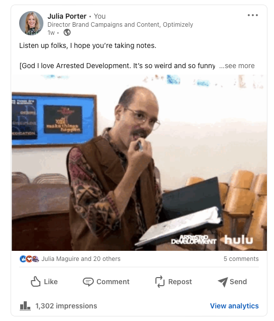
- Asked content community – I put a few questions out to my network on LinkedIn on the topic of content guidelines and content strategy, seeking to get input and guidance from smart marketers.
- Invited feedback: Over the course of a few weekswe invited collaborators to comment in a shared doc as a way of taking iterative feedback, getting ideas for the next scope of work, and also – bringing people on the journey of creating the guidelines. Look at all those reviewers! Doing this within our Content Marketing Platform (CMP) ensured that all that feedback was captured in one place, and that we could manage the process clearly, step by step:
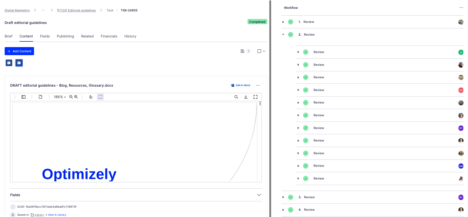
Look at all those collaborators! Thanks guys! And all of those beautiful ticks, so satisfying. So glad I could crop out the total outstanding tasks for this screen grab too (Source – Optimizely CMP)
- Updated content workflow: Now we have clear, documented guidance in place, we’ve included this as a step – the first step – in the workflow used for blog post creation:
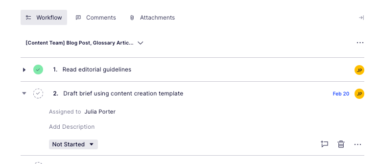
Source: Optimizely CMP
Results
It’s early days but we’re already seeing more engagement with the content creation process, especially amongst the teams involved in building the guidelines (which was part of the rationale in the first place :))

Source: My Teams chat
It’s inspired teams to think differently about the types of content we want to produce going forwards – for the blog and beyond.
I’d also say it’s boosted team morale and collaboration, helping different teams work together on shared goals to produce better quality work.
What’s next?
We’re busy planning wider communication of the editorial guidelines beyond marketing. We’ve kept the original draft and regularly share this with existing and potential collaborators for ongoing commentary, ideas and feedback.
Creating guidelines has also sparked discussion about the types of briefs and templates we want and need to create in CMP to support creating different assets. Finding the right balance between creative approach and using templates to scale content production is key.
We’ll review these guidelines on a quarterly basis and evolve as needed, adding new formats and channels as we go.
Key takeaways
- Editorial guidelines are a useful way to guide content creators as part of your overall content strategy
- Taking the time to do research upfront can help accelerate seemingly complex projects. Don’t be afraid to ask your community for inputs and advice as you create
- Keep the scope small at first rather than trying to align everything all at once. Test and learn as you go
- Work with stakeholders to build guidelines from the ground up to ensure you create a framework that is useful, relevant and used
And lastly, here’s that free template we created to help you build or evolve your own editorial guidelines!
MARKETING
Effective Communication in Business as a Crisis Management Strategy

Everyday business life is full of challenges. These include data breaches, product recalls, market downturns and public relations conflicts that can erupt at any moment. Such situations pose a significant threat to a company’s financial health, brand image, or even its further existence. However, only 49% of businesses in the US have a crisis communications plan. It is a big mistake, as such a strategy can build trust, minimize damage, and even strengthen the company after it survives the crisis. Let’s discover how communication can transform your crisis and weather the chaos.
The ruining impact of the crisis on business
A crisis can ruin a company. Naturally, it brings losses. But the actual consequences are far worse than lost profits. It is about people behind the business – they feel the weight of uncertainty and fear. Employees start worrying about their jobs, customers might lose faith in the brand they once trusted, and investors could start looking elsewhere. It can affect the brand image and everything you build from the branding, business logo, social media can be ruined. Even after the crisis recovery, the company’s reputation can suffer, and costly efforts might be needed to rebuild trust and regain momentum. So, any sign of a coming crisis should be immediately addressed. Communication is one of the crisis management strategies that can exacerbate the situation.
The power of effective communication
Even a short-term crisis may have irreversible consequences – a damaged reputation, high employee turnover, and loss of investors. Communication becomes a tool that can efficiently navigate many crisis-caused challenges:
- Improved trust. Crisis is a synonym for uncertainty. Leaders may communicate trust within the company when the situation gets out of control. Employees feel valued when they get clear responses. The same applies to the customers – they also appreciate transparency and are more likely to continue cooperation when they understand what’s happening. In these times, documenting these moments through event photographers can visually reinforce the company’s messages and enhance trust by showing real, transparent actions.
- Reputation protection. Crises immediately spiral into gossip and PR nightmares. However, effective communication allows you to proactively address concerns and disseminate true information through the right channels. It minimizes speculation and negative media coverage.
- Saved business relationships. A crisis can cause unbelievable damage to relationships with employees, customers, and investors. Transparent communication shows the company’s efforts to find solutions and keeps stakeholders informed and engaged, preventing misunderstandings and painful outcomes.
- Faster recovery. With the help of communication, the company is more likely to receive support and cooperation. This collaborative approach allows you to focus on solutions and resume normal operations as quickly as possible.
It is impossible to predict when a crisis will come. So, a crisis management strategy mitigates potential problems long before they arise.
Tips on crafting an effective crisis communication plan.
To effectively deal with unforeseen critical situations in business, you must have a clear-cut communication action plan. This involves things like messages, FAQs, media posts, and awareness of everyone in the company. This approach saves precious time when the crisis actually hits. It allows you to focus on solving the problem instead of intensifying uncertainty and panic. Here is a step-by-step guide.
Identify your crisis scenarios.
Being caught off guard is the worst thing. So, do not let it happen. Conduct a risk assessment to pinpoint potential crises specific to your business niche. Consider both internal and external factors that could disrupt normal operations or damage the online reputation of your company. Study industry-specific issues, past incidents, and current trends. How will you communicate in each situation? Knowing your risks helps you prepare targeted communication strategies in advance. Of course, it is impossible to create a perfectly polished strategy, but at least you will build a strong foundation for it.
Form a crisis response team.
The next step is assembling a core team. It will manage communication during a crisis and should include top executives like the CEO, CFO, and CMO, and representatives from key departments like public relations and marketing. Select a confident spokesperson who will be the face of your company during the crisis. Define roles and responsibilities for each team member and establish communication channels they will work with, such as email, telephone, and live chat. Remember, everyone in your crisis response team must be media-savvy and know how to deliver difficult messages to the stakeholders.
Prepare communication templates.
When a crisis hits, things happen fast. That means communication needs to be quick, too. That’s why it is wise to have ready-to-go messages prepared for different types of crises your company may face. These messages can be adjusted to a particular situation when needed and shared on the company’s social media, website, and other platforms right away. These templates should include frequently asked questions and outline the company’s general responses. Make sure to approve these messages with your legal team for accuracy and compliance.
Establish communication protocols.
A crisis is always chaotic, so clear communication protocols are a must-have. Define trigger points – specific events that would launch the crisis communication plan. Establish a clear hierarchy for messages to avoid conflicting information. Determine the most suitable forms and channels, like press releases or social media, to reach different audiences. Here is an example of how you can structure a communication protocol:
- Immediate alert. A company crisis response team is notified about a problem.
- Internal briefing. The crisis team discusses the situation and decides on the next steps.
- External communication. A spokesperson reaches the media, customers, and suppliers.
- Social media updates. A trained social media team outlines the situation to the company audience and monitors these channels for misinformation or negative comments.
- Stakeholder notification. The crisis team reaches out to customers and partners to inform them of the incident and its risks. They also provide details on the company’s response efforts and measures.
- Ongoing updates. Regular updates guarantee transparency and trust and let stakeholders see the crisis development and its recovery.
Practice and improve.
Do not wait for the real crisis to test your plan. Conduct regular crisis communication drills to allow your team to use theoretical protocols in practice. Simulate different crisis scenarios and see how your people respond to these. It will immediately demonstrate the strong and weak points of your strategy. Remember, your crisis communication plan is not a static document. New technologies and evolving media platforms necessitate regular adjustments. So, you must continuously review and update it to reflect changes in your business and industry.
Wrapping up
The ability to handle communication well during tough times gives companies a chance to really connect with the people who matter most—stakeholders. And that connection is a foundation for long-term success. Trust is key, and it grows when companies speak honestly, openly, and clearly. When customers and investors trust the company, they are more likely to stay with it and even support it. So, when a crisis hits, smart communication not only helps overcome it but also allows you to do it with minimal losses to your reputation and profits.
MARKETING
Should Your Brand Shout Its AI and Marketing Plan to the World?

To use AI or not to use AI, that is the question.
Let’s hope things work out better for you than they did for Shakespeare’s mad Danish prince with daddy issues.
But let’s add a twist to that existential question.
CMI’s chief strategy officer, Robert Rose, shares what marketers should really contemplate. Watch the video or read on to discover what he says:
Should you not use AI and be proud of not using it? Dove Beauty did that last week.
Should you use it but keep it a secret? Sports Illustrated did that last year.
Should you use AI and be vocal about using it? Agency giant Brandtech Group picked up the all-in vibe.
Should you not use it but tell everybody you are? The new term “AI washing” is hitting everywhere.
What’s the best option? Let’s explore.
Dove tells all it won’t use AI
Last week, Dove, the beauty brand celebrating 20 years of its Campaign for Real Beauty, pledged it would NEVER use AI in visual communication to portray real people.
In the announcement, they said they will create “Real Beauty Prompt Guidelines” that people can use to create images representing all types of physical beauty through popular generative AI programs. The prompt they picked for the launch video? “The most beautiful woman in the world, according to Dove.”
I applaud them for the powerful ad. But I’m perplexed by Dove issuing a statement saying it won’t use AI for images of real beauty and then sharing a branded prompt for doing exactly that. Isn’t it like me saying, “Don’t think of a parrot eating pizza. Don’t think about a parrot eating pizza,” and you can’t help but think about a parrot eating pizza right now?
Brandtech Group says it’s all in on AI
Now, Brandtech Group, a conglomerate ad agency, is going the other way. It’s going all-in on AI and telling everybody.
This week, Ad Age featured a press release — oops, I mean an article (subscription required) — with the details of how Brandtech is leaning into the takeaway from OpenAI’s Sam Altman, who says 95% of marketing work today can be done by AI.
A Brandtech representative talked about how they pitch big brands with two people instead of 20. They boast about how proud they are that its lean 7,000 staffers compete with 100,000-person teams. (To be clear, showing up to a pitch with 20 people has never been a good thing, but I digress.)
OK, that’s a differentiated approach. They’re all in. Ad Age certainly seemed to like it enough to promote it. Oops, I mean report about it.
False claims of using AI and not using AI
Offshoots of the all-in and never-will approaches also exist.
The term “AI washing” is de rigueur to describe companies claiming to use AI for something that really isn’t AI. The US Securities and Exchange Commission just fined two companies for using misleading statements about their use of AI in their business model. I know one startup technology organization faced so much pressure from their board and investors to “do something with AI” that they put a simple chatbot on their website — a glorified search engine — while they figured out what they wanted to do.
Lastly and perhaps most interestingly, companies have and will use AI for much of what they create but remain quiet about it or desire to keep it a secret. A recent notable example is the deepfake ad of a woman in a car professing the need for people to use a particular body wipe to get rid of body odor. It was purported to be real, but sharp-eyed viewers suspected the fake and called out the company, which then admitted it. Or was that the brand’s intent all along — the AI-use outrage would bring more attention?
This is an AI generated influencer video.
Looks 100% real. Even the interior car detailing.
UGC content for your brand is about to get really cheap. ☠️ pic.twitter.com/2m10RqoOW3
— Jon Elder | Amazon Growth | Private Label (@BlackLabelAdvsr) March 26, 2024
To yell or not to yell about your brand’s AI decision
Should a brand yell from a mountaintop that they use AI to differentiate themselves a la Brandtech? Or should a brand yell they’re never going to use AI to differentiate themselves a la Dove? Or should a brand use it and not yell anything? (I think it’s clear that a brand should not use AI and lie and say it is. That’s the worst of all choices.)
I lean far into not-yelling-from-mountaintop camp.
When I see a CEO proudly exclaim that they laid off 90% of their support workforce because of AI, I’m not surprised a little later when the value of their service is reduced, and the business is failing.
I’m not surprised when I hear “AI made us do it” to rationalize the latest big tech company latest rounds of layoffs. Or when a big consulting firm announces it’s going all-in on using AI to replace its creative and strategic resources.
I see all those things as desperate attempts for short-term attention or a distraction from the real challenge. They may get responses like, “Of course, you had to lay all those people off; AI is so disruptive,” or “Amazing. You’re so out in front of the rest of the pack by leveraging AI to create efficiency, let me cover your story.” Perhaps they get this response, “Your company deserves a bump in stock price because you’re already using this fancy new technology.”
But what happens if the AI doesn’t deliver as promoted? What happens the next time you need to lay off people? What happens the next time you need to prove your technologically forward-leaning?
Yelling out that you’re all in on a disruptive innovation, especially one the public doesn’t yet trust a lot is (at best) a business sugar high. That short-term burst of attention may or may not foul your long-term brand value.
Interestingly, the same scenarios can manifest when your brand proclaims loudly it is all out of AI, as Dove did. The sugar high may not last and now Dove has itself into a messaging box. One slip could cause distrust among its customers. And what if AI gets good at demonstrating diversity in beauty?
I tried Dove’s instructions and prompted ChatGPT for a picture of “the most beautiful woman in the world according to the Dove Real Beauty ad.”
It gave me this. Then this. And this. And finally, this.
She’s absolutely beautiful, but she doesn’t capture the many facets of diversity Dove has demonstrated in its Real Beauty campaigns. To be clear, Dove doesn’t have any control over generating the image. Maybe the prompt worked well for Dove, but it didn’t for me. Neither Dove nor you can know how the AI tool will behave.
To use AI or not to use AI?
When brands grab a microphone to answer that question, they work from an existential fear about the disruption’s meaning. They do not exhibit the confidence in their actions to deal with it.
Let’s return to Hamlet’s soliloquy:
Thus conscience doth make cowards of us all;
And thus the native hue of resolution
Is sicklied o’er with the pale cast of thought,
And enterprises of great pith and moment
With this regard their currents turn awry
And lose the name of action.
In other words, Hamlet says everybody is afraid to take real action because they fear the unknown outcome. You could act to mitigate or solve some challenges, but you don’t because you don’t trust yourself.
If I’m a brand marketer for any business (and I am), I’m going to take action on AI for my business. But until I see how I’m going to generate value with AI, I’m going to be circumspect about yelling or proselytizing how my business’ future is better.
HANDPICKED RELATED CONTENT:
Cover image by Joseph Kalinowski/Content Marketing Institute
-

 PPC7 days ago
19 Best SEO Tools in 2024 (For Every Use Case)
-
SEARCHENGINES6 days ago
Daily Search Forum Recap: April 19, 2024
-
SEARCHENGINES7 days ago
Daily Search Forum Recap: April 18, 2024
-

 WORDPRESS6 days ago
How to Make $5000 of Passive Income Every Month in WordPress
-

 SEO7 days ago
25 WordPress Alternatives Best For SEO
-

 WORDPRESS5 days ago
13 Best HubSpot Alternatives for 2024 (Free + Paid)
-

 WORDPRESS6 days ago
7 Best WooCommerce Points and Rewards Plugins (Free & Paid)
-

 MARKETING6 days ago
Battling for Attention in the 2024 Election Year Media Frenzy


You must be logged in to post a comment Login