SEO
25 Best Examples Of Effective FAQ Pages

Frequently Asked Question (FAQ) pages (or informational hubs) enable your business to respond, react, and anticipate the needs of your audience more quickly and appropriately than other types of destination page experiences.
An effective FAQ resource can educate, inform, and naturally guide the user through your website’s content and toward the goals and results you have set.
Over the years, the role of the FAQ page has changed substantially, and now an FAQ page is an essential webpage to have on your site.
Why An FAQ Resource?
Firstly, FAQ pages can bring new visitors to your website via organic search and drive them quickly to related pages – most typically deeper blog pages and service pages closely related to the questions being resolved.
Next, one of the most significant opportunities for impactful brand visibility within the search engine result pages (in-SERP) is targeting audience questions, wants, needs, and pain points.
The FAQ page is one of the best ways to help people visit your site and get snippets of answers in front of users before they click any results within the search pages.
A helpful FAQ page (more likely an FAQ hub of core pages and topical intent) shortens the time it takes for people to solve their search requirements.
The experience from the first visit to conversion is also faster because you remove any possible barriers to knowledge (informational and often trust).
As a company, you are showcasing expertise through FAQs, plus introducing your key staff, knowledge, and unique insights into the industry sooner.
You add credibility and value through meaningful content in the many forms your audience requires. This will typically include audio, visual/video, and layering of content types now, compared to traditional text-only content provision.
You are also servicing the need for offline conversation and experience through faster and always available online mechanisms.
People will always seek help and advice. They are unwilling to pick up the phone, walk into a store, or wait hours (even minutes) for that information or insight to become accessible.
It needs to be available now and in the format they enjoy the most.
Why FAQ Pages Are A Priority
FAQ pages continue to be a priority area for SEO and digital marketing professionals.
An FAQ page is one of the simplest ways to improve your site and help site visitors and users.
Your FAQ section should be seen as a constantly expanding source of value provided to your audience. It is a place where their ever-changing and growing requirements are not only met but anticipated and exceeded frequently.
In no small part, the importance of FAQ pages has been driven in recent years by the growth in voice search, mobile search, and personal/home assistants and speakers.
These predominantly rely on the pre-results (Google Answers and Featured Snippets) and can be explicitly targeted with FAQ pages.
People need conversation, comparison, and support for most of their decision-making online and offline; FAQs can cater to them all.
An effective FAQ page seeks to:
- Reflect and respond to your audience’s needs wholly and thoroughly.
- Cover a broad range of intent (transactional, informational, locational, etc.).
- Stay updated based on new insights from your data, the industry, and broader best practices.
- Land new users to the website by solving problems and supporting return visits with regular additions and valuable expertise sharing.
- Drive internal pageviews to other important pages and support key conversion paths.
- Fuel blog (and deeper content) creation logically and intuitively ties together semantically relevant content.
- Shine a light on expertise, trust, and authority within your niche, giving your brand and key staff a platform to educate, inform, and support your community.
25 Of The Best Examples Of FAQ Pages
Now let’s look at 25 great examples of FAQ pages/resources and why they’re so effective.
1. Twitter
Twitter’s FAQ help center made a list as it factored in some fascinating personalization, easy-to-use search functionality, and has a positive user experience (something few FAQ pages ever achieve).
2. YouTube
YouTube’s FAQ page is clean, fresh, simple to use, and provides access to the most commonly asked “help” topics.
As you might expect, content delivery combines video/visual content with standard textual content. The role of mixed content types in FAQ pages is something often overlooked.
 Screenshot from YouTube, July 2022
3. McDonald’s
The McDonald’s FAQ page feels informal and sociable, encouraging people to share their FAQ experiences (a rarity).
 Screenshot from mcdonalds.com, July 2022
4. WhatsApp
The FAQ resource for Whatsapp is bright, easy to use, and categorized effectively for quick desktop or mobile use.
When considering the functional role and practical requirements of an FAQ resource, it can be easy to forget the importance of loading time and speed of access to information.
 Screenshot from faq.whatsapp.com, July 2022
5. Wikipedia
Wikipedia’s help center is an excellent example of an “old-school” FAQ page.
It is text-heavy, blocked into key topic areas, and has extensive access to all the critical support areas you could ever need.
There is something necessary, meaningful and nostalgic about FAQ-orientated websites like this, plus they are hugely helpful and remain more than fit for purpose.
 Screenshot from en.wikipedia.org, July 2022
6. The University of East Anglia (UEA)
The University of East Anglia FAQ resource is more of an inbuilt problem-solving informational architecture than a separate FAQ resource.
This type of audience understanding throughout every critical section and site navigation reflects the potential to continuously service and support your audience as a core part of the business positioning.
 Screenshot from uea.ac.uk, July 2022
7. UCAS
The FAQs section of UCAS is simple, scaled back, and concise.
It includes a prompt to ask if the information was helpful and to gather user feedback to improve the resource.
This type of first-party/direct user feedback loop is excellent as it demonstrates a willingness to refine and improve the FAQ section iteratively.
 Screenshot from ucas.com, July 2022
8. Foresters Friendly Society
The Foresters Friendly Society FAQ page example showcases topic-specific FAQ content clusters or hubs in action.
This facilitates a quick and effective experience for people to explore topics in detail that matter to them the most, without the added clicks or distractions of single-stop (all-topic) FAQ destinations.
 Screenshot from forestersfriendlysociety.co.uk, July 2022
9. Ontrack
The standout features of the Ontrack FAQ section include the simplified user experience and bold, functional (dialed back) access to crucial information.
The content isn’t cluttered, it’s easy to skim read, plus you can switch between FAQ-related resources within a single click to service various layers of user intent.
 Screenshot from ontrack.com, July 2022
10. DaysOutGuide
DaysOutGuide’s frequently asked questions resource incorporates tags to make the most out of single-click functionality for all device access to information.
The balance between text, images, and interactive features works well.
Content segments are demarked and intuitive.
 Screenshot from daysoutguide.co.uk, July 2022
11. SendInBlue
SendInBlue’s FAQs are by far the most basic by design (single grid defined by thin square design categories) included in this list of my best and most effective FAQs, but they work.
It’s a simple solution but almost always overlooked.
This offers a helpful reminder that it is the content value and ease of access to information instead of over-design when it comes to effective FAQ pages.
 Screenshot from help.sendinblue.com, July 2022
12. FreeSpirit
The FreeSpirit FAQ page combines useful information navigational features with interactive content to empower users to progress through the site and make buying decisions faster.
 Screenshot from freespirittravelinsurance.com, July 2022
13. Amazon Web Services
Amazon Web Services’ FAQs are functional, easy to skim through, and categorized for use.
There are no frills here.
But, in some cases, it’s better to get straight to the point.
 Screenshot from aws.amazon.com, July 2022
14. Silicone Engineering
Silicone Engineering’s FAQs help demystify a traditionally complex industry.
The combination of quick links, ask the expert, and more profound content answers work well for the user regardless of time availability or device used.
Engineering and related industries can seem daunting to many, so this content distillation is always a welcome experience for the user.
 Screenshot from silicone.co.uk, July 2022
15. Dropbox
Dropbox Help brings fun to the FAQ area with the choice of images and encourages the user to experience the site through self-discovery.
It’s a helpful reminder that FAQs can be a fun and engaging way to bring your brand in front of new and existing audiences in various ways.
 Screenshot from help.dropbox.com, July 2022
16. TUI
TUI FAQs are in a grid format, include depth of topical coverage, and reflect the volumes of information available on the site.
The resource is not overly pretty by design, but it works and almost has a retro feel.
 Screenshot from tui.co.uk, July 2022
17. UPS
The UPS Help and Support Centre includes a virtual chat assistant which leverages the FAQs above the static functionality of most.
Chatbots are ideal FAQ considerations mainly based on their ability to expedite and drive the user journey (a key effectiveness area for any help and FAQ resource).
 Screenshot from ups.com, July 2022
18. Trent Furniture
In this example, the Trent Furniture FAQ and guides section acts as both an FAQ resource and a guide roll-up resource.
This means that users can access top-level information, deeper, more comprehensive buying guides, measurement information, and a whole host of other insights normally only accessible through blogs.
For ecommerce sites, it’s positive to access layers of content depth relevant to your buying decisions – whether you intend to purchase in the same session or are working your way through the buying and information-seeking journey.
 Screenshot from trentfurniture.co.uk, July 2022
19. FatFace
The FatFace help center and FAQs resource is a practical example of a bigger brand getting it right.
The help center places the users first with the topics covered and still manages to feel personable and helpful.
 Screenshot from fatface.com, July 2022
20. Stewarts Law
This Stewarts Law FAQs example demonstrates the multipurpose nature of informational content.
This case merges traditional news and article content provision alongside FAQs, insights, and broader expert opinions.
 Screenshot from stewartslaw.com, July 2022
21. Pinterest
Pinterest’s Help Center takes simplicity to the next level.
The design and information provided are prioritized for the mobile user by combining visual and textual triggers.
FAQ resources should place function first, and that’s clear in this example.
 Screenshot from help.pinterest.com, July 2022
22. Elite Island Holidays UK
The audience’s needs drive Elite Island Holidays’ FAQs and set out to answer people’s holiday dilemmas, from preparation to last-minute help and support.
The blog nature of the answers means that the site visitor doesn’t need to travel beyond the FAQs page for help.
FAQ answers’ completeness can vary by industry and on a site-by-site basis.
In this example, the more profound content provision is good to see and helps prevent multiple clicks or return to search engine query refinement to find a complete answer.
 Screenshot from eliteislandholidays.com, July 2022
23. Airtable
Airtable’s Help Center is fun, visually driven, and even provides helpful information on how to use the FAQ section.
Making a help resource fun isn’t easy. However, Airtable has achieved this.
I like to be objective (as much as possible with opinion-based topics like this) and consider FAQ pages that stand out with clear purpose and thought.
 Screenshot from support.airtable.com, July 2022
24. Pretty Little Thing
The FAQs on Pretty Little Thing immediately tell their audience and position the design and content accordingly.
The FAQs also appear well thought out and enticing to interact with.
The clickable visual elements reflect mobile and all device interaction, which is essential for online mobile-first and all device expectations.
 Screenshot from prettylittlething.com, July 2022
25. First Direct
First Direct’s FAQs, Help Center, and Tools/Guide Resource brings many information-rich segmented guides and financial tools into one place.
Making often complex and dry financial topics straightforward and accessible is not easy, but this section does it well.
 Screenshot from www1.firstdirect.com, July 2022
Creating An Effective FAQ page
Whether you have an FAQ page in place, believe it can contribute more, or are looking to create a new FAQ resource for your website, it’s essential to consider the next steps.
Remember not to overlook the necessity to gather data in your FAQ section. Use this to continue adding to it, refine, and expand the ongoing value provision to your audience.
Your FAQ resource needs to be proactively updated to cater to all the new and ever-changing data sets reflecting your existing and new community requirements, offline and online.
1. Decide On The Purpose Of The FAQ Page
Suppose you wish to bring your experts to the foreground and provide ongoing audience support. In that case, your FAQ hub will function very differently than it would if you intend to increase the ease of access to know cornerstone content on your website.
You need to have a clearly defined FAQ section purpose and ensure you support this with business objectives and KPIs.
This helps maintain prioritization and justification to keep investing resources and focus on FAQ development alongside more traditional commercial website pages.
2. Plan In Advance To Maintain And Grow Your FAQ Hub
Your audience questions will change frequently, and you must ensure that your FAQ content reflects this.
Data within Google Search Console (GSC), on-site search behavior, plus broader industry trends will help inform this.
Don’t limit your data gathering to a single source, however.
Look at the competition, consider Google Rich Results (using tools such as Semrush), and look at the completeness of your expertise provision through your FAQ content.
3. Look Outside Of Your Company Data Environment
While your data is fantastic for servicing your existing customer base, there are often multiple layers of FAQs to fulfill.
You can use free tools such as Answer the Public for more general questions, Google Trends, and competitor sites.
The opportunity to answer In-SERP questions grows all the time. You want to be present in these conversations by showcasing your FAQ content and creating compelling content types to target these items correctly.
4. Structuring FAQs
Both your page and individual FAQs (whether a single FAQ page or entire sections of your site specific to FAQ content) need some consideration on how you structure them and make a lot of varied content accessible for the user and search engines alike.
Consider the expandable on-click text at the individual FAQ level to keep answers clean and easy to use.
At the page structure level, take time to prioritize content based on value and demand, plus technical optimization areas such as the use of schema, page speed, and mobile-friendliness.
Remember that people look to digest content in many ways.
FAQ content does not have to be text only. It’s far broader reaching and valuable to people and for search if it’s multi-tiered and varied in content types.
5. Use Data To Refine & Improve: Part Of ‘Always On’ Focus
FAQ pages quickly become outdated, and their value declines over time.
Make sure you are testing page changes and iteratively improving everything from headings and clickable page elements to new data-led content additions and calls to action.
Every month there will be evidence-led chances to improve, and this mentality is key to maximizing business and user impact.
6. Don’t Forget The People Element
The most successful FAQ pages and help center hubs often stem from a deeper understanding of the people they are intended to help.
Data and evidence are always important, but you must balance this with real-world insights and offline experiences.
The best people to help with this are the front-line staff, who actively engage with your audience daily and truly understand how online and offline FAQs can support and enrich your problem-solving offering.
Your FAQ section supports your staff as much as it’s present to help educate and inform your community.
Think about your recurring conversations and how they can be served equally well online.
Don’t forget mixed content types to replicate the offline experience online, plus the need to gather feedback from your users directly.
As a final quick tip: Every FAQ resource, however complete it may appear, will have new ways to leverage the value received from it and areas to grow.
You can often reposition existing content for new search opportunities, bolster and expand its depth and value, plus create unique visual content from a text-only provision for many short-term and ongoing gains.
More Resources:
Featured Image: Kavaleuskaya Aksana/Shutterstock
SEO
How To Write ChatGPT Prompts To Get The Best Results

ChatGPT is a game changer in the field of SEO. This powerful language model can generate human-like content, making it an invaluable tool for SEO professionals.
However, the prompts you provide largely determine the quality of the output.
To unlock the full potential of ChatGPT and create content that resonates with your audience and search engines, writing effective prompts is crucial.
In this comprehensive guide, we’ll explore the art of writing prompts for ChatGPT, covering everything from basic techniques to advanced strategies for layering prompts and generating high-quality, SEO-friendly content.
Writing Prompts For ChatGPT
What Is A ChatGPT Prompt?
A ChatGPT prompt is an instruction or discussion topic a user provides for the ChatGPT AI model to respond to.
The prompt can be a question, statement, or any other stimulus to spark creativity, reflection, or engagement.
Users can use the prompt to generate ideas, share their thoughts, or start a conversation.
ChatGPT prompts are designed to be open-ended and can be customized based on the user’s preferences and interests.
How To Write Prompts For ChatGPT
Start by giving ChatGPT a writing prompt, such as, “Write a short story about a person who discovers they have a superpower.”
ChatGPT will then generate a response based on your prompt. Depending on the prompt’s complexity and the level of detail you requested, the answer may be a few sentences or several paragraphs long.
Use the ChatGPT-generated response as a starting point for your writing. You can take the ideas and concepts presented in the answer and expand upon them, adding your own unique spin to the story.
If you want to generate additional ideas, try asking ChatGPT follow-up questions related to your original prompt.
For example, you could ask, “What challenges might the person face in exploring their newfound superpower?” Or, “How might the person’s relationships with others be affected by their superpower?”
Remember that ChatGPT’s answers are generated by artificial intelligence and may not always be perfect or exactly what you want.
However, they can still be a great source of inspiration and help you start writing.
Must-Have GPTs Assistant
I recommend installing the WebBrowser Assistant created by the OpenAI Team. This tool allows you to add relevant Bing results to your ChatGPT prompts.
This assistant adds the first web results to your ChatGPT prompts for more accurate and up-to-date conversations.
It is very easy to install in only two clicks. (Click on Start Chat.)
For example, if I ask, “Who is Vincent Terrasi?,” ChatGPT has no answer.
With WebBrower Assistant, the assistant creates a new prompt with the first Bing results, and now ChatGPT knows who Vincent Terrasi is.
 Screenshot from ChatGPT, March 2023
You can test other GPT assistants available in the GPTs search engine if you want to use Google results.
Master Reverse Prompt Engineering
ChatGPT can be an excellent tool for reverse engineering prompts because it generates natural and engaging responses to any given input.
By analyzing the prompts generated by ChatGPT, it is possible to gain insight into the model’s underlying thought processes and decision-making strategies.
One key benefit of using ChatGPT to reverse engineer prompts is that the model is highly transparent in its decision-making.
This means that the reasoning and logic behind each response can be traced, making it easier to understand how the model arrives at its conclusions.
Once you’ve done this a few times for different types of content, you’ll gain insight into crafting more effective prompts.
Prepare Your ChatGPT For Generating Prompts
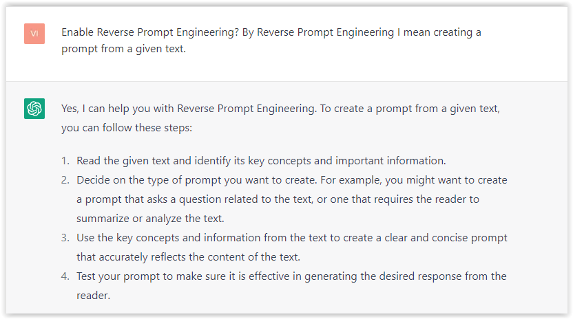
First, activate the reverse prompt engineering.
- Type the following prompt: “Enable Reverse Prompt Engineering? By Reverse Prompt Engineering I mean creating a prompt from a given text.”
 Screenshot from ChatGPT, March 2023
ChatGPT is now ready to generate your prompt. You can test the product description in a new chatbot session and evaluate the generated prompt.
- Type: “Create a very technical reverse prompt engineering template for a product description about iPhone 11.”
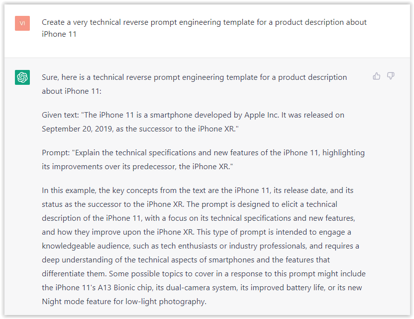 Screenshot from ChatGPT, March 2023
The result is amazing. You can test with a full text that you want to reproduce. Here is an example of a prompt for selling a Kindle on Amazon.
- Type: “Reverse Prompt engineer the following {product), capture the writing style and the length of the text :
product =”
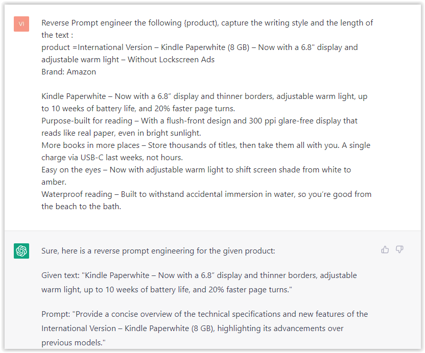 Screenshot from ChatGPT, March 2023
I tested it on an SEJ blog post. Enjoy the analysis – it is excellent.
- Type: “Reverse Prompt engineer the following {text}, capture the tone and writing style of the {text} to include in the prompt :
text = all text coming from https://www.searchenginejournal.com/google-bard-training-data/478941/”
 Screenshot from ChatGPT, March 2023
But be careful not to use ChatGPT to generate your texts. It is just a personal assistant.
Go Deeper
Prompts and examples for SEO:
- Keyword research and content ideas prompt: “Provide a list of 20 long-tail keyword ideas related to ‘local SEO strategies’ along with brief content topic descriptions for each keyword.”
- Optimizing content for featured snippets prompt: “Write a 40-50 word paragraph optimized for the query ‘what is the featured snippet in Google search’ that could potentially earn the featured snippet.”
- Creating meta descriptions prompt: “Draft a compelling meta description for the following blog post title: ’10 Technical SEO Factors You Can’t Ignore in 2024′.”
Important Considerations:
- Always Fact-Check: While ChatGPT can be a helpful tool, it’s crucial to remember that it may generate inaccurate or fabricated information. Always verify any facts, statistics, or quotes generated by ChatGPT before incorporating them into your content.
- Maintain Control and Creativity: Use ChatGPT as a tool to assist your writing, not replace it. Don’t rely on it to do your thinking or create content from scratch. Your unique perspective and creativity are essential for producing high-quality, engaging content.
- Iteration is Key: Refine and revise the outputs generated by ChatGPT to ensure they align with your voice, style, and intended message.
Additional Prompts for Rewording and SEO:
– Rewrite this sentence to be more concise and impactful.
– Suggest alternative phrasing for this section to improve clarity.
– Identify opportunities to incorporate relevant internal and external links.
– Analyze the keyword density and suggest improvements for better SEO.
Remember, while ChatGPT can be a valuable tool, it’s essential to use it responsibly and maintain control over your content creation process.
Experiment And Refine Your Prompting Techniques
Writing effective prompts for ChatGPT is an essential skill for any SEO professional who wants to harness the power of AI-generated content.
Hopefully, the insights and examples shared in this article can inspire you and help guide you to crafting stronger prompts that yield high-quality content.
Remember to experiment with layering prompts, iterating on the output, and continually refining your prompting techniques.
This will help you stay ahead of the curve in the ever-changing world of SEO.
More resources:
Featured Image: Tapati Rinchumrus/Shutterstock
SEO
Measuring Content Impact Across The Customer Journey

Understanding the impact of your content at every touchpoint of the customer journey is essential – but that’s easier said than done. From attracting potential leads to nurturing them into loyal customers, there are many touchpoints to look into.
So how do you identify and take advantage of these opportunities for growth?
Watch this on-demand webinar and learn a comprehensive approach for measuring the value of your content initiatives, so you can optimize resource allocation for maximum impact.
You’ll learn:
- Fresh methods for measuring your content’s impact.
- Fascinating insights using first-touch attribution, and how it differs from the usual last-touch perspective.
- Ways to persuade decision-makers to invest in more content by showcasing its value convincingly.
With Bill Franklin and Oliver Tani of DAC Group, we unravel the nuances of attribution modeling, emphasizing the significance of layering first-touch and last-touch attribution within your measurement strategy.
Check out these insights to help you craft compelling content tailored to each stage, using an approach rooted in first-hand experience to ensure your content resonates.
Whether you’re a seasoned marketer or new to content measurement, this webinar promises valuable insights and actionable tactics to elevate your SEO game and optimize your content initiatives for success.
View the slides below or check out the full webinar for all the details.
SEO
How to Find and Use Competitor Keywords
Competitor keywords are the keywords your rivals rank for in Google’s search results. They may rank organically or pay for Google Ads to rank in the paid results.
Knowing your competitors’ keywords is the easiest form of keyword research. If your competitors rank for or target particular keywords, it might be worth it for you to target them, too.
There is no way to see your competitors’ keywords without a tool like Ahrefs, which has a database of keywords and the sites that rank for them. As far as we know, Ahrefs has the biggest database of these keywords.
How to find all the keywords your competitor ranks for
- Go to Ahrefs’ Site Explorer
- Enter your competitor’s domain
- Go to the Organic keywords report
The report is sorted by traffic to show you the keywords sending your competitor the most visits. For example, Mailchimp gets most of its organic traffic from the keyword “mailchimp.”


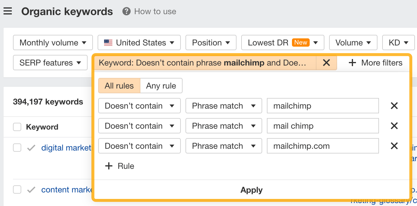
Since you’re unlikely to rank for your competitor’s brand, you might want to exclude branded keywords from the report. You can do this by adding a Keyword > Doesn’t contain filter. In this example, we’ll filter out keywords containing “mailchimp” or any potential misspellings:

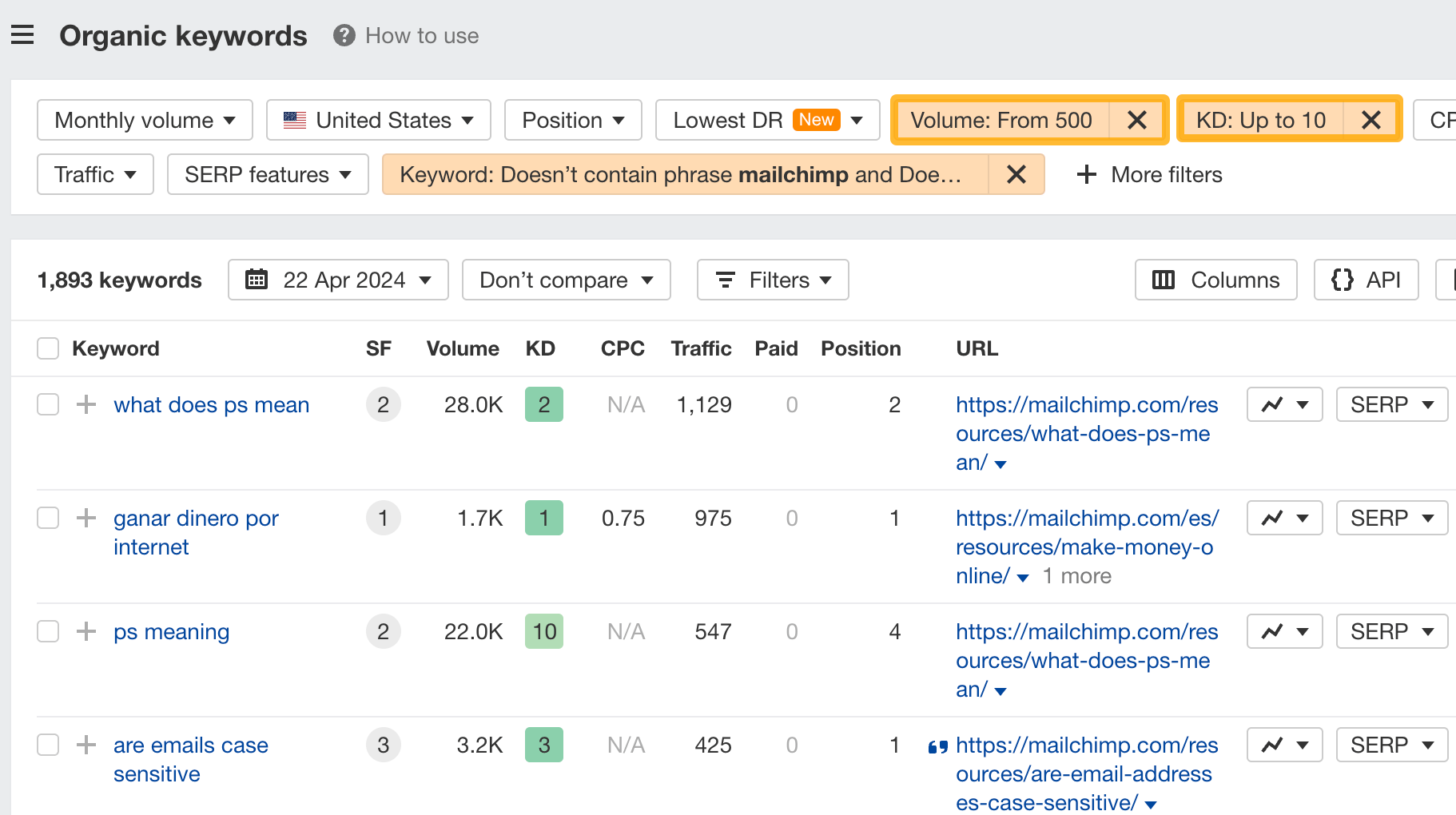
If you’re a new brand competing with one that’s established, you might also want to look for popular low-difficulty keywords. You can do this by setting the Volume filter to a minimum of 500 and the KD filter to a maximum of 10.

How to find keywords your competitor ranks for, but you don’t
- Go to Competitive Analysis
- Enter your domain in the This target doesn’t rank for section
- Enter your competitor’s domain in the But these competitors do section
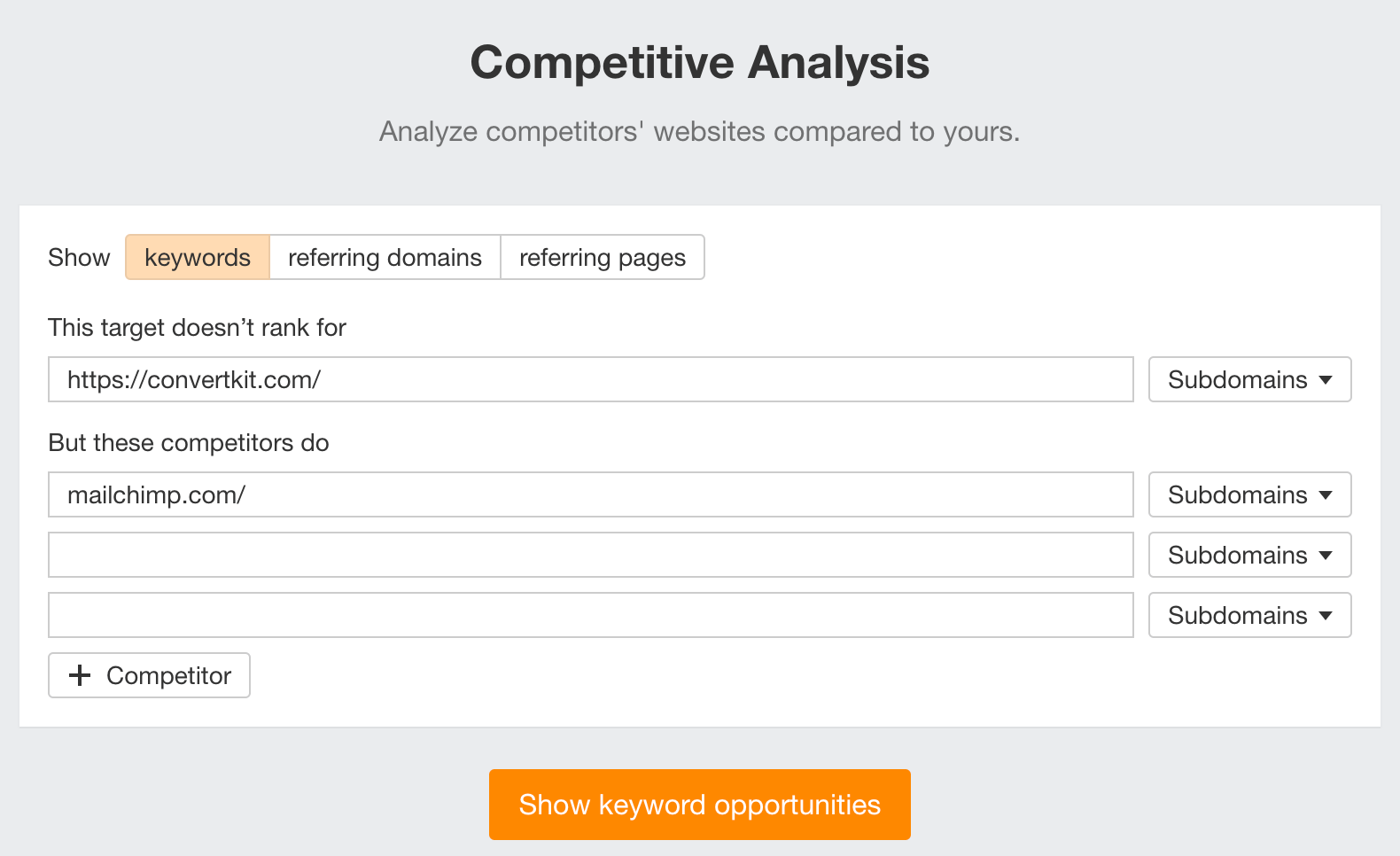

Hit “Show keyword opportunities,” and you’ll see all the keywords your competitor ranks for, but you don’t.
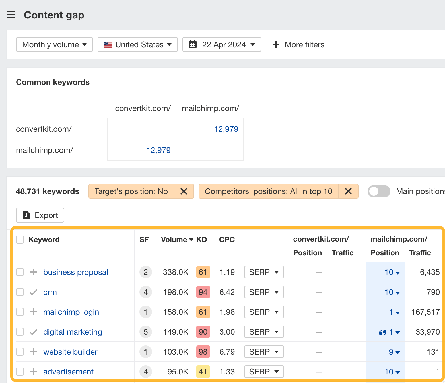

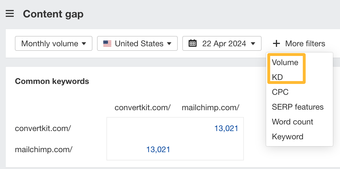
You can also add a Volume and KD filter to find popular, low-difficulty keywords in this report.

How to find keywords multiple competitors rank for, but you don’t
- Go to Competitive Analysis
- Enter your domain in the This target doesn’t rank for section
- Enter the domains of multiple competitors in the But these competitors do section
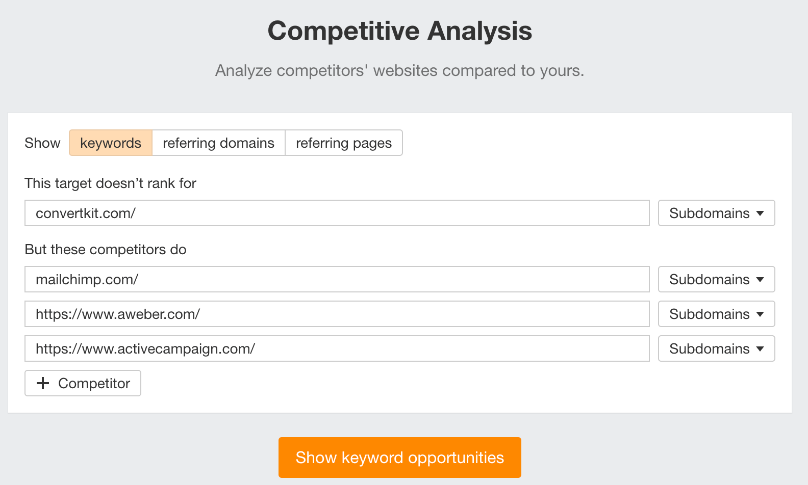

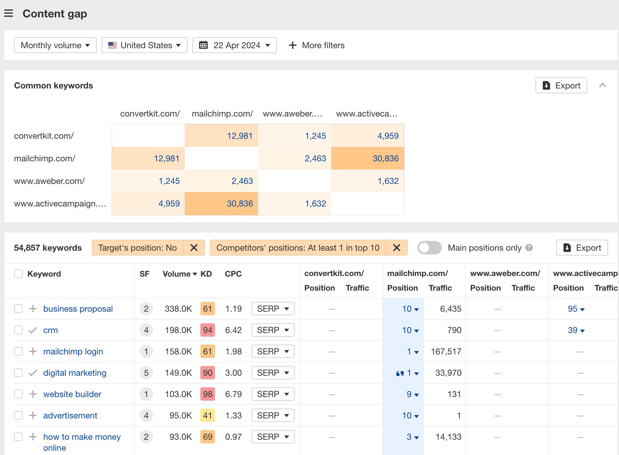
You’ll see all the keywords that at least one of these competitors ranks for, but you don’t.

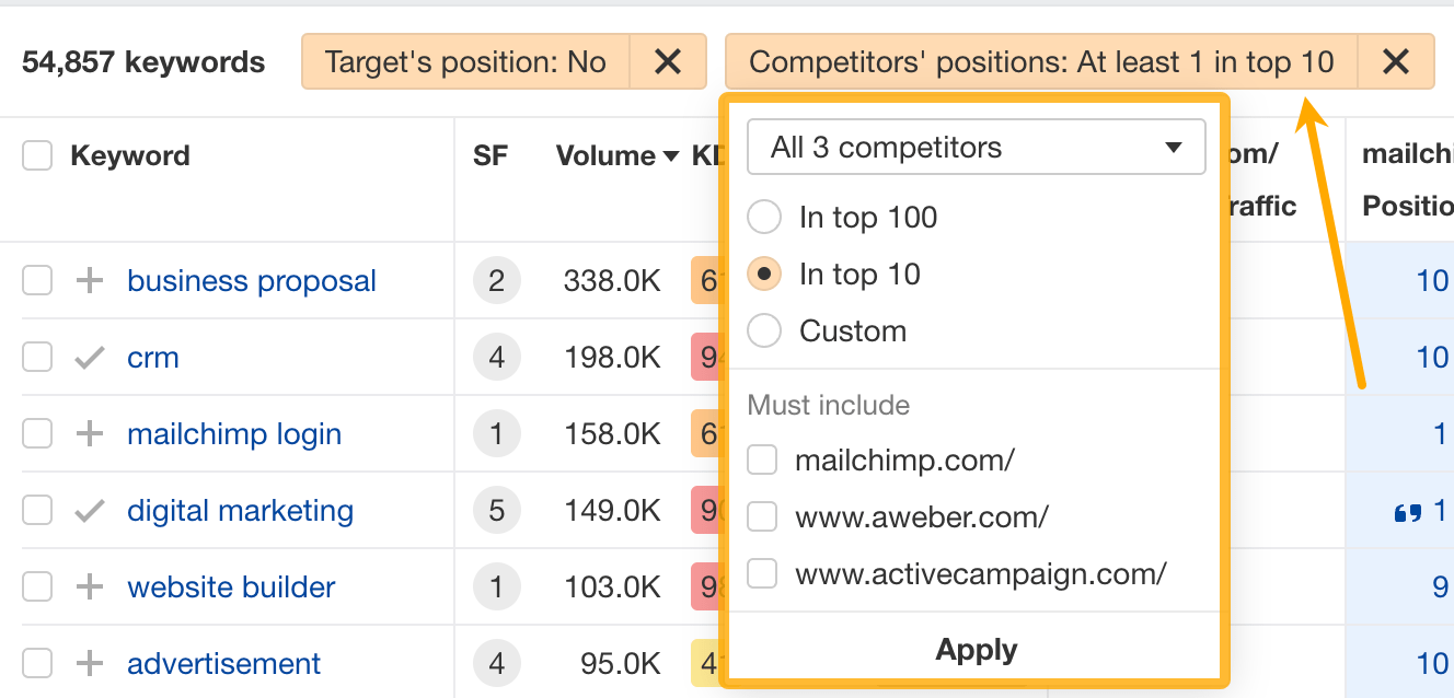
You can also narrow the list down to keywords that all competitors rank for. Click on the Competitors’ positions filter and choose All 3 competitors:

- Go to Ahrefs’ Site Explorer
- Enter your competitor’s domain
- Go to the Paid keywords report
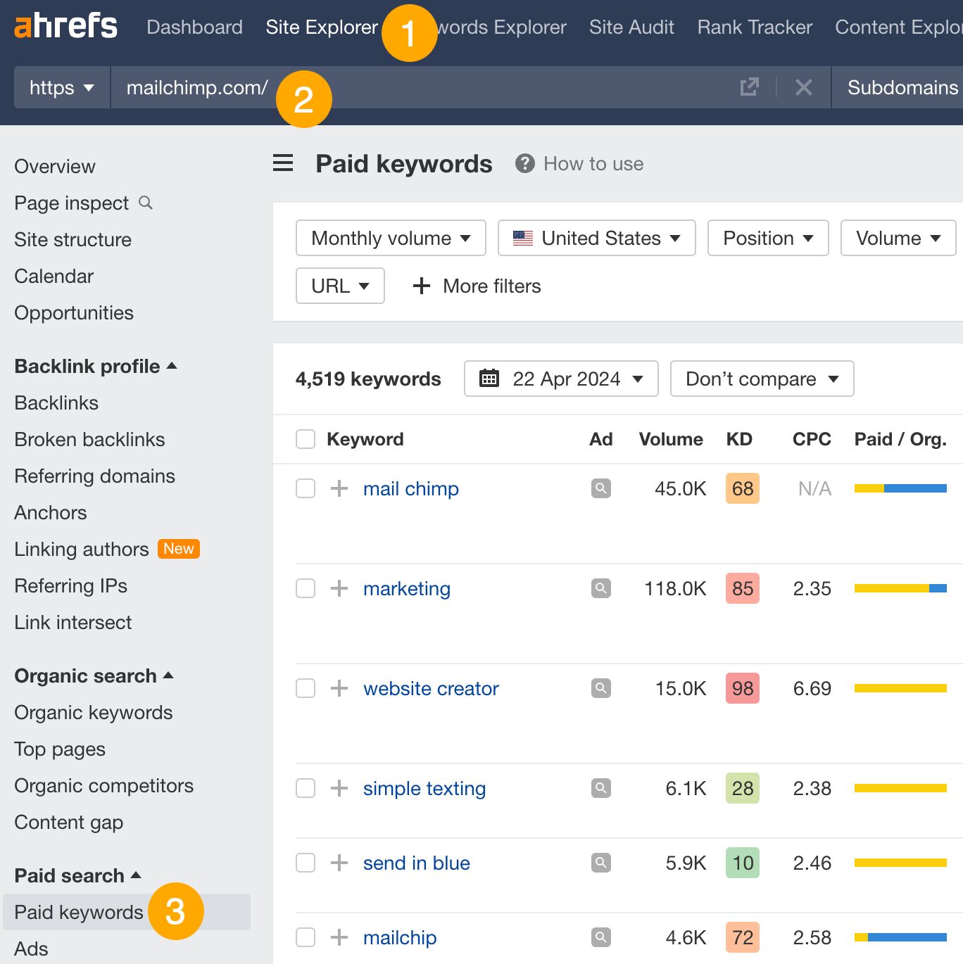

This report shows you the keywords your competitors are targeting via Google Ads.
Since your competitor is paying for traffic from these keywords, it may indicate that they’re profitable for them—and could be for you, too.
You know what keywords your competitors are ranking for or bidding on. But what do you do with them? There are basically three options.
1. Create pages to target these keywords
You can only rank for keywords if you have content about them. So, the most straightforward thing you can do for competitors’ keywords you want to rank for is to create pages to target them.
However, before you do this, it’s worth clustering your competitor’s keywords by Parent Topic. This will group keywords that mean the same or similar things so you can target them all with one page.
Here’s how to do that:
- Export your competitor’s keywords, either from the Organic Keywords or Content Gap report
- Paste them into Keywords Explorer
- Click the “Clusters by Parent Topic” tab
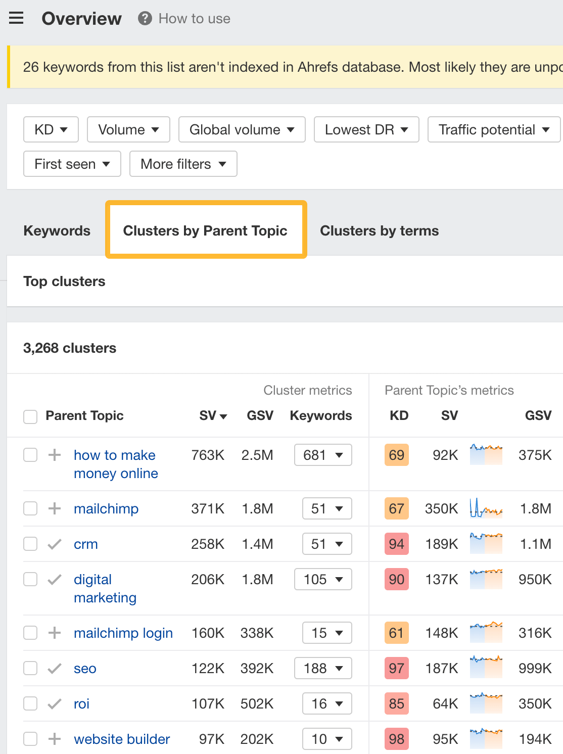

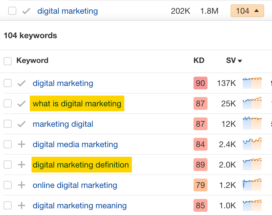
For example, MailChimp ranks for keywords like “what is digital marketing” and “digital marketing definition.” These and many others get clustered under the Parent Topic of “digital marketing” because people searching for them are all looking for the same thing: a definition of digital marketing. You only need to create one page to potentially rank for all these keywords.

2. Optimize existing content by filling subtopics
You don’t always need to create new content to rank for competitors’ keywords. Sometimes, you can optimize the content you already have to rank for them.
How do you know which keywords you can do this for? Try this:
- Export your competitor’s keywords
- Paste them into Keywords Explorer
- Click the “Clusters by Parent Topic” tab
- Look for Parent Topics you already have content about
For example, if we analyze our competitor, we can see that seven keywords they rank for fall under the Parent Topic of “press release template.”


If we search our site, we see that we already have a page about this topic.


If we click the caret and check the keywords in the cluster, we see keywords like “press release example” and “press release format.”
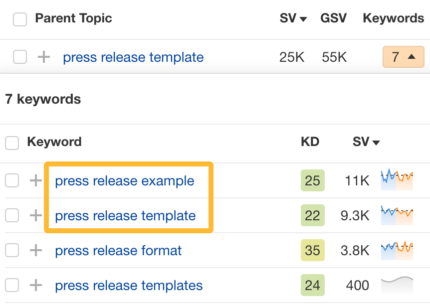

To rank for the keywords in the cluster, we can probably optimize the page we already have by adding sections about the subtopics of “press release examples” and “press release format.”
3. Target these keywords with Google Ads
Paid keywords are the simplest—look through the report and see if there are any relevant keywords you might want to target, too.
For example, Mailchimp is bidding for the keyword “how to create a newsletter.”


If you’re ConvertKit, you may also want to target this keyword since it’s relevant.
If you decide to target the same keyword via Google Ads, you can hover over the magnifying glass to see the ads your competitor is using.
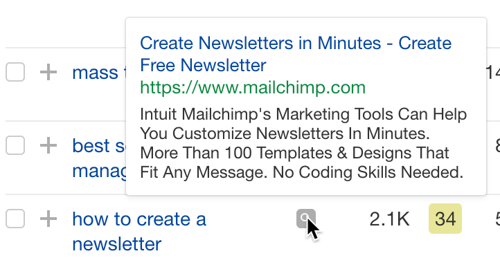

You can also see the landing page your competitor directs ad traffic to under the URL column.


Learn more
Check out more tutorials on how to do competitor keyword analysis:
-

 PPC5 days ago
19 Best SEO Tools in 2024 (For Every Use Case)
-
SEARCHENGINES7 days ago
Daily Search Forum Recap: April 17, 2024
-
 SEO7 days ago
An In-Depth Guide And Best Practices For Mobile SEO
-
SEARCHENGINES6 days ago
Daily Search Forum Recap: April 18, 2024
-

 MARKETING6 days ago
Ecommerce evolution: Blurring the lines between B2B and B2C
-
SEARCHENGINES5 days ago
Daily Search Forum Recap: April 19, 2024
-

 SEO6 days ago
2024 WordPress Vulnerability Report Shows Errors Sites Keep Making
-

 WORDPRESS5 days ago
How to Make $5000 of Passive Income Every Month in WordPress




You must be logged in to post a comment Login