MARKETING
How we got 75% more e-commerce orders in a single A/B test for this major brand

We used research to optimize the page and ran an A/B test. The winning version, labeled “radical,” resulted in a 75% increase in sales.
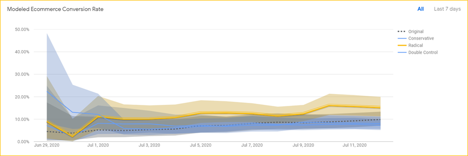
The original and double-control pages are actually identical. And to ensure that our judgment is sound, we always include a double-control.

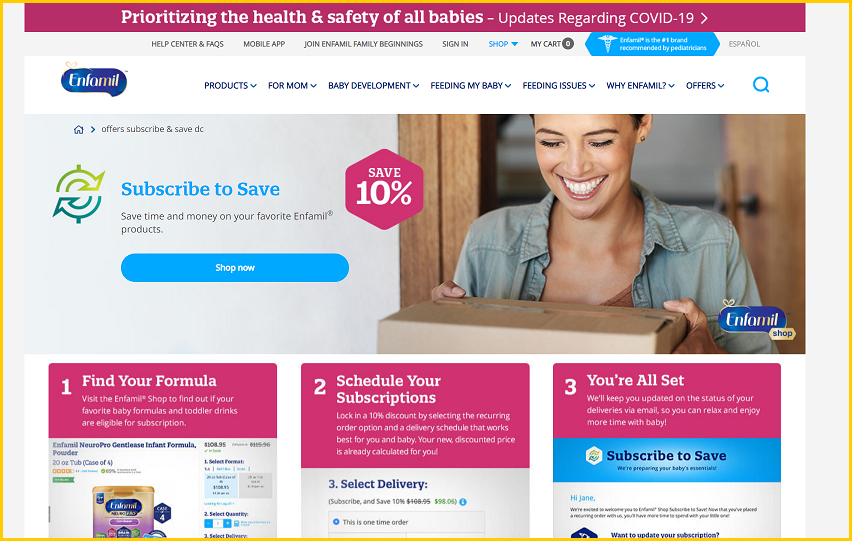
Screenshot from the winning, optimized treatment (above the fold, desktop). Image Credits: Conversion Wizards

Here’s a screenshot of the original page (above the fold, desktop). Image Credits: Conversion Wizards
We took the average of those two identical pages as the baseline to determine the lift, and it revealed a 75% increase at 99% statistical significance.
Here are the Google optimize screenshots:

Image Credits: Conversion Wizards

Image Credits: Conversion Wizards
Here’s a link to the full image of the original page.
Here’s a link to the full image of the winning page.
A look under the hood
Before I discuss the changes that produced the lift, it is important that I quickly go over the research that informed those changes. Why? Because it is a critical aspect of the process and too many CRO practitioners do not devote enough attention to figuring out why more site visitors aren’t converting.
Help TechCrunch find the best growth marketers for startups.
Provide a recommendation in this quick survey and we’ll share the results with everybody.
We surveyed both bouncing visitors and subscribers to the Subscribe & Save program. One of the important questions we asked the bouncing visitors was: “If you did not purchase today, what was your reason?”


